The Bacchus Pub is a Bozeman staple. It closed in 2017 and remained shuttered for a few years. Before it reopened, we worked with the new owners to refine the brand and eliminate any confusion about its heritage (Bacchus was the name of the Roman god of agriculture, wine and fertility) and move it back toward its German pub roots. Through visuals, like an updated German stein logo and usage of the German blackletter type, we infused the pub’s heritage back into the Bacchus brand.
If you spent time at the Bacchus in the past, you’ll notice interior updates. The ceiling has been painted to lighten up the space and make it more welcoming. We worked with the Bacchus team to provide furnishing, lighting and layout recommendations, as well as new sidewalk and entryway signage.
Brand Exploration
Brand Strategy
Brand Positioning
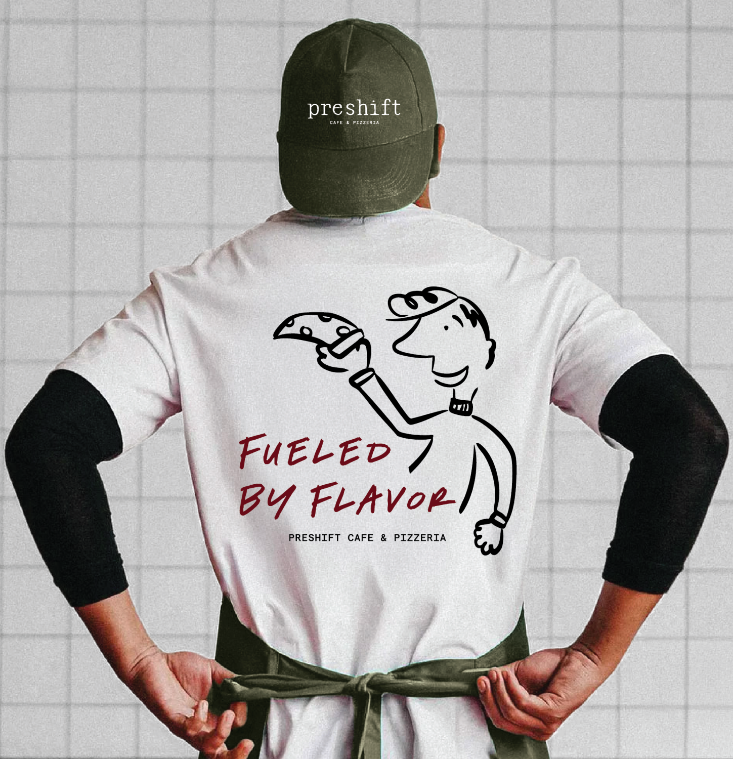
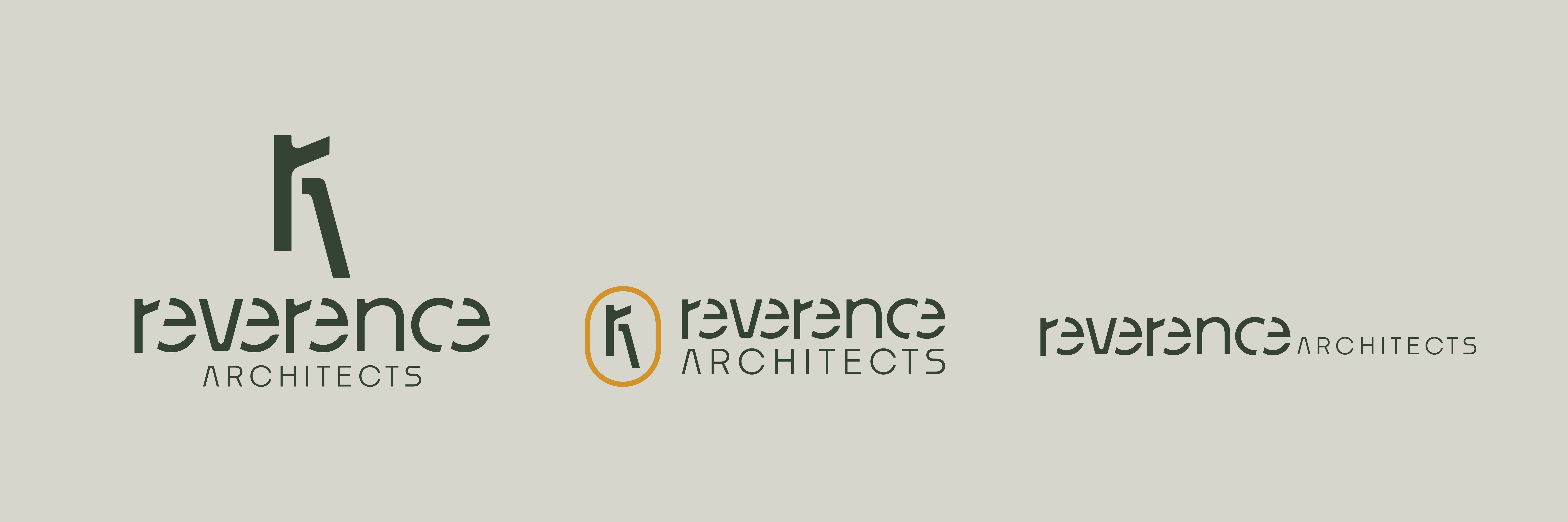
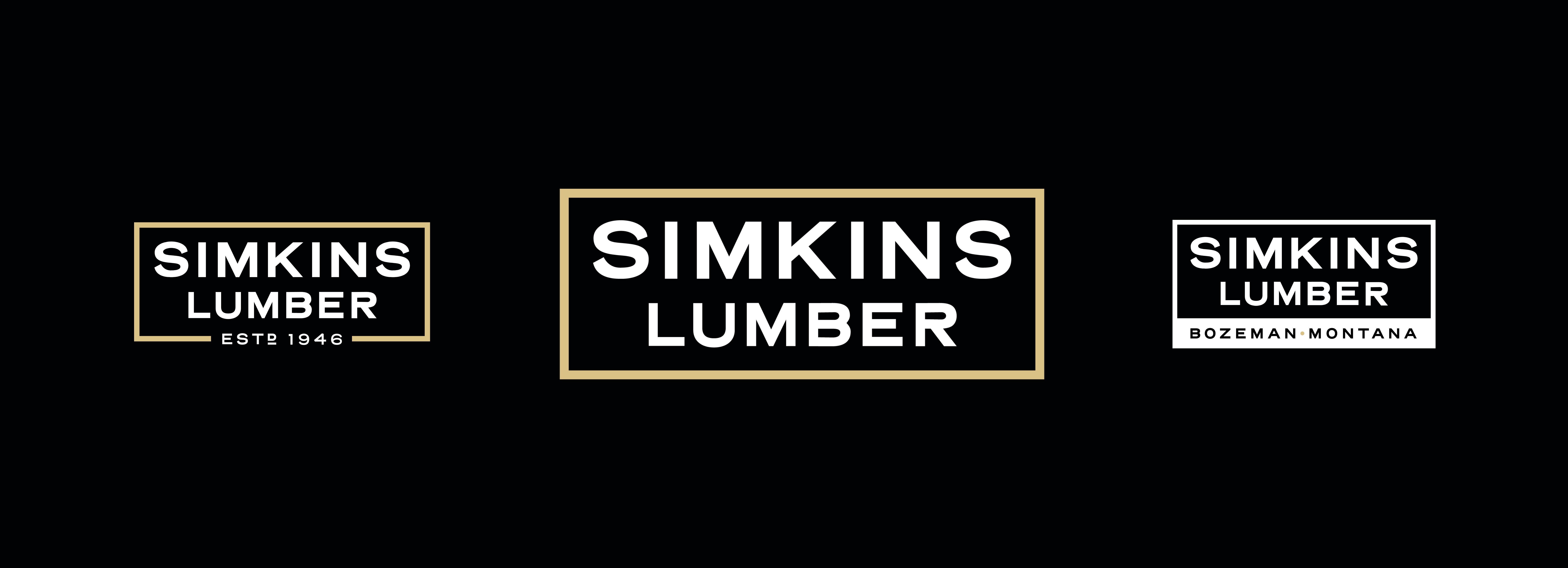
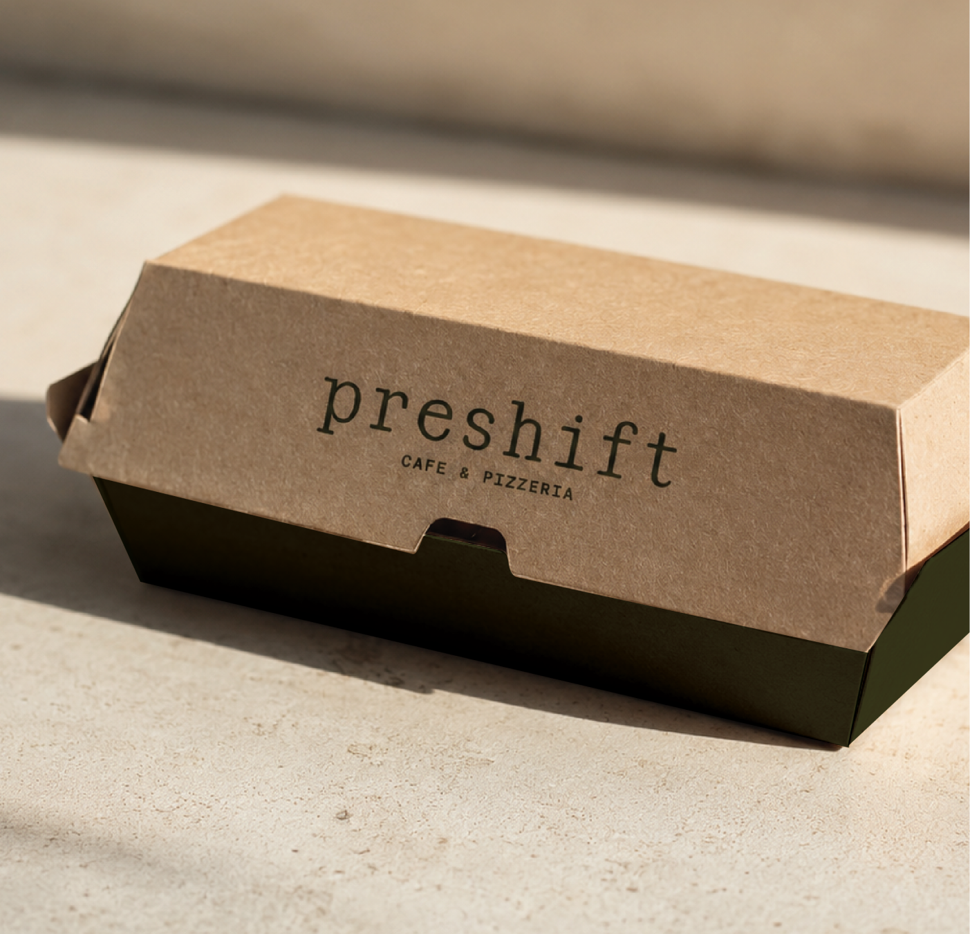
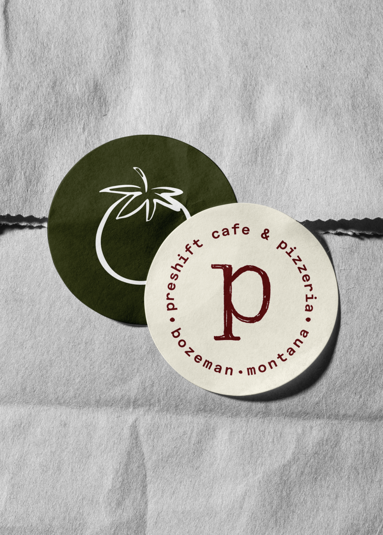
Brand Identity
Interior Branding/Design
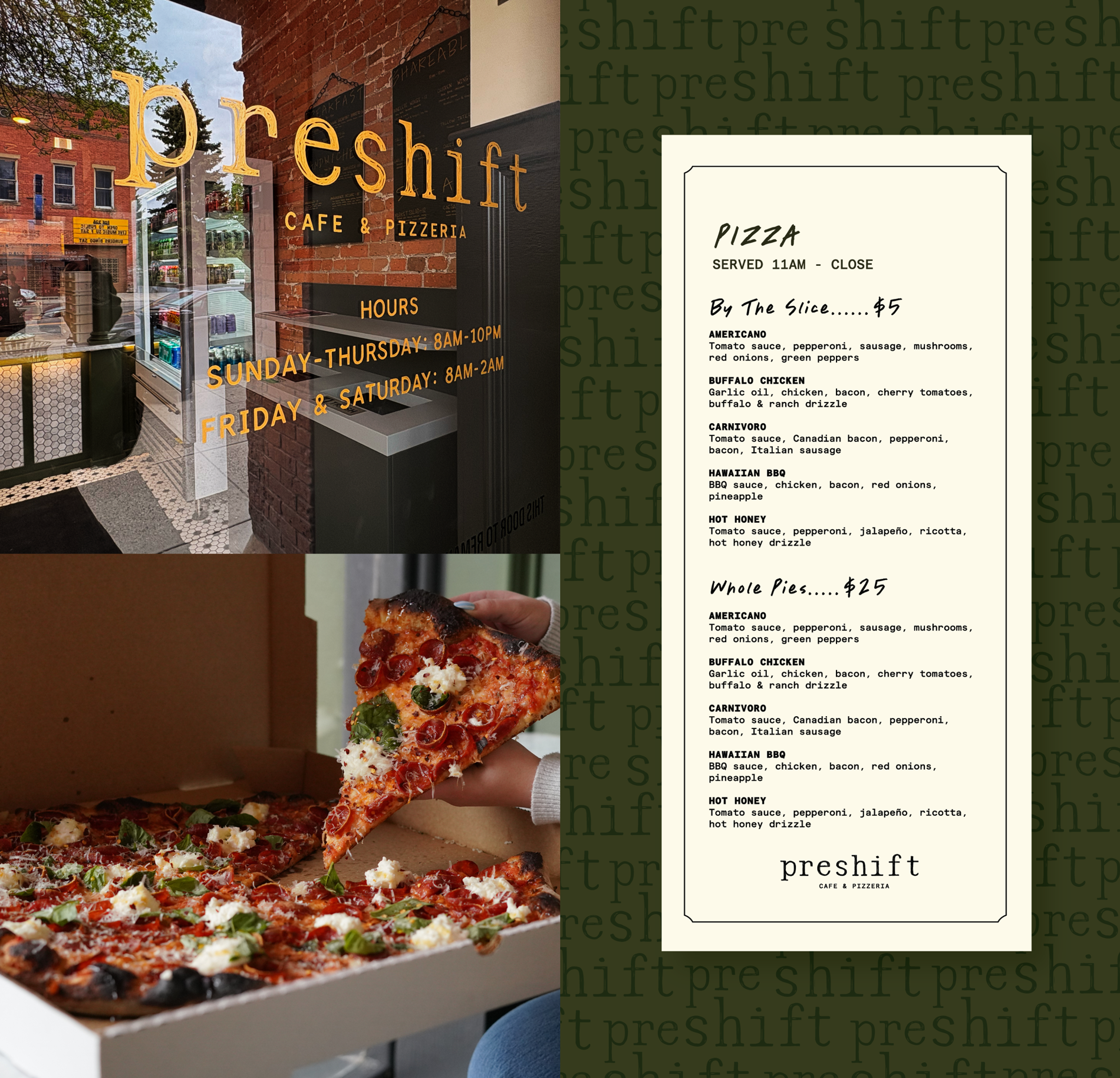
Signage
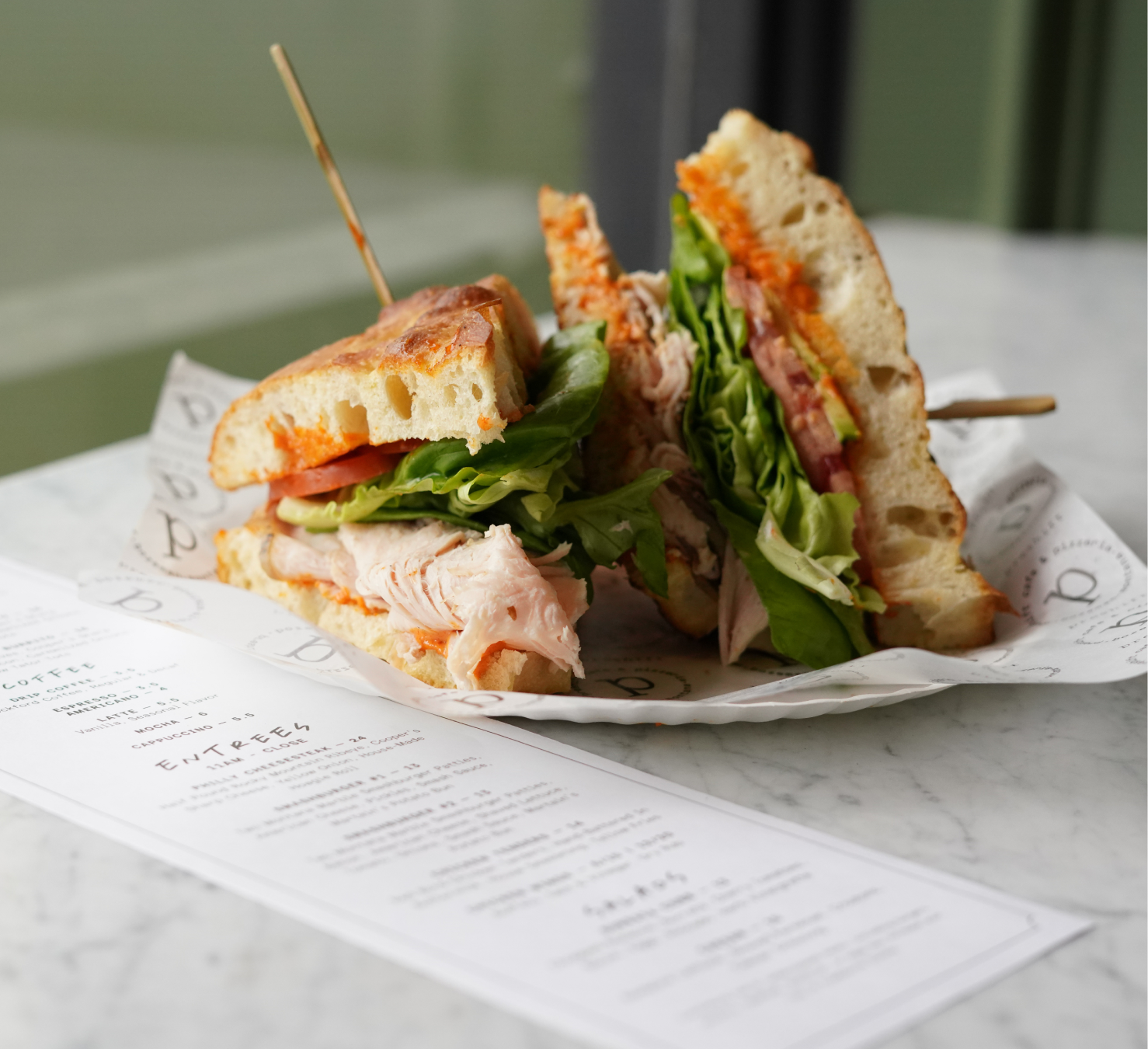
Menus Design
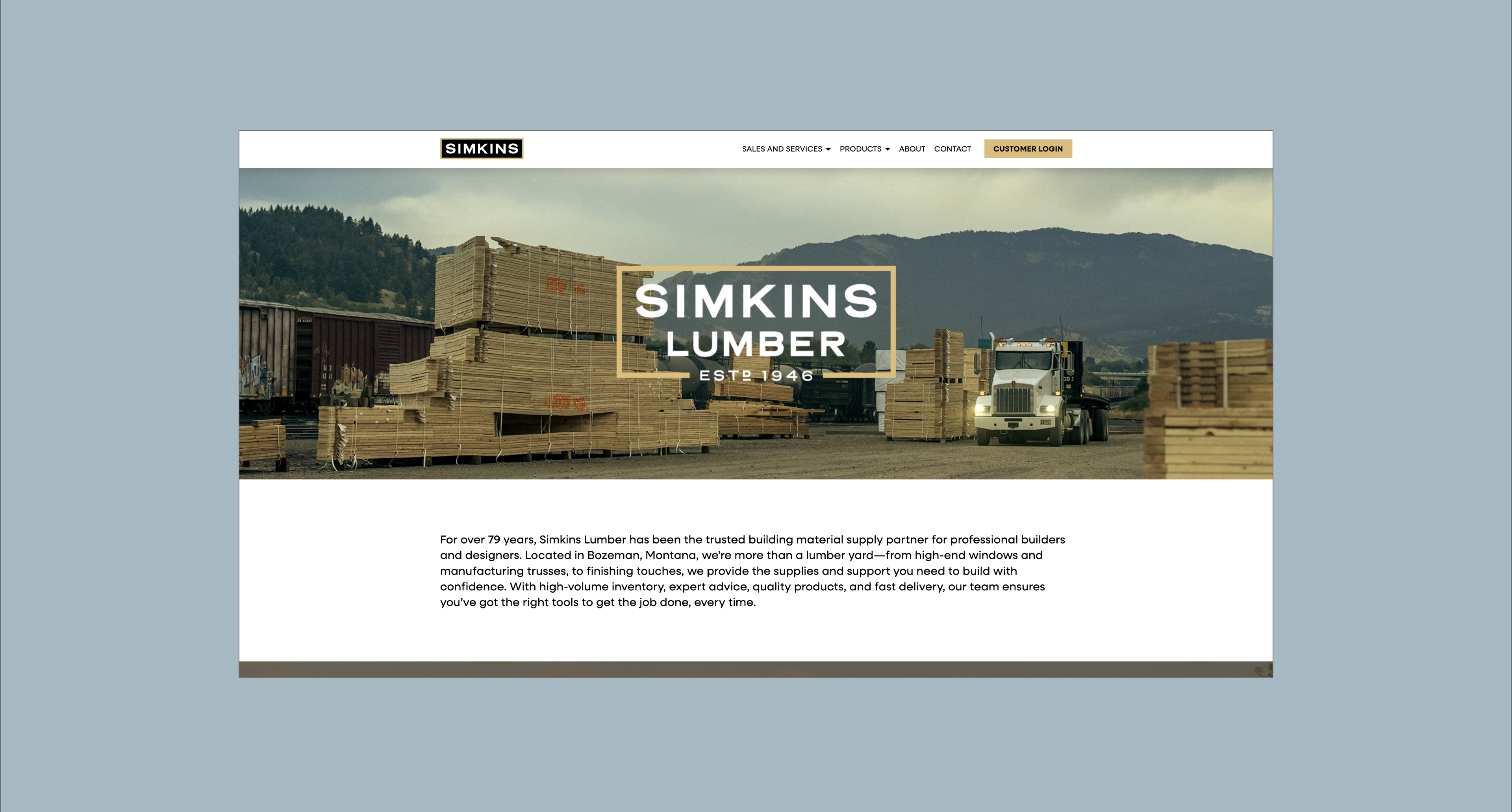
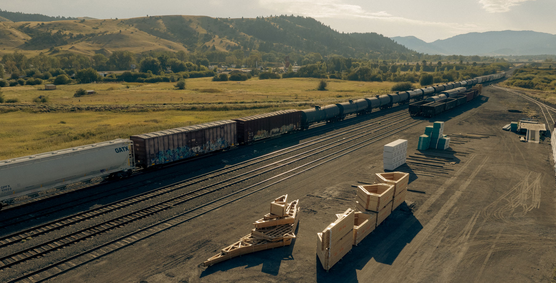
Bozeman, Montana
A timeless and fitting brand that reflects the rich history of the establishment, creating a warm and welcoming gathering place that can grow with the community.


Overcome a cluttered and ambiguous identity that had been muddied through years of inconsistent ownership.
To revitalize a historic Bozeman establishment by giving its appearance a refresh and highlighting its German heritage.
We embraced the pub’s roots and amplified its German traditions, coupling them with a more contemporary and inviting aesthetic.


Hardy facilitated a multi-phase brand launch that considered everything from employee-owner training to the ‘why pay more’ signs. The first step was to train all leadership staff on the new strategy. By providing consistent language, their leadership team has the tools to communicate the brand to all employee-owners and customers, utilize it in hiring, and lean on it for business decisions. To support the high level of service T&C is known for, we created talking points, rack cards, and tools that empower employee-owners to answer questions customers may have.


The Bridger Brewing team wanted to be prepared to can and distribute its beer after opening its second location. AMS partnered with Bridger Brewing for packaging design concepts. The first step in the packaging process involved a strategy session in which the unique identity of each beer was explored and dissected. Several concepts were then sketched out. Once a concept was selected for each beer, custom illustrations were created for cans and boxes. The result is a full lineup of beers, each with its own design that is unique while still clearly a member of the Bridger Brewing brand.


The longest line you’ll see comes from a reel.
Big ideas are best discussed on the back of a pickup.