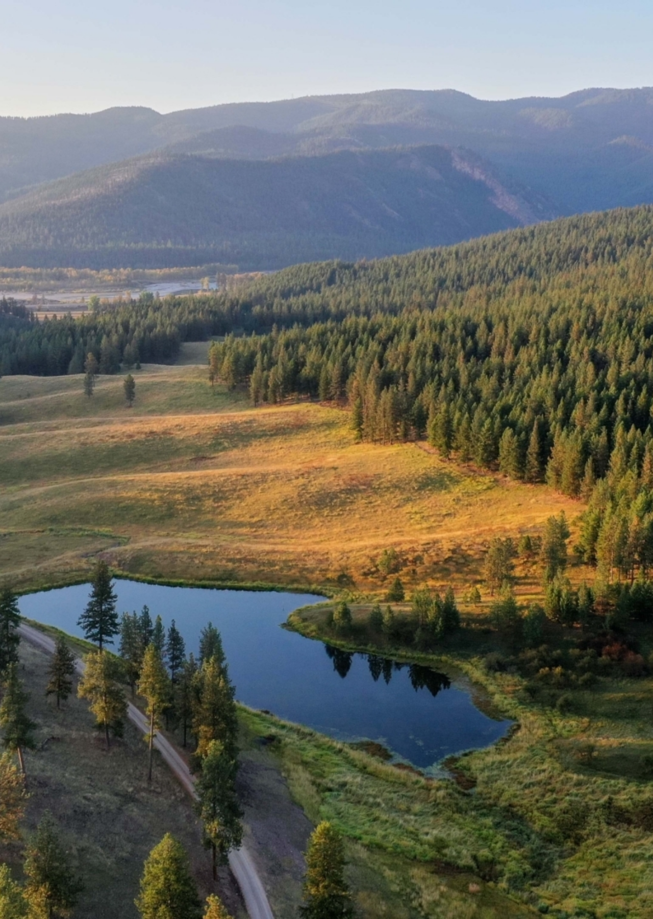
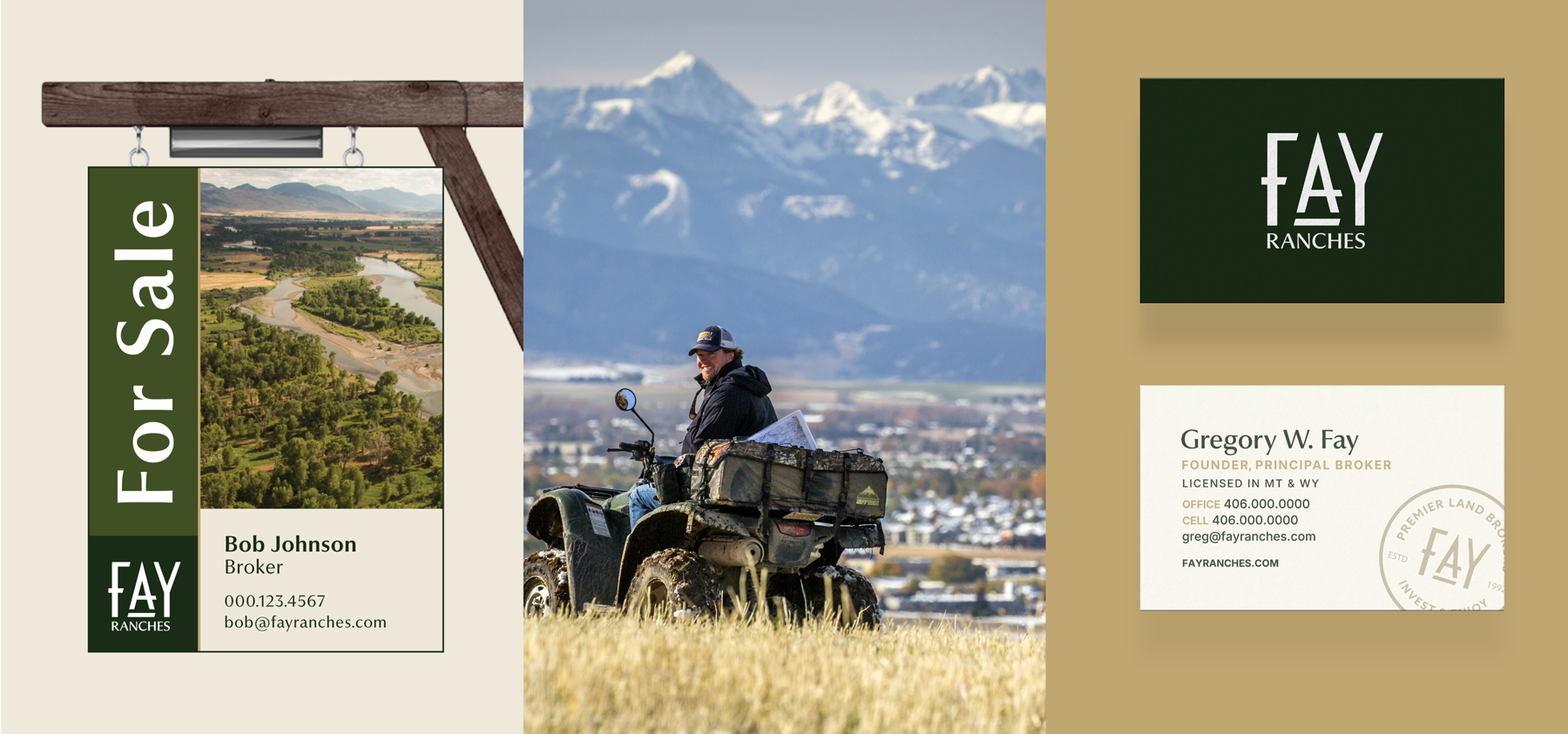
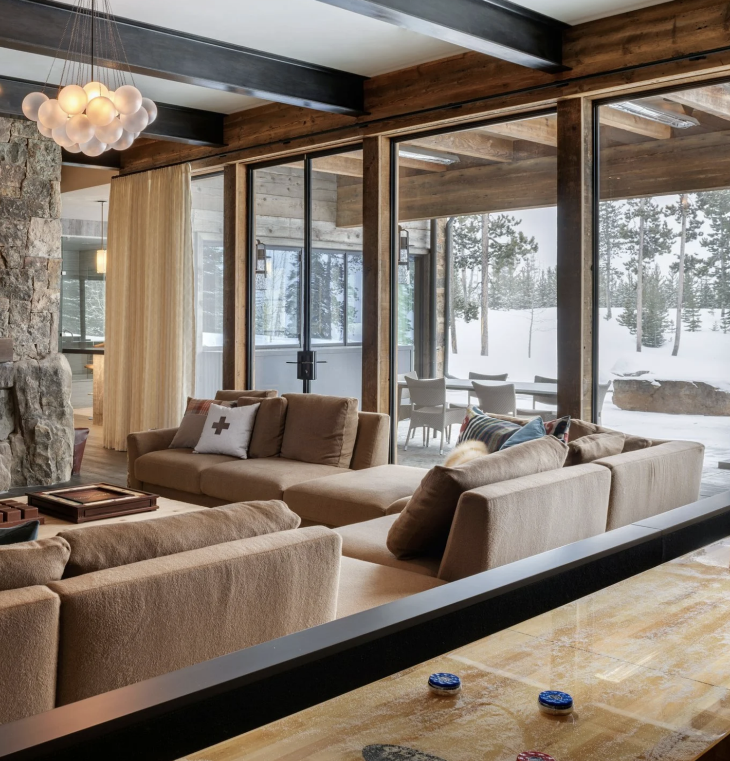
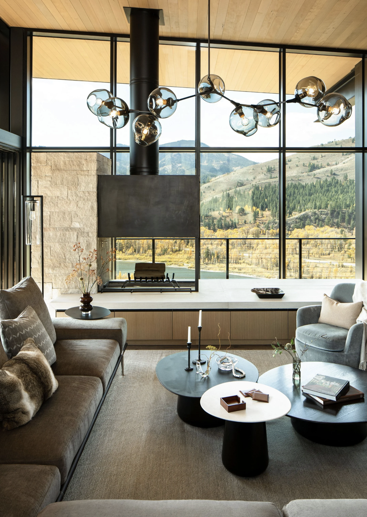
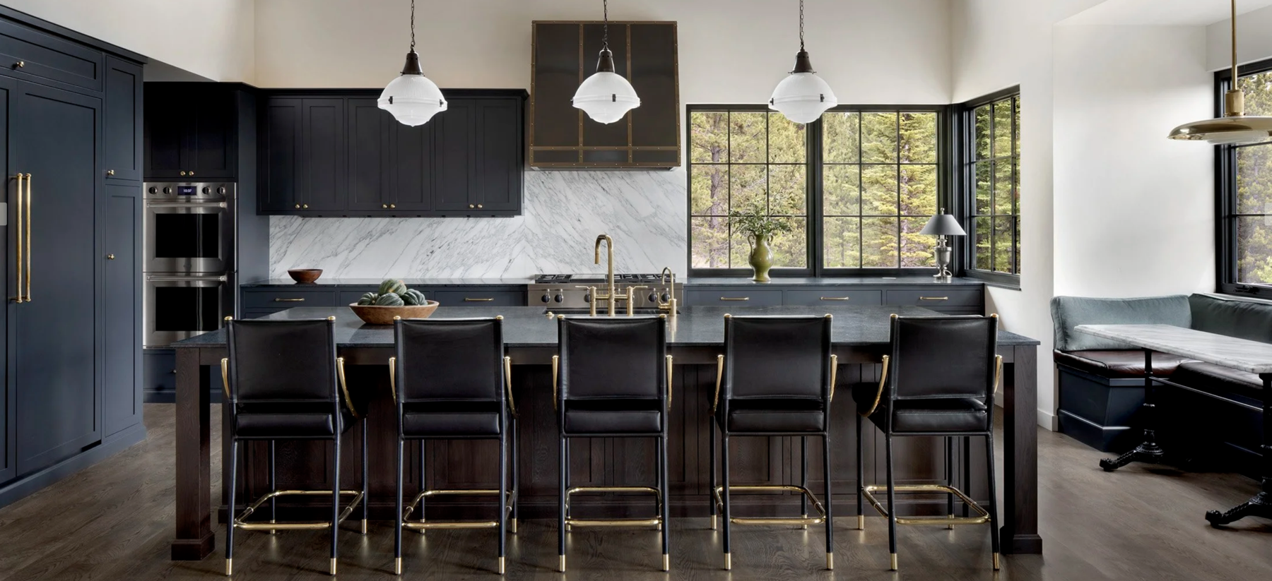
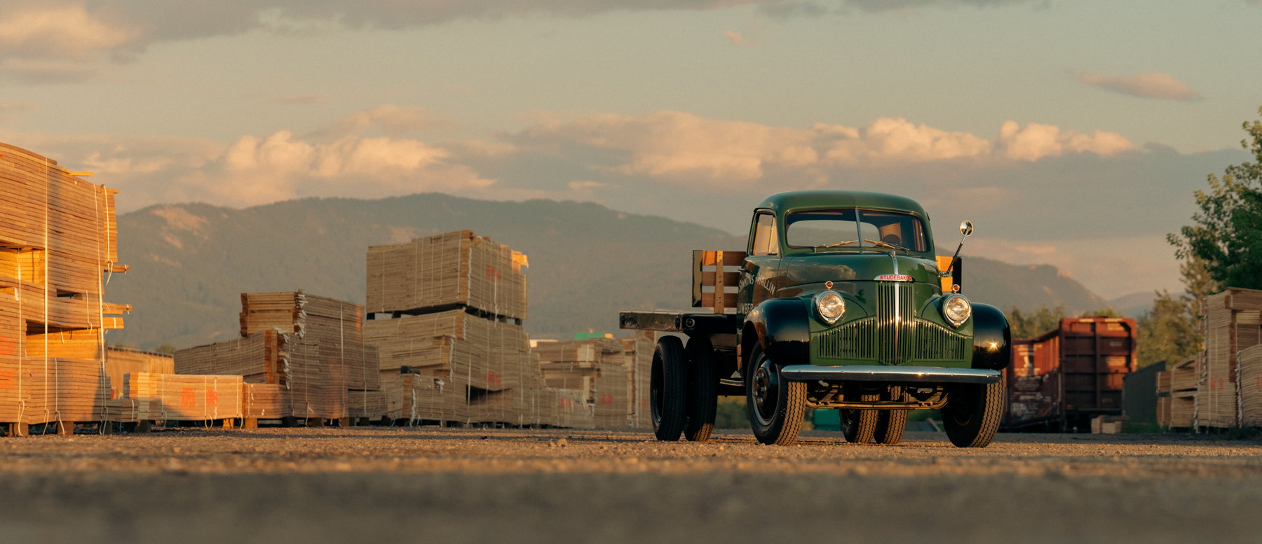
Since 1992, Fay Ranches has connected passionate people with meaningful land investments. What began as a brokerage focused on sporting ranches has grown into one of the nation’s premier firms for exceptional land and property, including working ranches, farms, timberland, luxury residences, and sporting estates.
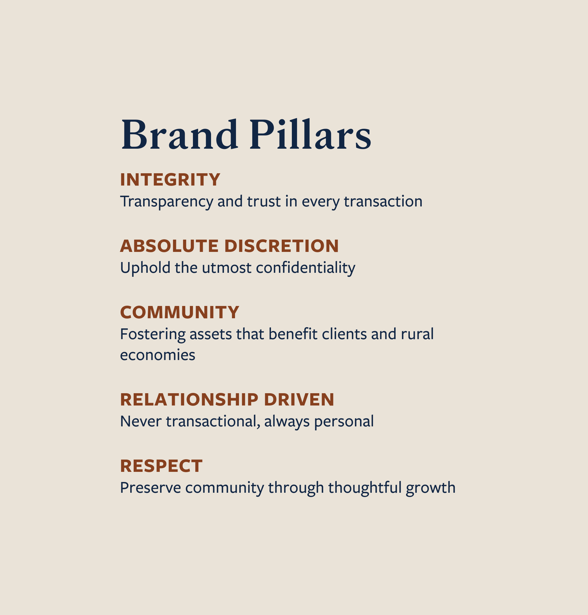
As the company expanded nationwide, Fay Ranches partnered with Hardy Brands to lead a comprehensive brand refresh. The work focused on clarifying the company’s purpose, unifying its message, and modernizing its identity while remaining grounded in the principles that have defined the firm from the beginning: Family, Investment Value, Sporting Pursuits, and Conservation.
Brand Strategy
Employee Surveys
Agent Surveys
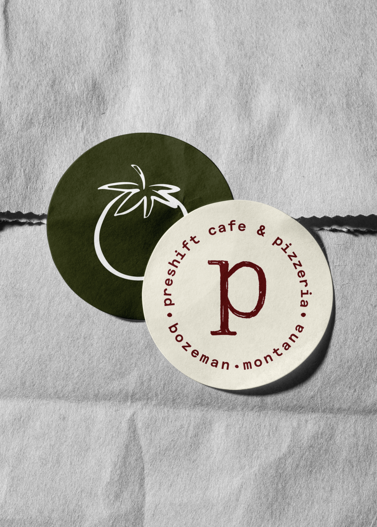
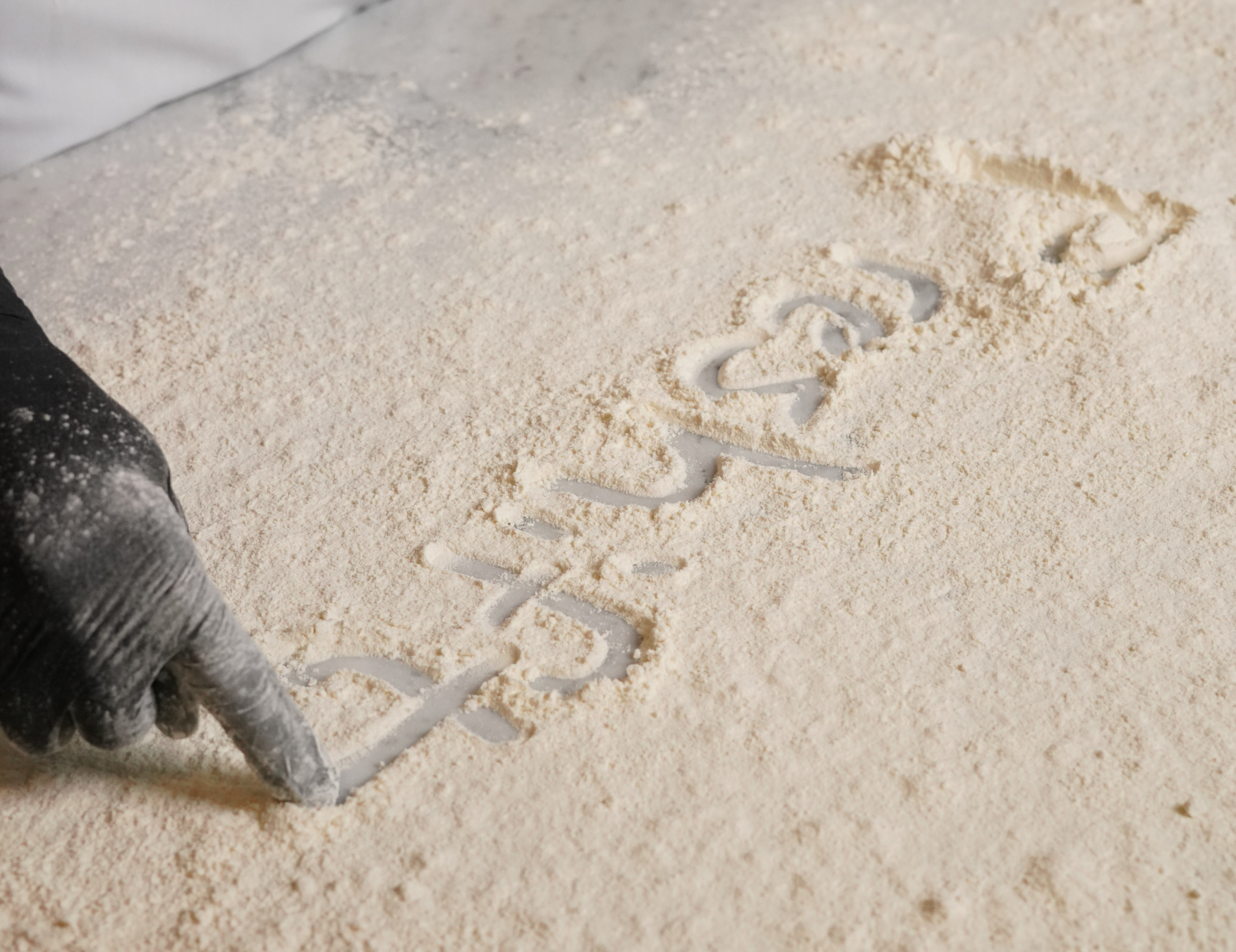
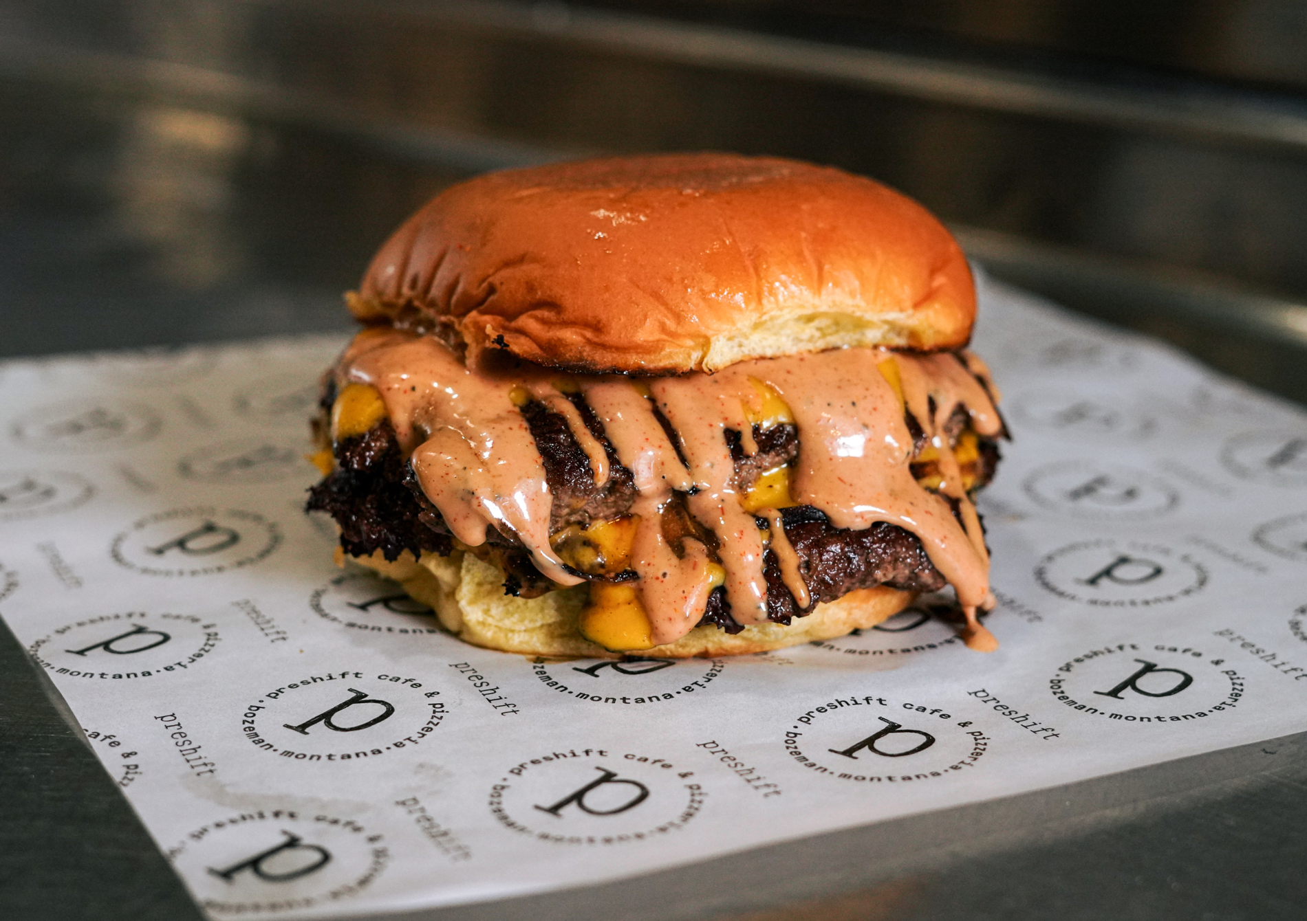
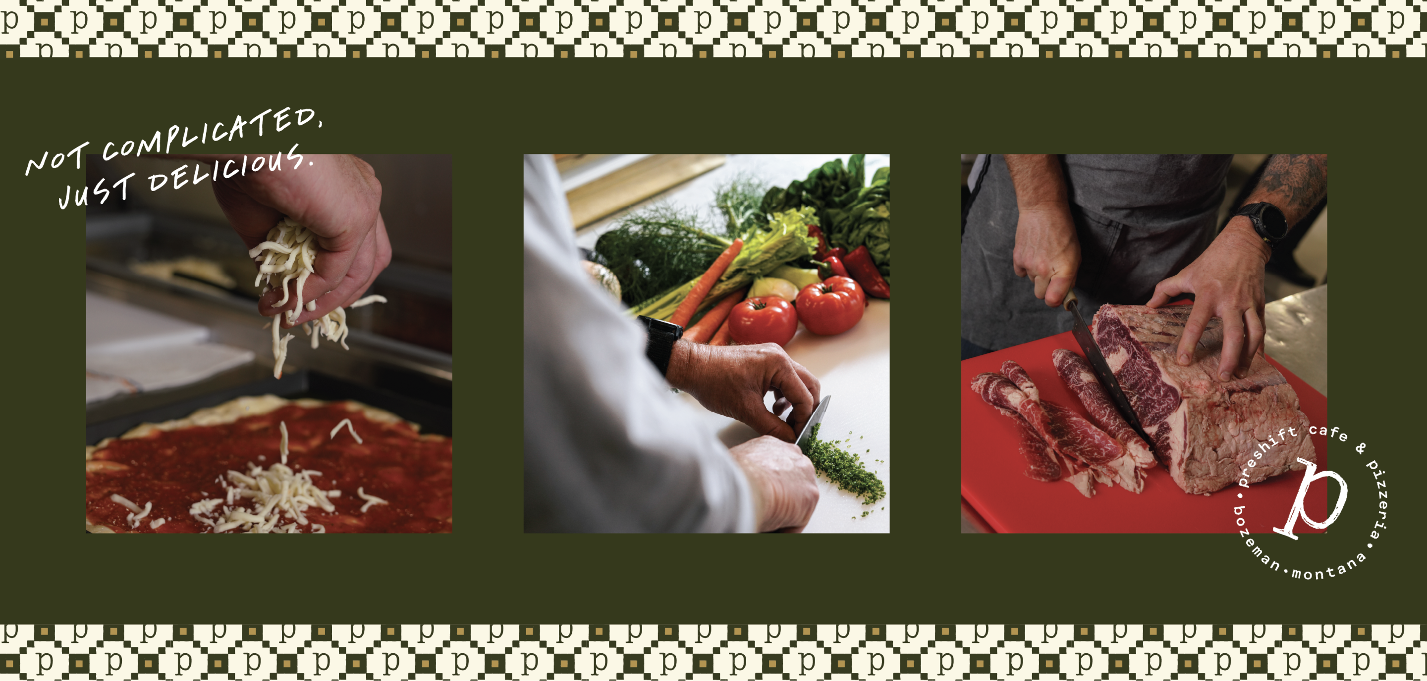
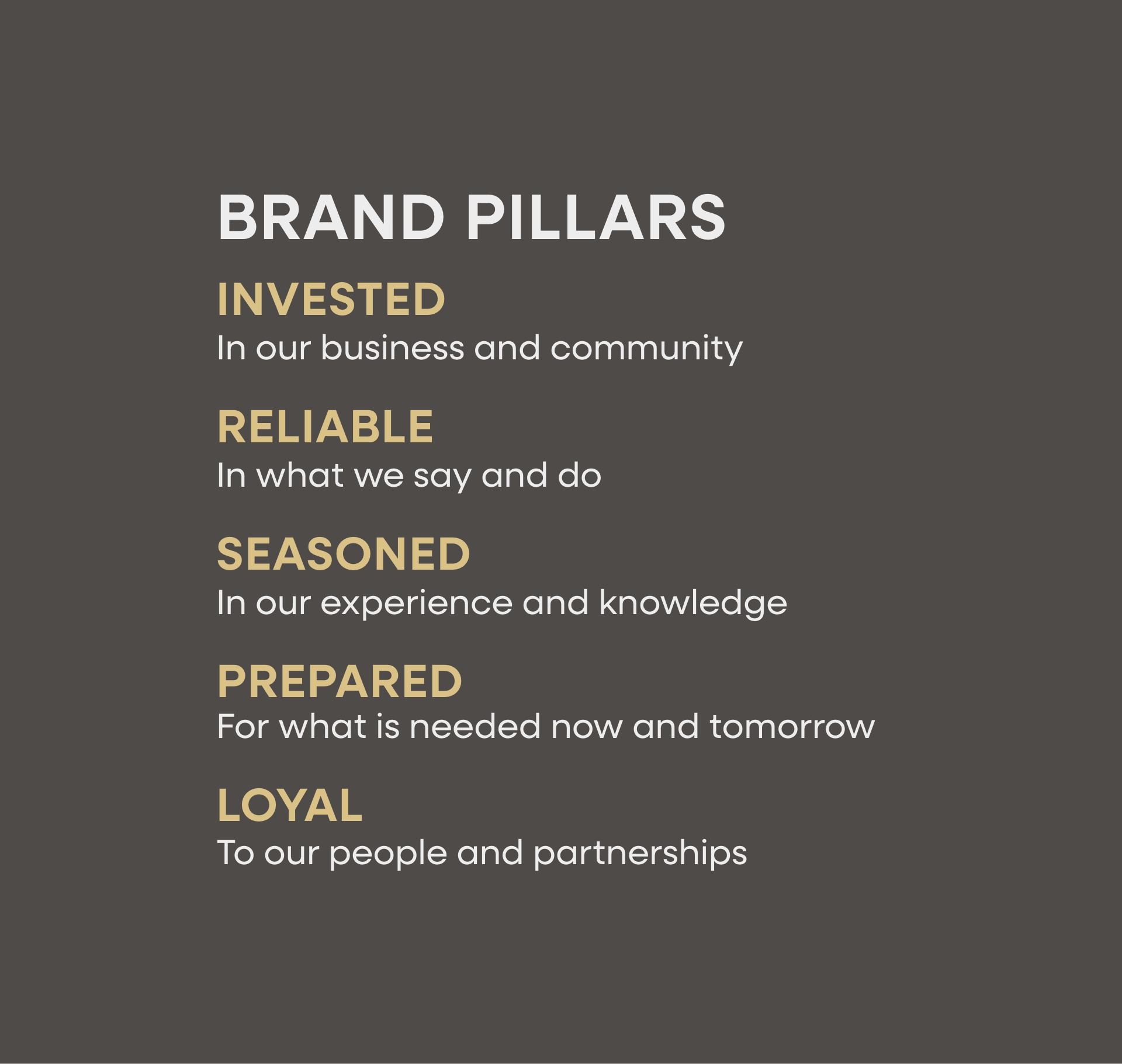
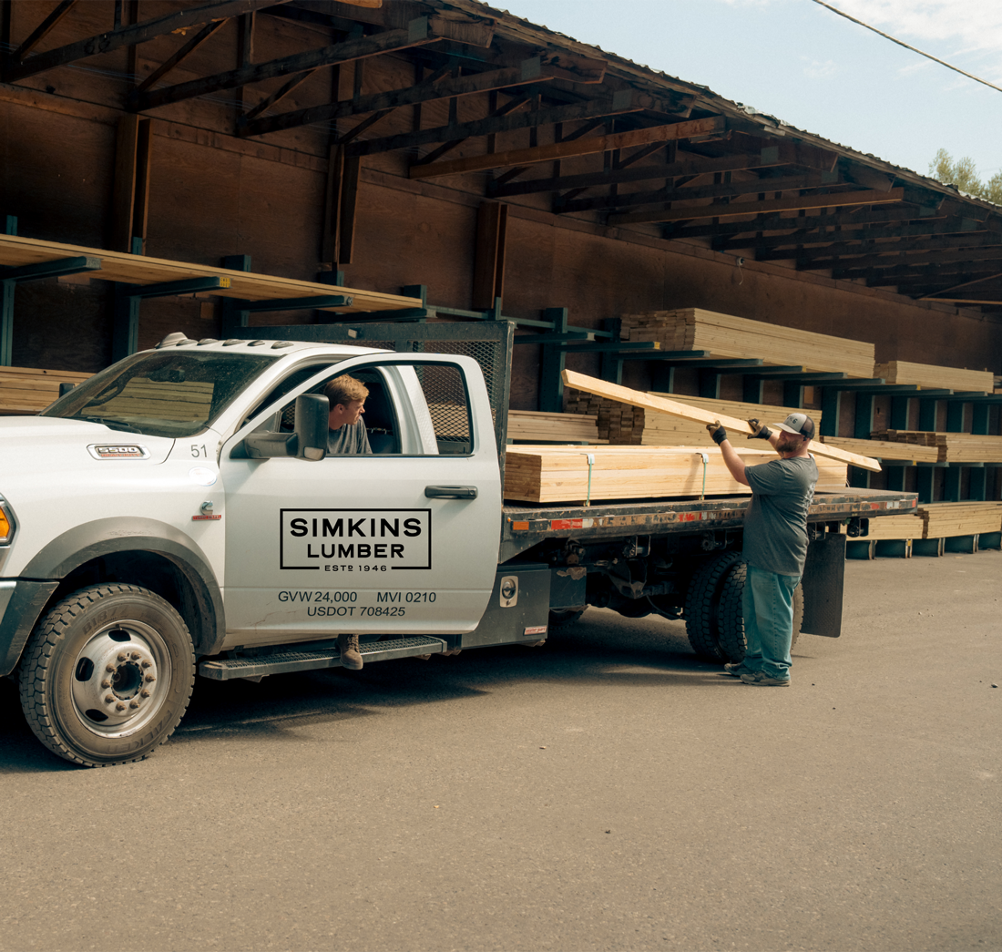
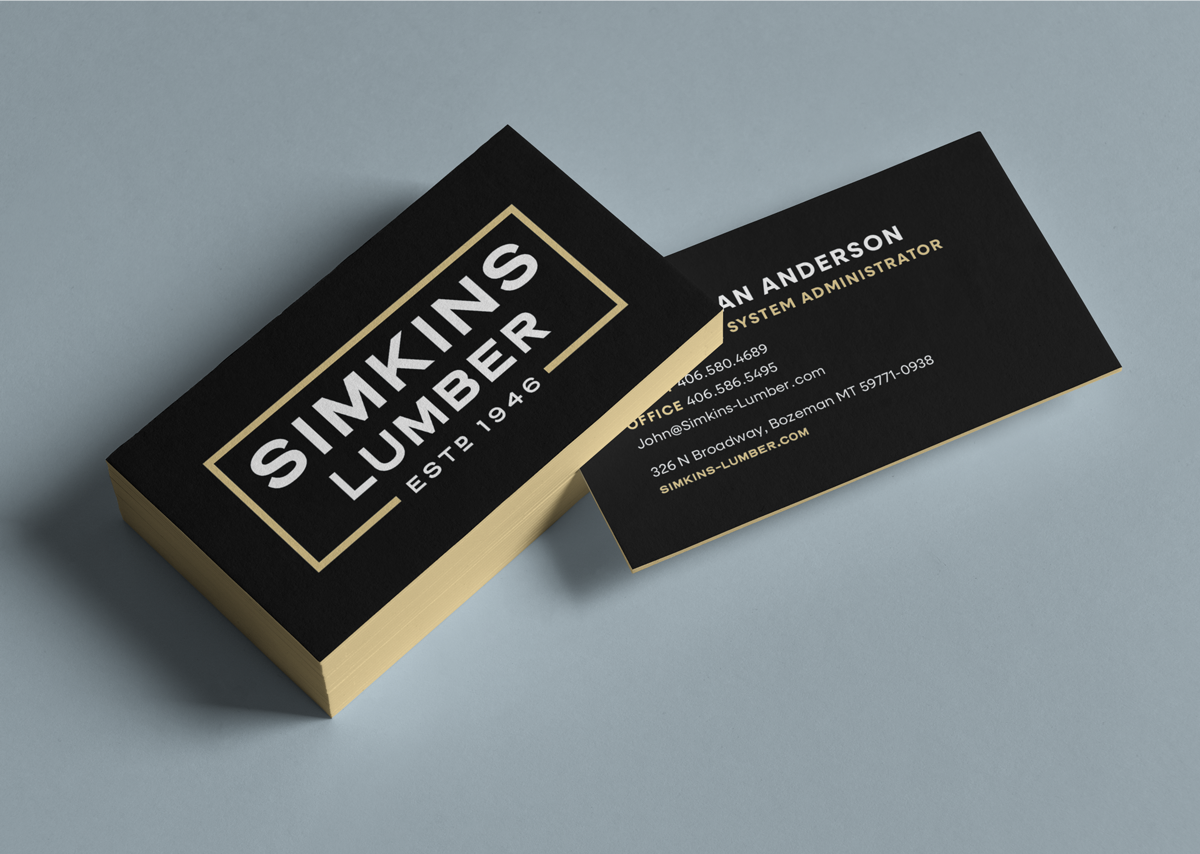
Brand Identity
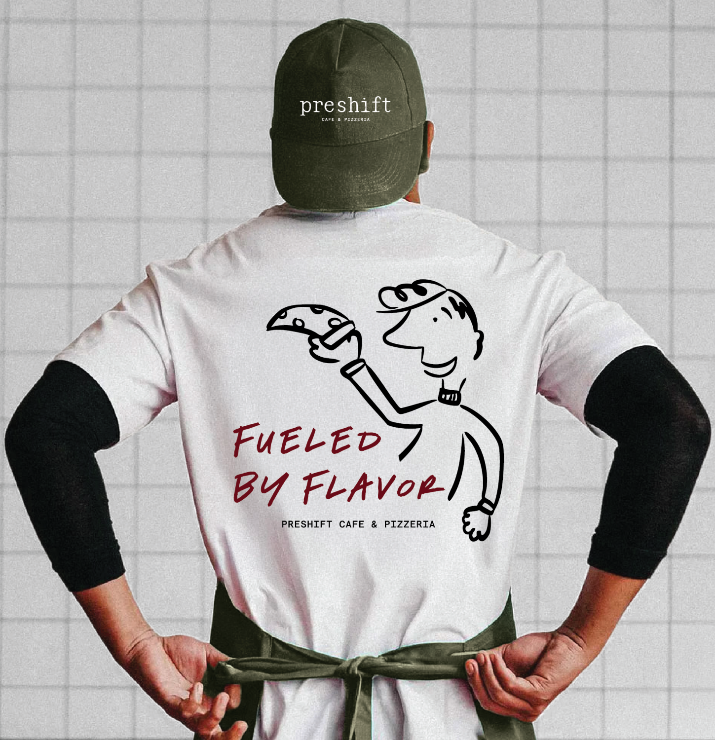
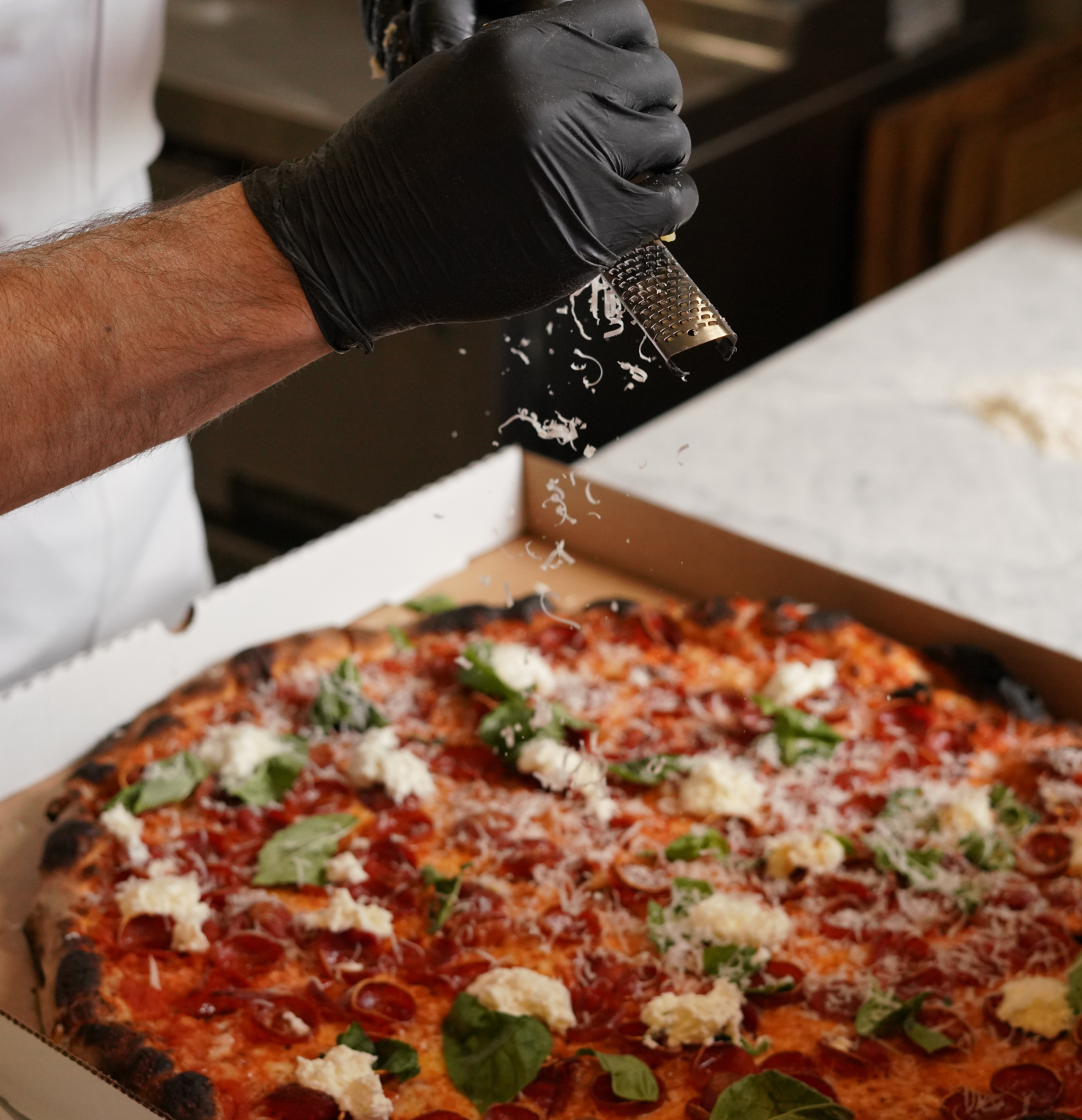
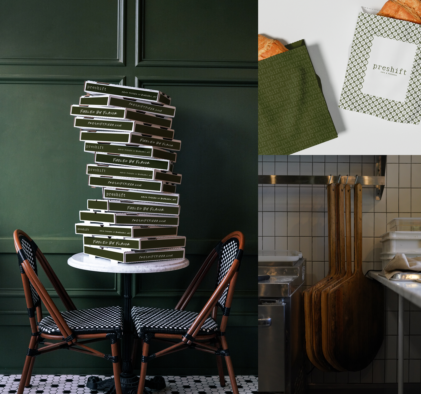
Brand Execution
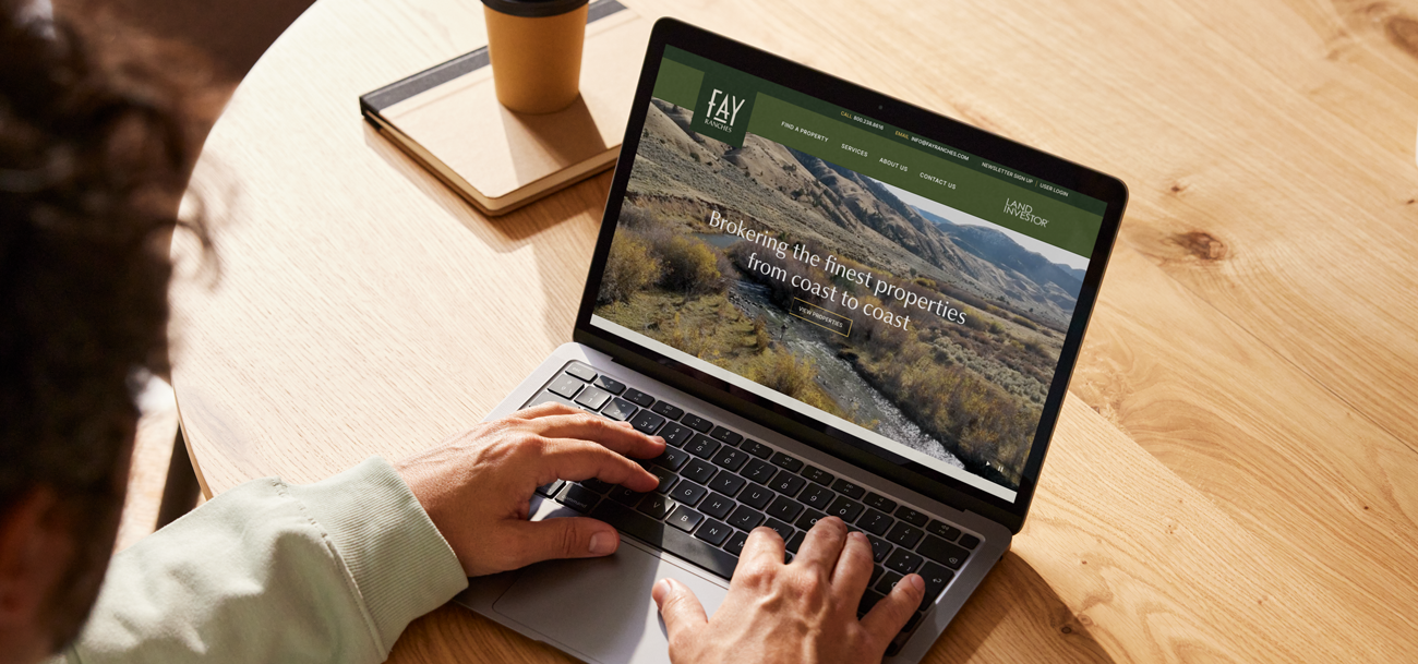
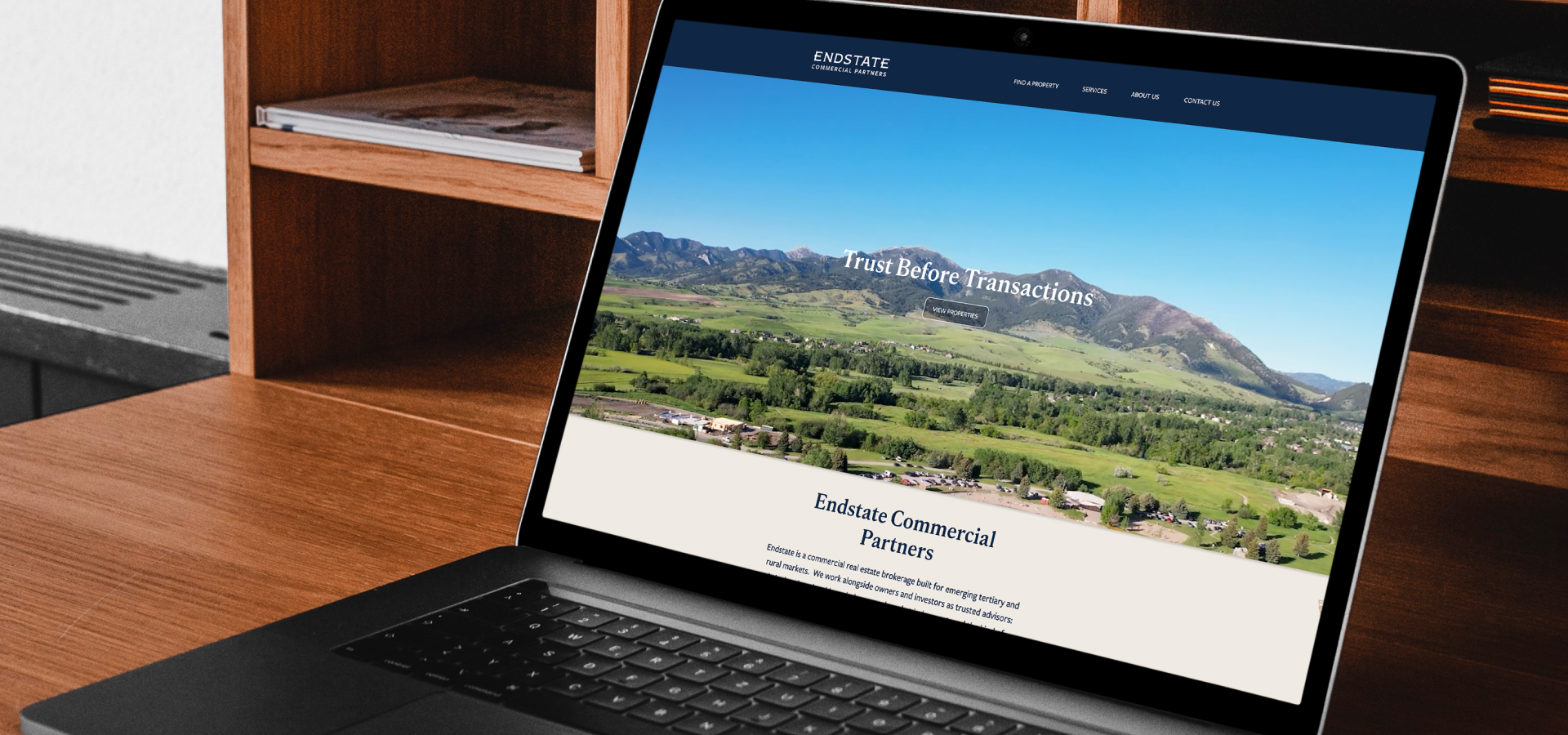
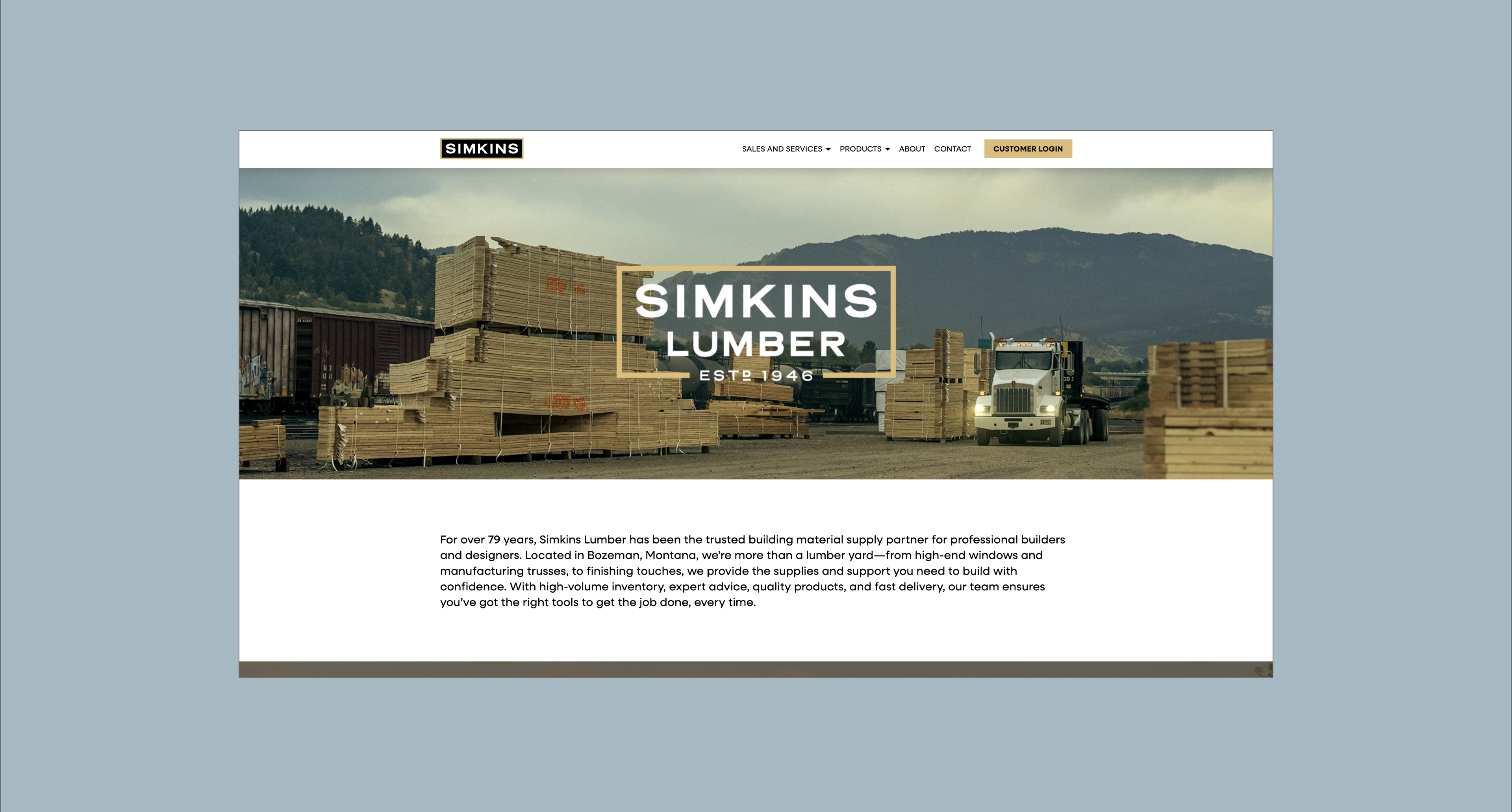
Website
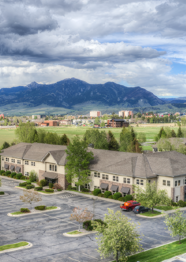
Headquartered in Bozeman, Montana - serving clients nationwide.
The result is a unified and scalable brand system that reflects Fay Ranches’ authority, integrity, and national reach. Research confirmed that the strength of the Fay Ranches name extends well beyond traditional ranch properties, allowing the brand to grow without changing its core identity. The refreshed visual system feels current while staying grounded in the land-focused heritage of the company. A refined color palette, modern typography, and cohesive messaging create consistency across markets and platforms. The new website significantly improves load speed, navigation, and property visibility by prioritizing listings and eliminating unnecessary pathways. Together, these updates position Fay Ranches for continued national growth while protecting the legacy and reputation that define the brand.


As Fay Ranches expanded its national presence, the brand faced the challenge of evolving without losing the trust and authority it had built over decades in the Rocky Mountain West. There was internal consideration around whether the name “Ranches” might limit perception in broader markets, particularly as the company explored opportunities in luxury and commercial real estate. At the same time, growth across regions required a more unified brand system that could support agents, meet diverse client expectations, and maintain the culture and reputation that set Fay Ranches apart.
The objective was to clearly define and communicate Fay Ranches’ value to buyers, sellers, and brokers while building a scalable foundation for long-term growth. This included reinforcing its position as a leader in land brokerage, expanding its appeal beyond traditional ranch properties, and protecting the integrity of a brand rooted in conservation and stewardship.
Our approach was grounded in research and alignment. Through industry analysis and internal feedback, we confirmed that the Fay Ranches name carries strong national authority and that “Ranches” does not limit broader perception. From there, we unified messaging across regions, modernized the visual identity with a refined, land-inspired palette and contemporary typography, and ensured the brand reflected both sophistication and authenticity. To preserve its conservation-led reputation, we recommended creating a separate arm for commercial real estate, allowing for strategic growth without diluting the core brand. The website was also redesigned with a consumer-first mindset, improving usability and placing greater emphasis on property listings to better serve buyers.


Hardy facilitated a multi-phase brand launch that considered everything from employee-owner training to the ‘why pay more’ signs. The first step was to train all leadership staff on the new strategy. By providing consistent language, their leadership team has the tools to communicate the brand to all employee-owners and customers, utilize it in hiring, and lean on it for business decisions. To support the high level of service T&C is known for, we created talking points, rack cards, and tools that empower employee-owners to answer questions customers may have.


The Bridger Brewing team wanted to be prepared to can and distribute its beer after opening its second location. AMS partnered with Bridger Brewing for packaging design concepts. The first step in the packaging process involved a strategy session in which the unique identity of each beer was explored and dissected. Several concepts were then sketched out. Once a concept was selected for each beer, custom illustrations were created for cans and boxes. The result is a full lineup of beers, each with its own design that is unique while still clearly a member of the Bridger Brewing brand.


The longest line you’ll see comes from a reel.
Big ideas are best discussed on the back of a pickup.