Bozeman’s Community Café is the first pay-what-you-can restaurant in Montana. Because no other restaurant of this kind exists in the state, the Café had to introduce the concept and communicate that it is a restaurant with meals made from fresh, locally sourced ingredients that is open and affordable for every member of the community.
Hardy partnered with the Community Café to rebrand the restaurant, revamp the messaging and reintroduce it to the community with a fresh, new face as Fork & Spoon Kitchen. From a new name to a new brand identity and website, we wanted everything to reflect that Fork & Spoon is a restaurant that serves delicious food and welcomes everyone.
Brand Exploration
Brand Strategy
Brand Positioning
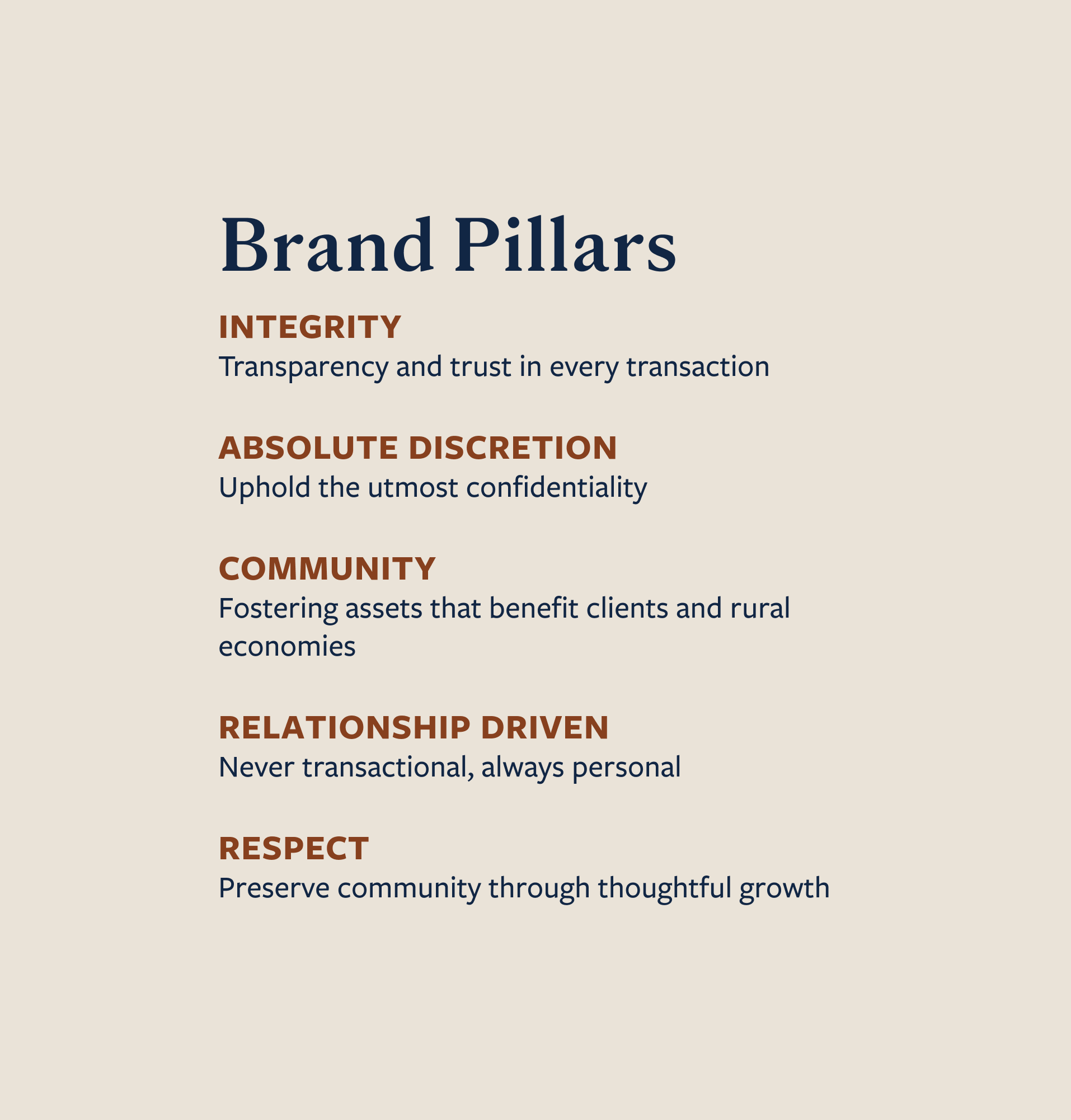
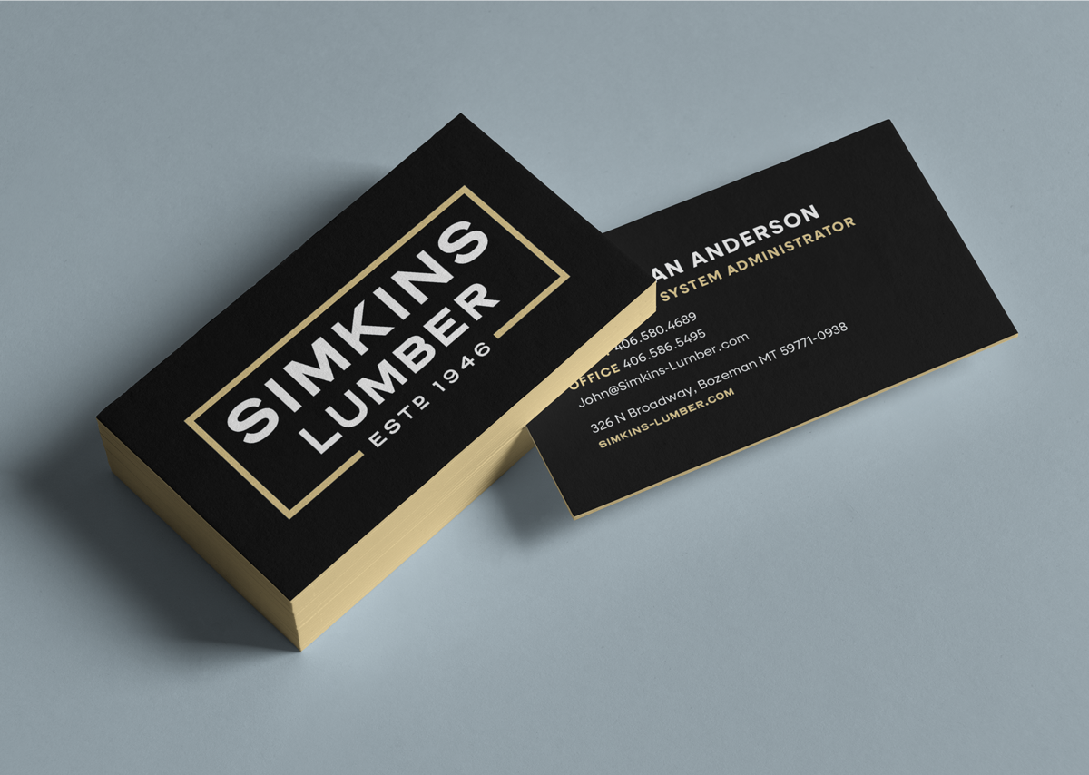
Brand Identity
Naming
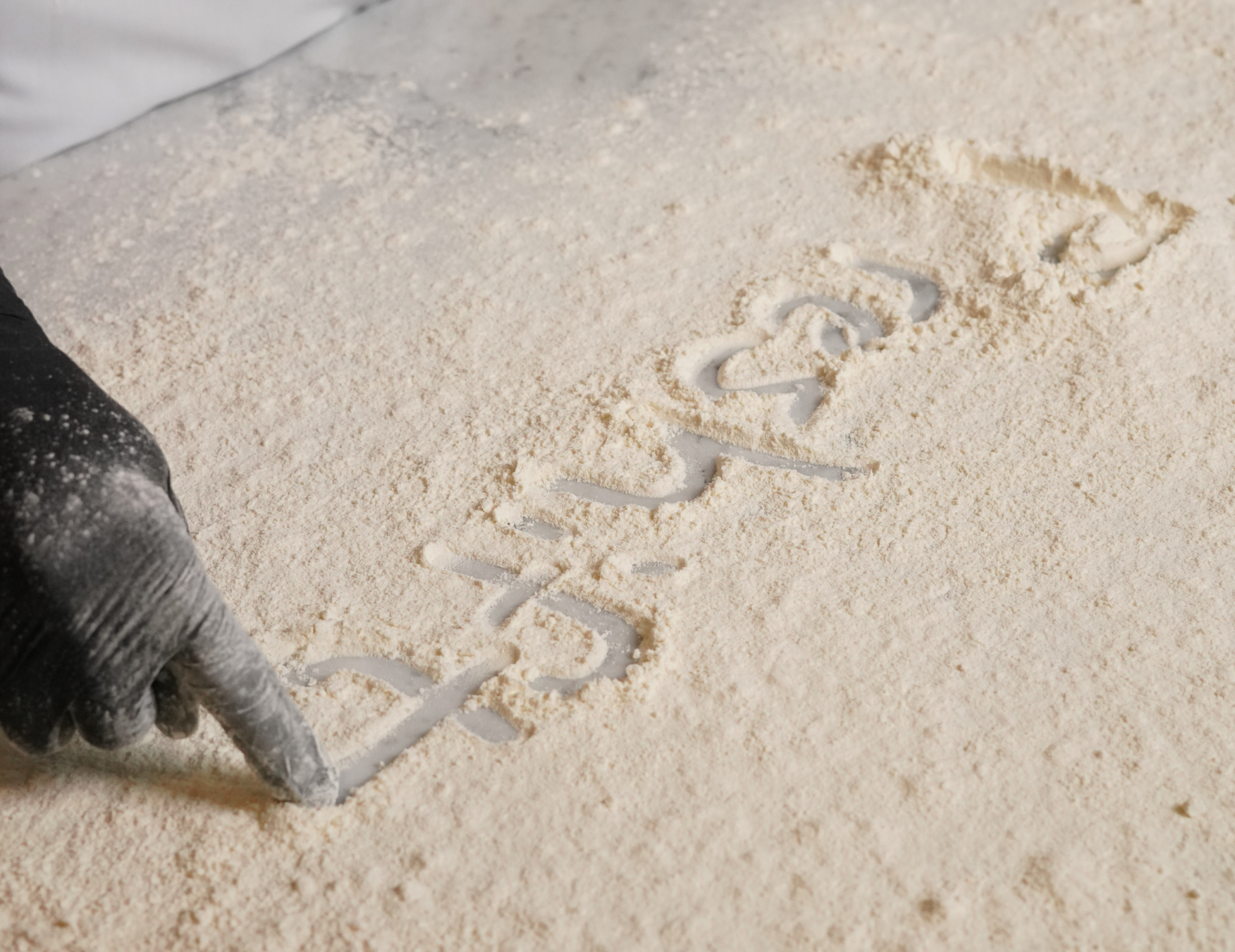
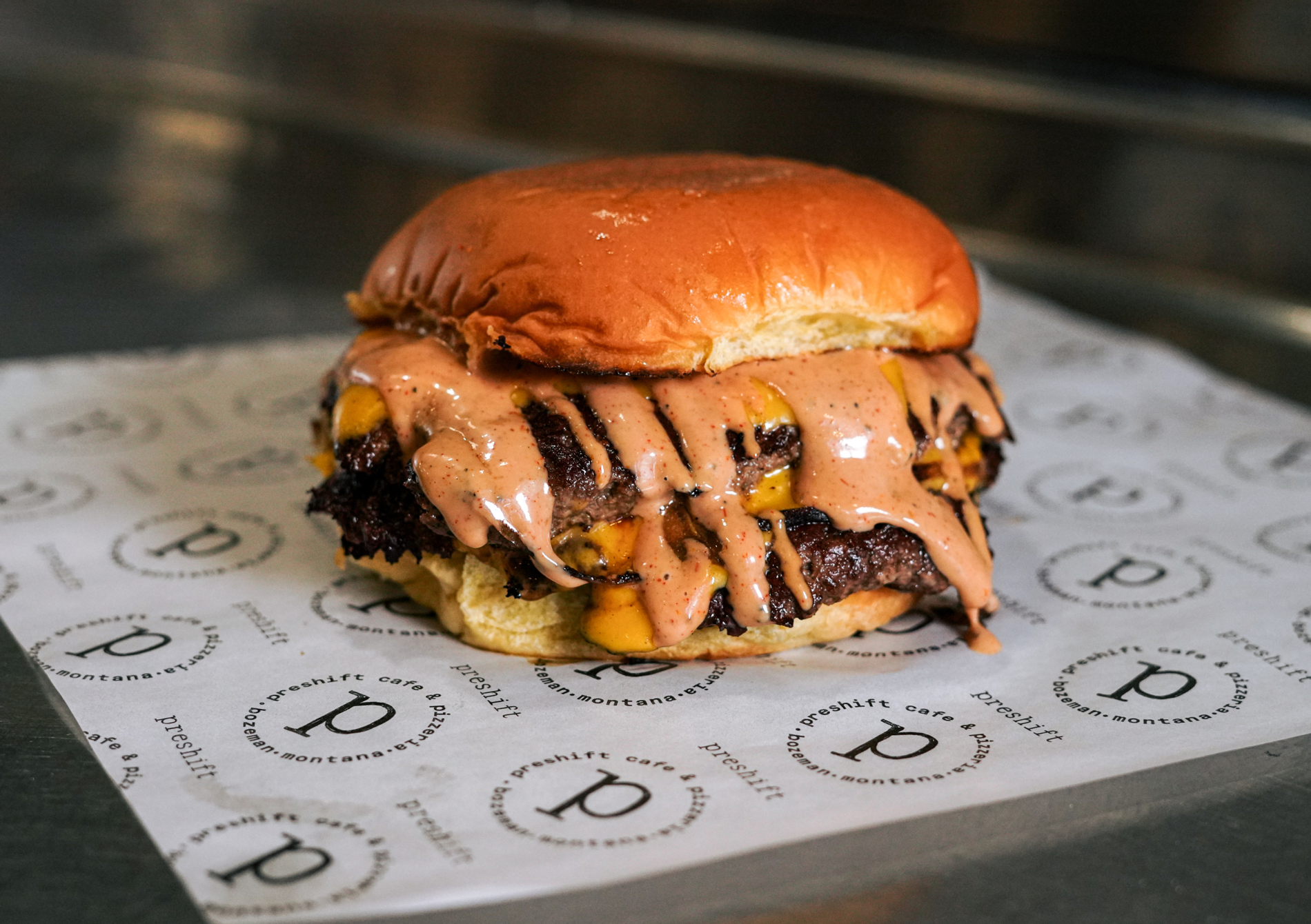
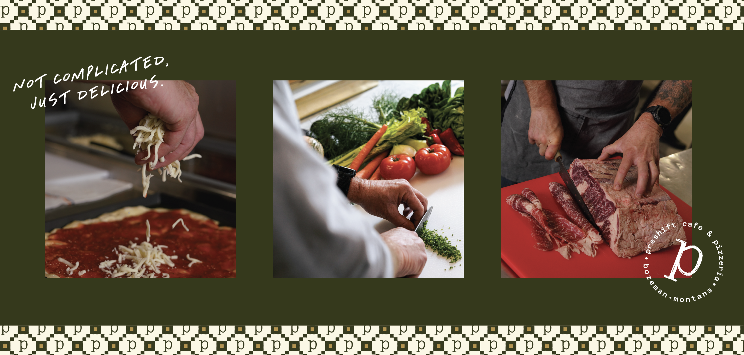
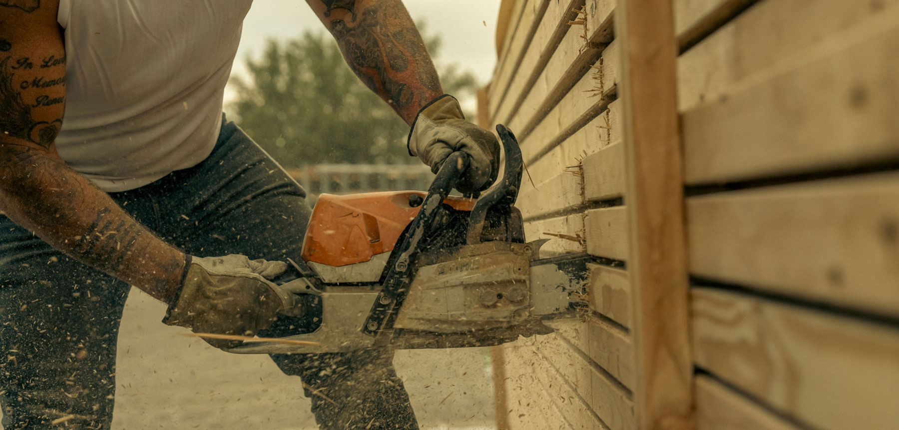
Photography
Copywriting
Social Media Strategy
Interior Design Guidance
Campaign Strategy + Design
Website Design + Development
Art+ Creative Direction for Video
Signage Design
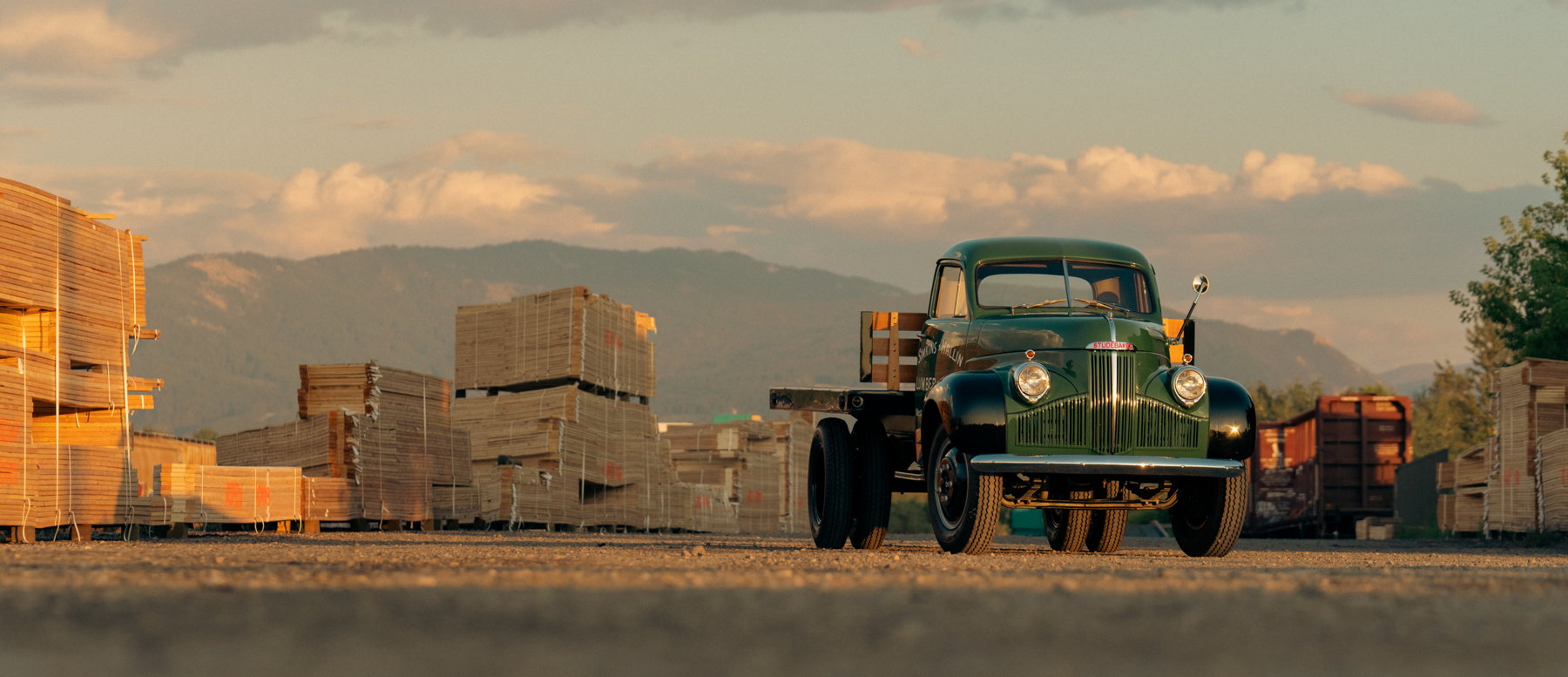
Bozeman, Montana
A restaurant to better serve and support our growing community, boasting a 30% increase in revenue within eight weeks of launching the new brand.


Overcoming the public perception that the restaurant was a soup kitchen that just offered free, bland meals.
Rebrand and reintroduce the restaurant to the community, attracting more paying customers in order to help more people in need.
Using high quality food photography and welcoming visuals, emphasizing the focus on quality food and fresh ingredients.


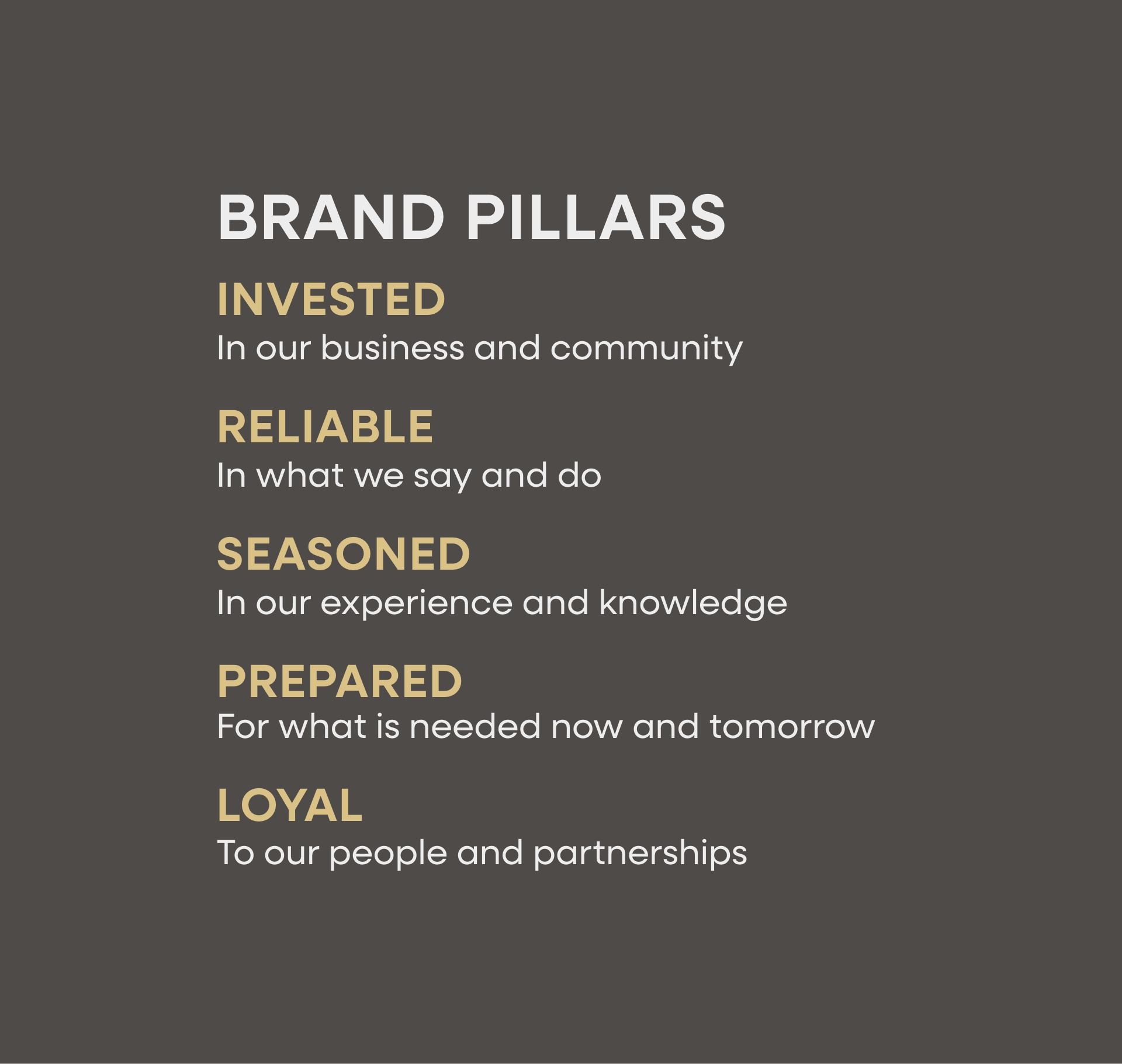


Hardy facilitated a multi-phase brand launch that considered everything from employee-owner training to the ‘why pay more’ signs. The first step was to train all leadership staff on the new strategy. By providing consistent language, their leadership team has the tools to communicate the brand to all employee-owners and customers, utilize it in hiring, and lean on it for business decisions. To support the high level of service T&C is known for, we created talking points, rack cards, and tools that empower employee-owners to answer questions customers may have.


The Bridger Brewing team wanted to be prepared to can and distribute its beer after opening its second location. AMS partnered with Bridger Brewing for packaging design concepts. The first step in the packaging process involved a strategy session in which the unique identity of each beer was explored and dissected. Several concepts were then sketched out. Once a concept was selected for each beer, custom illustrations were created for cans and boxes. The result is a full lineup of beers, each with its own design that is unique while still clearly a member of the Bridger Brewing brand.


The longest line you’ll see comes from a reel.
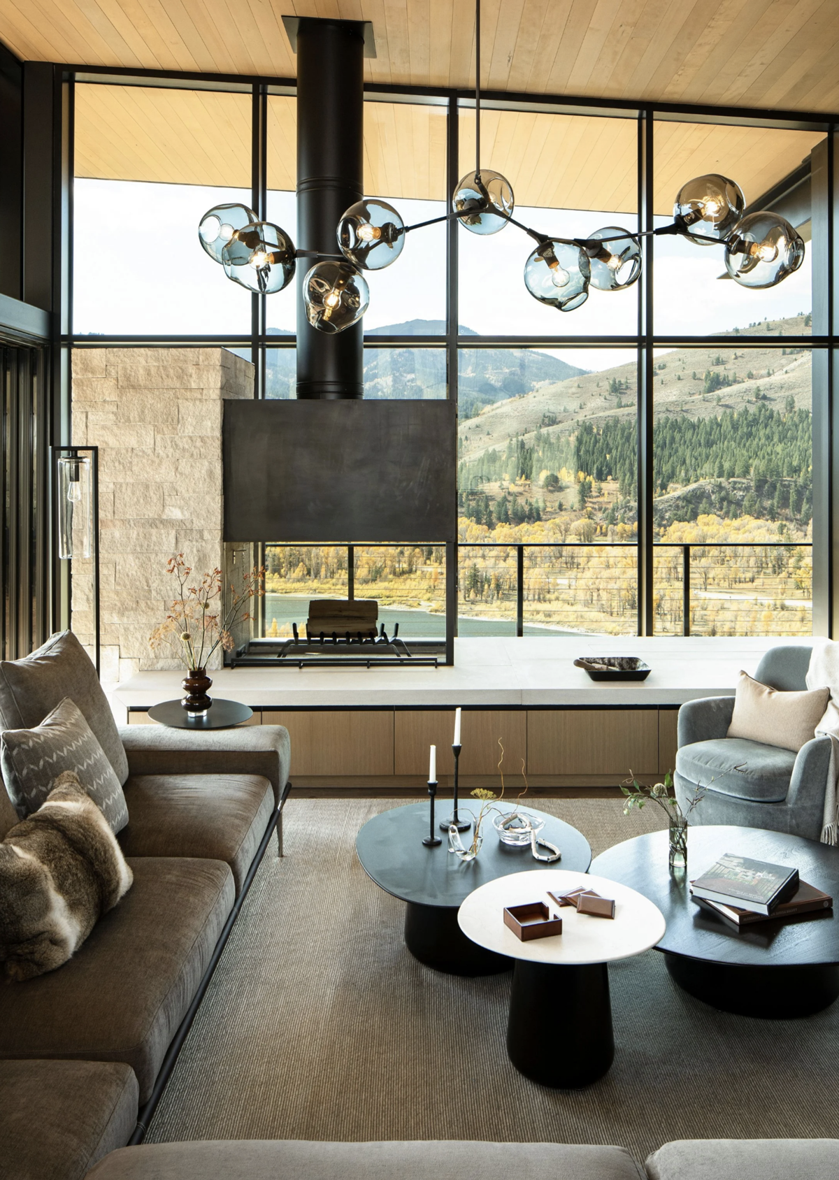
Big ideas are best discussed on the back of a pickup.


Hardy spearheaded and were the creative masterminds behind Fork & Spoon’s rebrand. By listening to our challenges and the changes we were hoping to make through this process, they designed a new logo, color scheme, and messaging platform, which included hard materials like posters, a rack card, and custom social media posts. They guided us through changing our ordering process and renovating the restaurant’s interior. Hardy consistently went above and beyond. I guarantee Fork & Spoon would not be what it is today without Hardy – they did an amazing job and we continue to choose them for all of our ongoing F&S projects!