

Based in Bozeman, Montana, one of the country’s fastest growing cities, Paine Group came to AMS wanting to set their brand apart from other development firms in the community. It was important to Paine Group to communicate their commitment to only build developments that create worthwhile, lasting and positive impacts on the community.
AMS used crisp and modern visuals to highlight the personal element of creating new spaces where people live and work. Our goal was to challenge the stigma around development and bring forth the idea that developments can be built for the benefit of people, not just developer’s pockets.
Brand Exploration
Brand Identity
Website Design and Development
Bozeman, Montana
A clearly defined brand that has been elevated to the level of other esteemed development firms in the region and that is ready to tackle whatever comes next.


Overcoming negative associations with development in order to position Paine Group as a valuable asset to investors, other developers and the community as a whole.
To create a brand that communicates Paine Group’s intention to create valuable spaces that bring a positive, lasting impact to the community.
Focused, modern design elements paired with high quality photography, both of which mirror their clearly defined values and vision for the future.




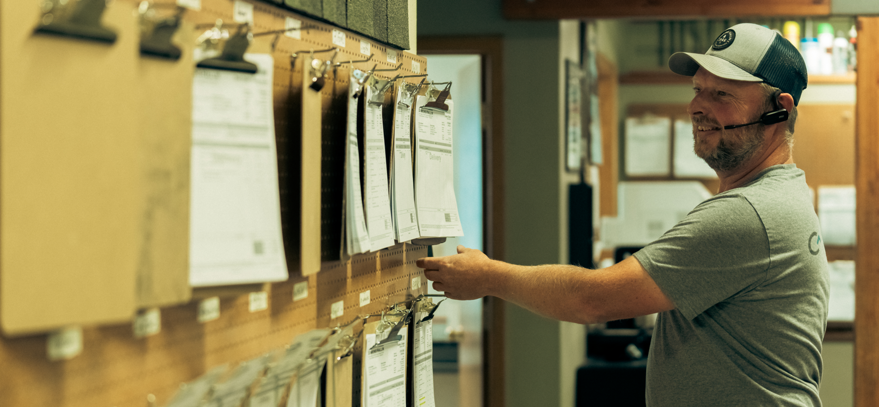
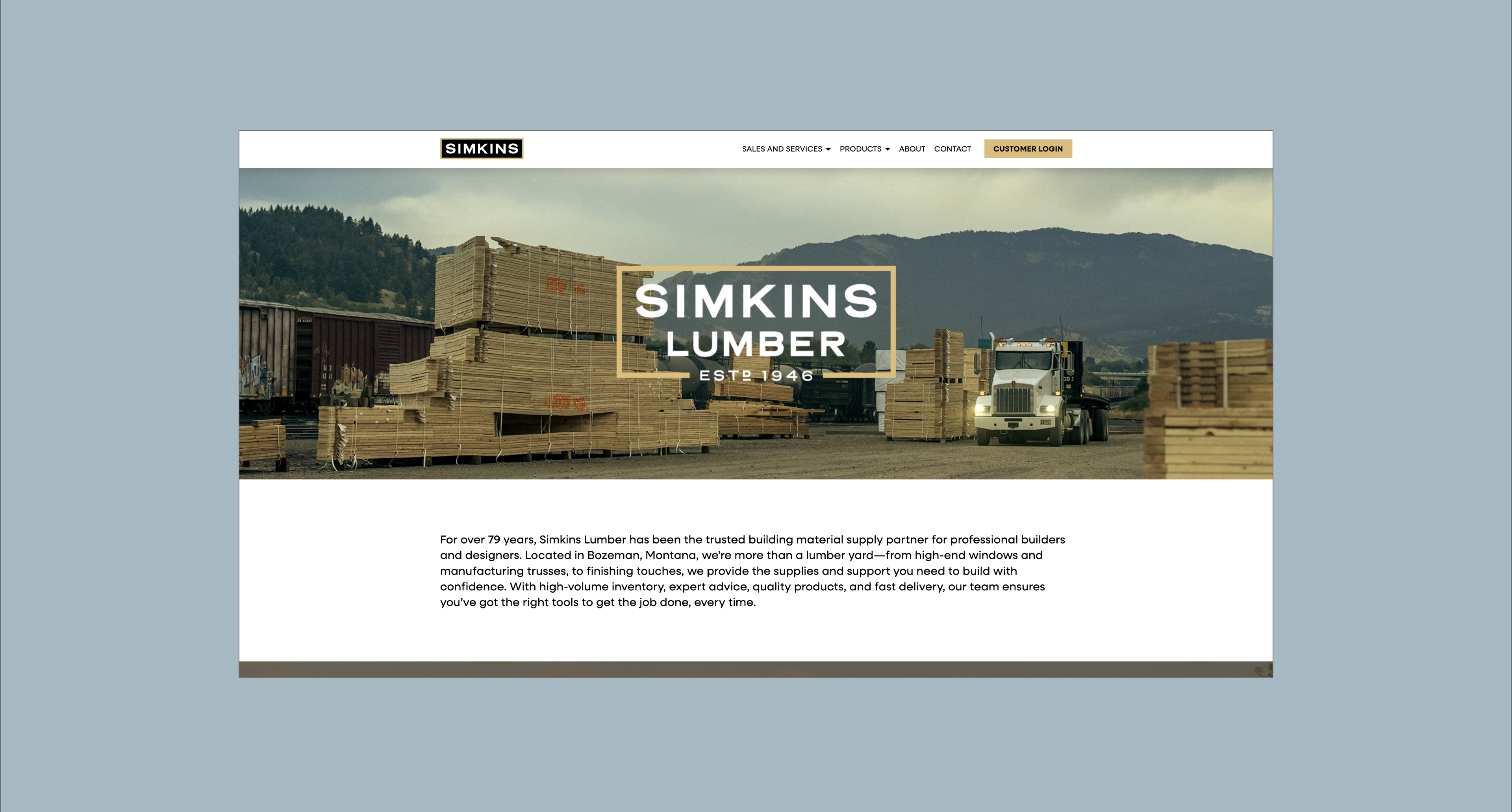


Hardy facilitated a multi-phase brand launch that considered everything from employee-owner training to the ‘why pay more’ signs. The first step was to train all leadership staff on the new strategy. By providing consistent language, their leadership team has the tools to communicate the brand to all employee-owners and customers, utilize it in hiring, and lean on it for business decisions. To support the high level of service T&C is known for, we created talking points, rack cards, and tools that empower employee-owners to answer questions customers may have.


The Bridger Brewing team wanted to be prepared to can and distribute its beer after opening its second location. AMS partnered with Bridger Brewing for packaging design concepts. The first step in the packaging process involved a strategy session in which the unique identity of each beer was explored and dissected. Several concepts were then sketched out. Once a concept was selected for each beer, custom illustrations were created for cans and boxes. The result is a full lineup of beers, each with its own design that is unique while still clearly a member of the Bridger Brewing brand.


The longest line you’ll see comes from a reel.
Big ideas are best discussed on the back of a pickup.


