

This small batch distillery, based in Ennis, Montana, was one of the first of its kind to pop up in Montana. Willie’s quickly gained local popularity, becoming a leader in the distillery movement. Renowned for their Western-inspired spirits, every Willie’s product is made from natural, local ingredients — Montana grains, honey and native berries, along with a good dose of heart and soul.
Brand Exploration
Brand Assets
Campaign Development
Imagery & Taglines
Packaging
Copywriting
Ennis, Montana
Packaging — Denver International Spirits Packaging Awards, 2017
Illustration — American Advertising Awards MT, 2016
Packaging — American Advertising Awards MT, 2015
Campaign — American Advertising Awards MT, 2015
A small Montana-born brand, ready to take on the American West.


We needed to find a fresh take on “Western”, one of the most over-played genres in North American marketing. We also sought to steer away from tropes of contemporary micro-distilleries, which often speak through the language and imagery of “hipsters”.
The ultimate goal was to position Willie’s as of equal quality as national, non-craft brands. Willie’s needed the branding assets to convey a clear image of their product and the mountain culture it sought to represent. The brand needed thoughtful, cohesive materials to reach a national scale of play.
The visual elements selected for Willie’s entire product line reflect the natural and local values of their distilling process along with an authentic Western heritage. We chose images of wildlife, cowboys, and gritty type and paired these crisp images of mixed drinks and bottles.




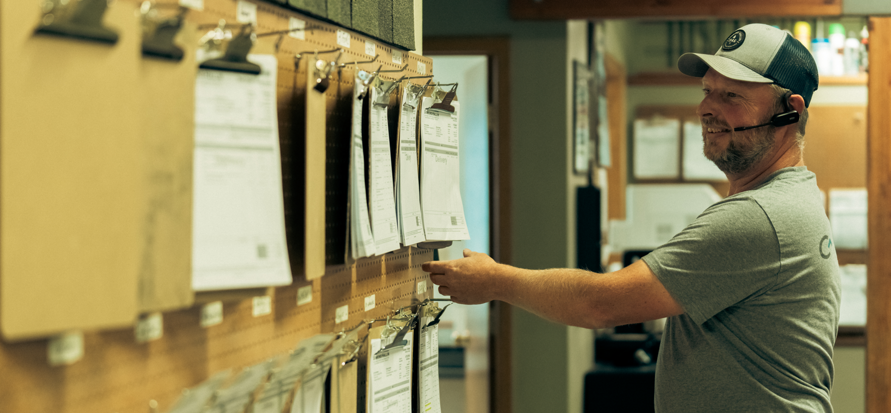


Hardy facilitated a multi-phase brand launch that considered everything from employee-owner training to the ‘why pay more’ signs. The first step was to train all leadership staff on the new strategy. By providing consistent language, their leadership team has the tools to communicate the brand to all employee-owners and customers, utilize it in hiring, and lean on it for business decisions. To support the high level of service T&C is known for, we created talking points, rack cards, and tools that empower employee-owners to answer questions customers may have.


The Bridger Brewing team wanted to be prepared to can and distribute its beer after opening its second location. AMS partnered with Bridger Brewing for packaging design concepts. The first step in the packaging process involved a strategy session in which the unique identity of each beer was explored and dissected. Several concepts were then sketched out. Once a concept was selected for each beer, custom illustrations were created for cans and boxes. The result is a full lineup of beers, each with its own design that is unique while still clearly a member of the Bridger Brewing brand.


The longest line you’ll see comes from a reel.
Big ideas are best discussed on the back of a pickup.


“We’ve worked with Hardy for more than two years. In that time, they’ve helped us rebrand in every way, developing all our new bottle designs and creating all new campaigns for our products. Their approach is top-notch and I would recommend them to any company looking for a fresh creative direction.”


