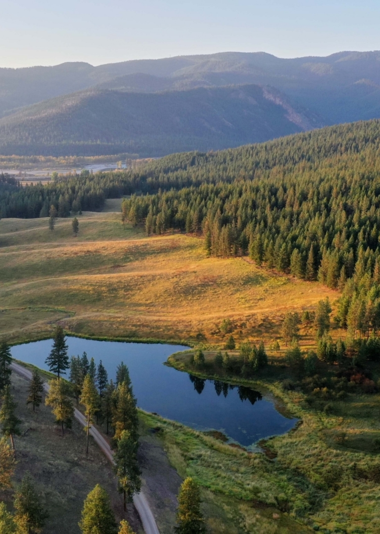
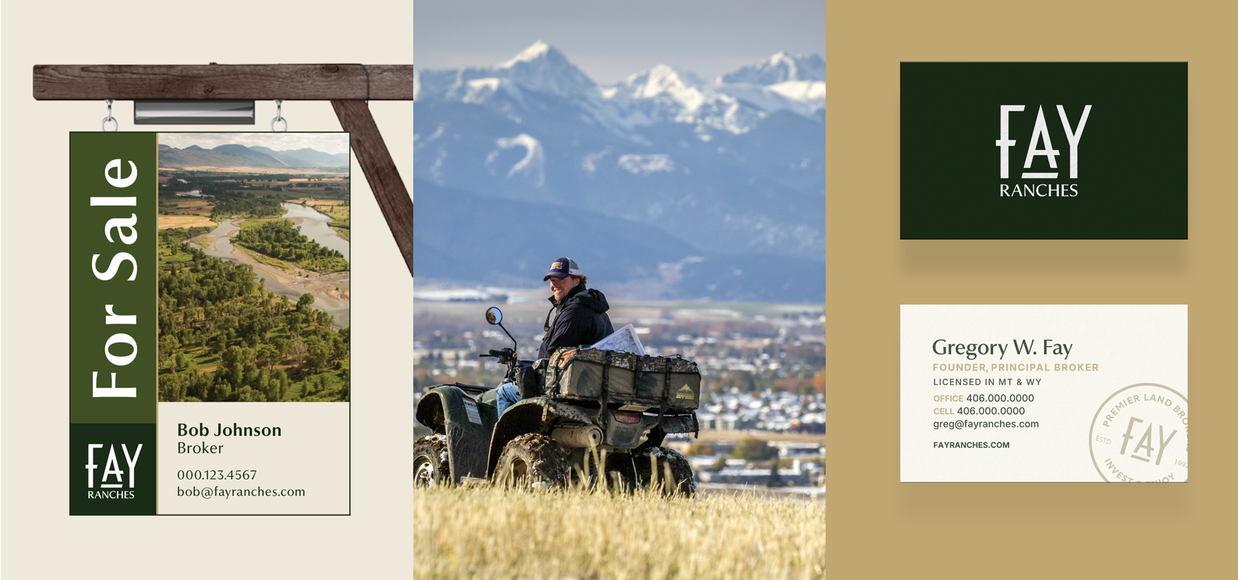
Founded in 2019, 18 Land Co. is a land brokerage that specializes in farms, ranches and recreational properties in Southwest Montana. But, that’s not all they do. They are also seasoned Montana ranchers with loads of experience running successful ranch operations.
The team at 18 Land Co. came to Hardy seeking a partner to help them build their new business. They needed help communicating the fact that they were not just realtors. The folks at 18 Land Co. have real ranch and agriculture experience that can help their clients navigate important land purchase decisions.
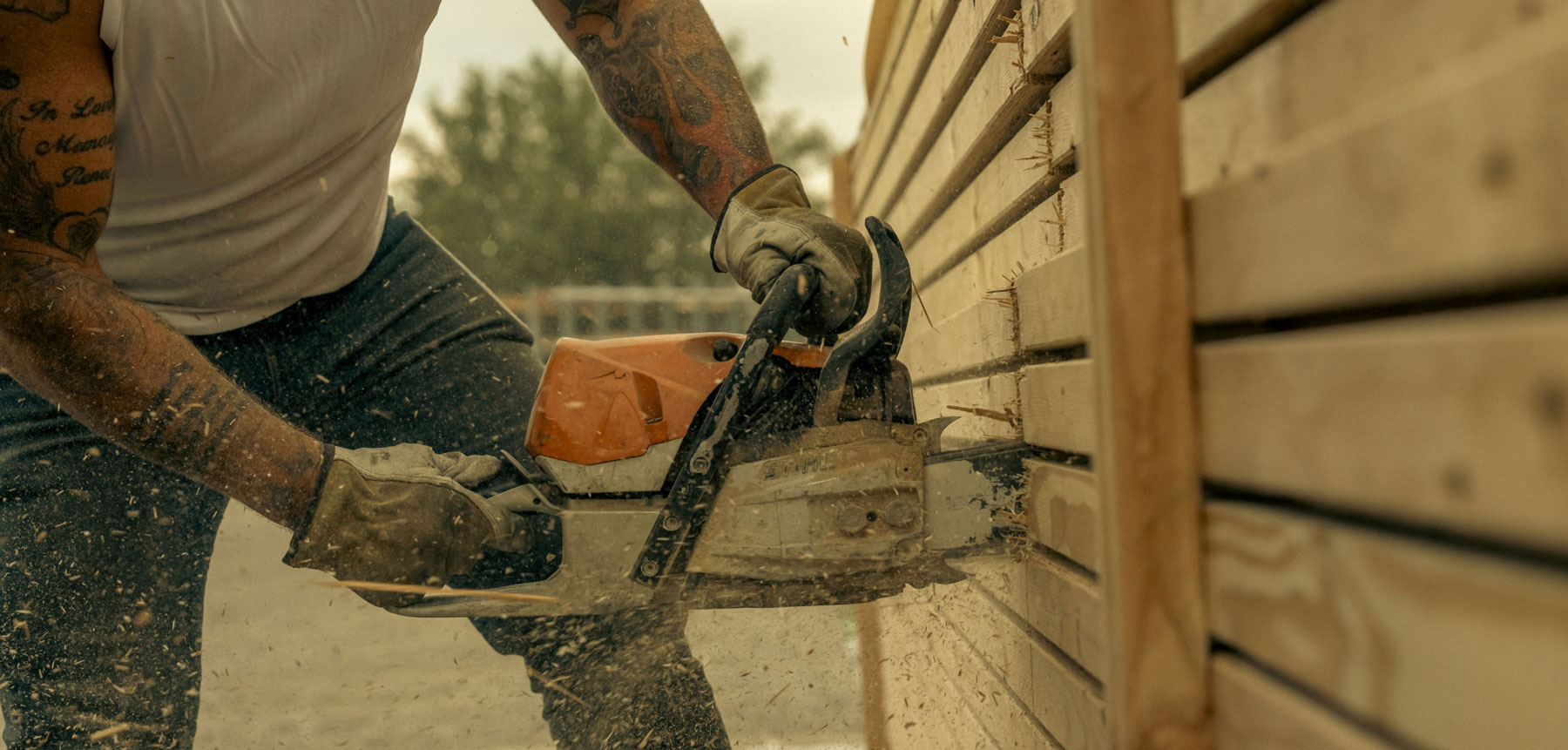
Hardy created a brand that reflects their straight-shooter values, not overcomplicating things and keeping it classic. Our designers drew inspiration from Old West visuals, executing the assets in a way that felt fresh and contemporary.
Brand Identity
Brand Strategy
Brand Positioning
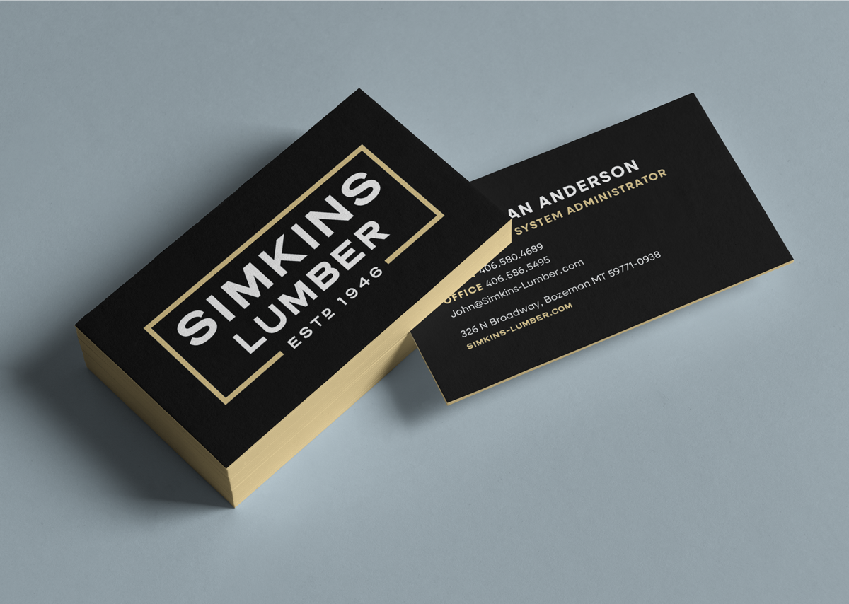
Business Set
Naming
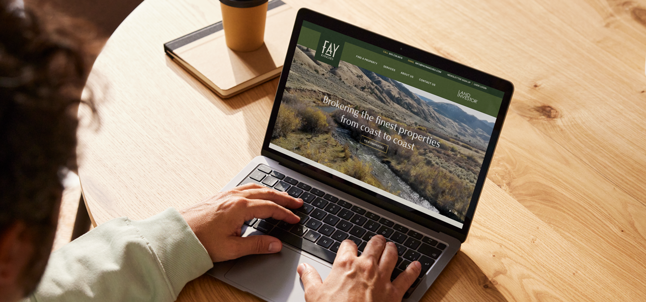
Website
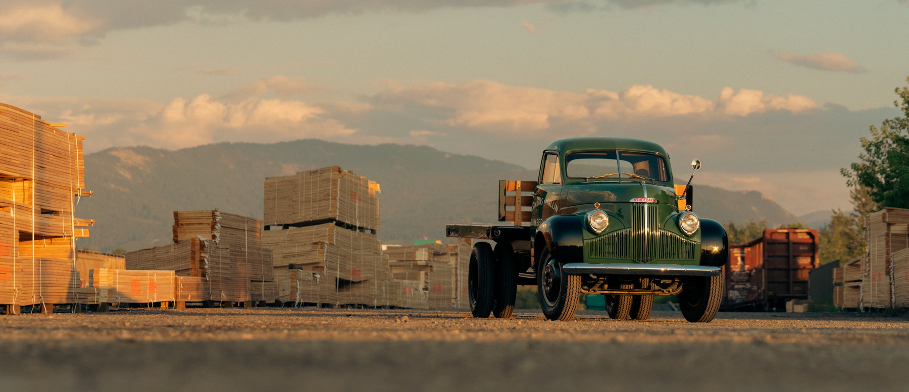
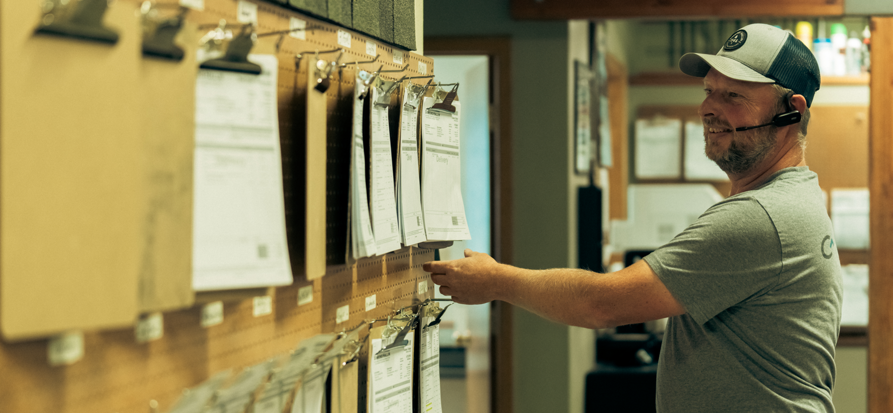
Photography
Creative and Art Direction
Advertising Campaigns
Promotional Materials
Dillon, Montana
A brokerage that puts the “real” back in real estate. A genuine brand able to resonate with local Dillon residents and a national audience alike.


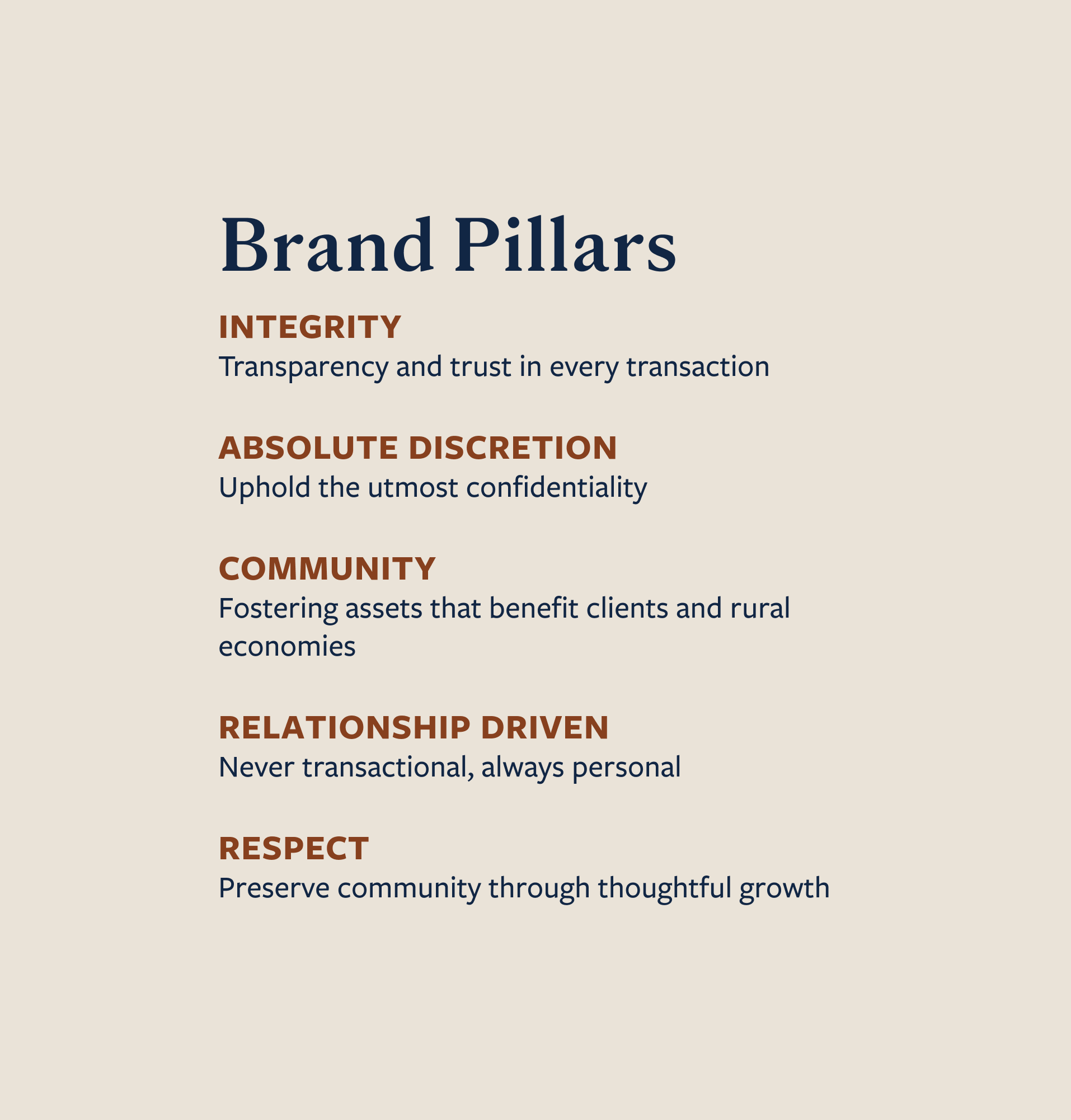


Communicate good old fashioned Montana values in a way that still felt relevant and on pace with a dynamic industry.
Differentiate 18 Land Co. from a sea of other professional land brokerages, highlighting their expertise and experience as ranchers.
Leverage 18 Land Co.’s authenticity and character by utilizing contemporary, approachable visual elements, strategic marketing and ad campaigns focused on brand recognition


Hardy facilitated a multi-phase brand launch that considered everything from employee-owner training to the ‘why pay more’ signs. The first step was to train all leadership staff on the new strategy. By providing consistent language, their leadership team has the tools to communicate the brand to all employee-owners and customers, utilize it in hiring, and lean on it for business decisions. To support the high level of service T&C is known for, we created talking points, rack cards, and tools that empower employee-owners to answer questions customers may have.


The Bridger Brewing team wanted to be prepared to can and distribute its beer after opening its second location. AMS partnered with Bridger Brewing for packaging design concepts. The first step in the packaging process involved a strategy session in which the unique identity of each beer was explored and dissected. Several concepts were then sketched out. Once a concept was selected for each beer, custom illustrations were created for cans and boxes. The result is a full lineup of beers, each with its own design that is unique while still clearly a member of the Bridger Brewing brand.


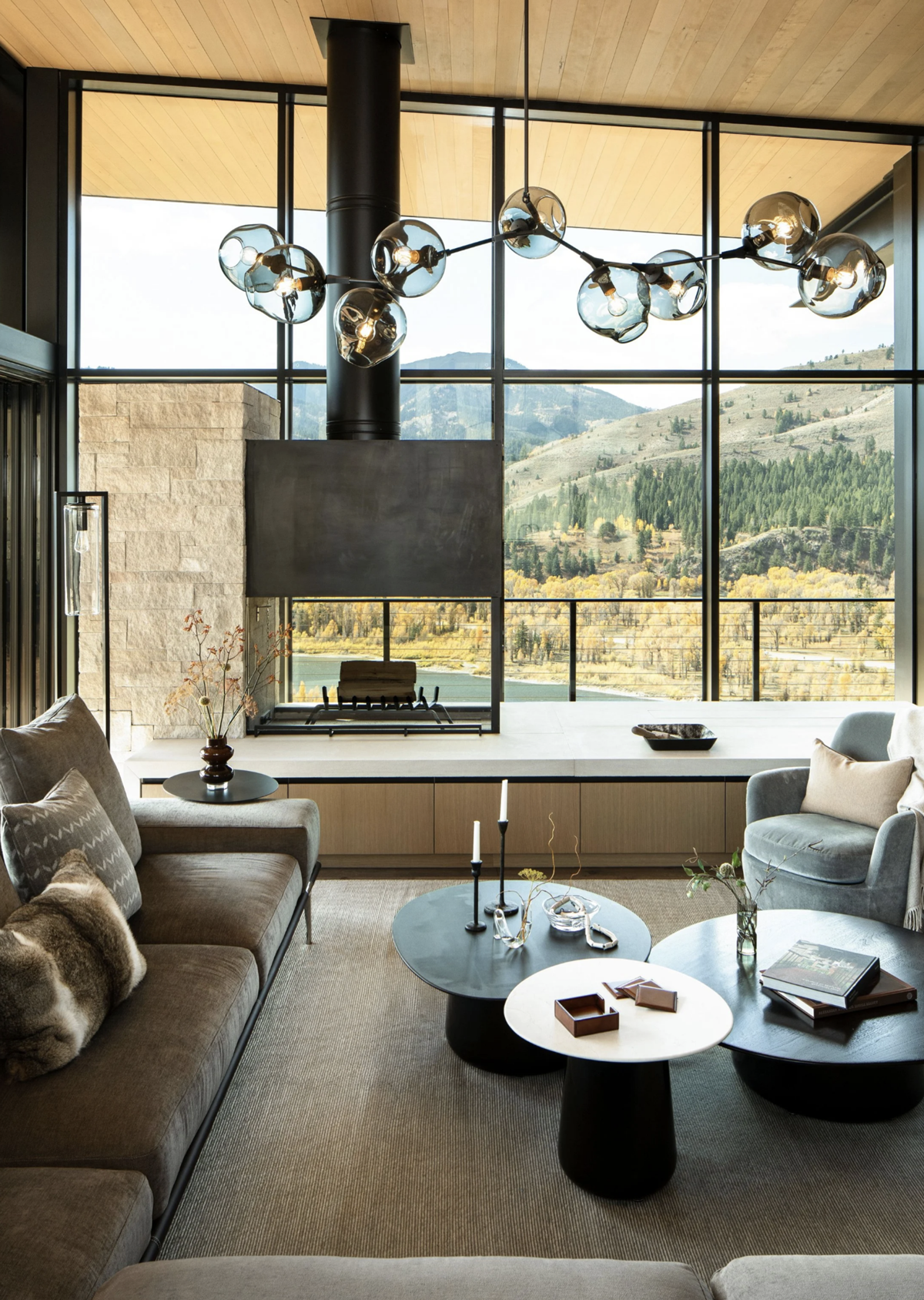
The longest line you’ll see comes from a reel.
Big ideas are best discussed on the back of a pickup.


“About one year ago we were at the early stages of a new business startup and knew we needed a dynamic marketing plan to help us make up ground with very established competitors. After a fairly lengthy research and interview process we chose Hardy as our marketing company. Hardy has handled all of our brand design right from the beginning and also designed and maintained our website. We have been completely satisfied with Hardy's professionalism, expertise and attention to detail. They have stayed in close contact throughout this process and are always available when we have questions or needs. I would definitely recommend Hardy for all of your marketing needs.”