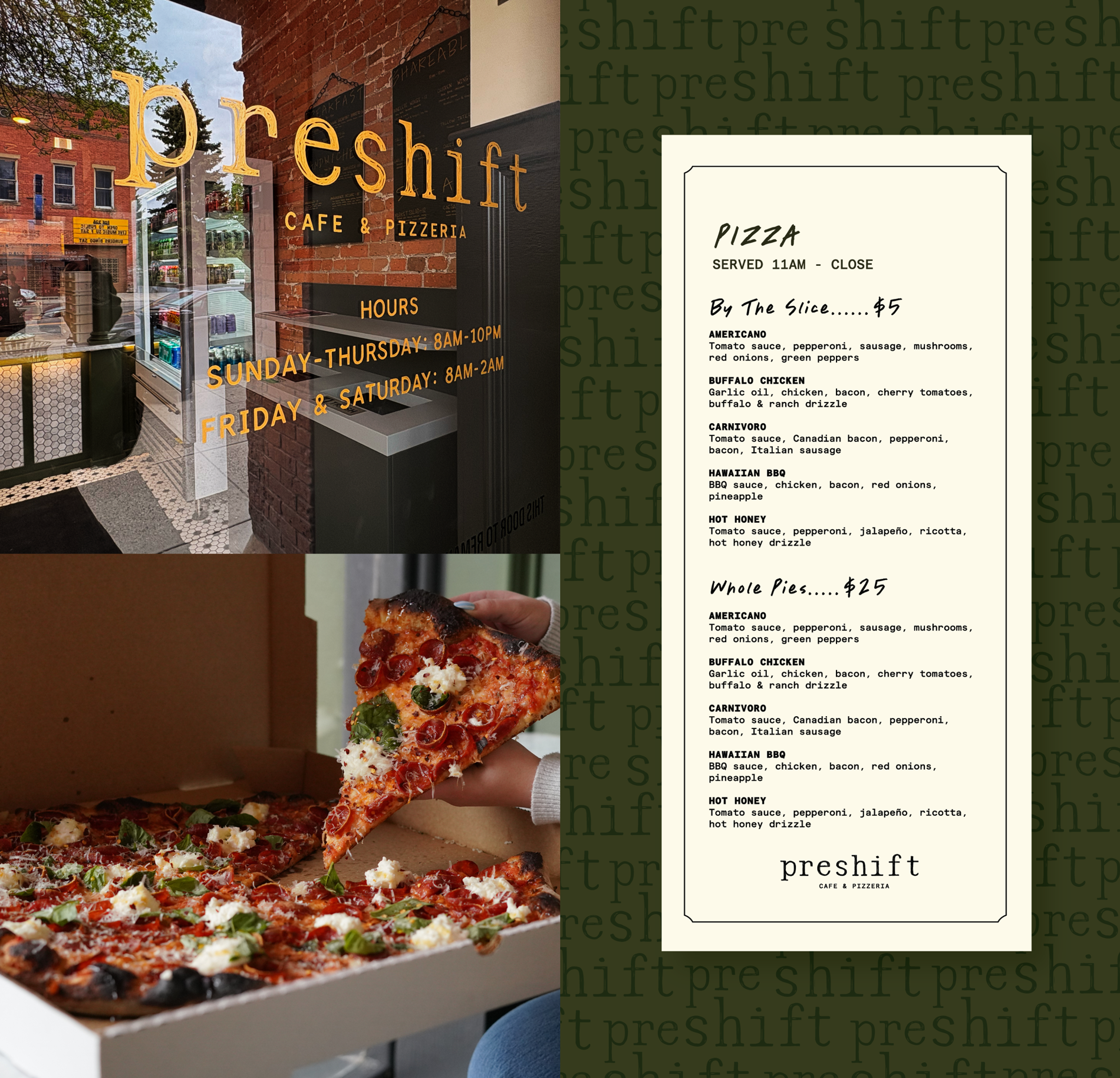
A community of “wouldn’t-it-be-cool-if” thinkers, Crucible is Montana’s first workers’ cooperative that creates high-quality custom fabrication and design. From the bold forms and fine details of their metalwork, to the striking appeal of their Chatsubu fired-wood finishes, they are a visionary partner that brings design ideas to life. The passion, collaboration, and honor that Crucible brings to every project and to their people leaves you inspired.
Through our brand strategy process, we identified that we first needed to better define their brand architecture since Crucible is made up of different divisions. We used brand architecture to help structure each division as an endorsed brand which helped provide scalability as they bring on new trades/divisions.
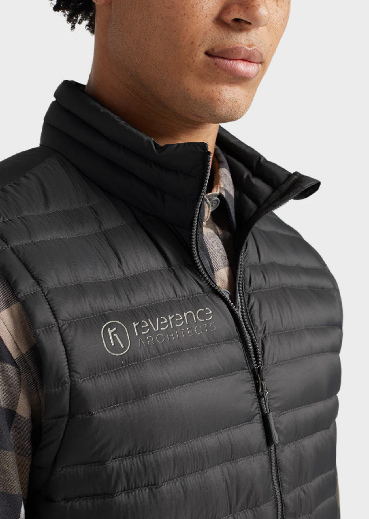
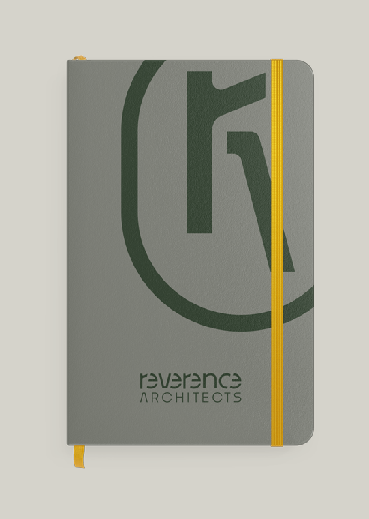
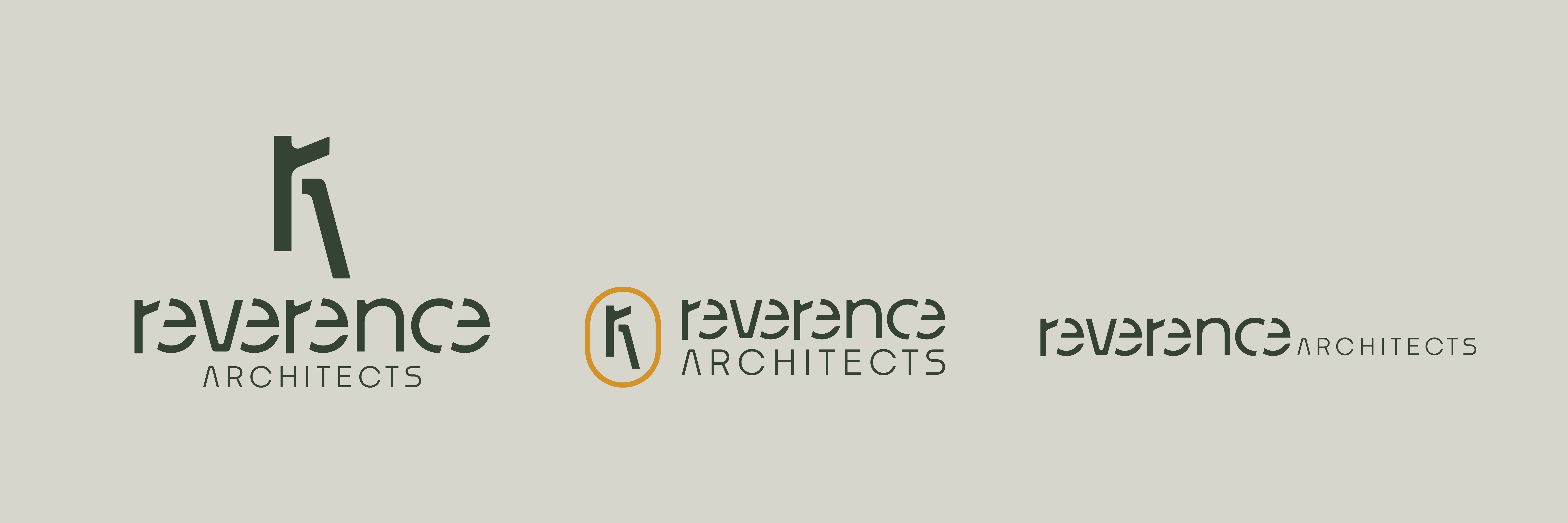
From the visual identity side, we established a ‘Medieval Modern’ vibe that was rooted in their continuous desire to honor their people, work and materials. The Crucible name lends to what the brand wants to achieve; to serve as a crucible for creative individuals to come together and hone their craft. Continue to scroll to learn more about their brand.
Brand Strategy
Brand Architecture
Brand Identity
Bozeman, Montana
A brand architecture that provides the structure and framework for their cooperative business model along with the strategy and identity to support their long-term growth.


The Crucible team initially needed help articulating their “why.” Additionally, through interviews, we identified that it was unclear what Crucible does and how the different divisions fold into the overall business structure.
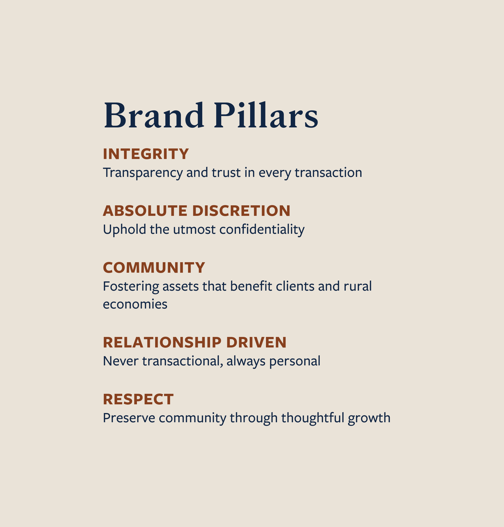
Define the brand architecture to help ensure scalability as the company grows as well as develop a strategy and visual identity that inspires and unites the cooperative members along with external audiences.
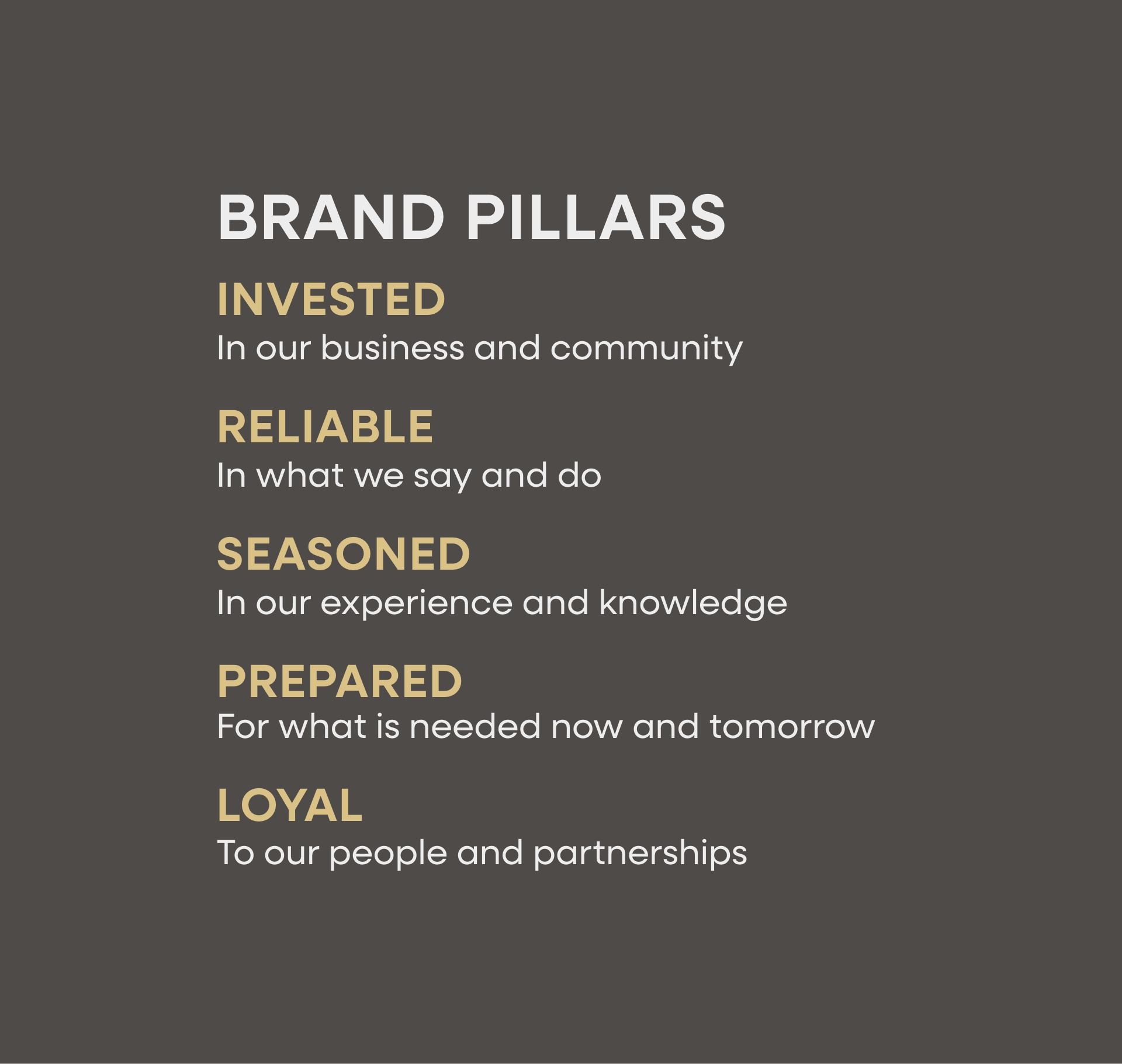
Crucible’s brand honors their passion for being a metaphorical crucible that shapes and supports creatives to come together. Rooted in values of honor, valor, support, and precision, visually the brand reinforces the quality of their work and mastery of their skills.


Hardy facilitated a multi-phase brand launch that considered everything from employee-owner training to the ‘why pay more’ signs. The first step was to train all leadership staff on the new strategy. By providing consistent language, their leadership team has the tools to communicate the brand to all employee-owners and customers, utilize it in hiring, and lean on it for business decisions. To support the high level of service T&C is known for, we created talking points, rack cards, and tools that empower employee-owners to answer questions customers may have.


The Bridger Brewing team wanted to be prepared to can and distribute its beer after opening its second location. AMS partnered with Bridger Brewing for packaging design concepts. The first step in the packaging process involved a strategy session in which the unique identity of each beer was explored and dissected. Several concepts were then sketched out. Once a concept was selected for each beer, custom illustrations were created for cans and boxes. The result is a full lineup of beers, each with its own design that is unique while still clearly a member of the Bridger Brewing brand.


The longest line you’ll see comes from a reel.
Big ideas are best discussed on the back of a pickup.


The Hardy team was truly amazing to work with. The streamlined methodology with which they approached the process was not only professional but attentive and meaningful. They dove deep, helping us define and articulate our "why" and what we really want our clientele to see, hear, and feel when intersecting with our business. We couldn't be happier and are moving forward with our brand well-positioned and ready for growth!