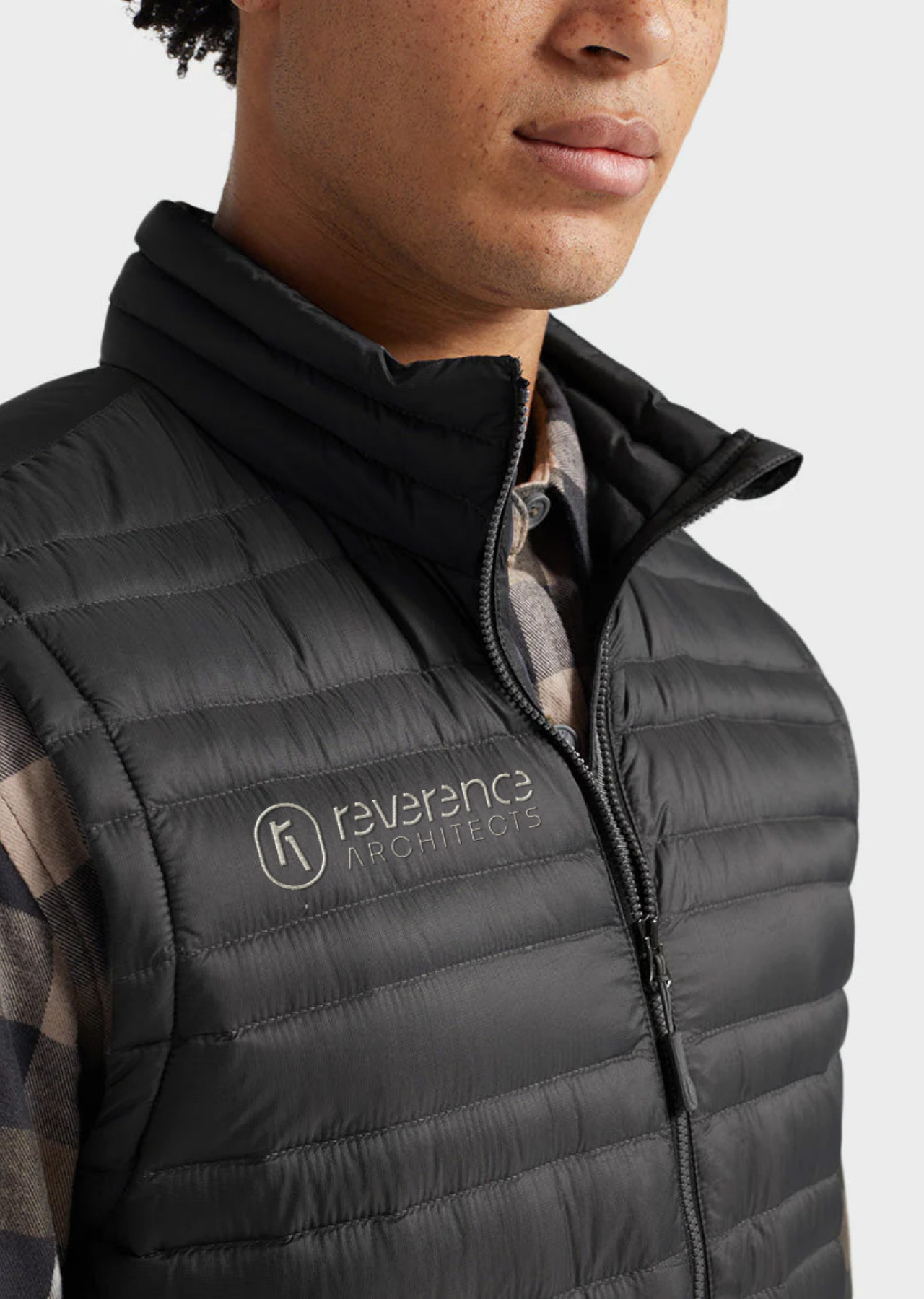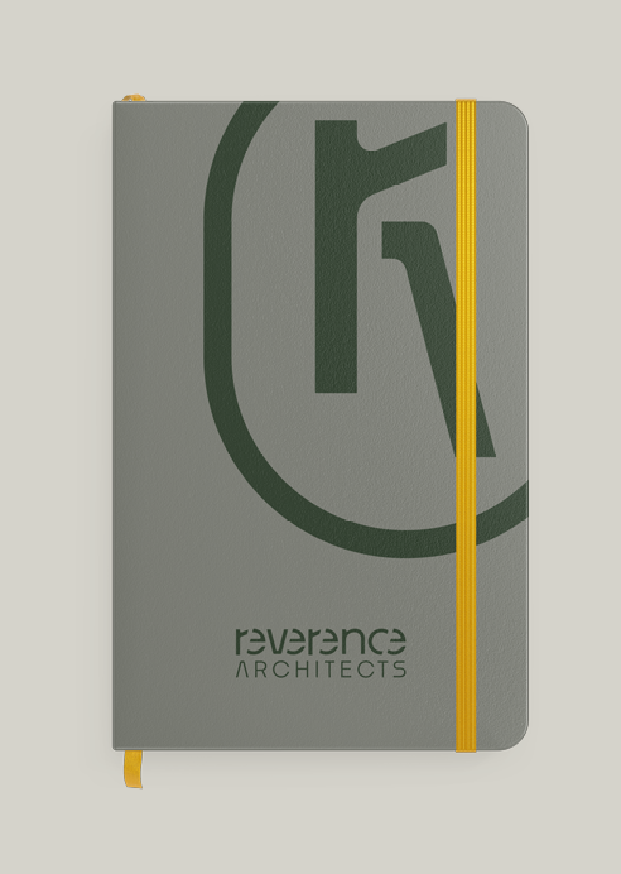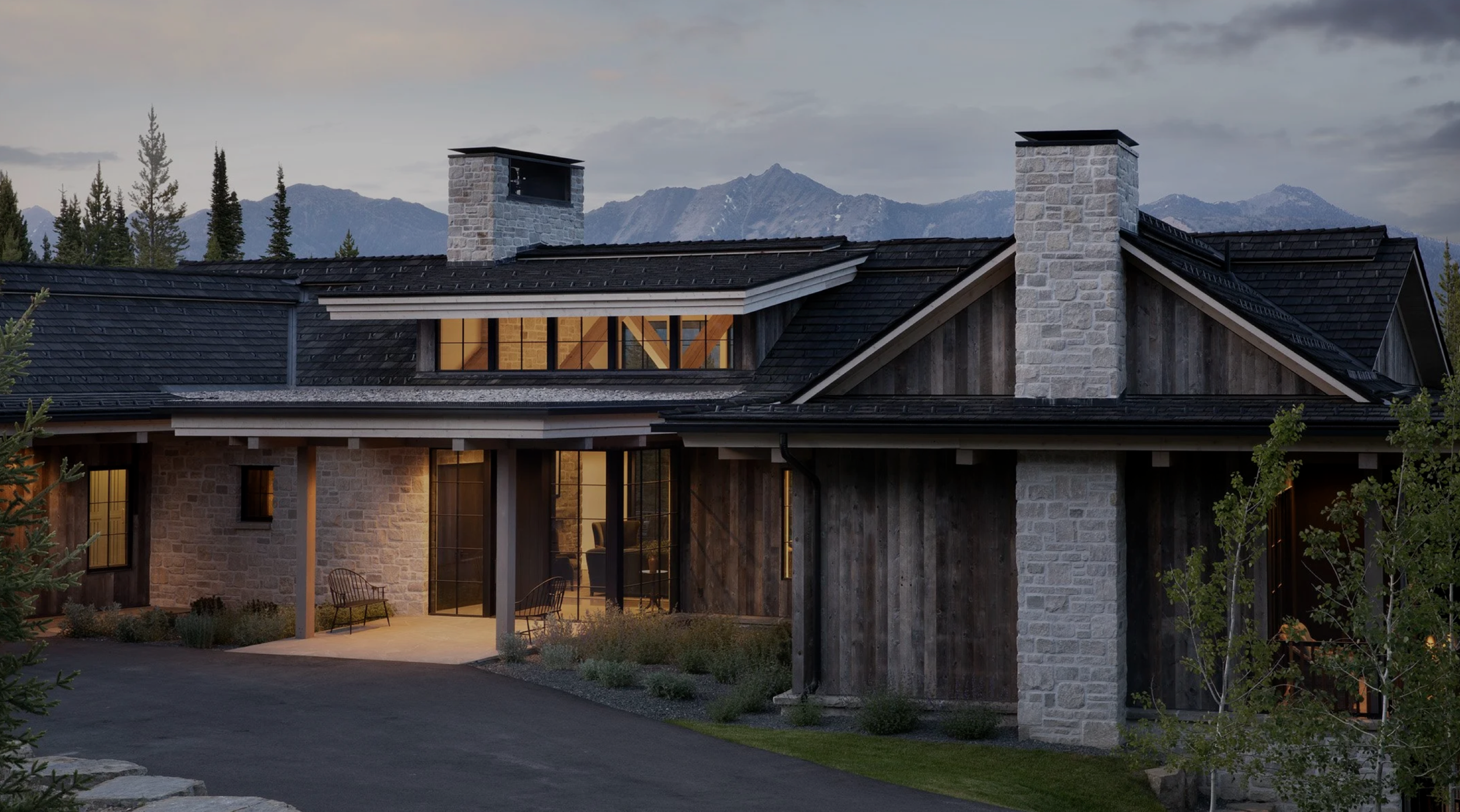
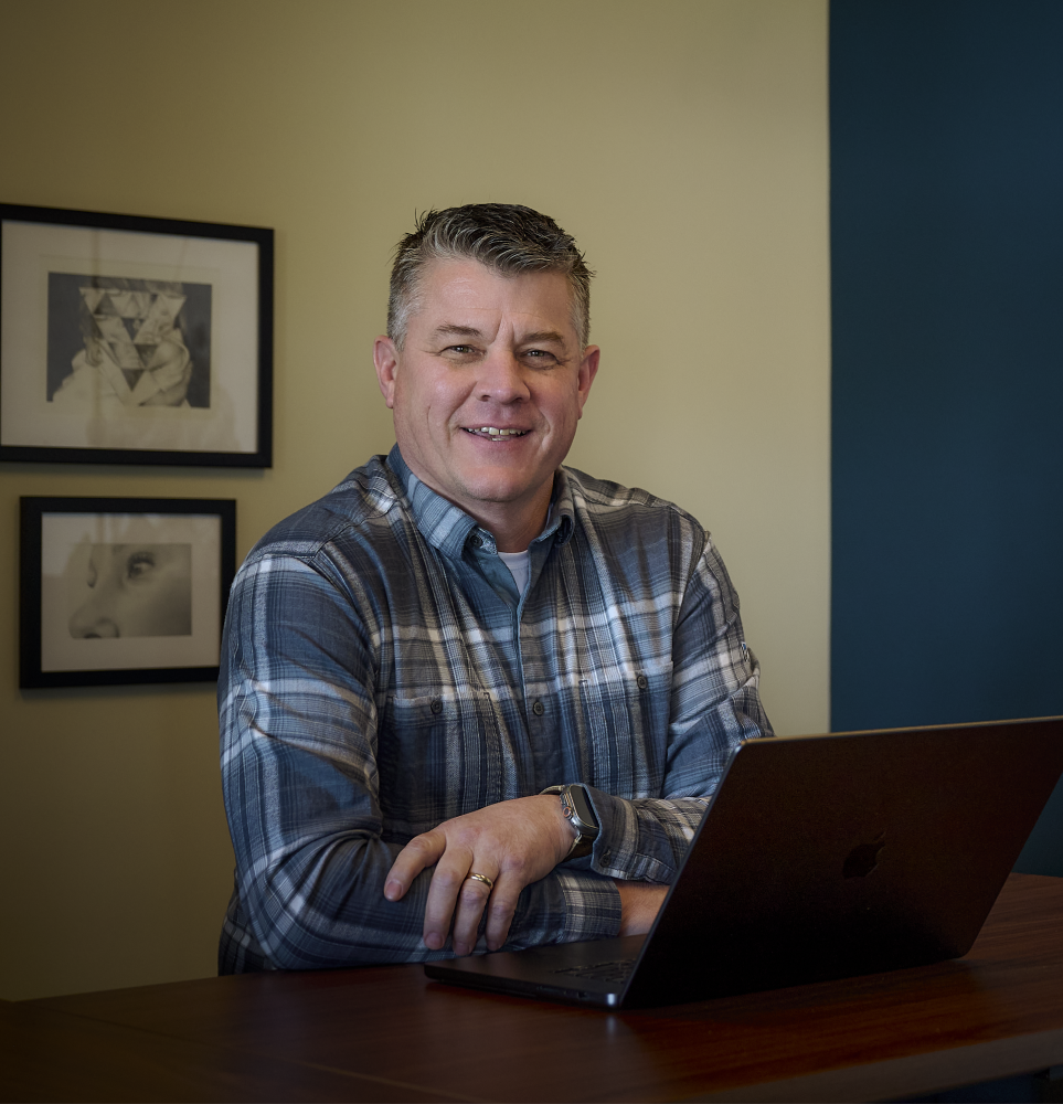
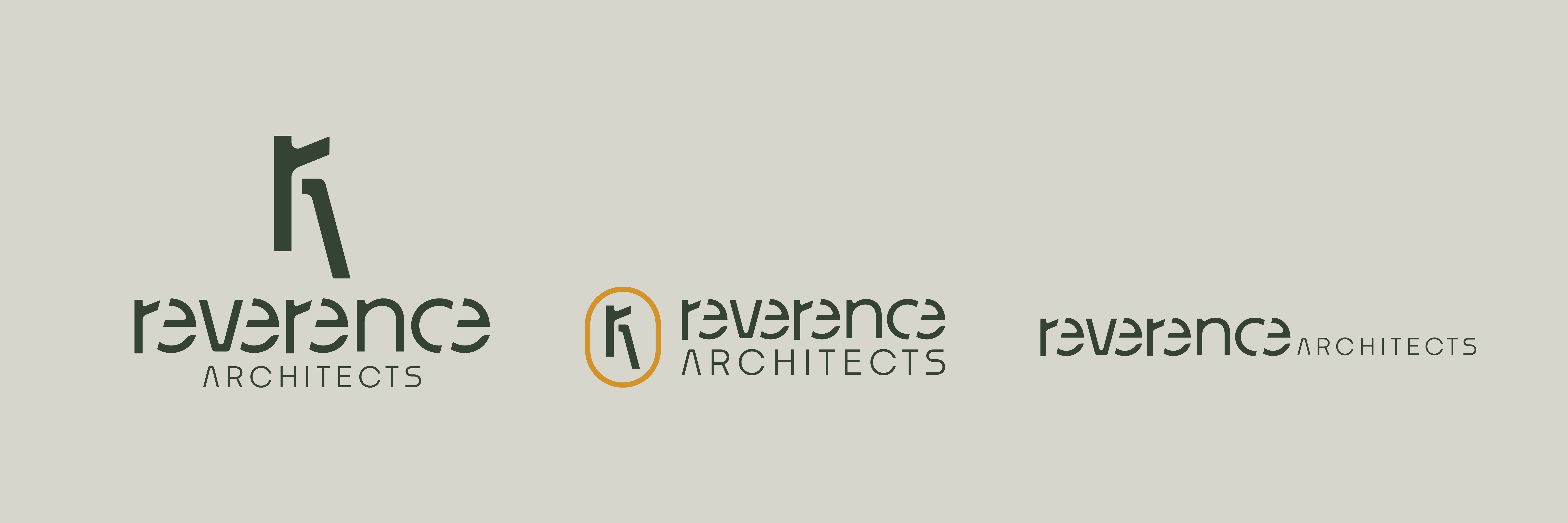
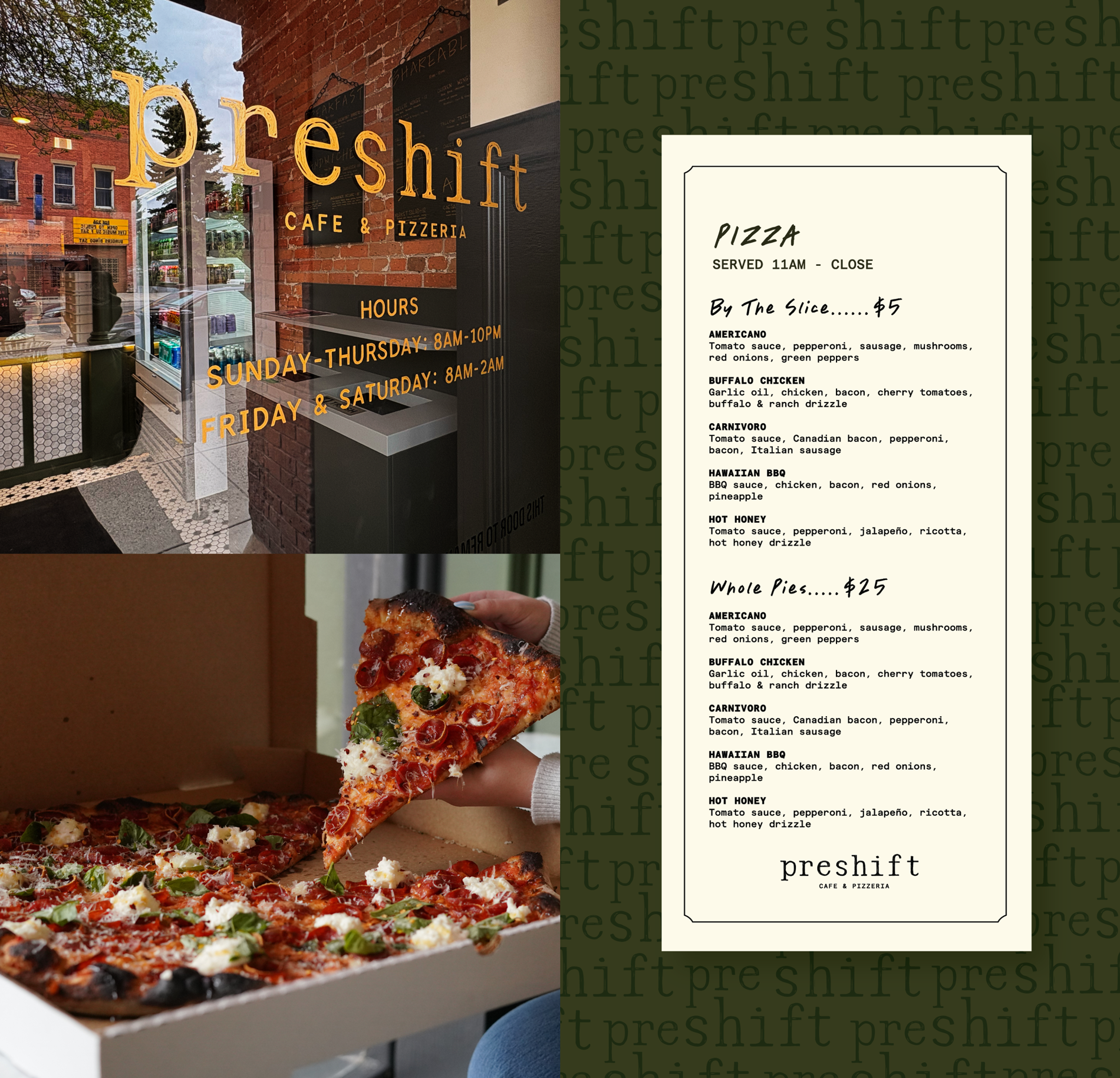
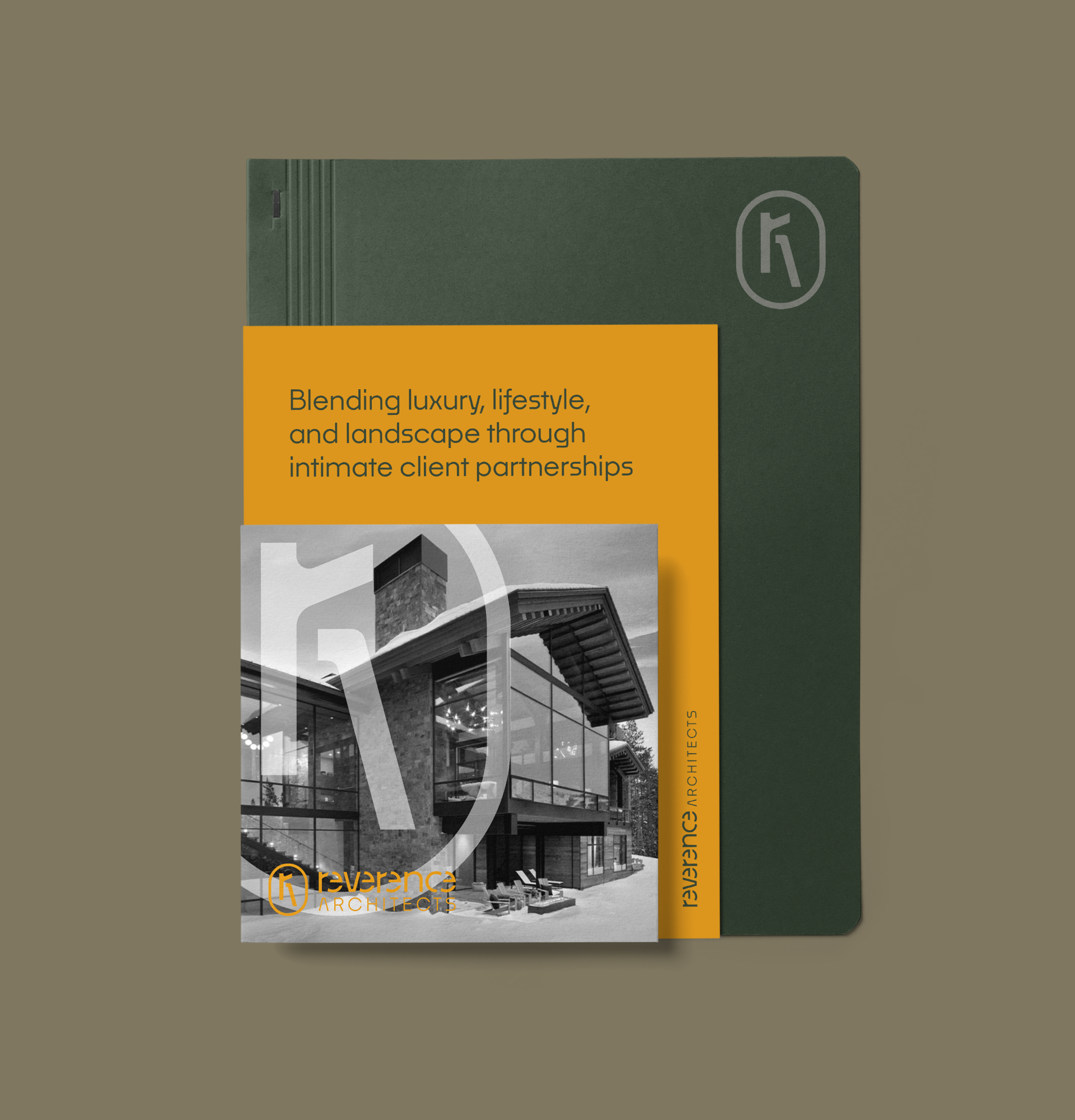
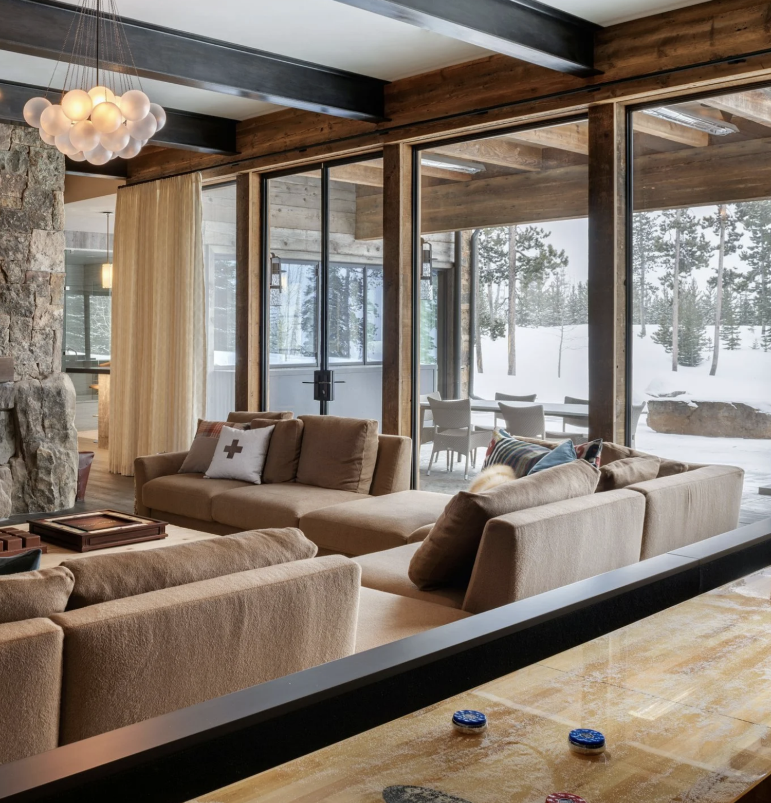
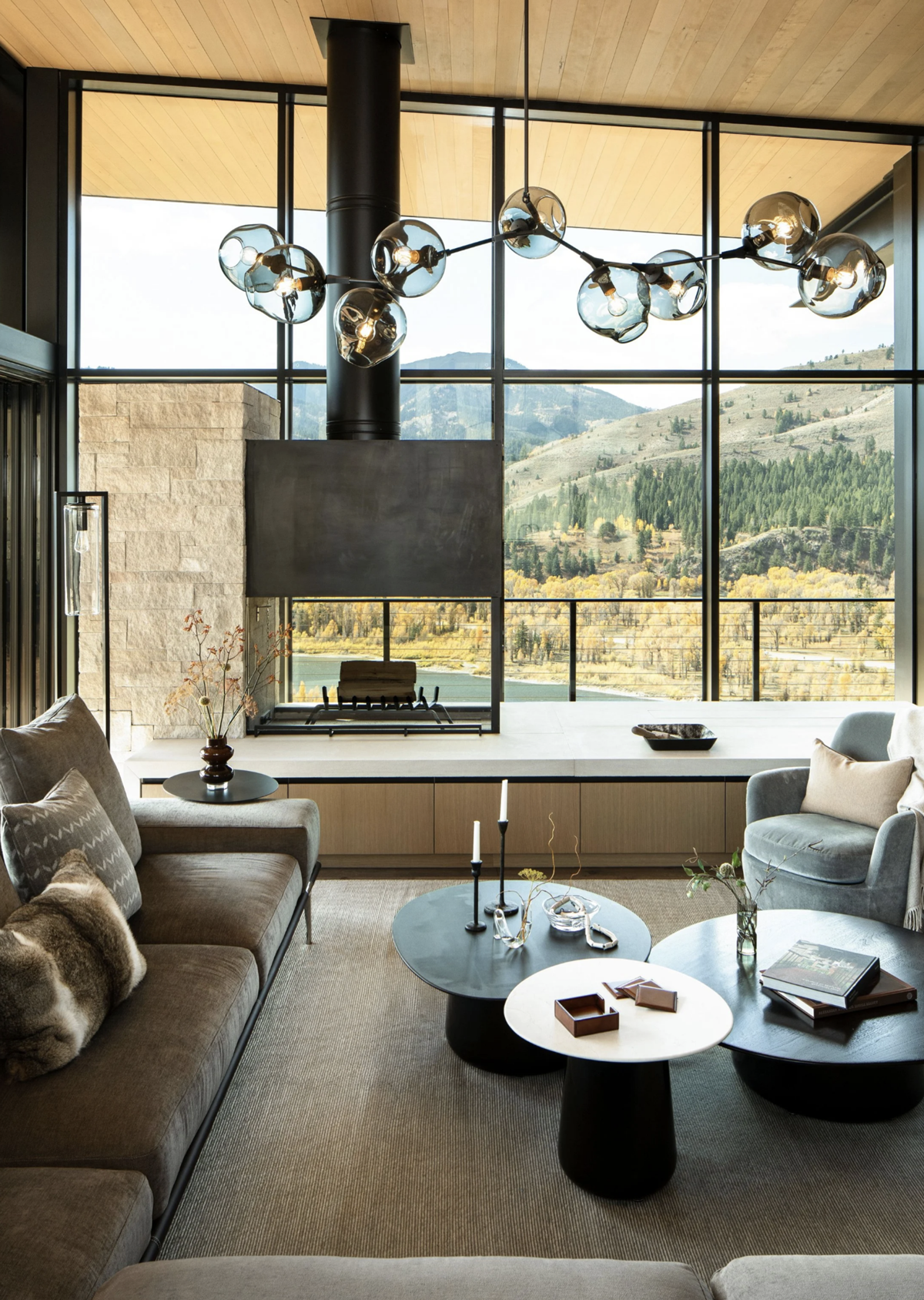
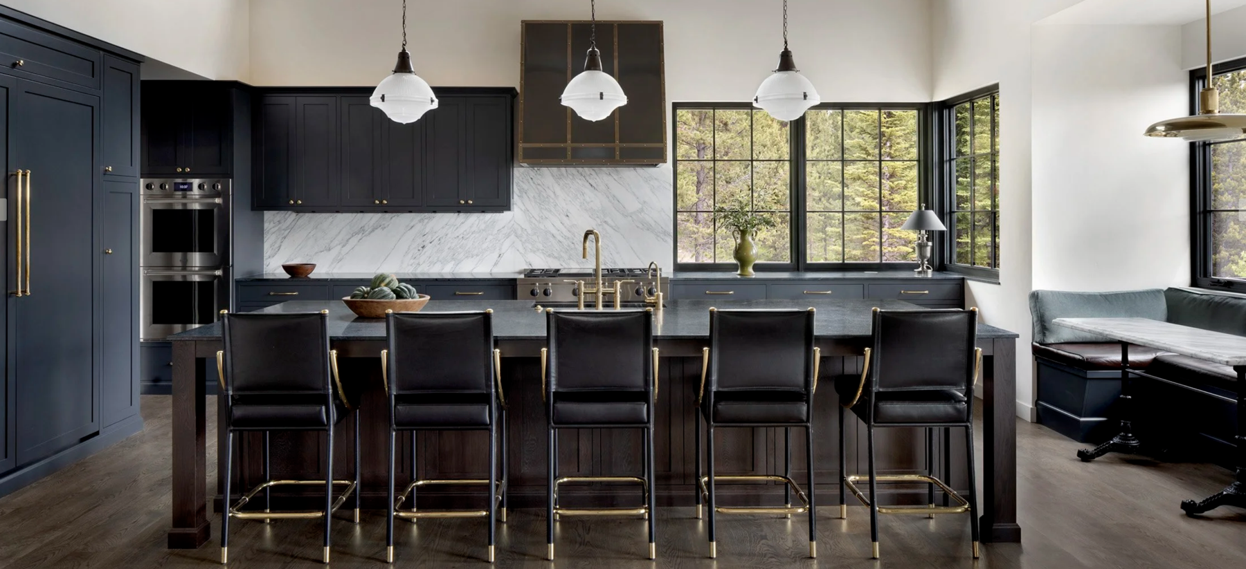
Based in Bozeman, Montana, Reverence Architects creates custom homes that seamlessly blend luxury, lifestyle, and landscape. The firm is the long-envisioned dream of founder Daryl Nourse, a seasoned architect with over two decades of experience and an infectious passion for design. Daryl partnered with Hardy to shape a brand that reflects his high standards for architectural excellence and his genuine, collaborative approach to client relationships. Beyond aesthetics, the brand needed to cultivate a culture of creativity and integrity–a place where both clients and employees feel inspired to build something remarkable. Together, we crafted a brand voice and identity that is both polished and personable, celebrating Daryl’s meticulous attention to detail while making space for joy, curiosity, and versatility.
Brand Strategy
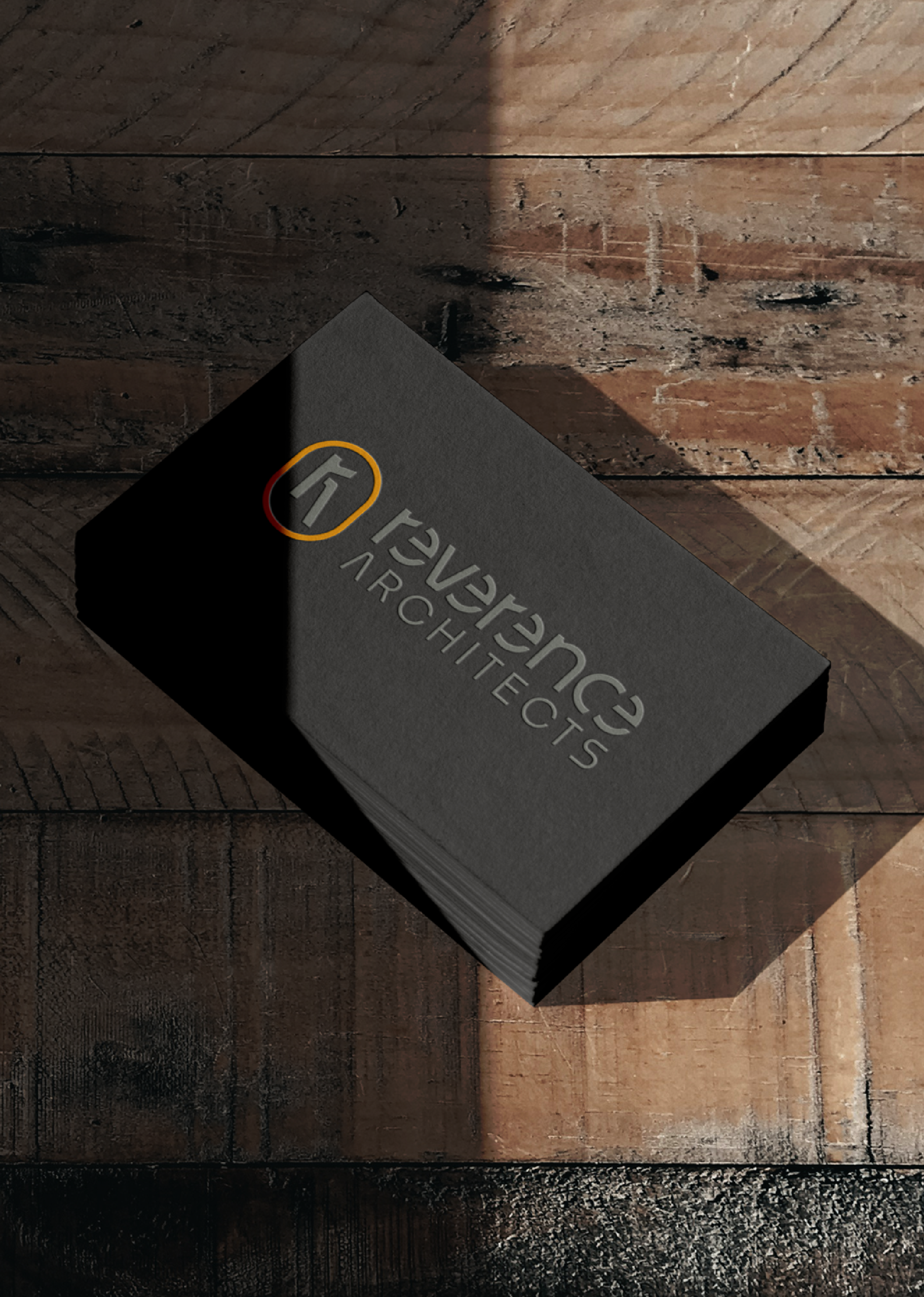
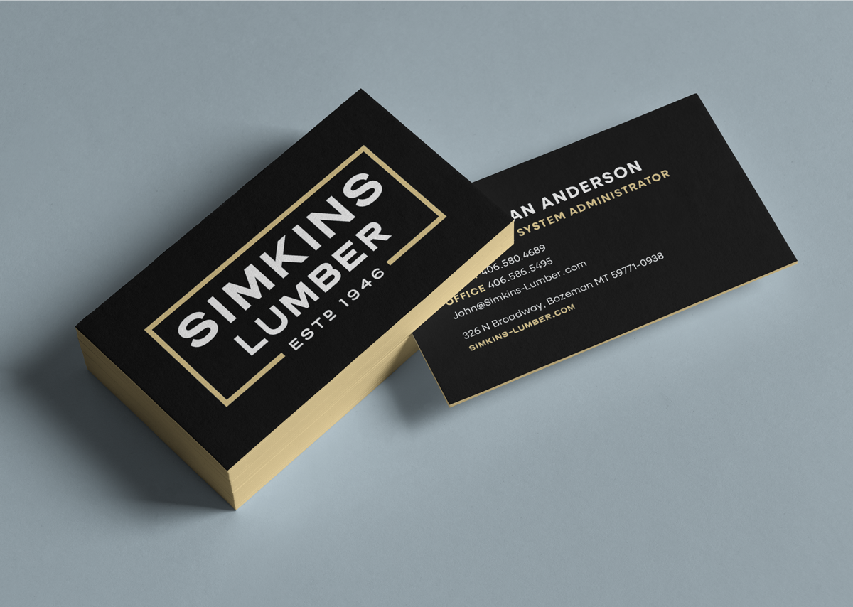
Brand Identity
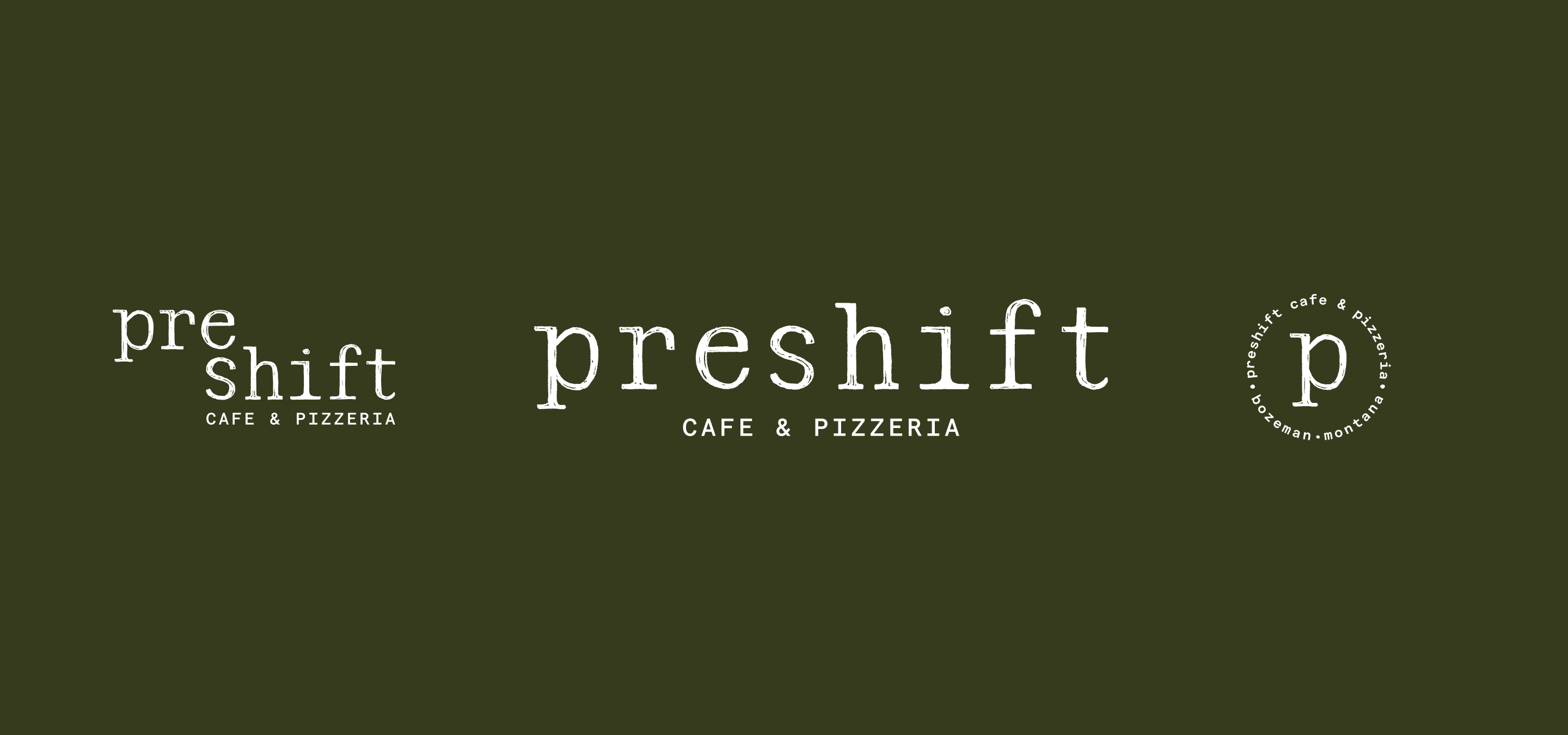
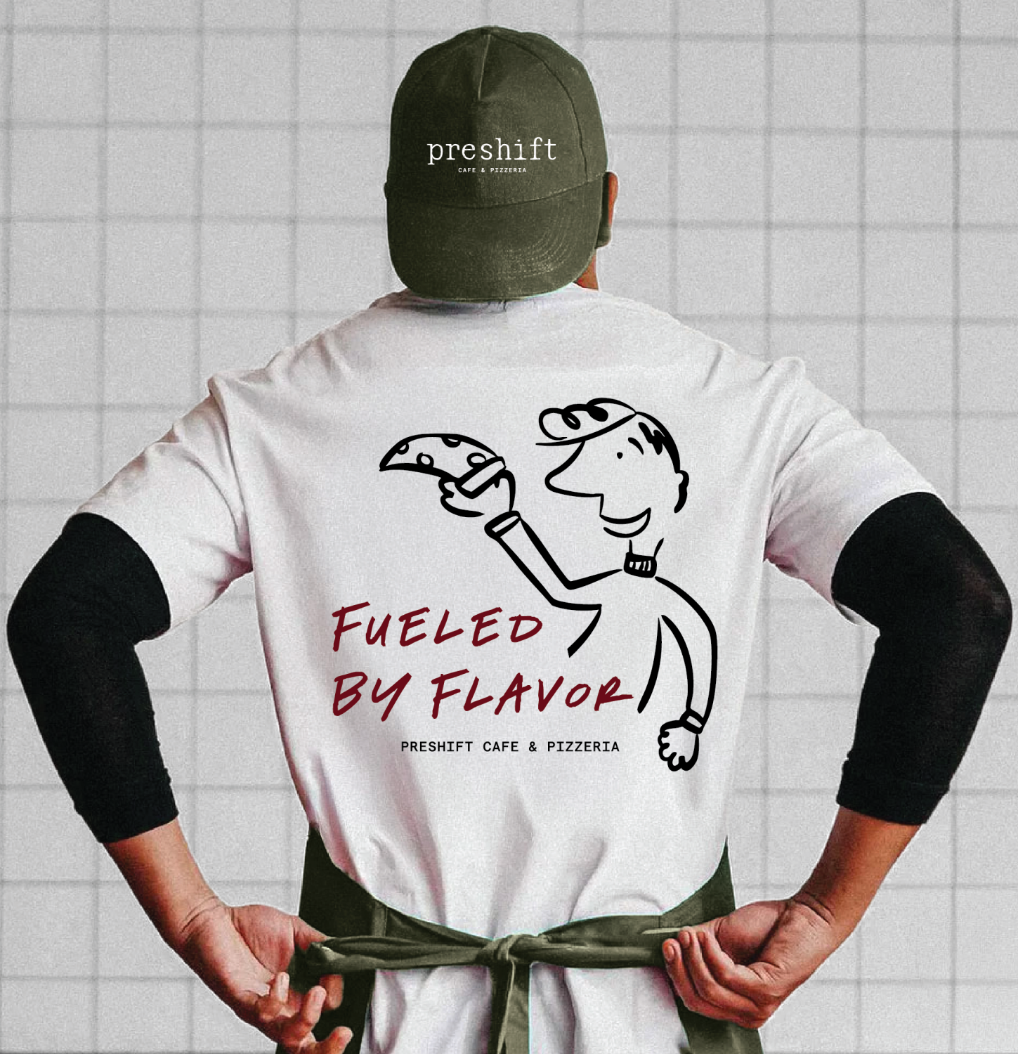
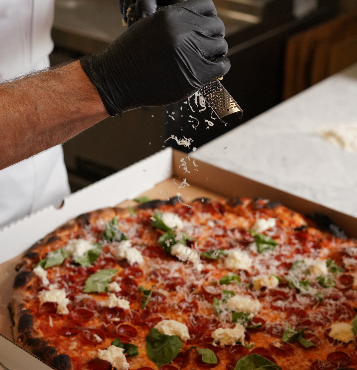
Naming
Brand Execution
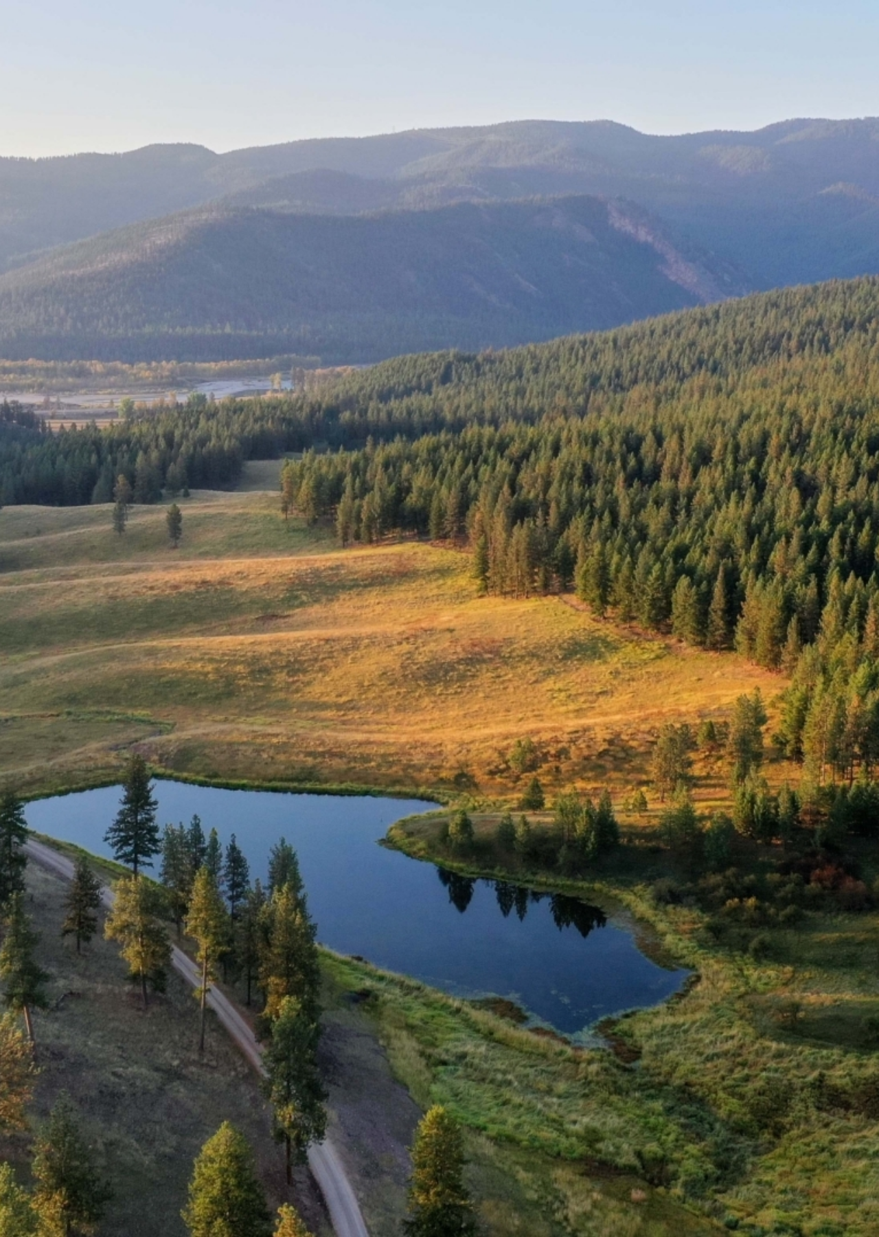
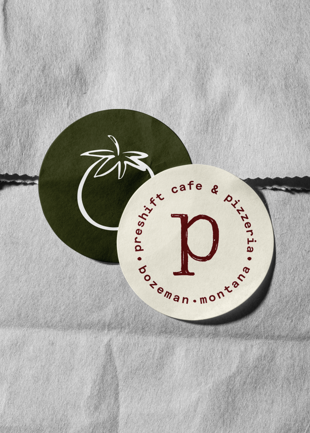
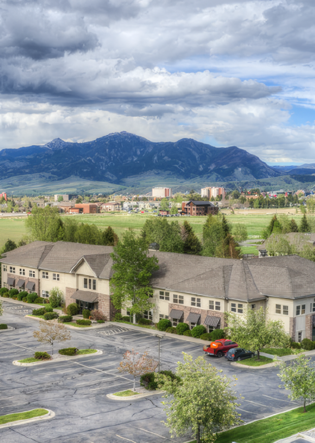
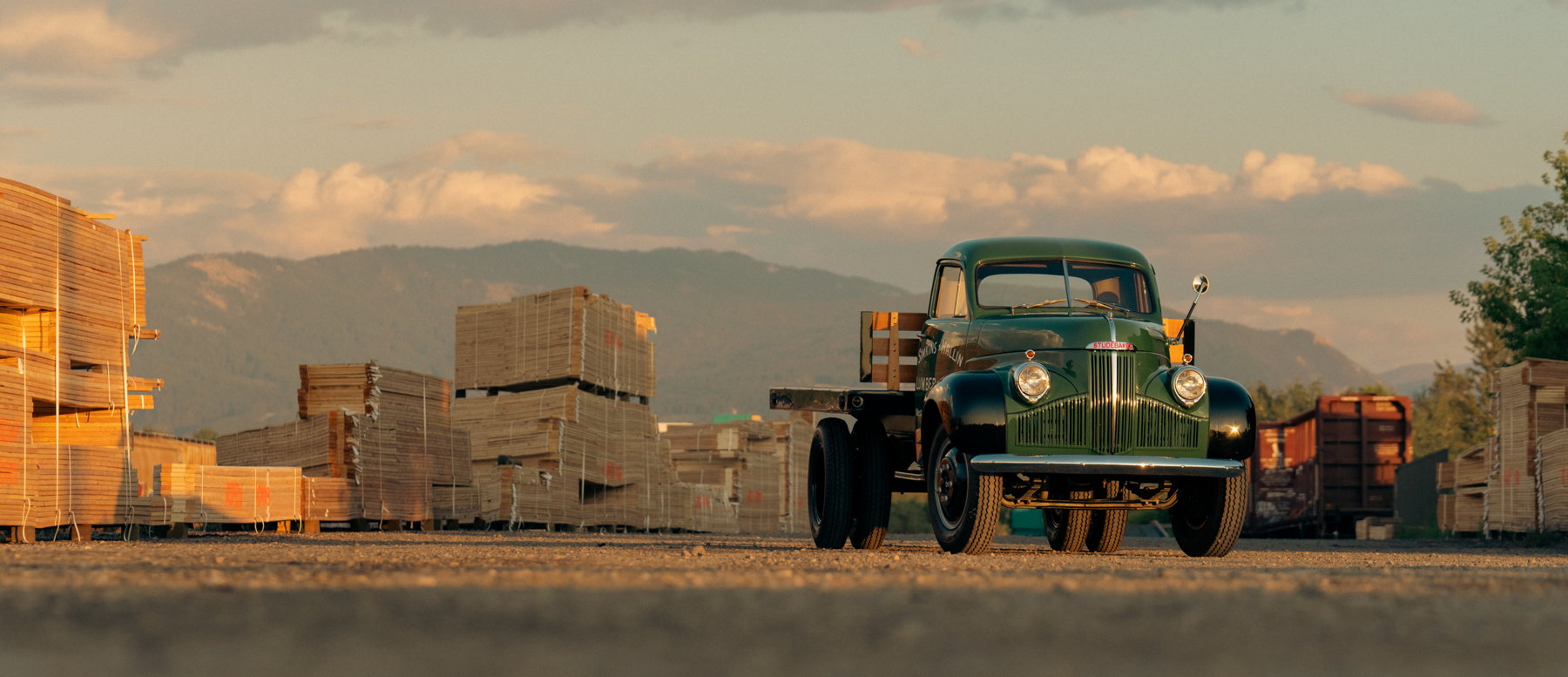
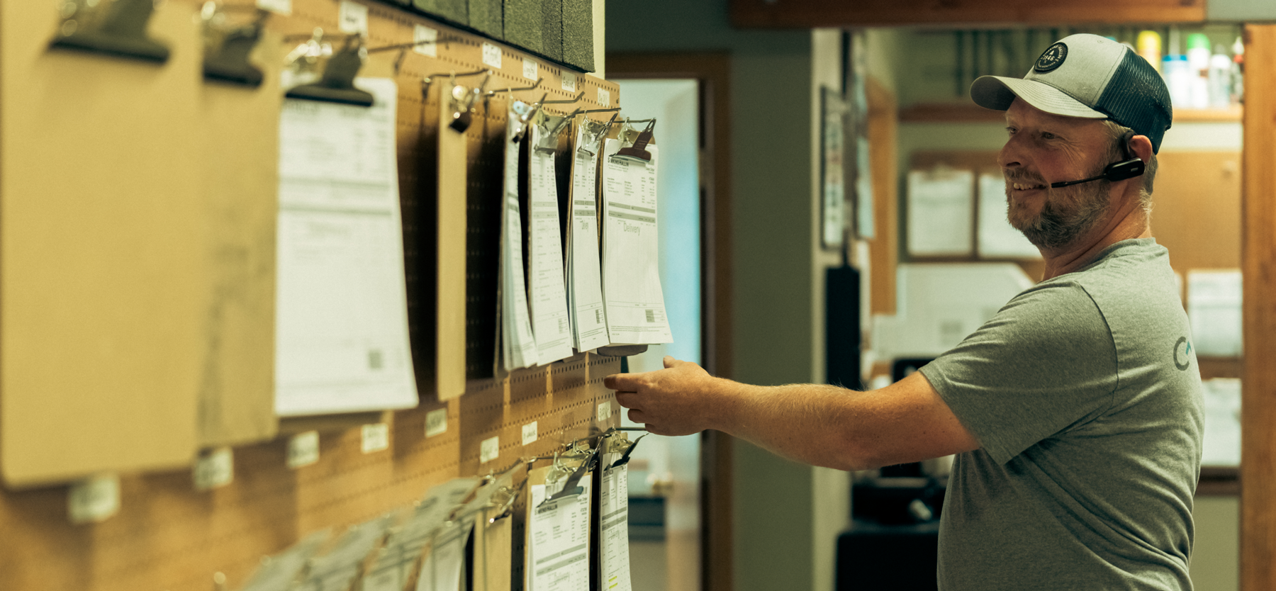
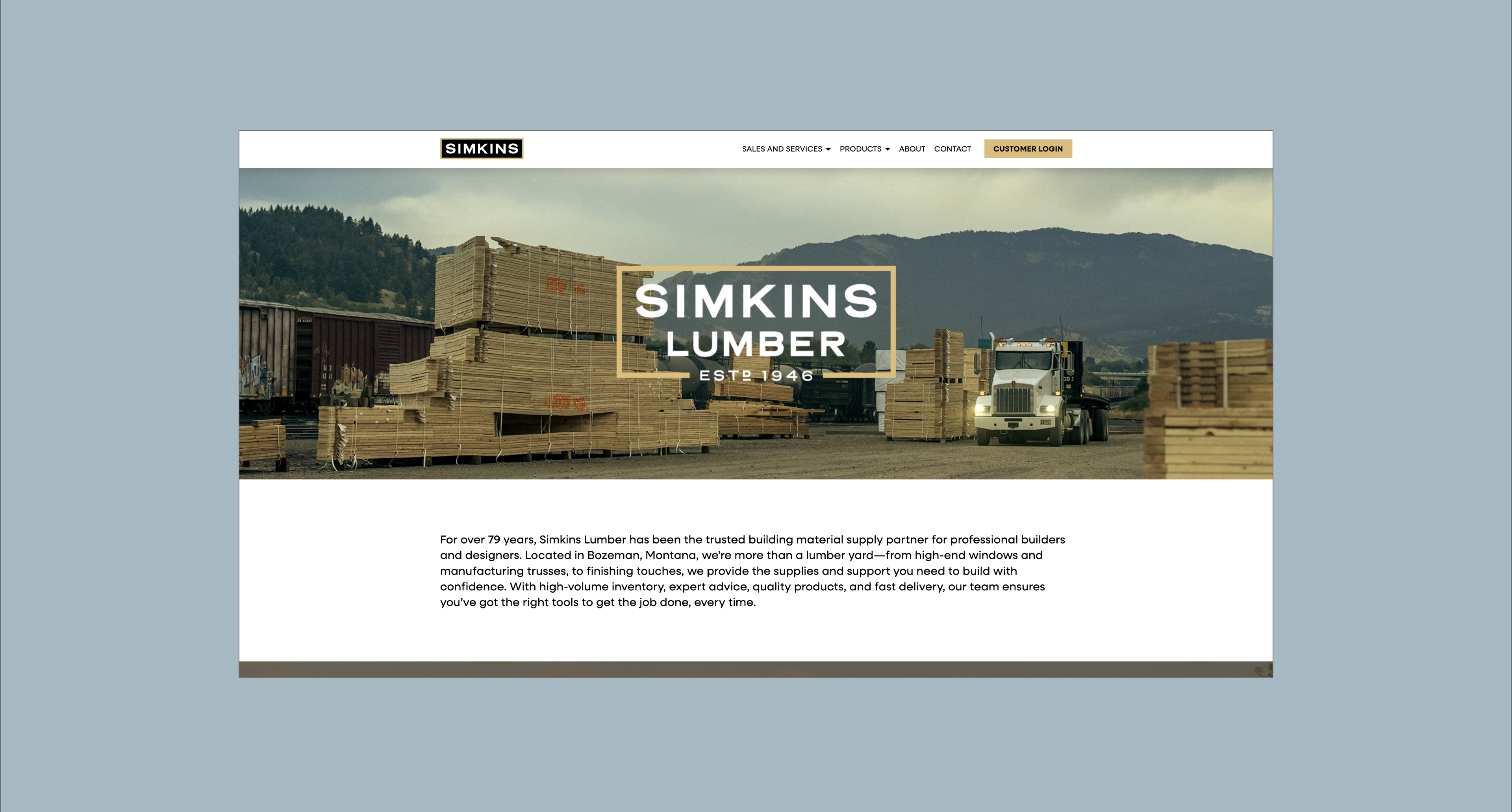
Bozeman, Montana
A refined brand identity that reflects Daryl’s precision, professionalism, and joy for architecture. Through strategic messaging, thoughtful visuals, and a clear point of view, Reverence Architects is now positioned to resonate with discerning clients who value intentional design and a company culture that honors curiosity, respect, and excellence. Visually and verbally, the brand aligns with Daryl’s vision: polished but never cold, nerdy but never rigid, and celebrates the art of building meaningful spaces.


Create a brand that embodies the genuine voice of its lead architect, resonates with the desired clients, and stands out in a saturated market.
Clearly communicate Reverence’s value to discerning clients seeking a trusted design partner. At the same time, lay the foundation for long-term growth by articulating a vision that employees and collaborators are proud to support.
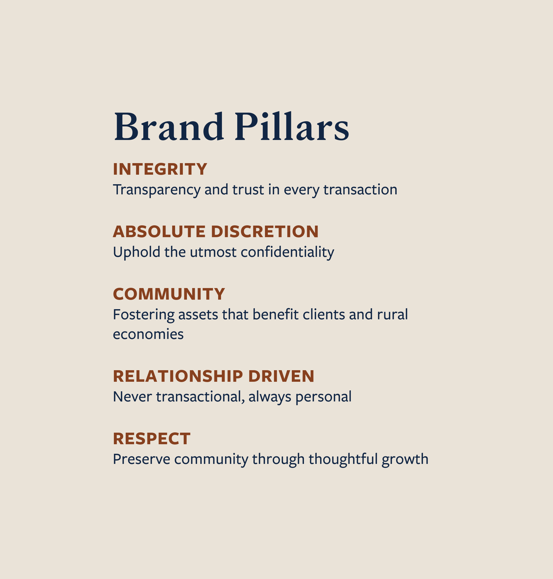
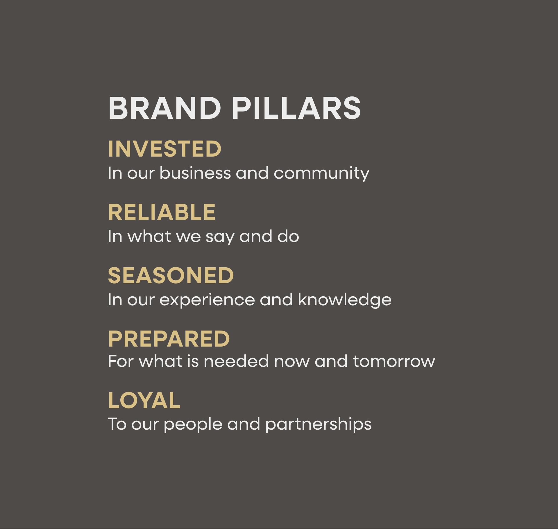
Craft a brand message that reflects the real impact of Reverence Architects’ work, where innovation, versatility, and precision come together to create extraordinary spaces. By aligning messaging with core brand pillars–precise, attentive, inspired, respectful, versatile, and just the right amount of nerdy- we built a brand that’s both polished and personal. The tone remains genuine and receptive, resonating with clients who value trust, excellence, and being heard throughout the process.


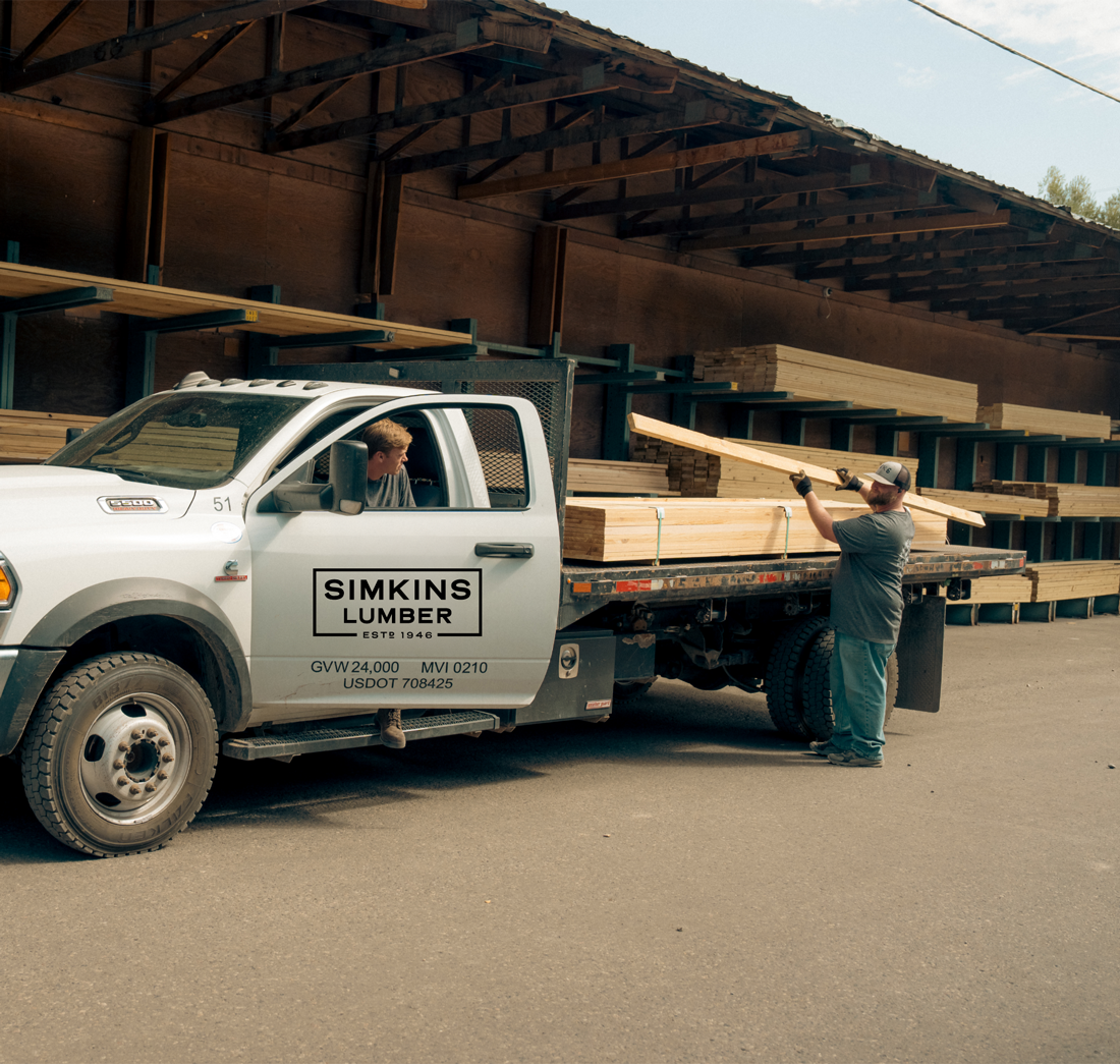


Hardy facilitated a multi-phase brand launch that considered everything from employee-owner training to the ‘why pay more’ signs. The first step was to train all leadership staff on the new strategy. By providing consistent language, their leadership team has the tools to communicate the brand to all employee-owners and customers, utilize it in hiring, and lean on it for business decisions. To support the high level of service T&C is known for, we created talking points, rack cards, and tools that empower employee-owners to answer questions customers may have.


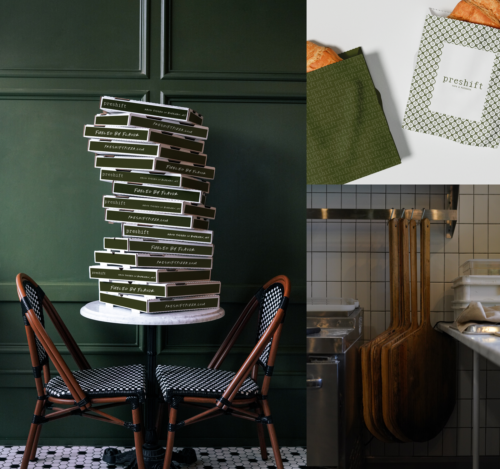
The Bridger Brewing team wanted to be prepared to can and distribute its beer after opening its second location. AMS partnered with Bridger Brewing for packaging design concepts. The first step in the packaging process involved a strategy session in which the unique identity of each beer was explored and dissected. Several concepts were then sketched out. Once a concept was selected for each beer, custom illustrations were created for cans and boxes. The result is a full lineup of beers, each with its own design that is unique while still clearly a member of the Bridger Brewing brand.


The longest line you’ll see comes from a reel.
Big ideas are best discussed on the back of a pickup.