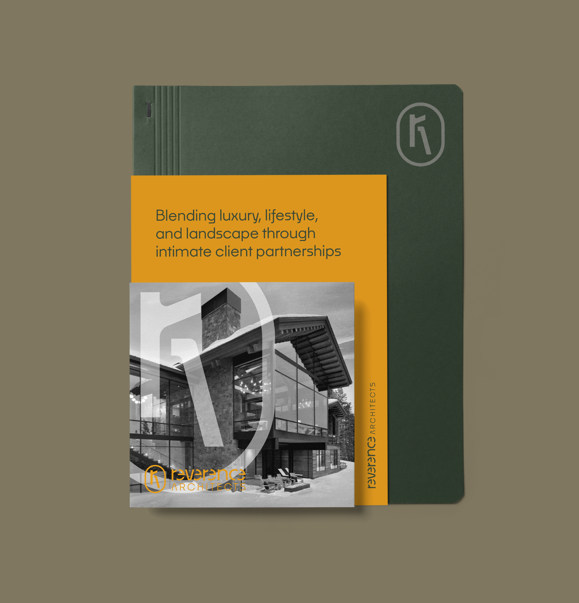
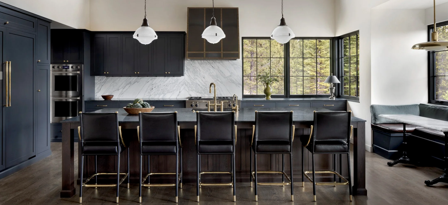
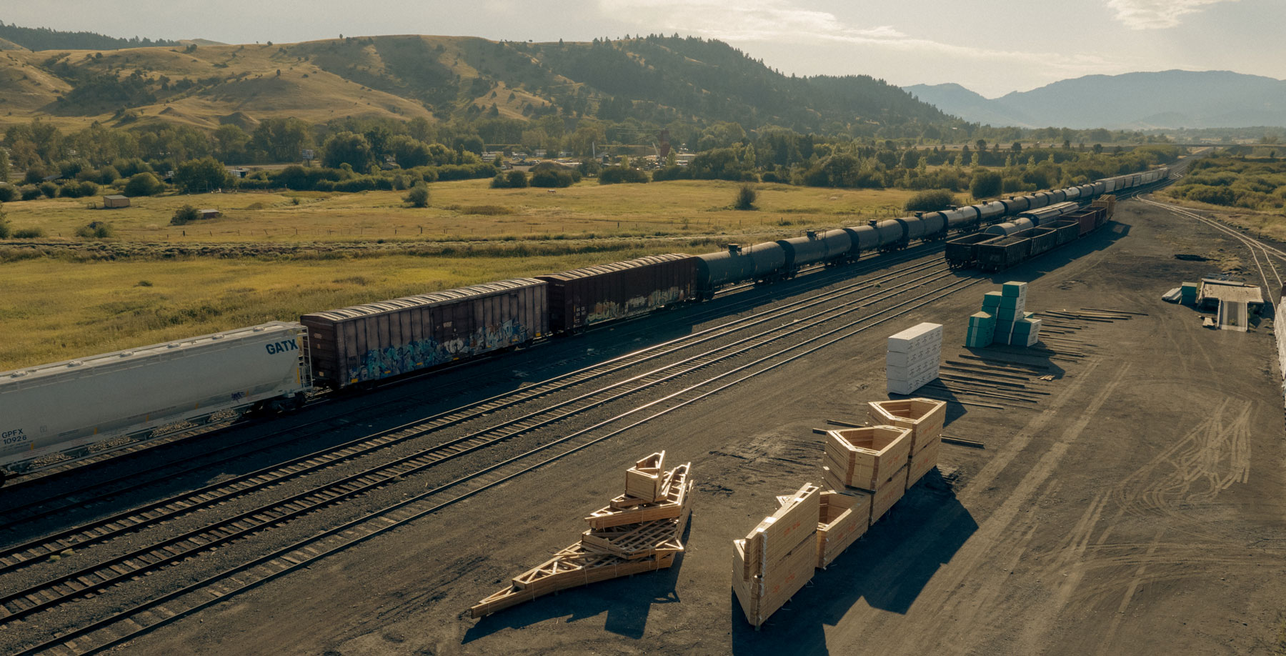
North Fork Builders is a top-notch general contractor that has constructed significant residential and commercial buildings in Montana and across the country. Their focus on excellent craftsmanship and meticulous project management sets them apart in their field.
They needed a brand and website that represented their level of expertise and communicated that they are builders, not architects, which was a common misconception. Hardy accomplished this and showcased the quality of their work and their process to completion through strategy, design, photo direction and copywriting.
Today, North Fork has an elevated brand and a dynamic website to help the company advance even further in its field.
Brand Exploration
Brand Strategy
Brand Positioning
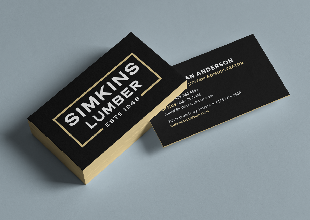
Brand Identity
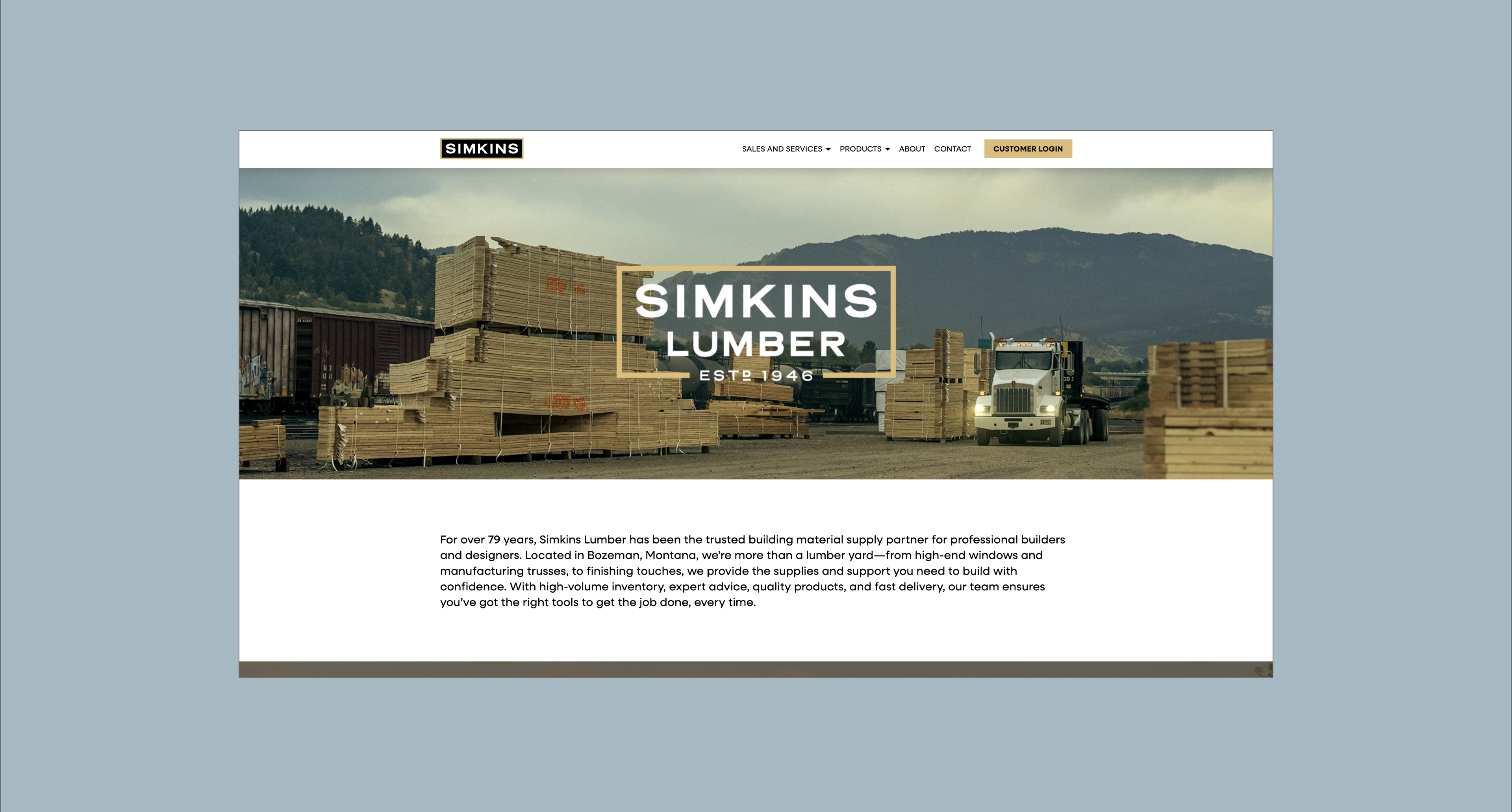
Website
Art and Creative Direction
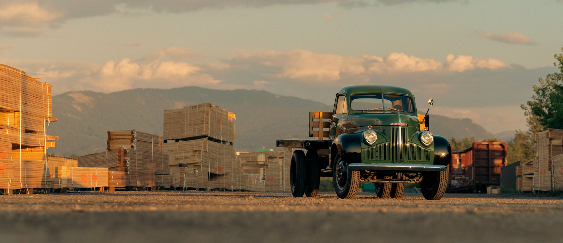
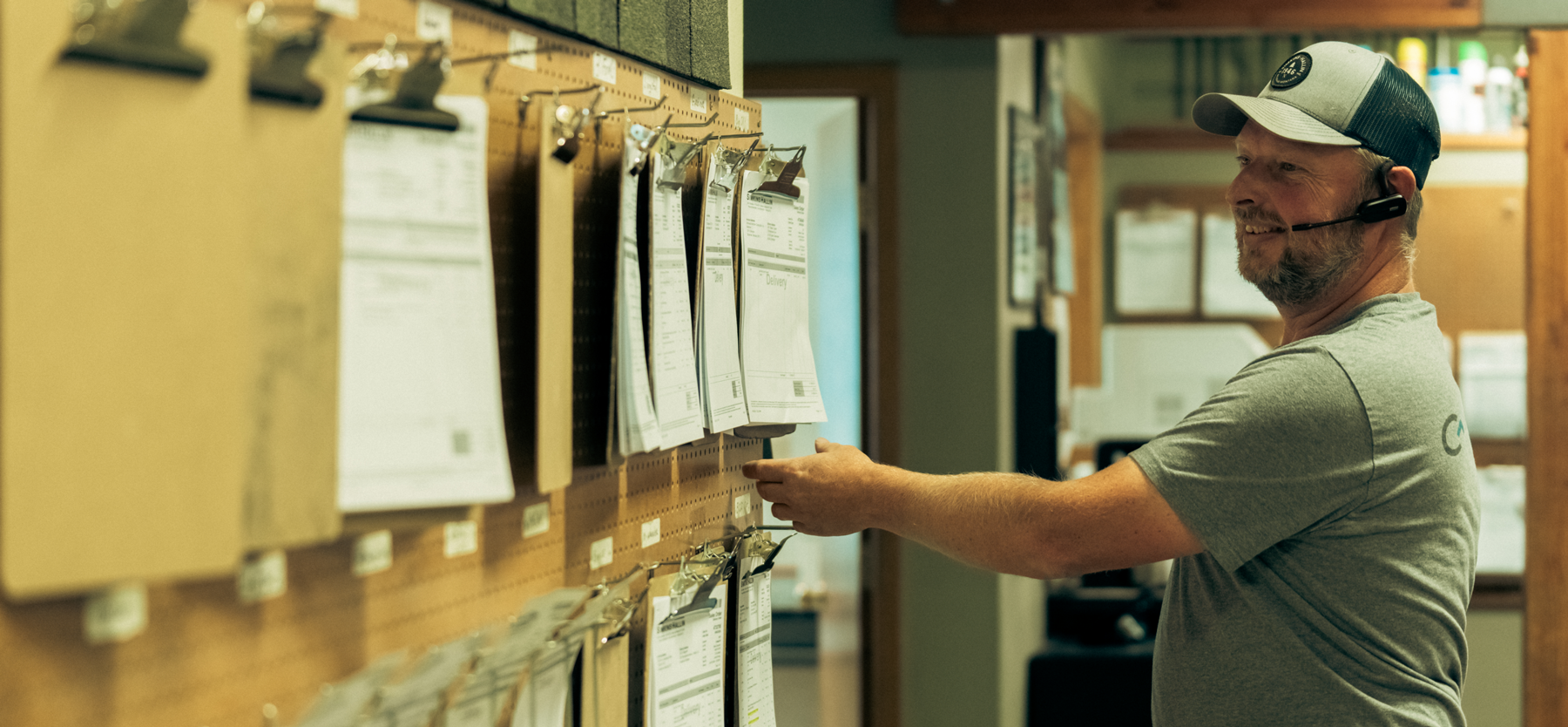
Photo Direction
Social Media Strategy
Business Set
Advertising Design
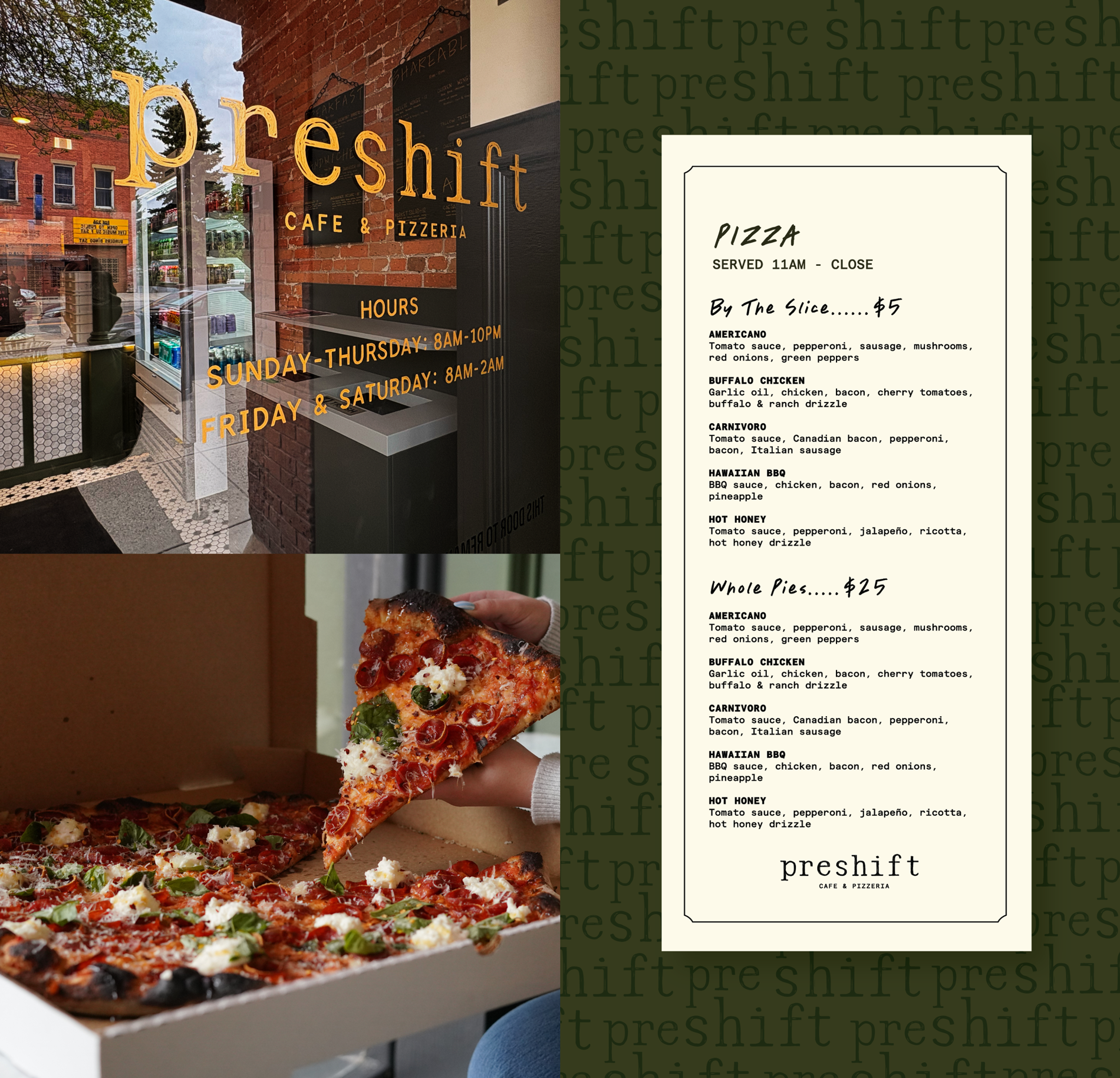
Bozeman, Montana
A refined brand and website that feel polished and reflect North Fork’s level of craftsmanship and the standards they uphold on their job sites.


Clearly differentiating North Fork from businesses in parallel industries, like architecture, by highlighting the process and execution in addition to the aesthetics.
To move the North Fork brand into a contemporary space in order to attract high-end clientele and communicate the value of a professional contractor.
Use a high-end and professional design language that showcases the construction itself, bringing in human elements and emphasizing the whole process, not just the end result.


Hardy facilitated a multi-phase brand launch that considered everything from employee-owner training to the ‘why pay more’ signs. The first step was to train all leadership staff on the new strategy. By providing consistent language, their leadership team has the tools to communicate the brand to all employee-owners and customers, utilize it in hiring, and lean on it for business decisions. To support the high level of service T&C is known for, we created talking points, rack cards, and tools that empower employee-owners to answer questions customers may have.


The Bridger Brewing team wanted to be prepared to can and distribute its beer after opening its second location. AMS partnered with Bridger Brewing for packaging design concepts. The first step in the packaging process involved a strategy session in which the unique identity of each beer was explored and dissected. Several concepts were then sketched out. Once a concept was selected for each beer, custom illustrations were created for cans and boxes. The result is a full lineup of beers, each with its own design that is unique while still clearly a member of the Bridger Brewing brand.


The longest line you’ll see comes from a reel.
Big ideas are best discussed on the back of a pickup.