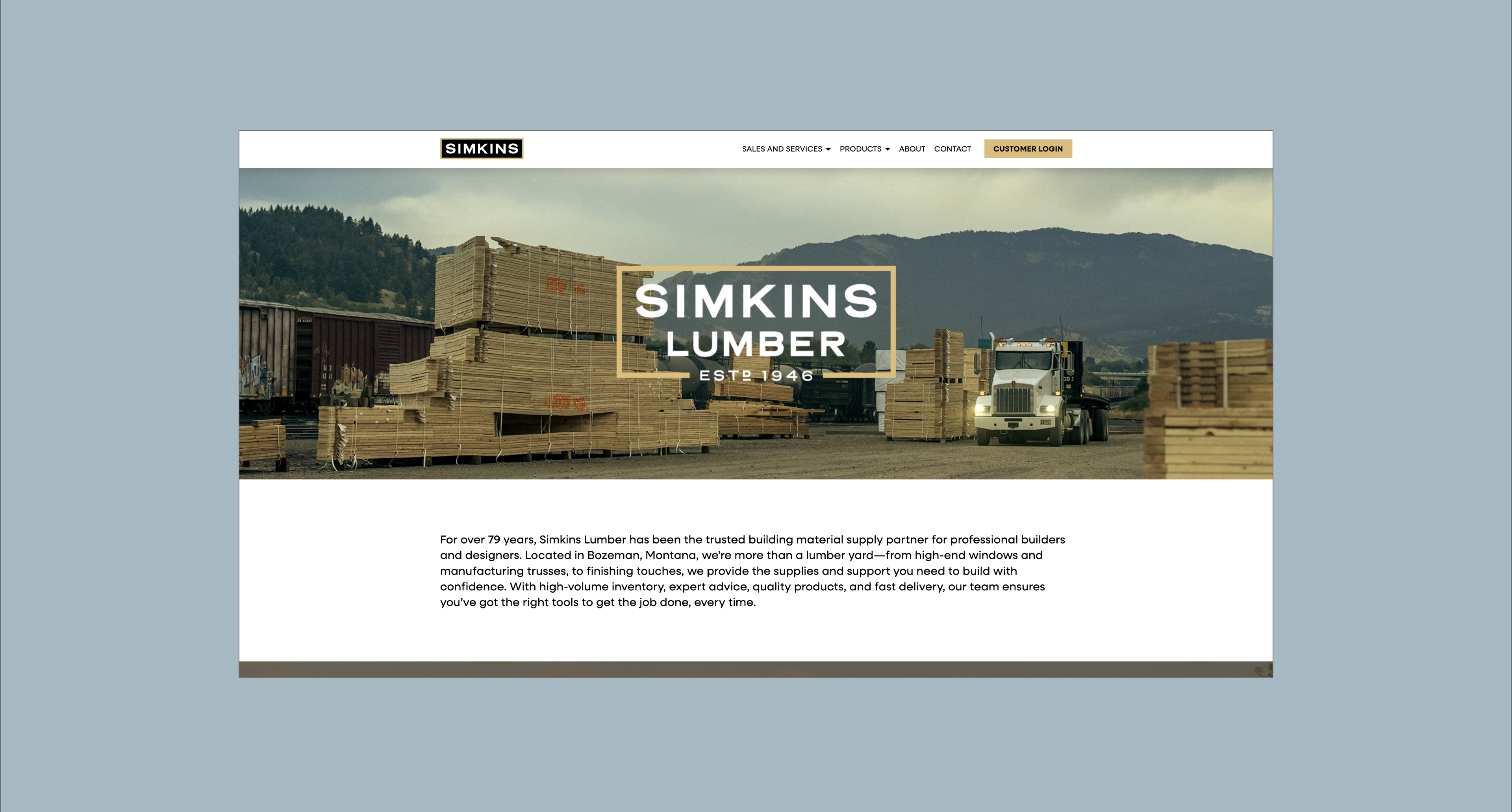
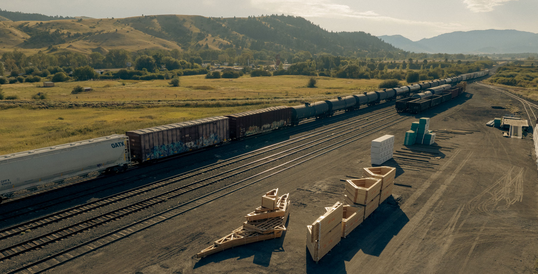
Town & Country Foods is a longstanding, beloved Montana brand. With eight stores in six unique communities, T&C is a trusted neighborhood staple — feeding people, growing relationships, and giving back. To punctuate the people-first ethos Town & Country evolved into a 100% employee owned company – a transition that is driving success today.
While the blueprint for the 60-year-old company remains the same, Hardy Brands was brought in to create a brand strategy that fits where they are today and will empower T&C scale in the future. This strategy laid the groundwork for a visual identity system that unites each location while highlighting their unique charm.
Brand Strategy
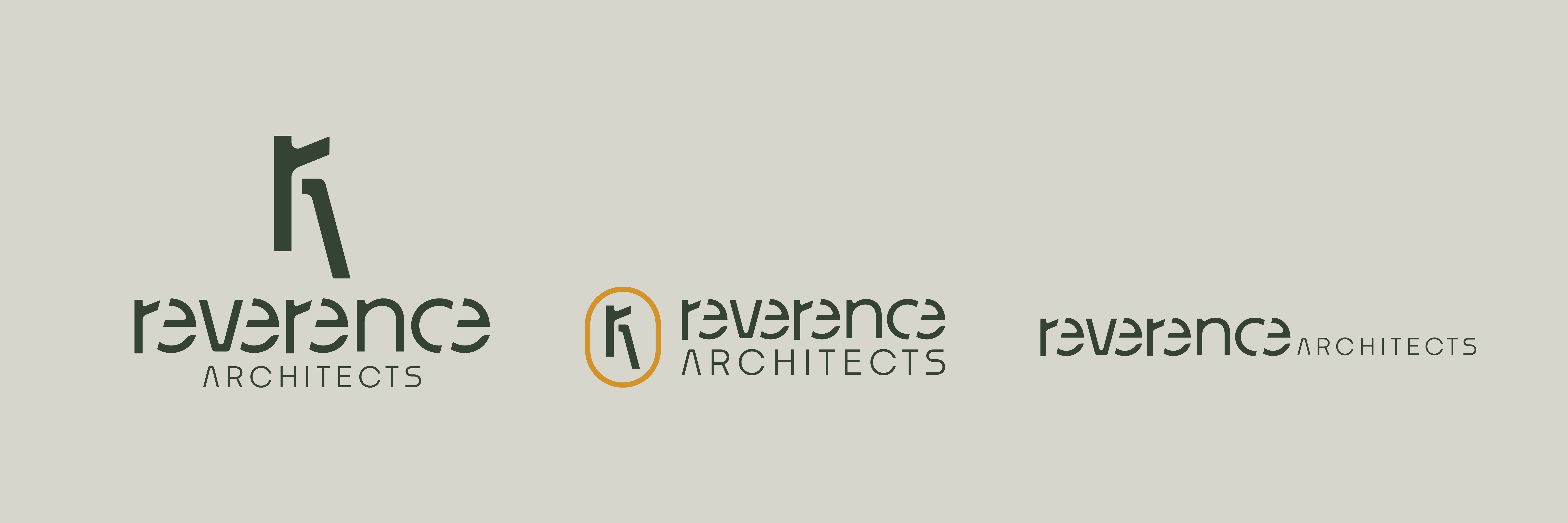
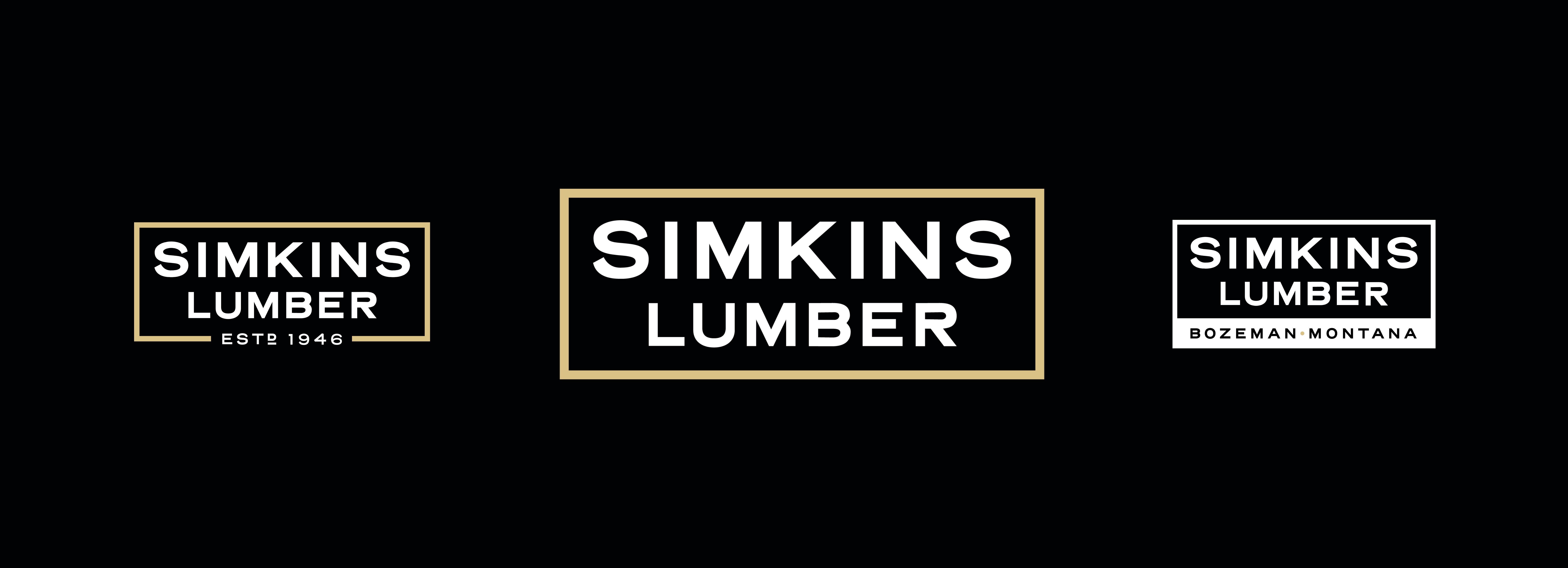
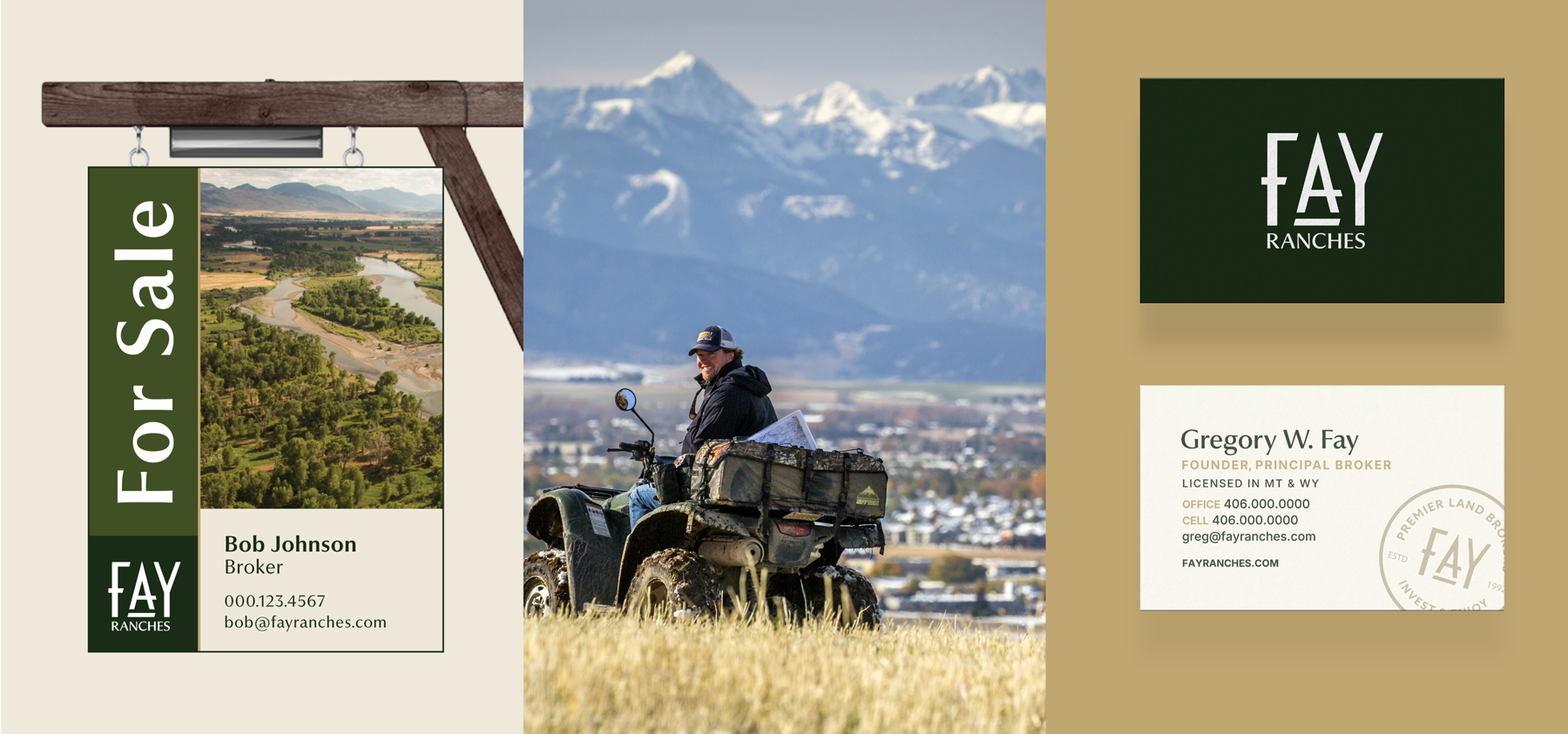
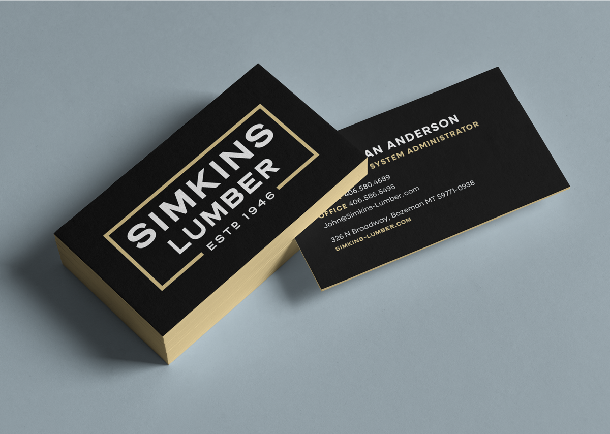
Brand Identity
Environmental Branding
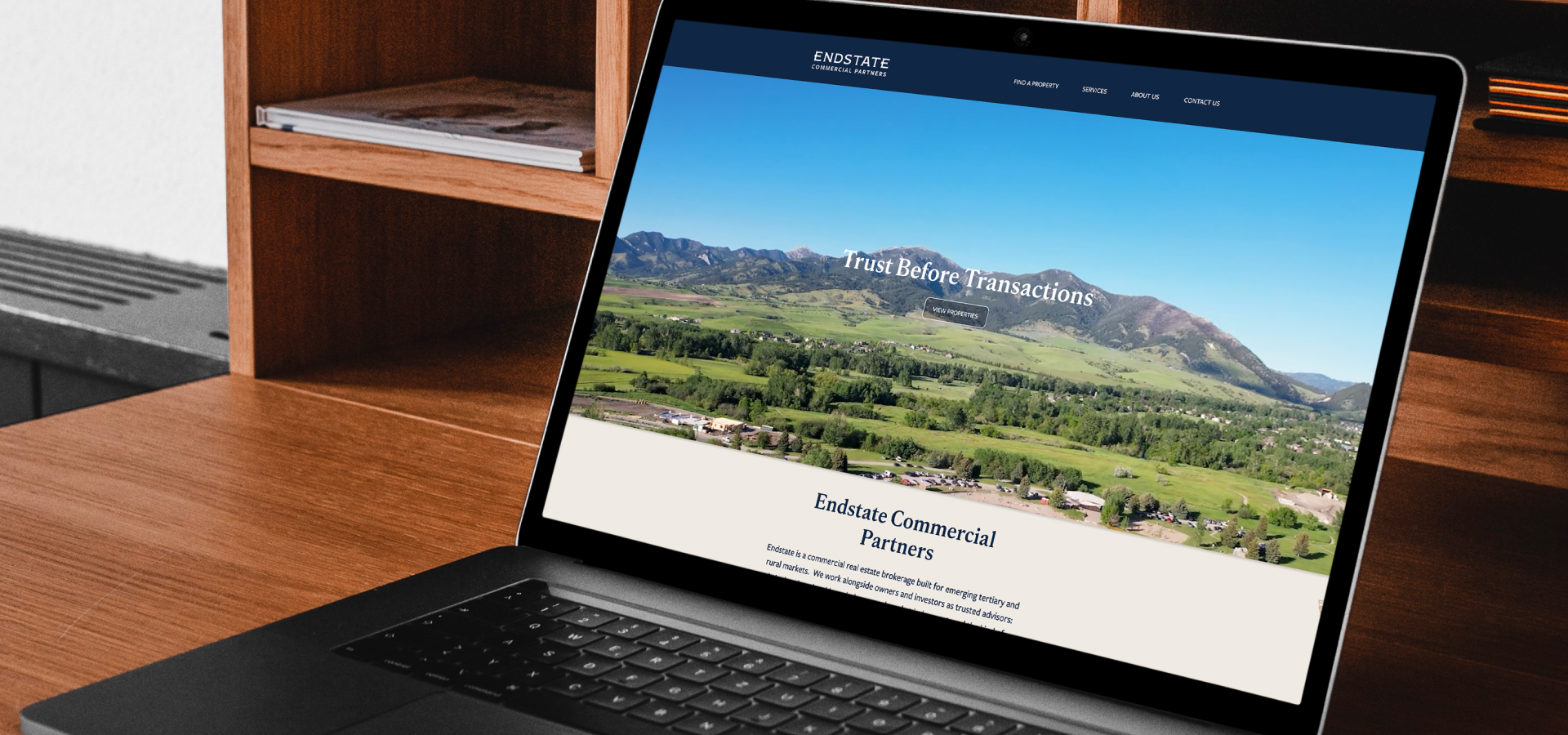
Brand Launch
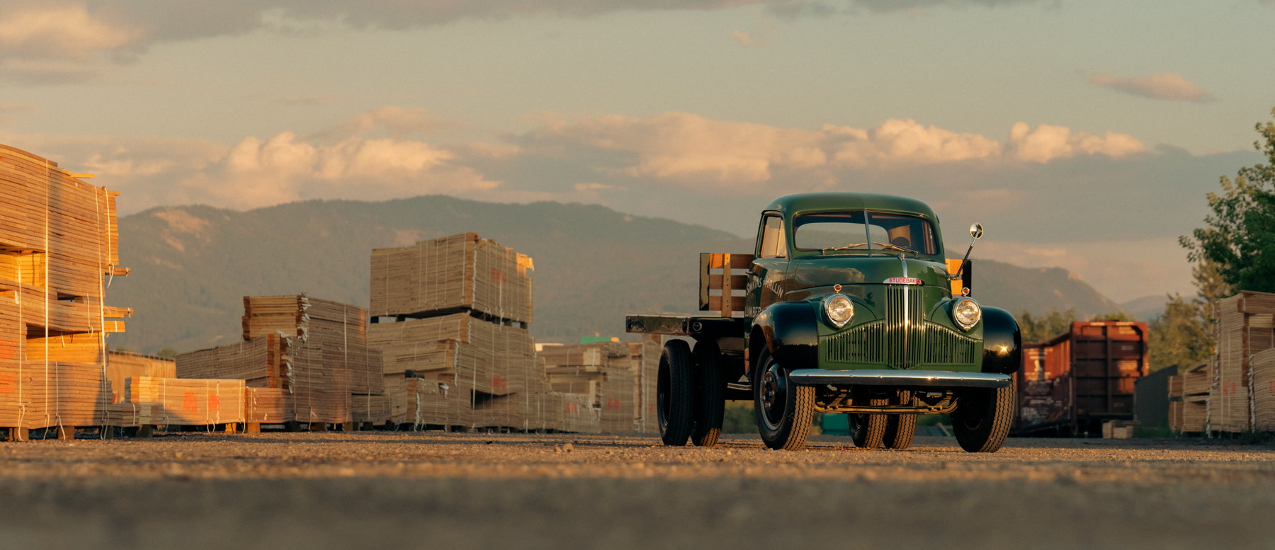
Across Montana
A brand that celebrates Town & Country Foods’ longstanding community presence, reaffirms employee ownership, and enables sustainable growth into new locations across Montana.


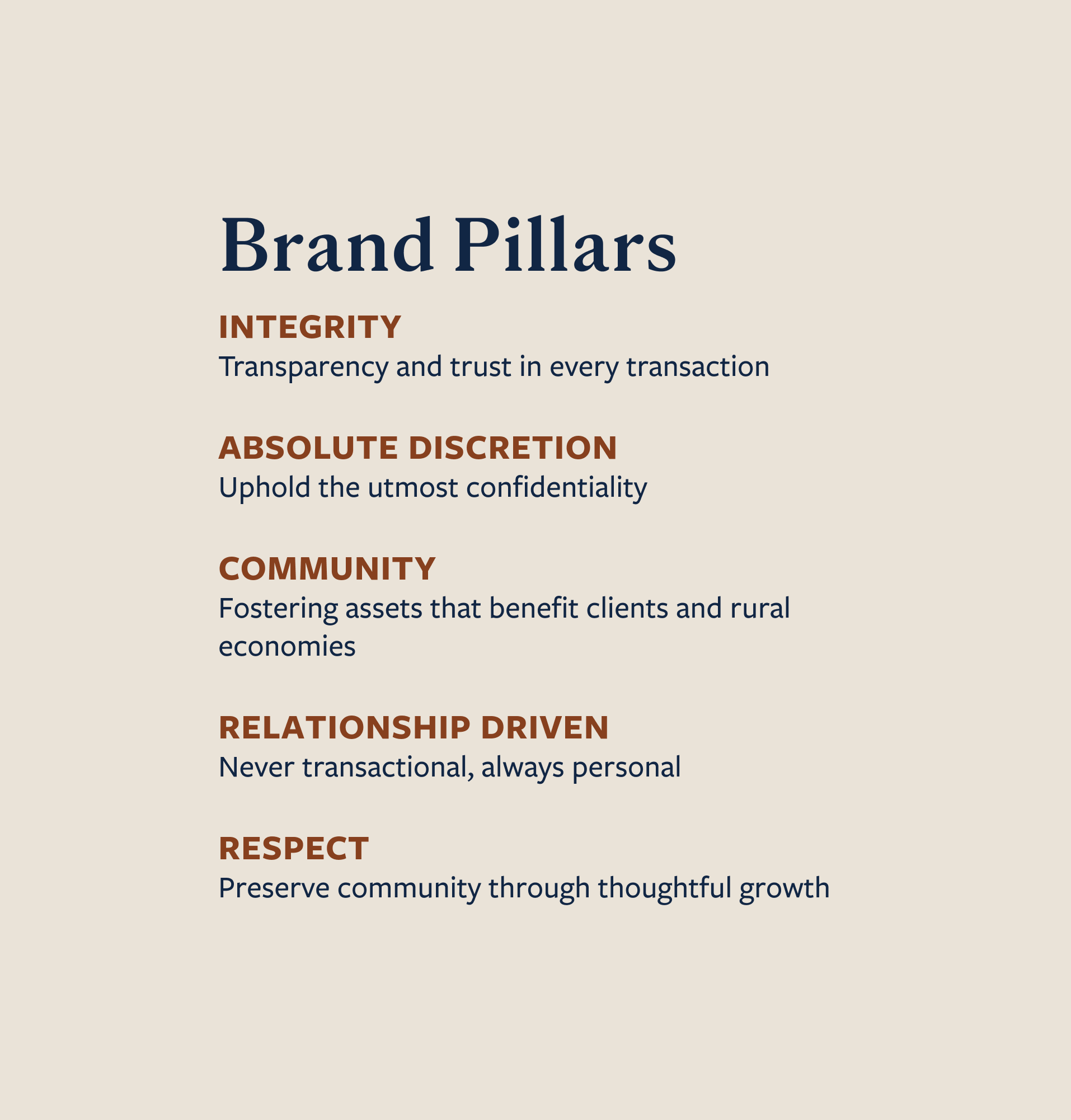


Town & Country Foods is a beloved organization, and rebranding it was not taken lightly. Every store has its unique charm. Through surveys, it became clear that most customers were not aware that they are 100% employee owned.
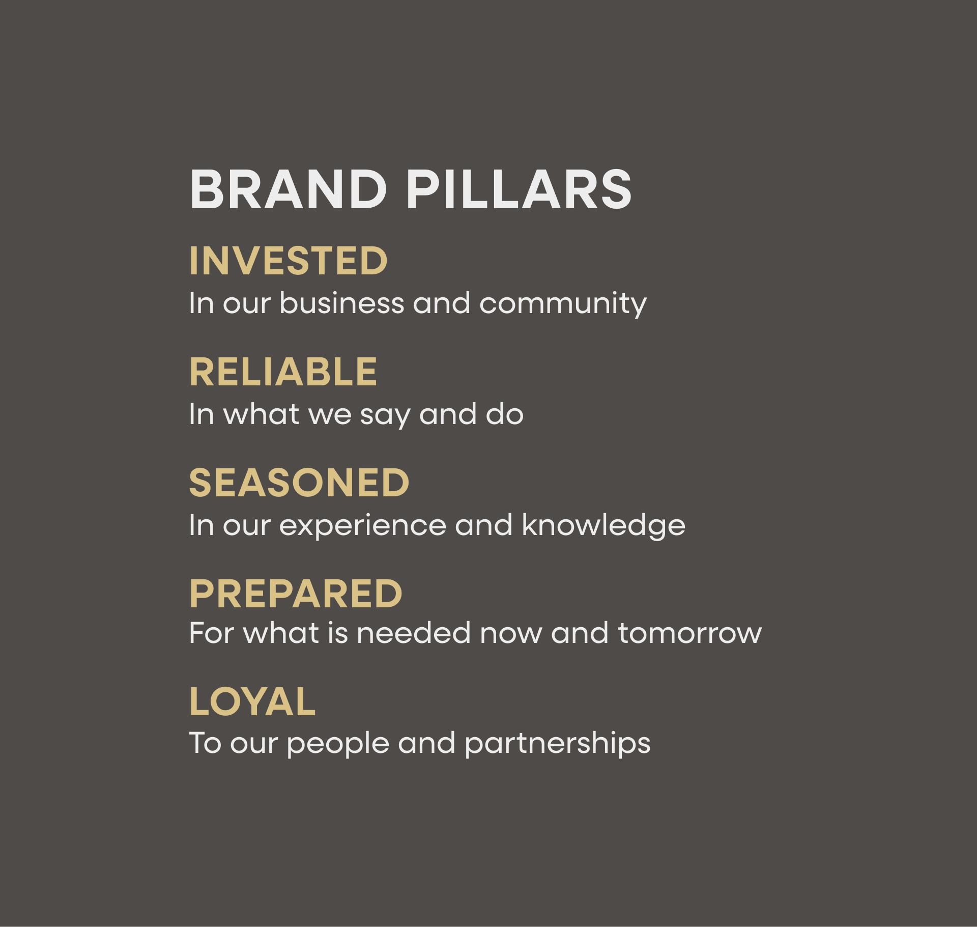
Evolve the brand to better represent their values and communicate employee ownership all while celebrating T&C’s long heritage and maintaining the individualized charm in each location. Create tools that will help the company scale in the future.
From the strategy to the logo, every part of T&C’s brand was carefully crafted to pay homage to the history of the company while maintaining an honest, no-fuss feel.


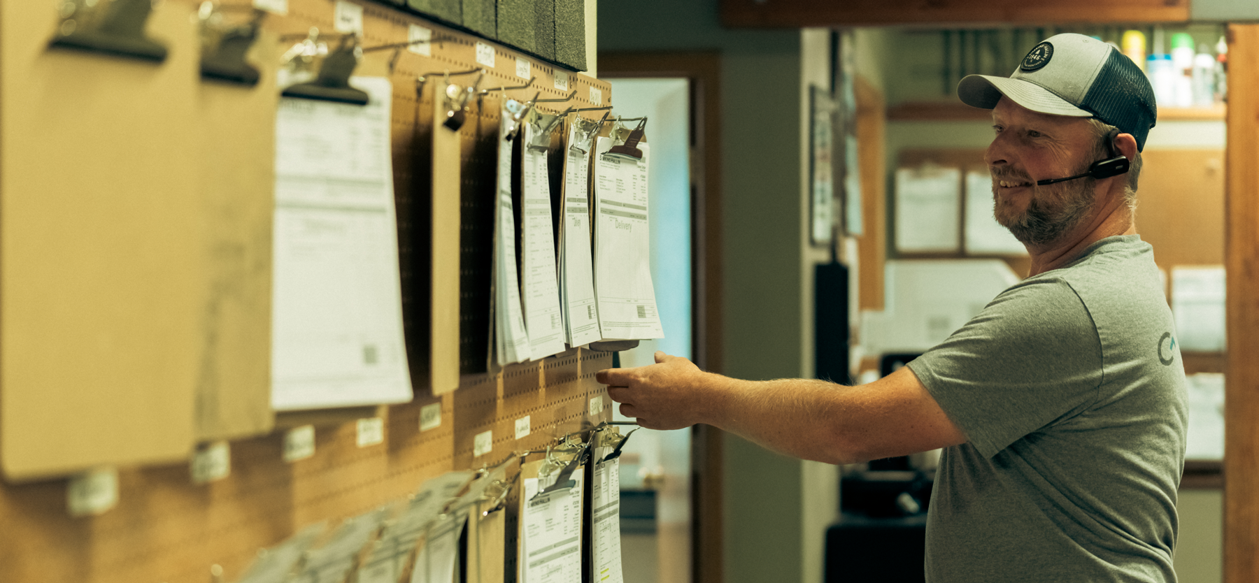


Hardy facilitated a multi-phase brand launch that considered everything from employee-owner training to the ‘why pay more’ signs. The first step was to train all leadership staff on the new strategy. By providing consistent language, their leadership team has the tools to communicate the brand to all employee-owners and customers, utilize it in hiring, and lean on it for business decisions. To support the high level of service T&C is known for, we created talking points, rack cards, and tools that empower employee-owners to answer questions customers may have.


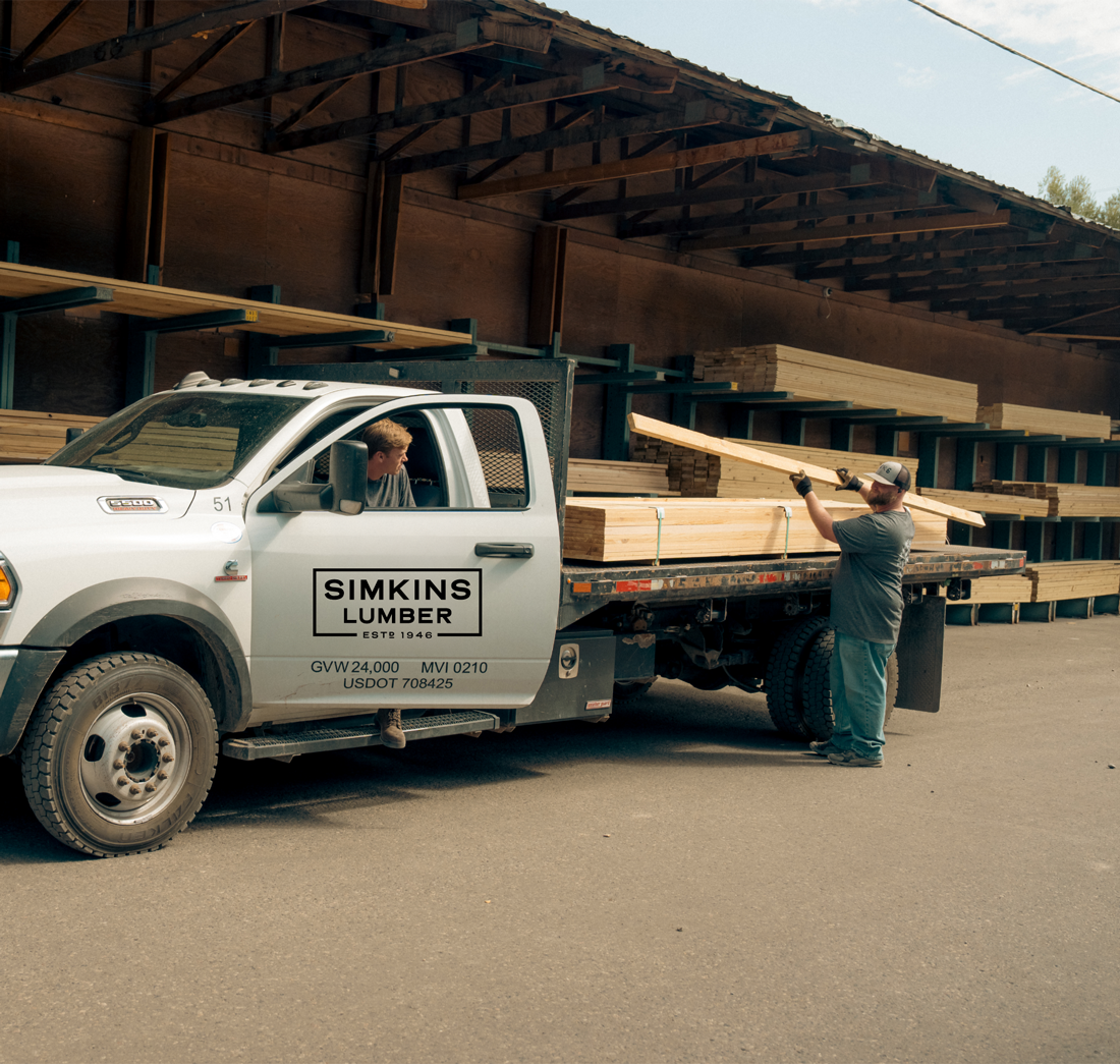
The Bridger Brewing team wanted to be prepared to can and distribute its beer after opening its second location. AMS partnered with Bridger Brewing for packaging design concepts. The first step in the packaging process involved a strategy session in which the unique identity of each beer was explored and dissected. Several concepts were then sketched out. Once a concept was selected for each beer, custom illustrations were created for cans and boxes. The result is a full lineup of beers, each with its own design that is unique while still clearly a member of the Bridger Brewing brand.


The longest line you’ll see comes from a reel.
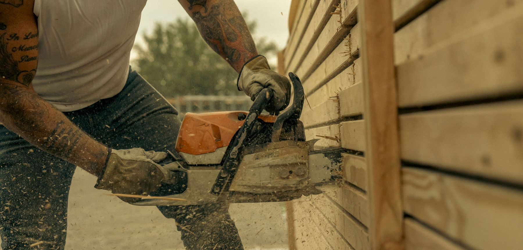
Big ideas are best discussed on the back of a pickup.


We have worked with Hardy Brands for the last two years and we are very impressed with their work. The communication, knowledge, and dedication they put in for our company was second to none. We didn't really know what to expect with a rebranding and the crew helped us through every stage with fine tuning our thoughts and ideas for the company.