Merry Piglets is where it all started for the Blue Collar Restaurant Group, which now runs 10 restaurants between Bozeman and Jackson Hole. Joe and Denise Rice bought the long-standing Jackson restaurant when they moved there in 1989. Since then, Merry Piglets has become the go-to place for a good time, great Tex Mex and a killer margarita.
Photo Credit: 40 Watt Photo
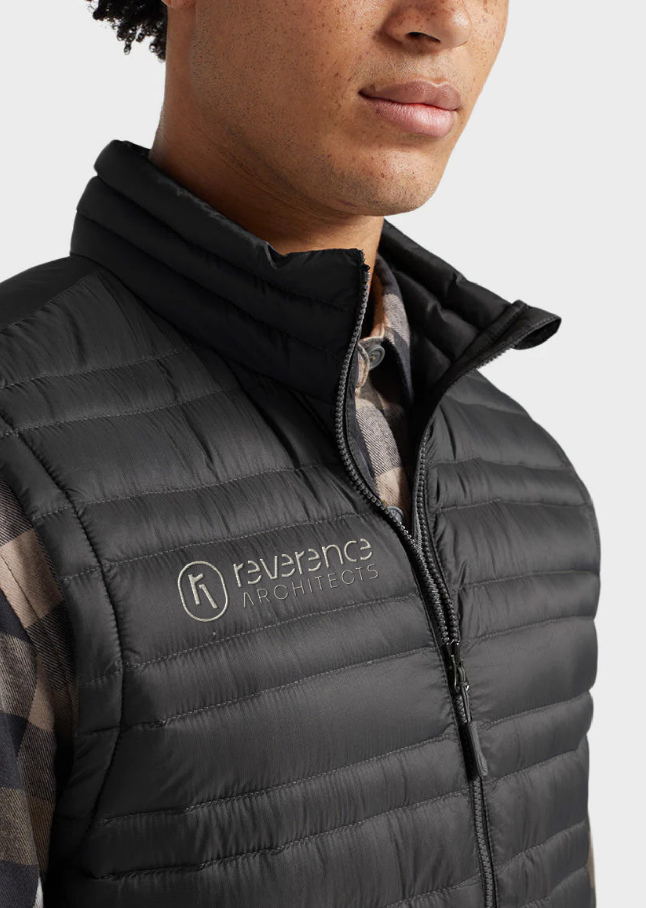
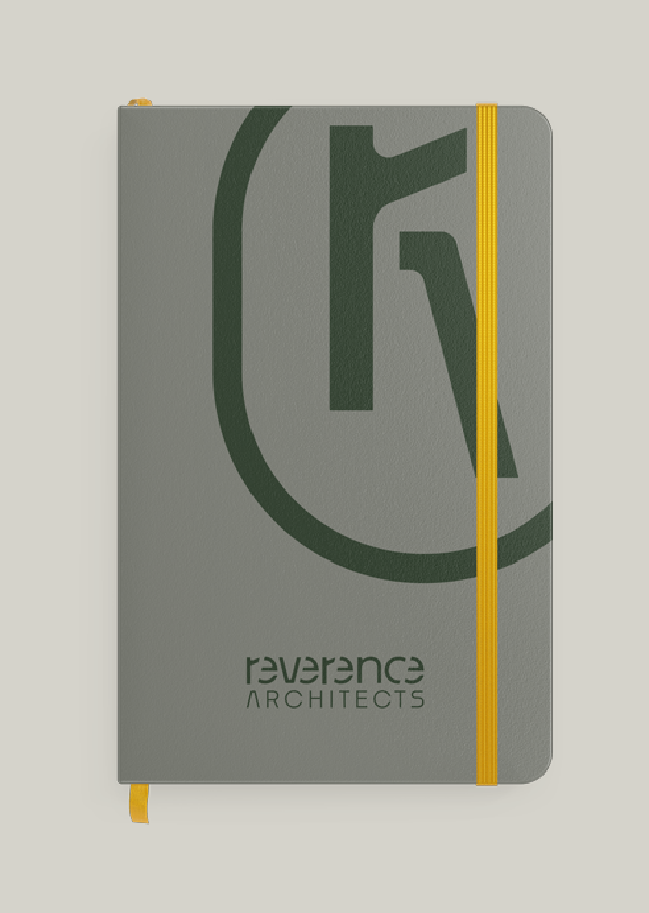
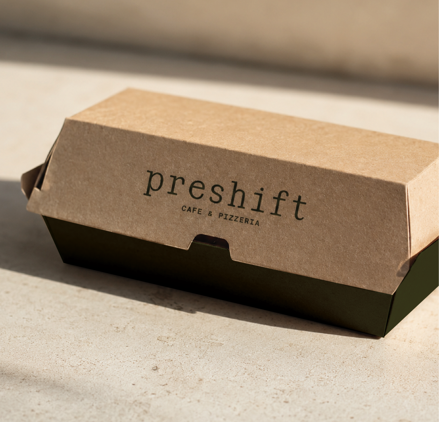
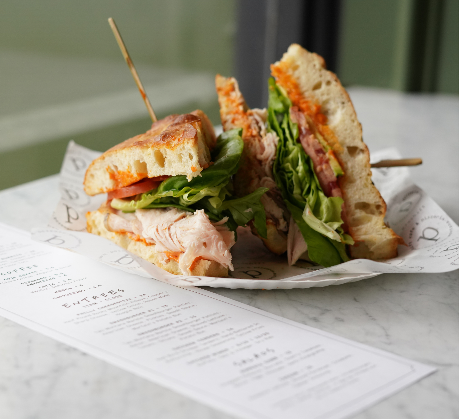
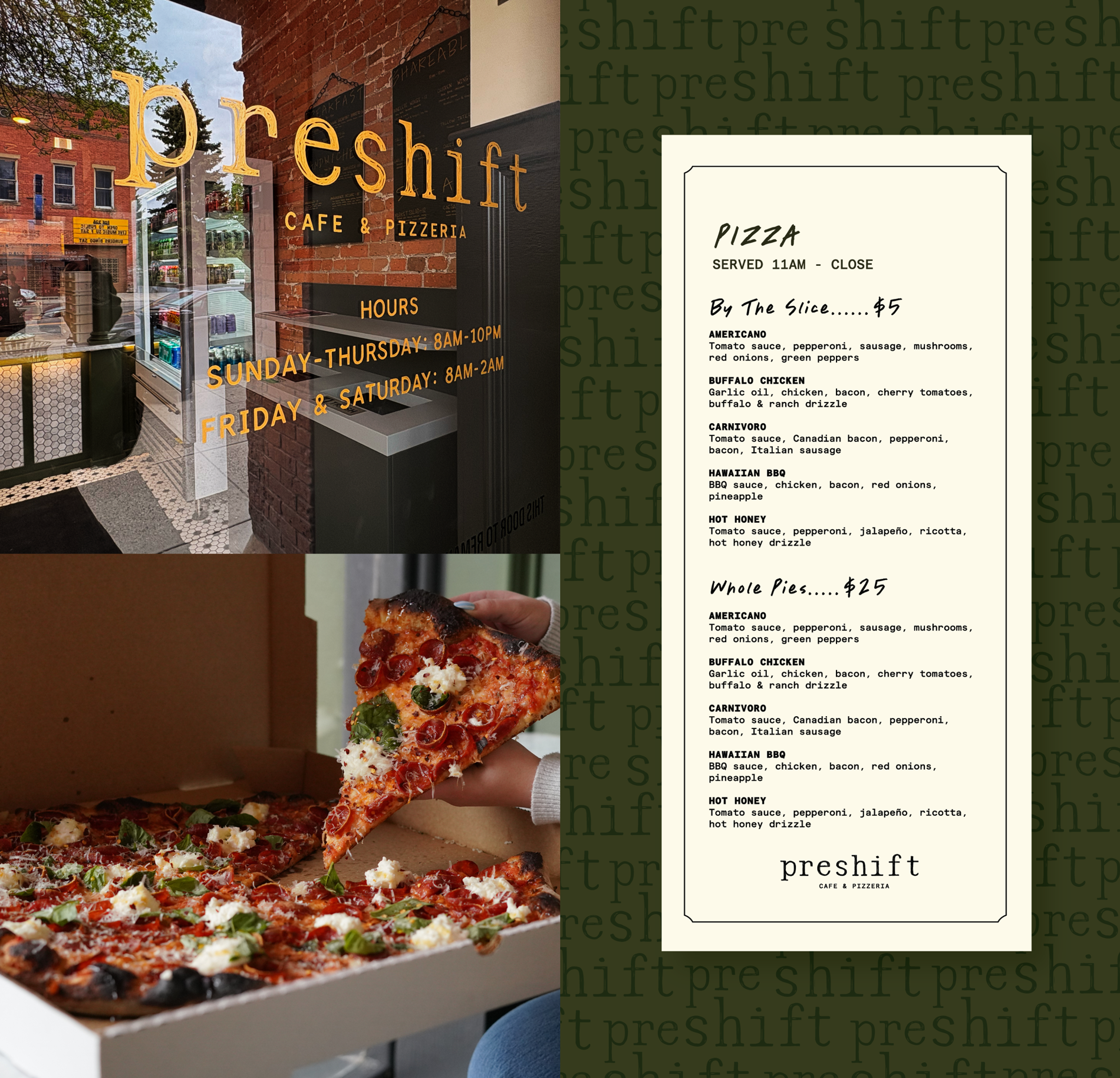
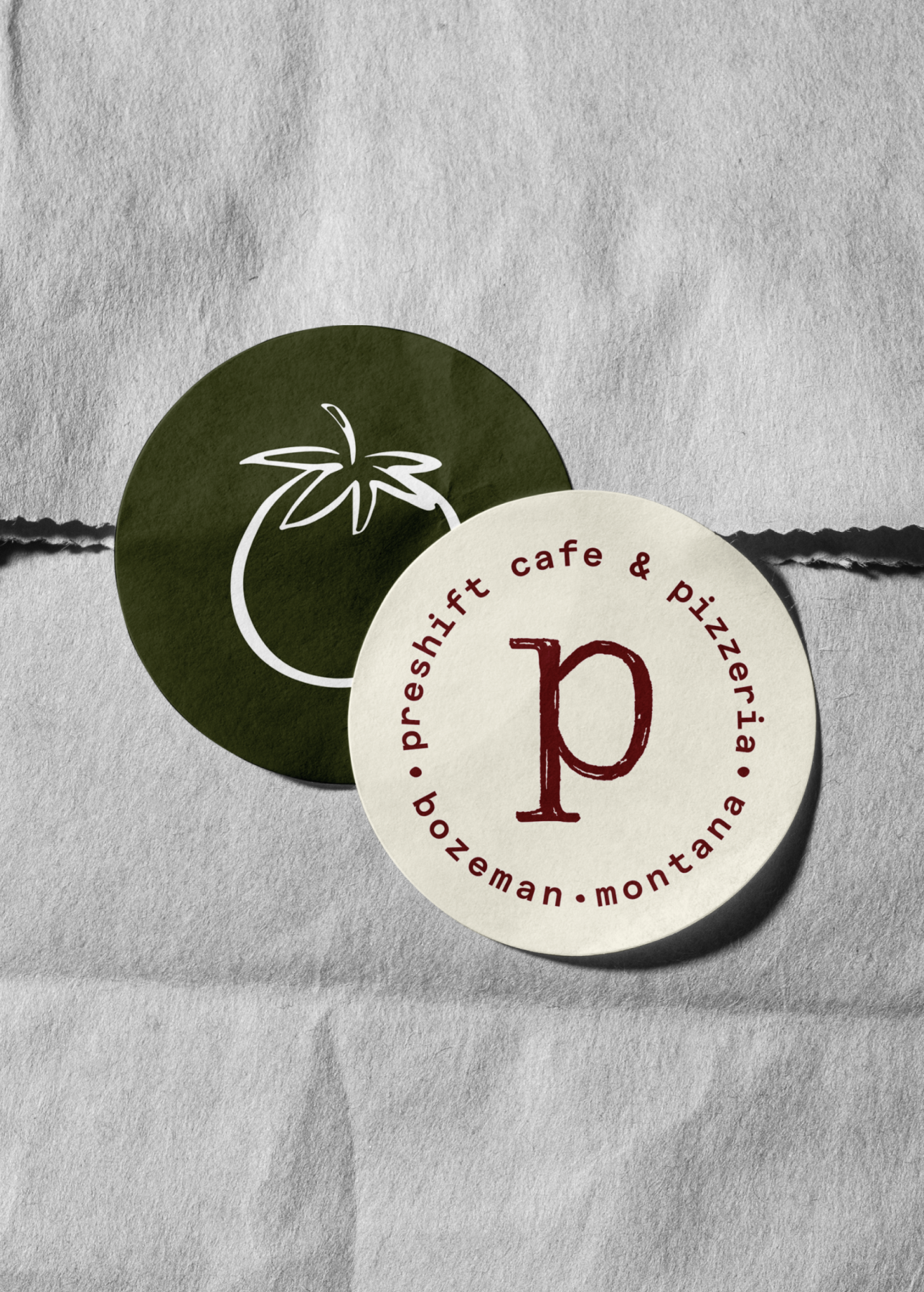
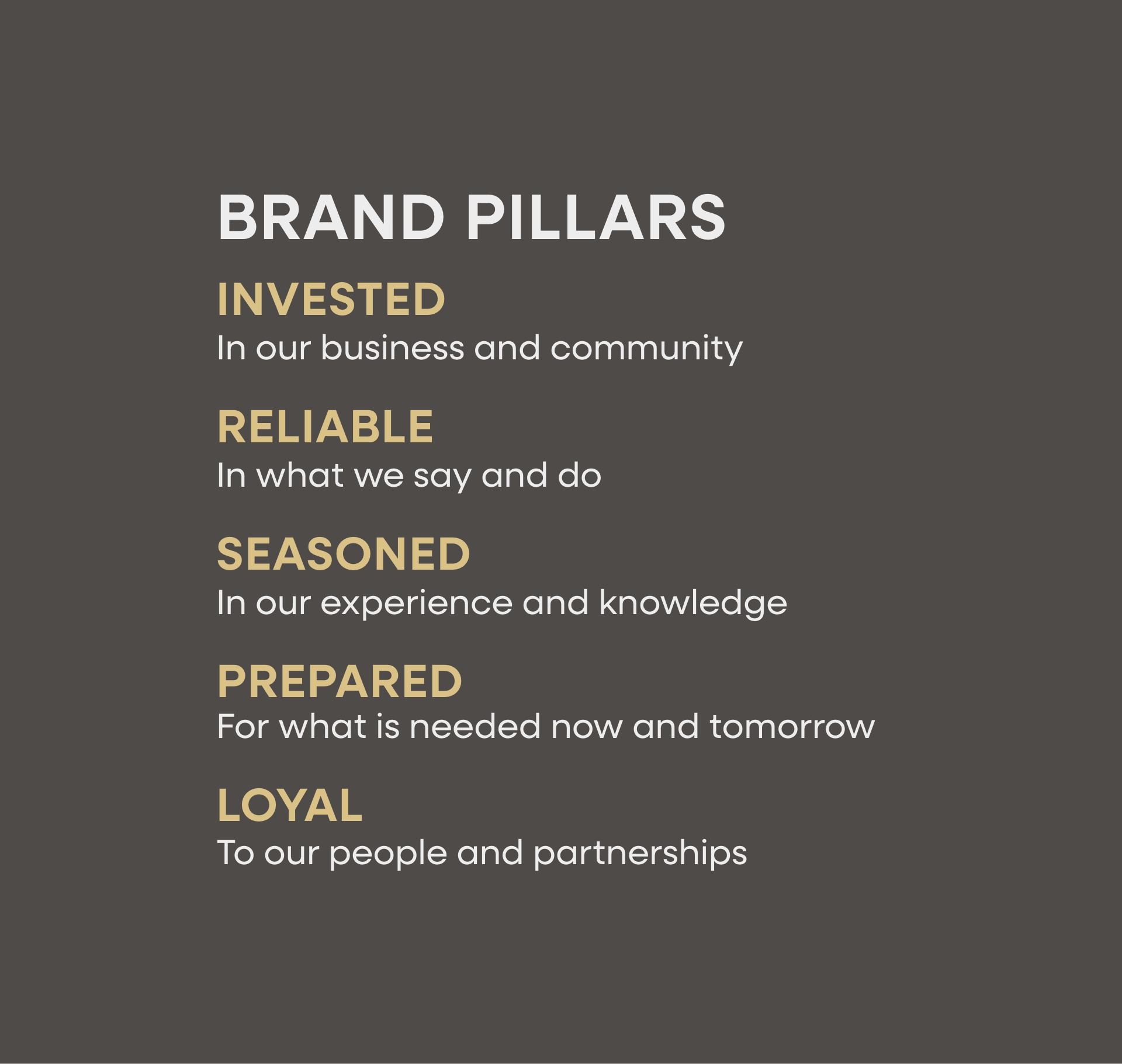
Brand strategy
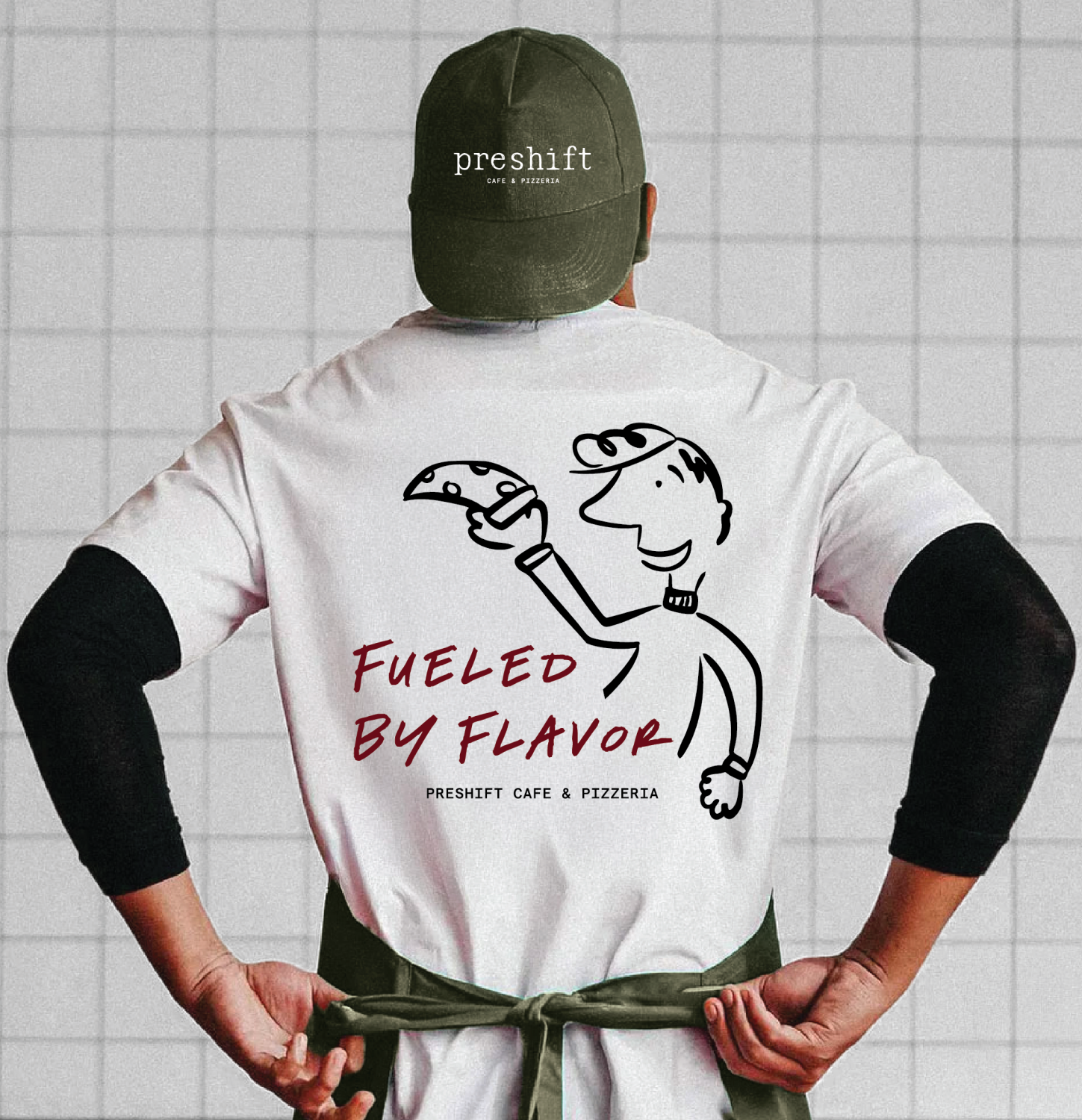
Brand identity
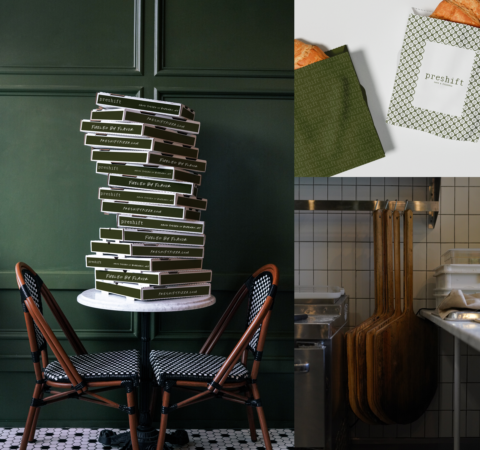
Packaging
Jackson, Wyoming
A brand strategy that both aligns with the Blue Collar Restaurant Group parent brand and defines and expresses the uniqueness of Merry Piglets. A refined and extended brand identity. Craft salsa packaging.


In order to fully evolve the Merry Piglets brand, we needed to understand its essence and the things that made it special. For example, its original logo was an illustration of two dancing pigs. We knew we needed to keep the pigs but first had to figure out the right way to do it.
Maintain the funkiness of the Merry Piglets brand, while giving it a much-needed update and making it approachable to people who are experiencing it for the first time. Express the brand through packaging for its signature salsa.
By embracing the Tex Mex language and leaning into current expressions popular in places with vibrant Tex Mex scenes, like Austin, Texas, we crafted an identity that felt true to Merry Piglets. We used bright colors, crafted custom typefaces and used texture to honor the history and embrace the future.


Hardy facilitated a multi-phase brand launch that considered everything from employee-owner training to the ‘why pay more’ signs. The first step was to train all leadership staff on the new strategy. By providing consistent language, their leadership team has the tools to communicate the brand to all employee-owners and customers, utilize it in hiring, and lean on it for business decisions. To support the high level of service T&C is known for, we created talking points, rack cards, and tools that empower employee-owners to answer questions customers may have.


The Bridger Brewing team wanted to be prepared to can and distribute its beer after opening its second location. AMS partnered with Bridger Brewing for packaging design concepts. The first step in the packaging process involved a strategy session in which the unique identity of each beer was explored and dissected. Several concepts were then sketched out. Once a concept was selected for each beer, custom illustrations were created for cans and boxes. The result is a full lineup of beers, each with its own design that is unique while still clearly a member of the Bridger Brewing brand.


The longest line you’ll see comes from a reel.
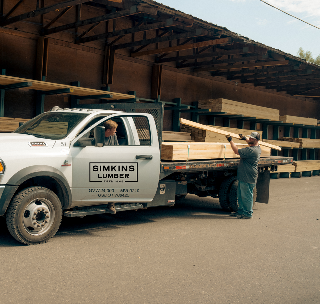
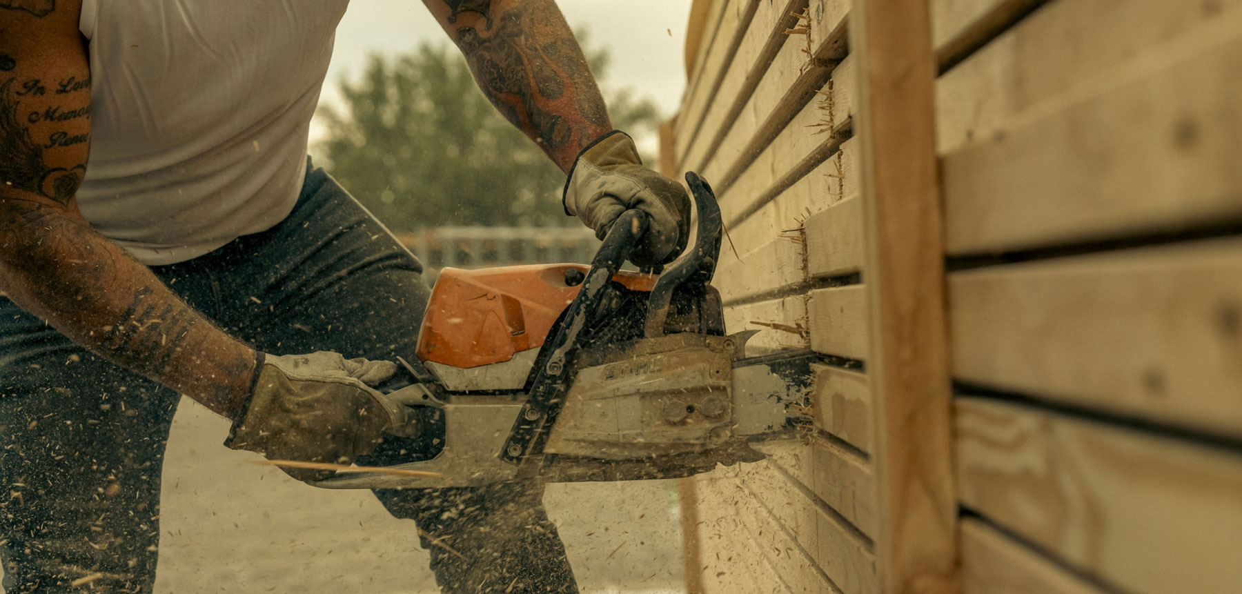
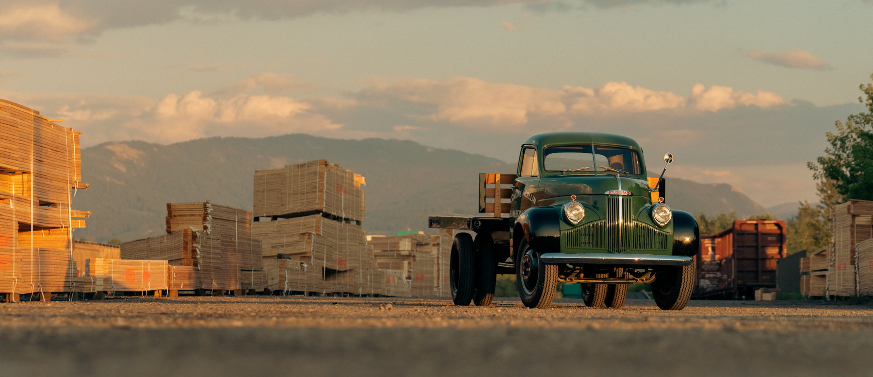
Big ideas are best discussed on the back of a pickup.