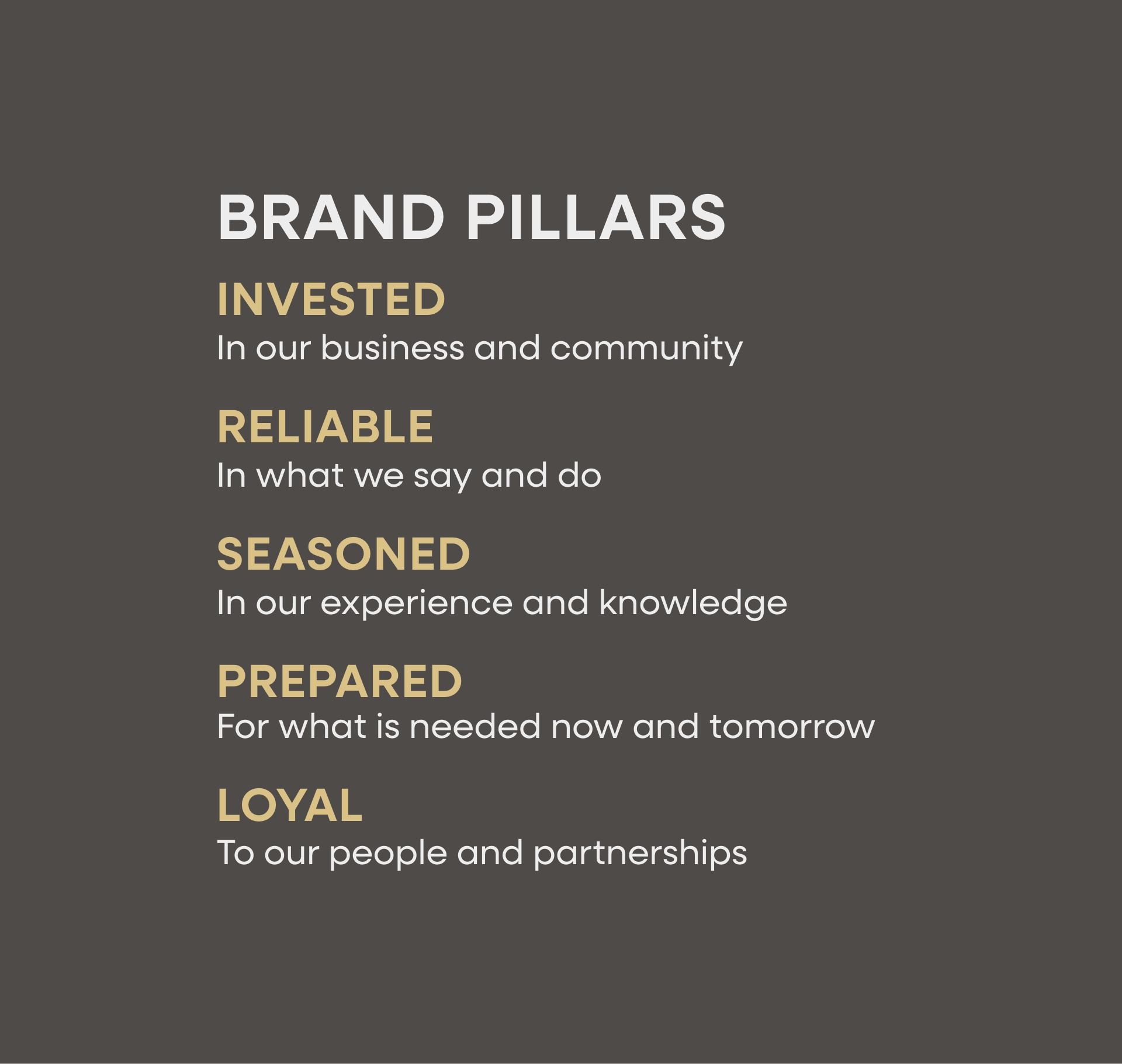
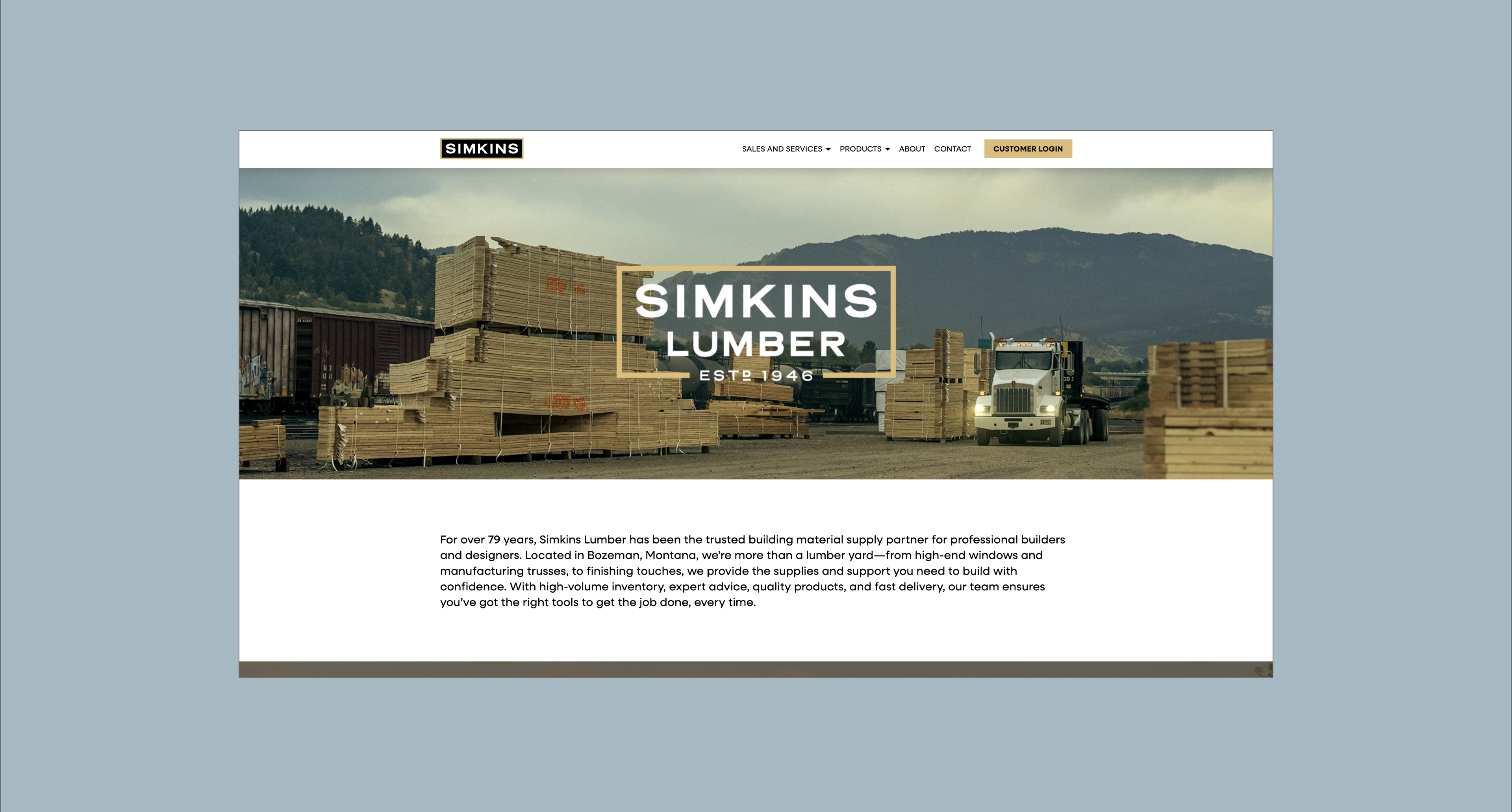
Based in Bozeman, Montana, Premier Systems develops, installs and services interior systems, with a specialization in HVAC, plumbing, and electrical. Their team came to us to develop a brand strategy and define a brand architecture that would help guide the brand as they grow.
When we first started our brand strategy process, in the survey phase, it was clear that customers were not understanding the breadth of the services Premier Systems could provide. It was also evident that their customers valued how effortless it was to work with Premier Systems. By crafting a brand strategy that included changing its name from “Premier Air” to “Premier Systems” and developing a brand identity, Premier Systems now has the tools to provide consistent, effortless experiences as they grow.
Brand Strategy
Brand Identity
Logo Design
Marketing Research
Customer and Employee Surveys
Graphic Design Support
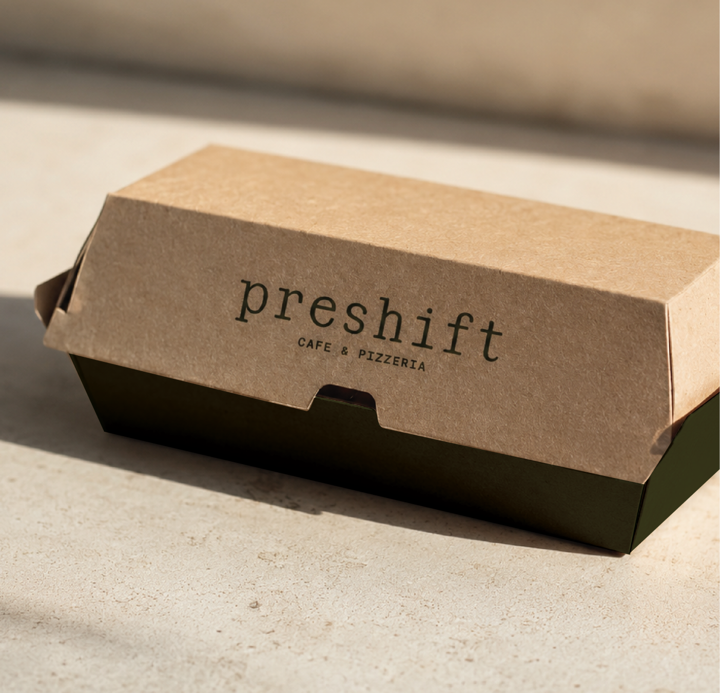
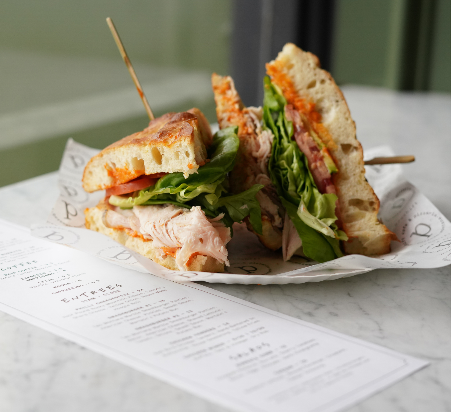
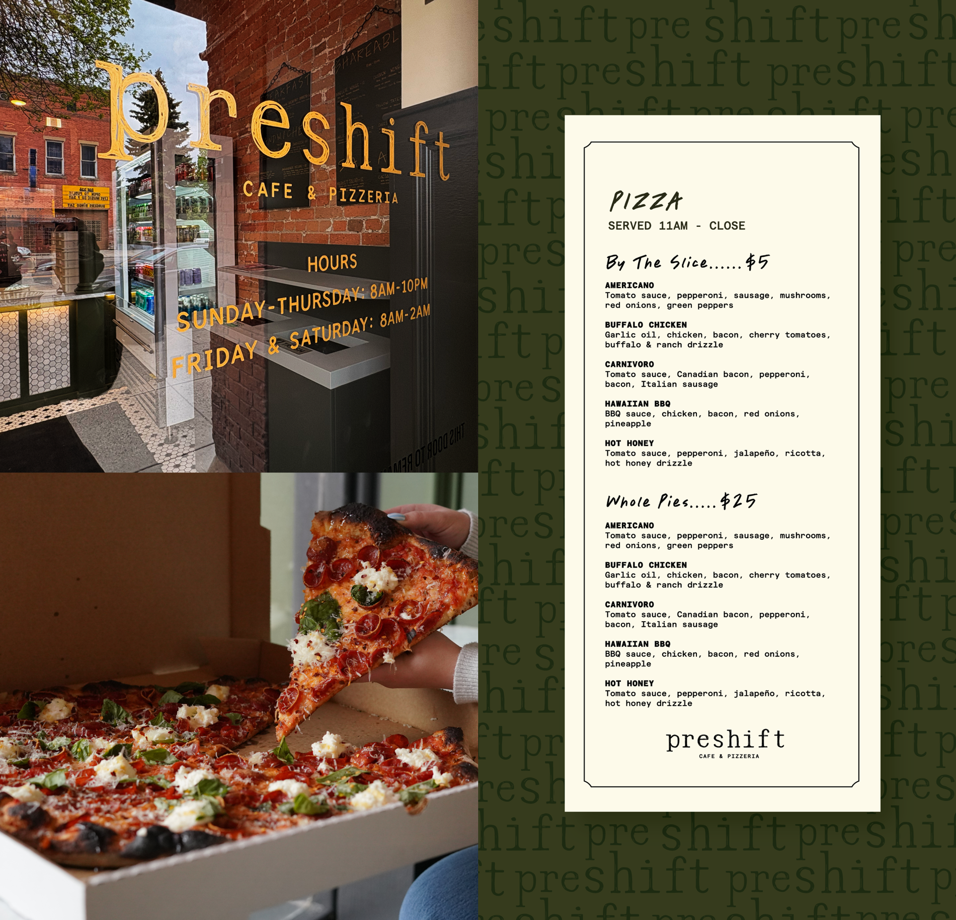
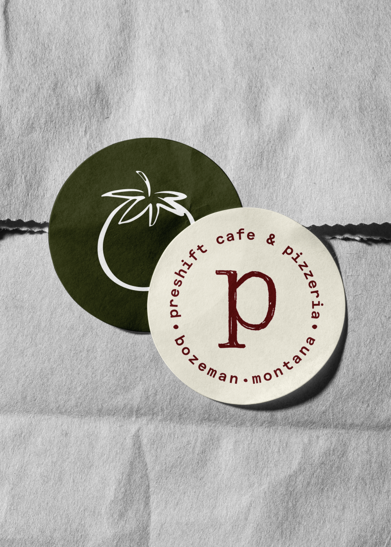
Bozeman, Montana
An evolved brand strategy and identity for Premier Systems that enforces effortless experiences.


Stand out in a crowded and competitive building space where many competitors are also focusing on customer service.
Create a brand that fully communicates the dedication to providing the most effortless experiences in the building industry.
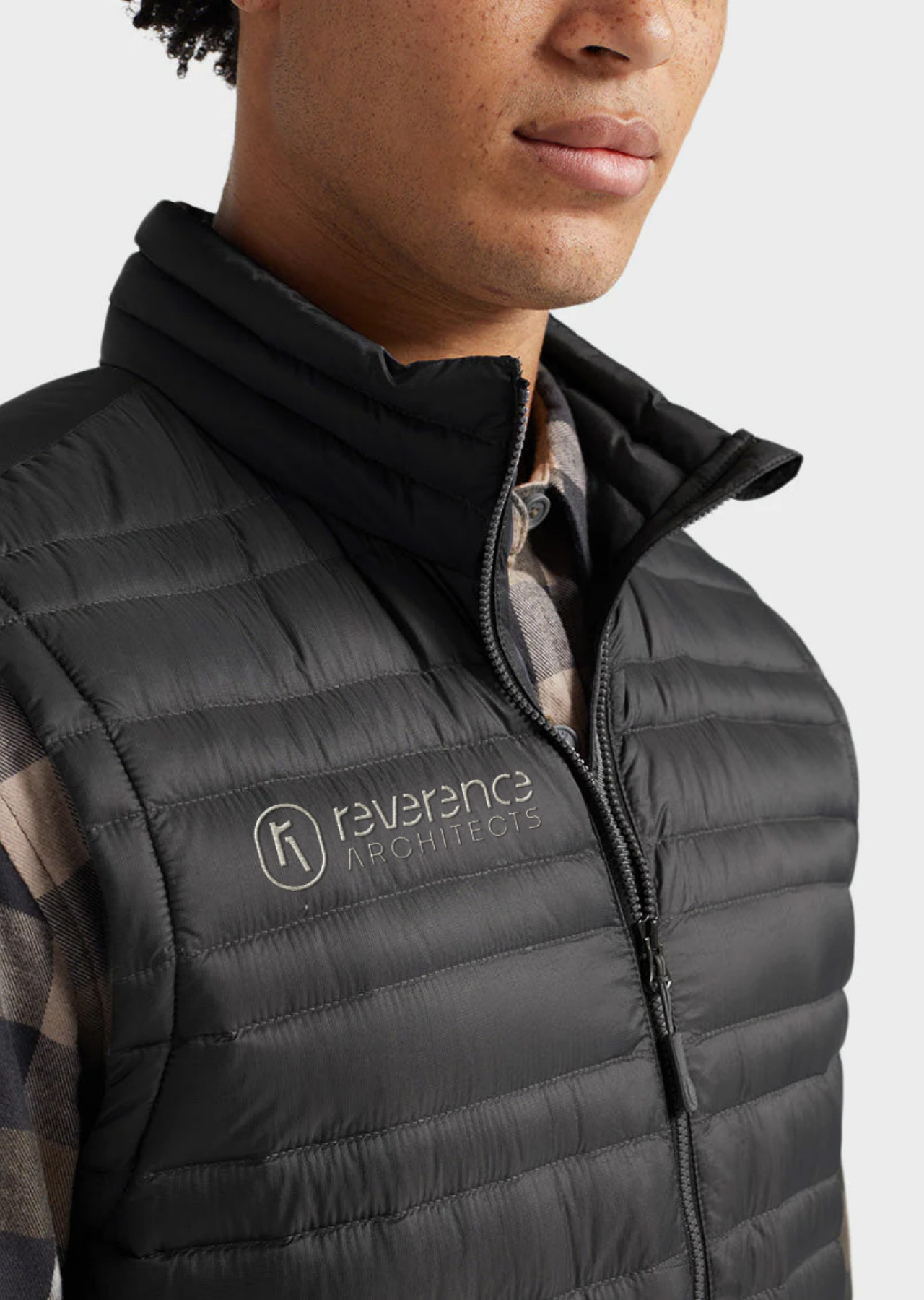
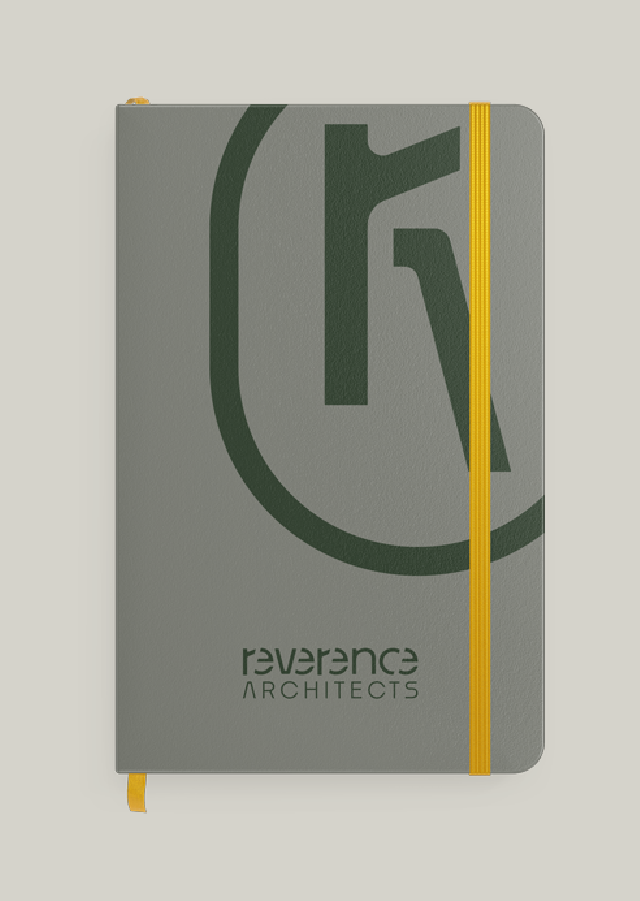
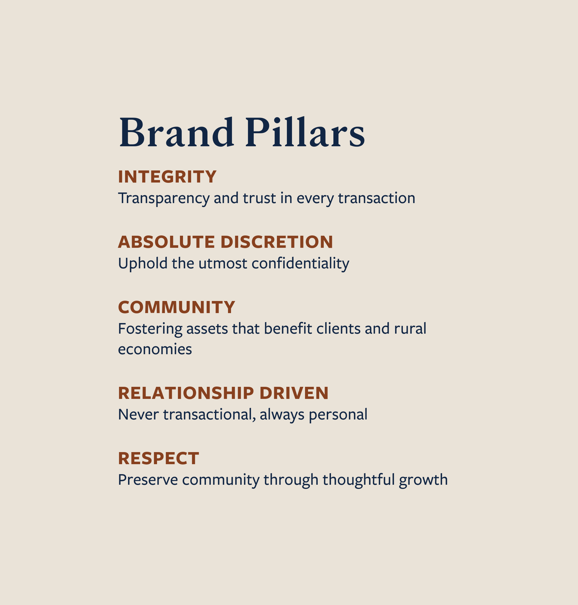
Position their brand as one that "gives a shit" through their different brand assets. Their primary logo draws physical inspiration from the cupping of hands, suggesting that the customer is always handled, while fingers and palms close around a star eluding to excellence in service. We used high-contrast colors paired with friendly photography that brings the Premier Systems brand to life.


Hardy facilitated a multi-phase brand launch that considered everything from employee-owner training to the ‘why pay more’ signs. The first step was to train all leadership staff on the new strategy. By providing consistent language, their leadership team has the tools to communicate the brand to all employee-owners and customers, utilize it in hiring, and lean on it for business decisions. To support the high level of service T&C is known for, we created talking points, rack cards, and tools that empower employee-owners to answer questions customers may have.


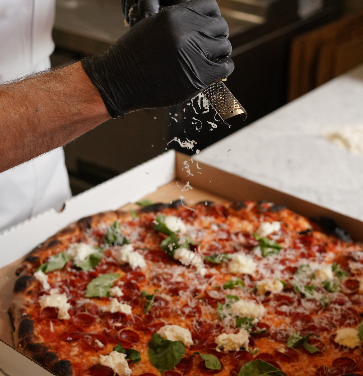
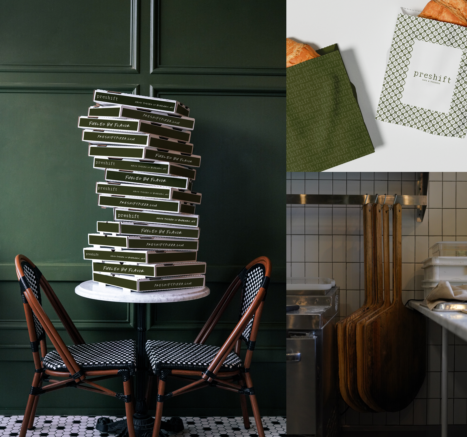
The Bridger Brewing team wanted to be prepared to can and distribute its beer after opening its second location. AMS partnered with Bridger Brewing for packaging design concepts. The first step in the packaging process involved a strategy session in which the unique identity of each beer was explored and dissected. Several concepts were then sketched out. Once a concept was selected for each beer, custom illustrations were created for cans and boxes. The result is a full lineup of beers, each with its own design that is unique while still clearly a member of the Bridger Brewing brand.


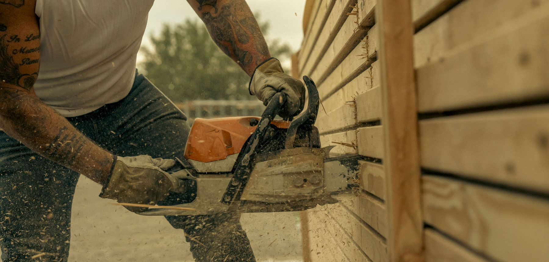
The longest line you’ll see comes from a reel.
Big ideas are best discussed on the back of a pickup.


Working with Hardy Brands was an amazing, crazy, hard, emotional and challenging experience... IN ALL THE BEST WAYS! If you have ever gone through a rebrand, you know that you are giving up a piece of your baby and that can be a very emotional experience. The team at Hardy helped us to navigate the challenges and hurdles that come with a rebrand. We often left meetings exhausted and emotionally drained, but in the end, we ended up with a new brand that we absolutely love as well as a solid plan for execution and rollout. If you are rebranding or creating a new brand, I would HIGHLY recommend working with the Hardy team to take your innermost thoughts and ideas and vision and turn it into a solid brand.