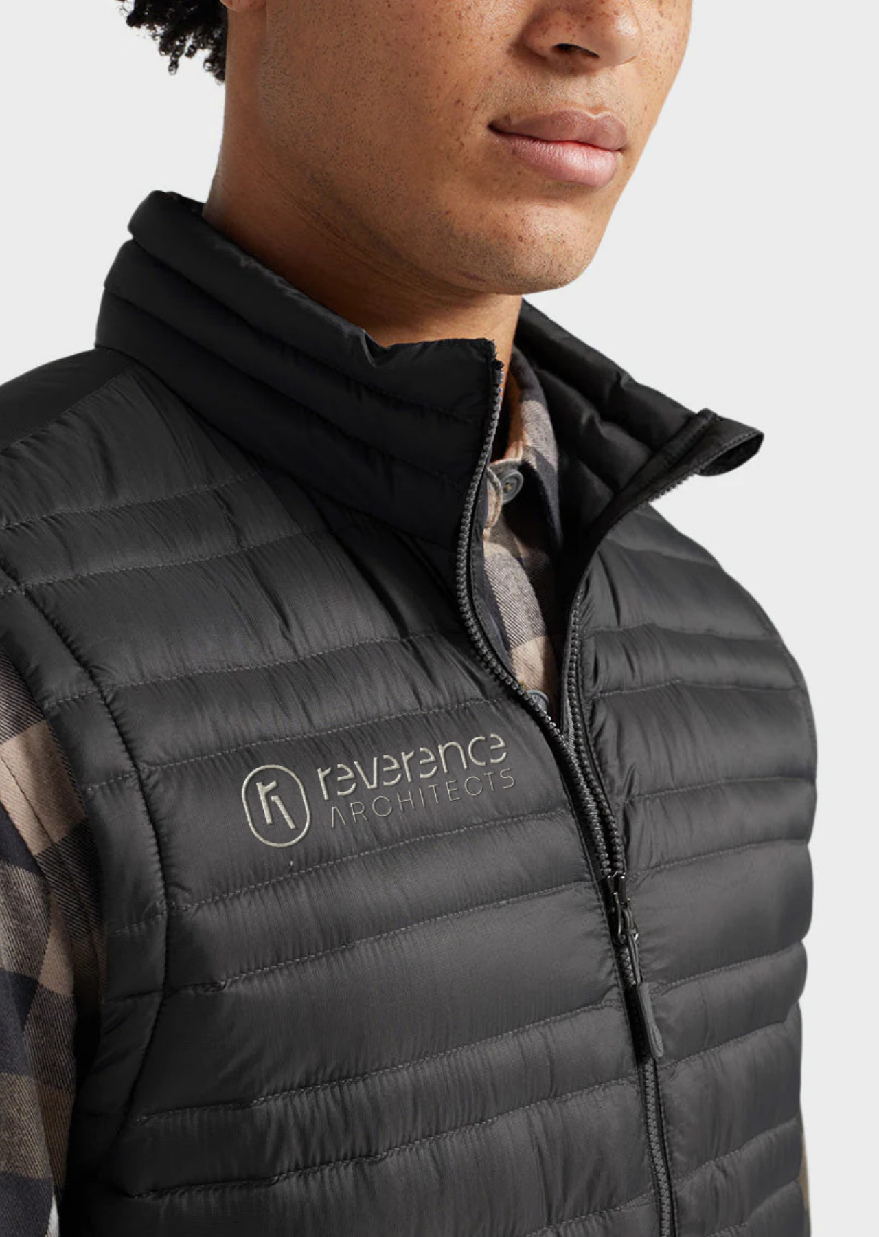
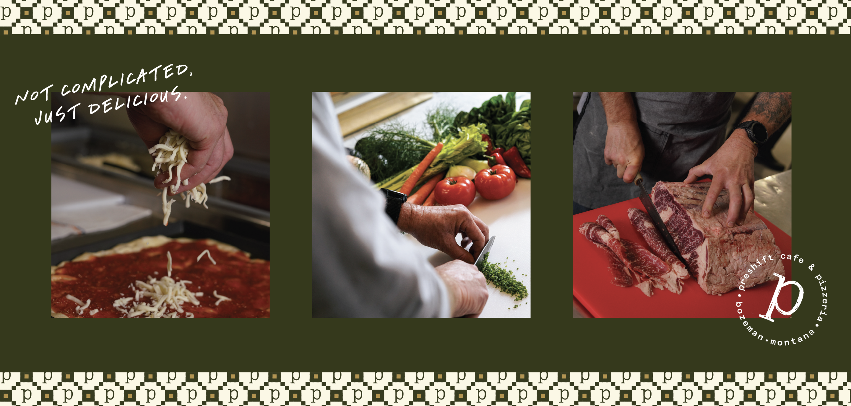
Genuine Ice Cream crafts rich, creamy ice cream that transforms a regular day into a delightful one. As an active member of the Bozeman community, Genuine Ice Cream goes beyond just making ice cream by being a 2% for Conservation company. They donate time and money to organizations they believe in.
When we started working with Genuine Ice Cream, they were up against a customer connection issue. Originally, their first location was in front of the Lark Hotel in Downtown Bozeman in a silver Spartan trailer, but then they moved into a brick-and-mortar location a few blocks away. Through surveys, it was clear that customers were not aware that the same delectable ice cream they once had at the trailer was the same as the brick-and-mortar business down the street.
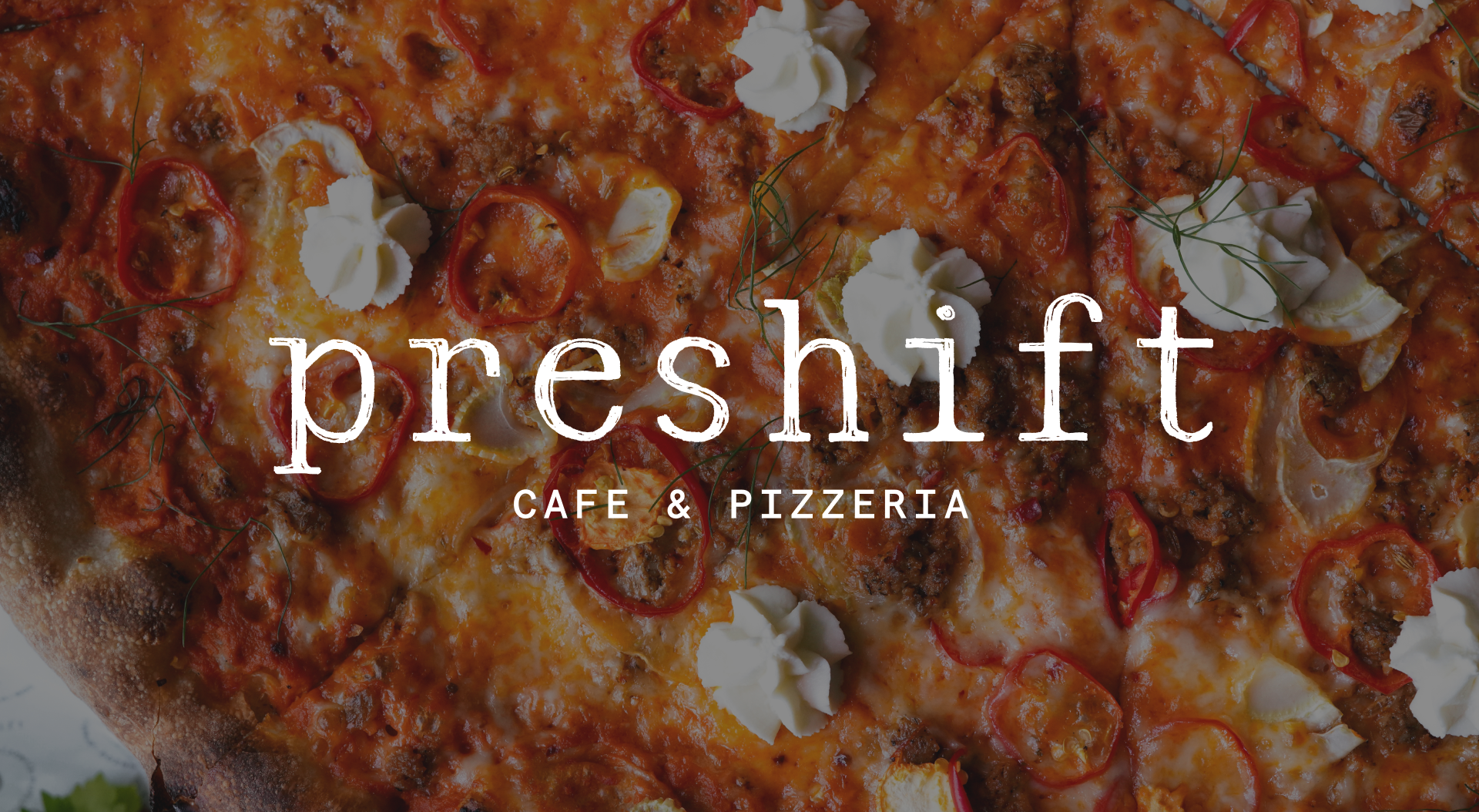
We worked with Genuine Ice Cream to develop a brand strategy and identity that would bring to life the essence of how they started with the exceptional joy that is the essence of summer, ice cream!
After the brand strategy and identity were complete, we moved into packaging. Each of their seven tasty signature flavors got custom illustrations that embody what you can expect from the flavor while referencing aspects of a Montanan summer, like a bear eating raspberries for the Bright Raspberry flavor or a bee in a field of wildflowers for Honey Lavender.
Read on to see how we went about rebranding this community staple to reflect what sets it apart from other ice cream shops.
Brand Strategy
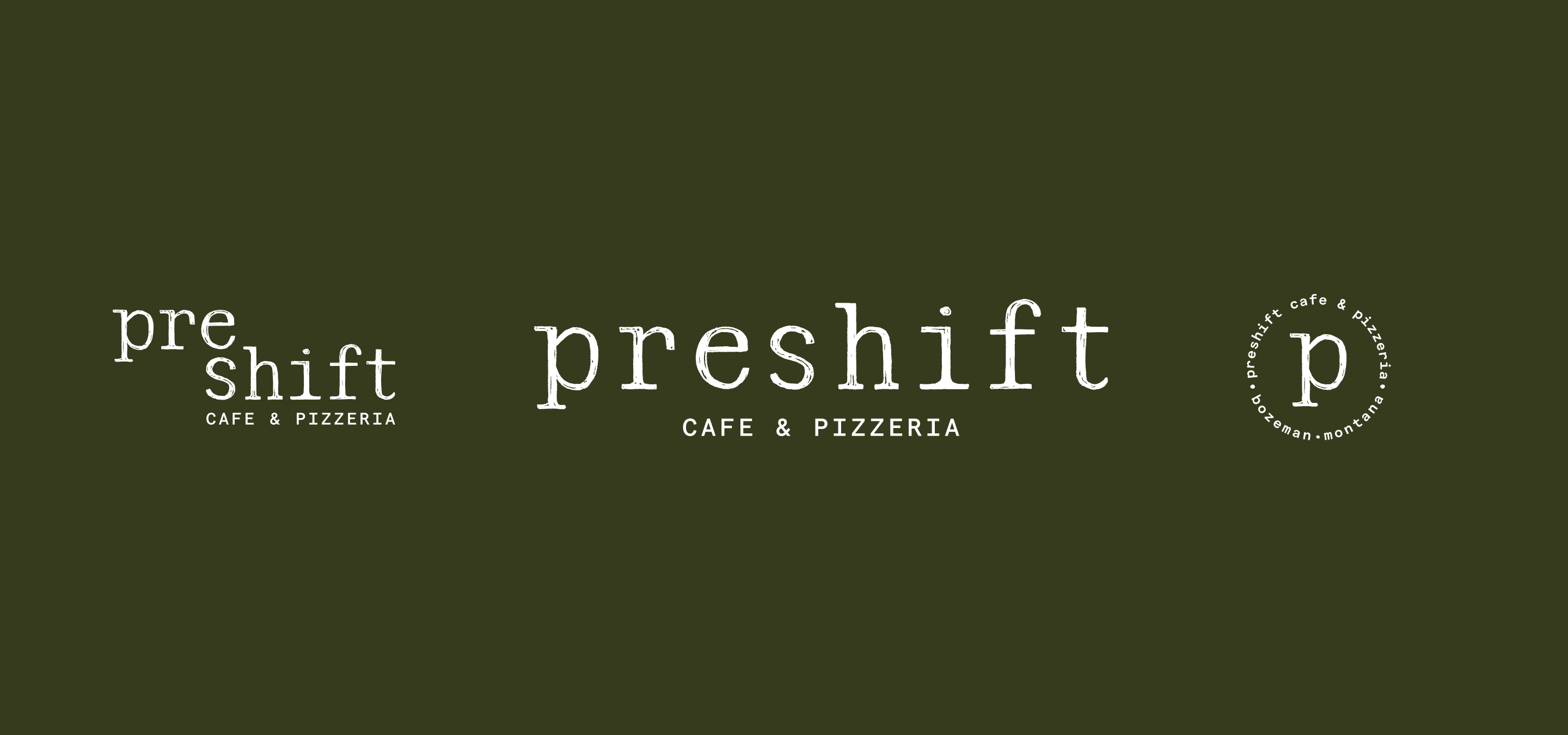
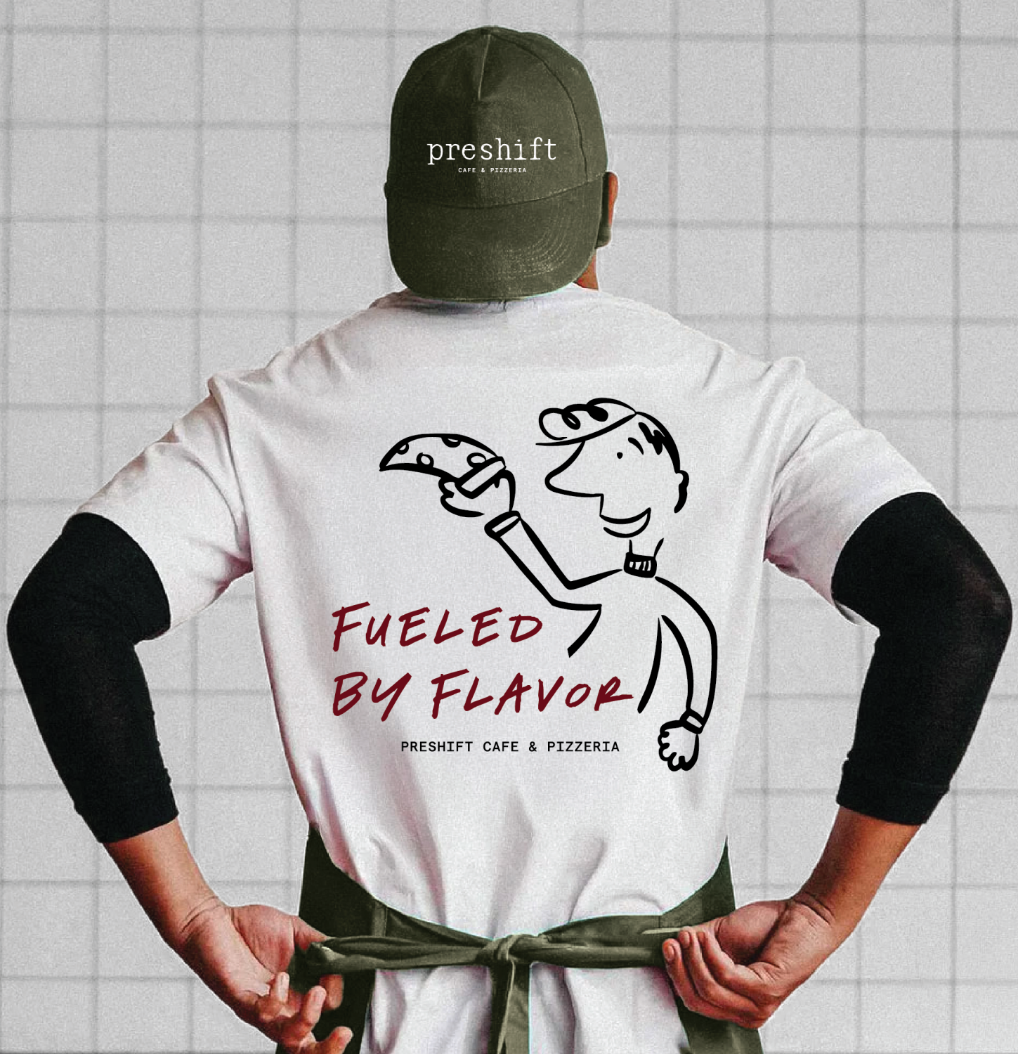
Brand Identity
Packaging
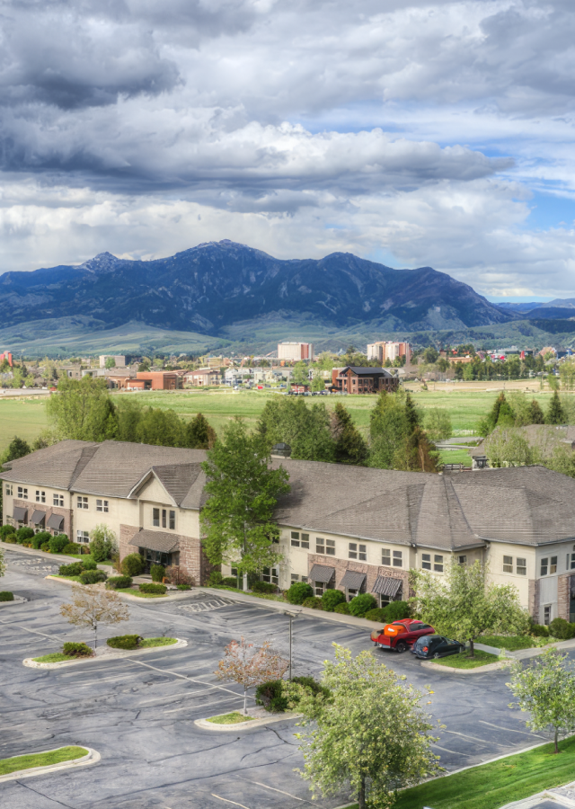
Bozeman, Montana
After the rebrand and packaging were launched in 2022 Q2, there was a 68% increase in retail sales, year over year. Additionally, in January 2023, there was a 114% increase in wholesale sales from the previous January.


Genuine Ice Cream's brand was having trouble staying connected to its followers and community because of the disconnect between the "retro silver trailer" and their old brand.
Develop a brand that reminds people that the best things in life are simple and sweet all while connecting the "retro silver trailer" to their new brand identity.
Creating a brand strategy and identity that brings to life the love of their community and the simple joy of sharing ice cream. By utilizing survey data, we leveraged existing brand equity in the colors pink and light blue.


Hardy facilitated a multi-phase brand launch that considered everything from employee-owner training to the ‘why pay more’ signs. The first step was to train all leadership staff on the new strategy. By providing consistent language, their leadership team has the tools to communicate the brand to all employee-owners and customers, utilize it in hiring, and lean on it for business decisions. To support the high level of service T&C is known for, we created talking points, rack cards, and tools that empower employee-owners to answer questions customers may have.


The Bridger Brewing team wanted to be prepared to can and distribute its beer after opening its second location. AMS partnered with Bridger Brewing for packaging design concepts. The first step in the packaging process involved a strategy session in which the unique identity of each beer was explored and dissected. Several concepts were then sketched out. Once a concept was selected for each beer, custom illustrations were created for cans and boxes. The result is a full lineup of beers, each with its own design that is unique while still clearly a member of the Bridger Brewing brand.


The longest line you’ll see comes from a reel.
Big ideas are best discussed on the back of a pickup.


Working with the Hardy team was and continues to be a rewarding and inspiring experience. Everyone at Hardy is creative, passionate about what they do, and truly skilled. We went to Hardy in search of a new look for our pint packaging but they encouraged us to dig deeper into what it was that our brand really needed. The rebranding process was a thoughtful, professional experience that challenged us to hone in on our values in order to make our brand stand out in a highly competitive industry. I would highly recommend working with the team at Hardy to anyone who wants the best for their branding and marketing needs.