

Committed to patient care, Advanced Medical Imaging and Breast Center serves Southwest Montana by providing the most up-to-date care in a relaxed, patient-first environment. When patients arrive at AMI, they are often anxious and afraid of the possible outcomes of their imaging. To help ease these worries, everything that AMI does is to make patients' experiences less stressful. The Hardy team started working with AMI in Spring 2021, as they were about to open their second location within the Bozeman Health Cottonwood Clinic, making it the ideal time to dig deep and define the brand to ensure consistency.
We started by developing a brand strategy and identity. Informed by patient surveys, the AMI brand highlights their commitment to providing excellent, comprehensive care in a calming environment.
To bring their patient-empowered mindset to life, the Hardy team collaborated with AMI to identify and redesign customer touchpoints. Touchpoints, like branded water bottles and office interior design, were crafted for patient comfort. While informational pieces and the website prioritize clear information, easing anxieties patients may have. Then we created a traditional marketing campaign that communicates their unique ability to see patients both 'Inside and Out.'
Explore more of the AMI rebrand below.
Brand Strategy
Brand Identity
Logo Refresh
Brand Refresh
Brand Execution
Website Design & Development
Bozeman, Montana
Advanced Medical Imaging and Breast Center’s patient-first mindset is now clearly communicated through their brand, patient touchpoints, marketing campaign, and website. This strengthens their existing reputation and resonates with patients who may not be as familiar with their commitment to care.


Advanced Medical Imaging's existing brand was not highlighting their reputation for offering the best, most up-to-date care in a relaxed, compassionate, patient-first environment.
Create a brand that communicates high-quality patient care through a modern approach that unites both locations and evokes ease and comfort in an often-stressful setting.
By evolving their existing branding through an updated logo and messaging, AMI’s brand connects to commitment to advanced care while feeling cutting edge, like their technology. Each additional touchpoint, including traditional marketing tactics and a website, communicates their duty of creating a calm environment where patients feel informed, heard, and put first.




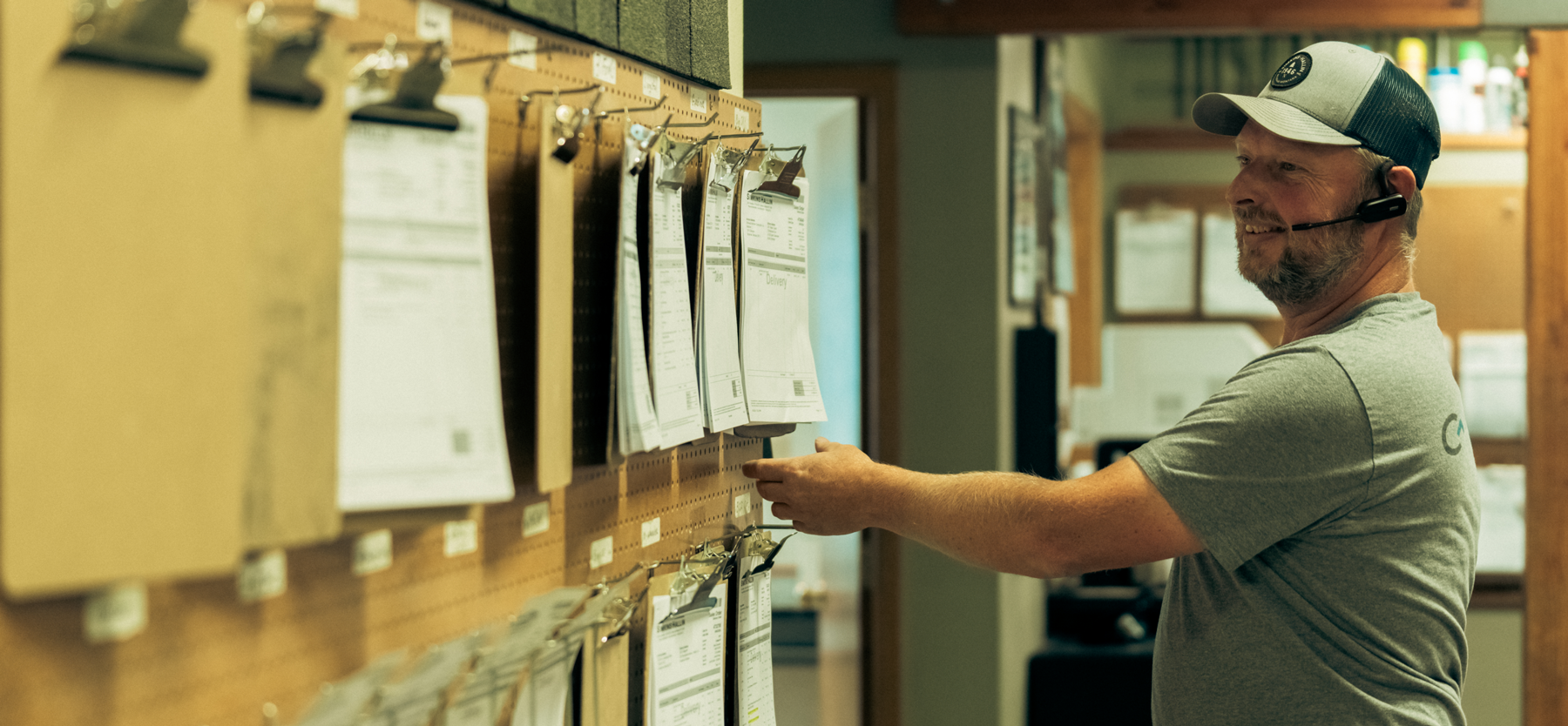


Hardy facilitated a multi-phase brand launch that considered everything from employee-owner training to the ‘why pay more’ signs. The first step was to train all leadership staff on the new strategy. By providing consistent language, their leadership team has the tools to communicate the brand to all employee-owners and customers, utilize it in hiring, and lean on it for business decisions. To support the high level of service T&C is known for, we created talking points, rack cards, and tools that empower employee-owners to answer questions customers may have.


The Bridger Brewing team wanted to be prepared to can and distribute its beer after opening its second location. AMS partnered with Bridger Brewing for packaging design concepts. The first step in the packaging process involved a strategy session in which the unique identity of each beer was explored and dissected. Several concepts were then sketched out. Once a concept was selected for each beer, custom illustrations were created for cans and boxes. The result is a full lineup of beers, each with its own design that is unique while still clearly a member of the Bridger Brewing brand.


The longest line you’ll see comes from a reel.
Big ideas are best discussed on the back of a pickup.


