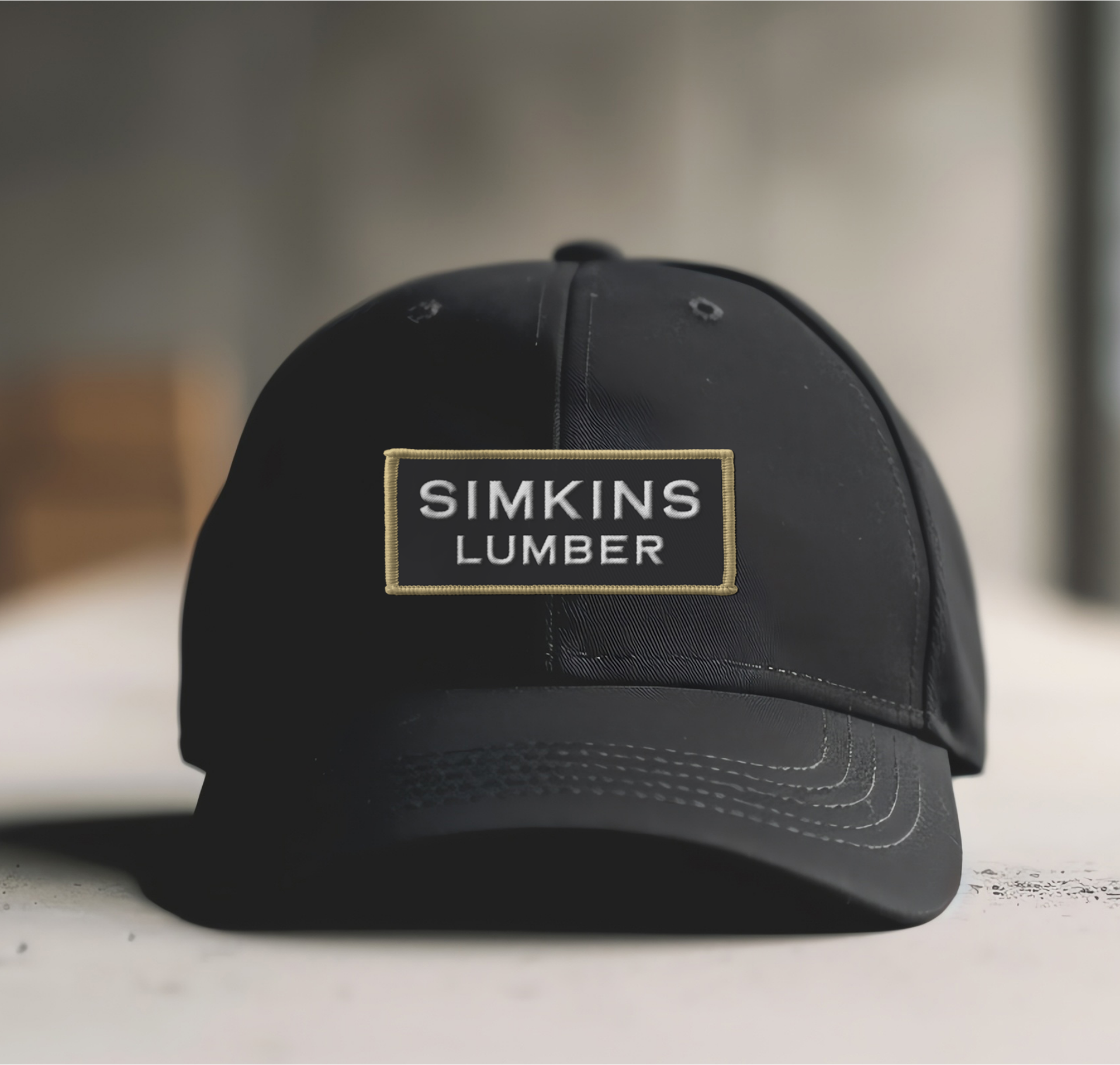
The long-time Bozeman business formerly known as Simply Office Supplies came to Hardy looking to revitalize its dated brand and elevate the business.
Supply Squad offers a user-friendly system for ordering business supplies at a great value and is known for its exceptional service. The business needed a brand that complemented its vibrant, snappy service and brought personality to the company.
Hardy created a look that put the excitement back into office supplies. Now, it’s hard to drive around Bozeman without spotting one of their electric blue delivery vehicles making its rounds. The Supply Squad brand is not only bold and memorable, but also mirrors the uncomplicated, easy-to-use service. Click. Done.
Brand Exploration
Brand Strategy
Brand Positioning
Brand Identity
Naming
Messaging
Uniforms
Business Set
Vehicle Wraps
Web Consultation
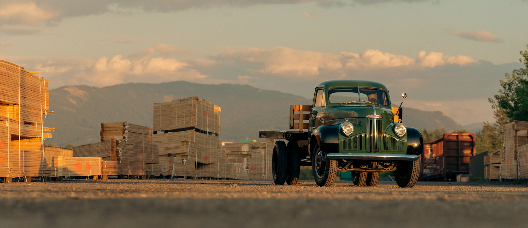
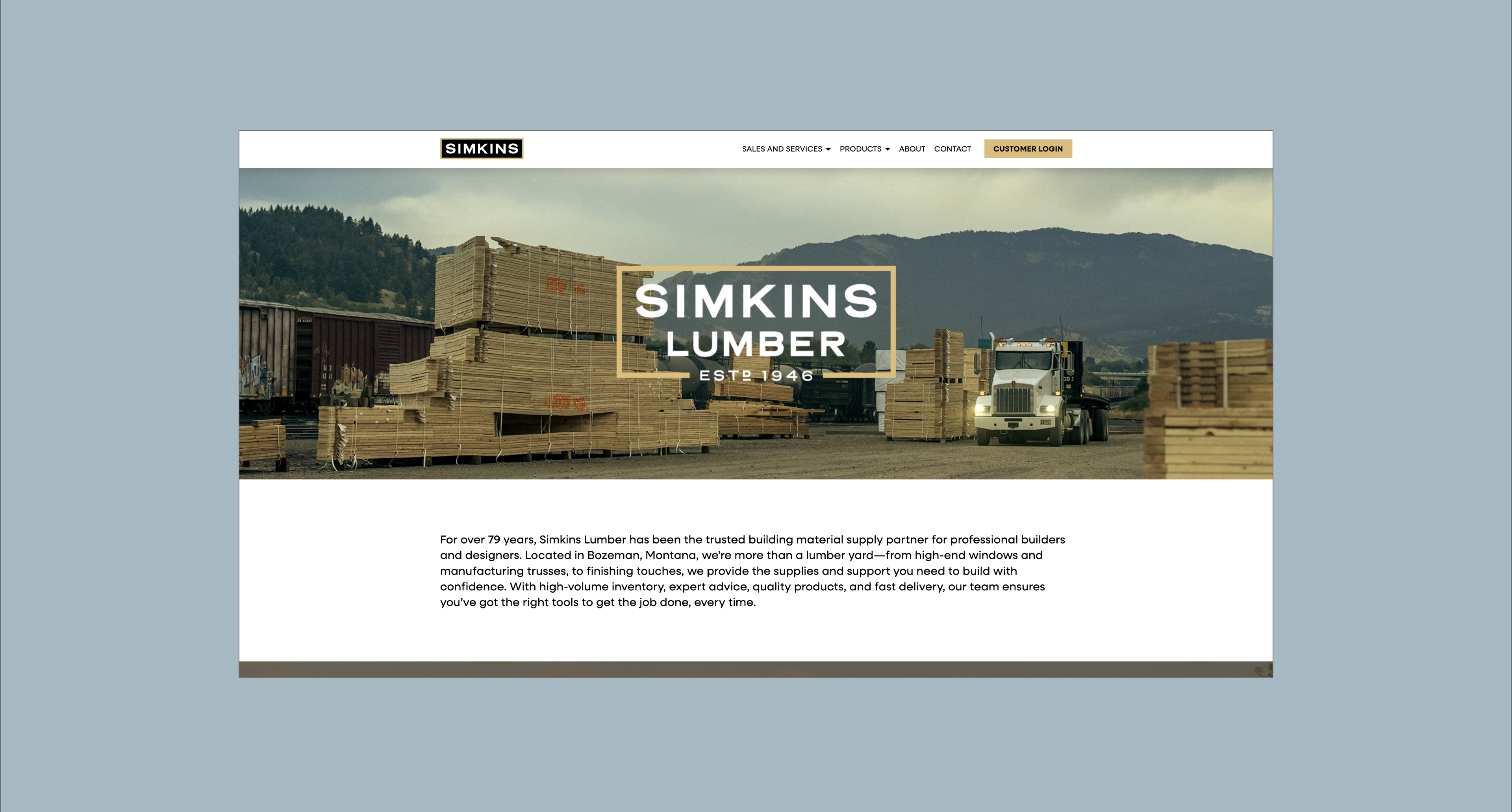
Bozeman, Montana
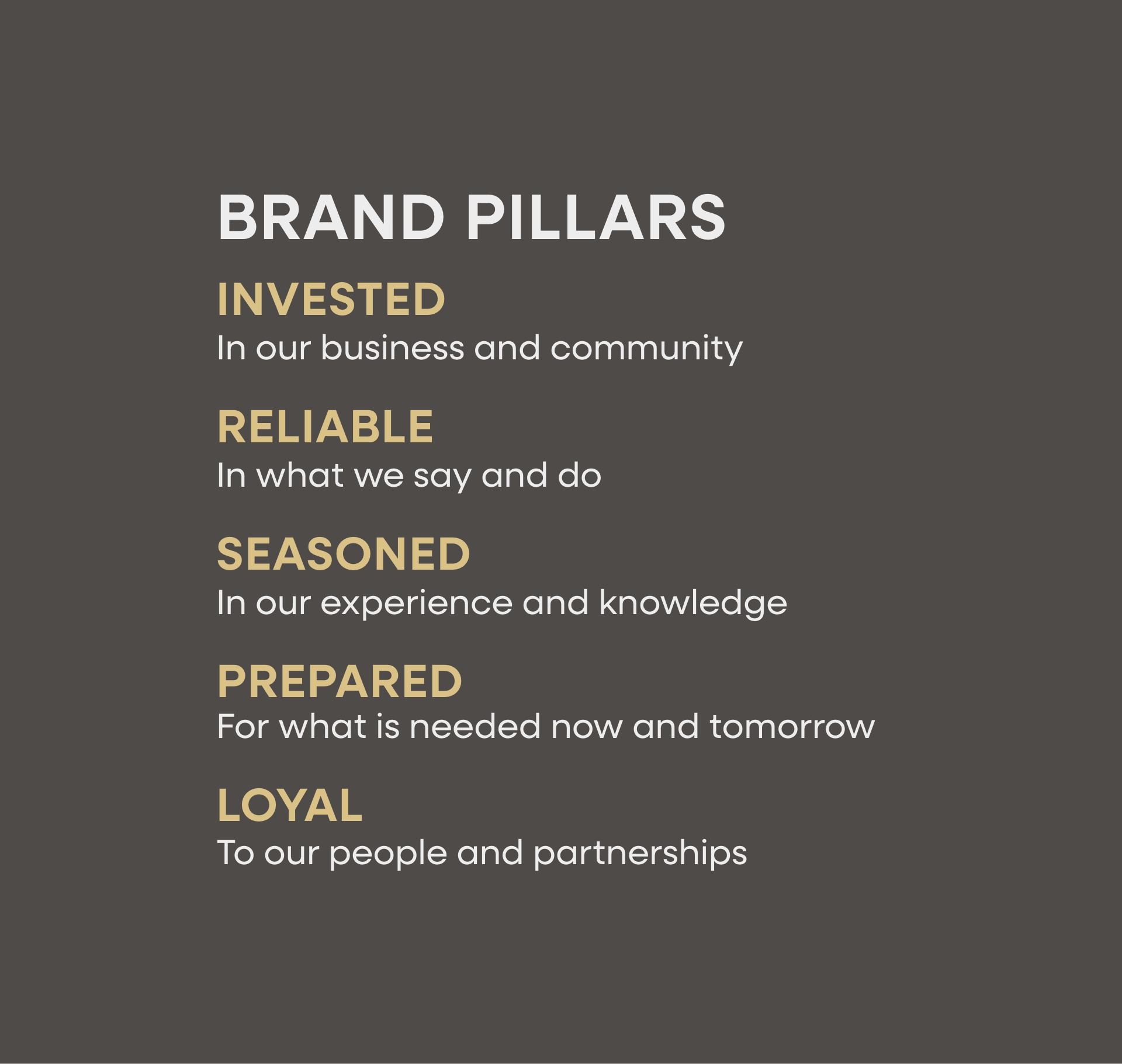
A bold and energetic identity that is well on its way to becoming one of Bozeman’s most iconic brands.


Communicate the personality and life of the business in an industry that’s not known for communicating excitement.
To elevate a longtime Bozeman business by capturing consumer’s attention with a fun, memorable brand.
Succinct messaging paired with vibrant, playful visuals.


Hardy facilitated a multi-phase brand launch that considered everything from employee-owner training to the ‘why pay more’ signs. The first step was to train all leadership staff on the new strategy. By providing consistent language, their leadership team has the tools to communicate the brand to all employee-owners and customers, utilize it in hiring, and lean on it for business decisions. To support the high level of service T&C is known for, we created talking points, rack cards, and tools that empower employee-owners to answer questions customers may have.


The Bridger Brewing team wanted to be prepared to can and distribute its beer after opening its second location. AMS partnered with Bridger Brewing for packaging design concepts. The first step in the packaging process involved a strategy session in which the unique identity of each beer was explored and dissected. Several concepts were then sketched out. Once a concept was selected for each beer, custom illustrations were created for cans and boxes. The result is a full lineup of beers, each with its own design that is unique while still clearly a member of the Bridger Brewing brand.


The longest line you’ll see comes from a reel.
Big ideas are best discussed on the back of a pickup.


“After interviewing several companies, we selected Hardy to help us rebrand our 40+ year old company… and we’re so glad we did! The team at Hardy guided us through the project professionally with a well-defined process. The results were exactly what we were hoping for… polished, vibrant, energetic and different. It wasn’t an easy task and Hardy really delivered. We have come back to Hardy for other projects since then and look forward to a long and productive relationship!”