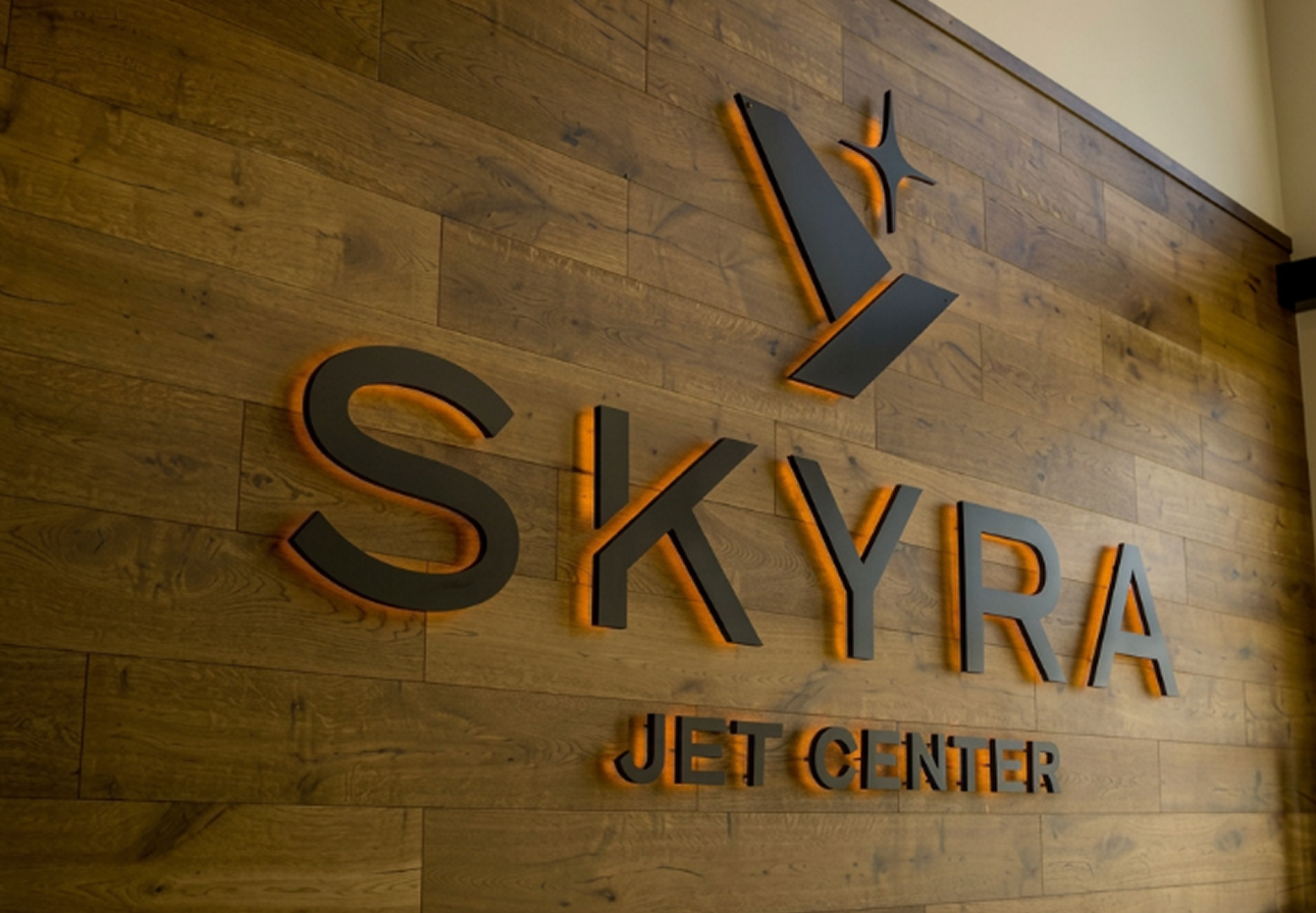
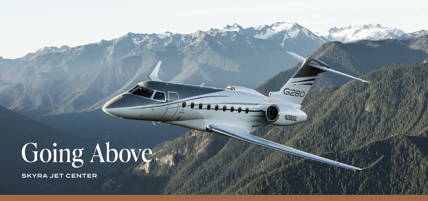
Skyra Jet Center is a full-service fixed-base operator (FBO) serving private aircraft owners, pilots, and travelers in Bozeman, Montana. Designed to deliver seamless aviation services in a warm and welcoming environment, Skyra provides fueling, hangar space, ground support, pilot amenities, and passenger services in a facility built around hospitality and operational excellence.
Skyra partnered with Hardy Brands to develop a comprehensive brand strategy and identity that would clearly define its position in the FBO market while establishing a visual and messaging system capable of supporting long-term growth. The work focused on articulating Skyra’s commitment to safety, attentive service, and reliability while creating a timeless brand that reflects the spirit of aviation and the warm hospitality the team aims to provide.
Brand Strategy
Brand Identity
Bozeman, Montana
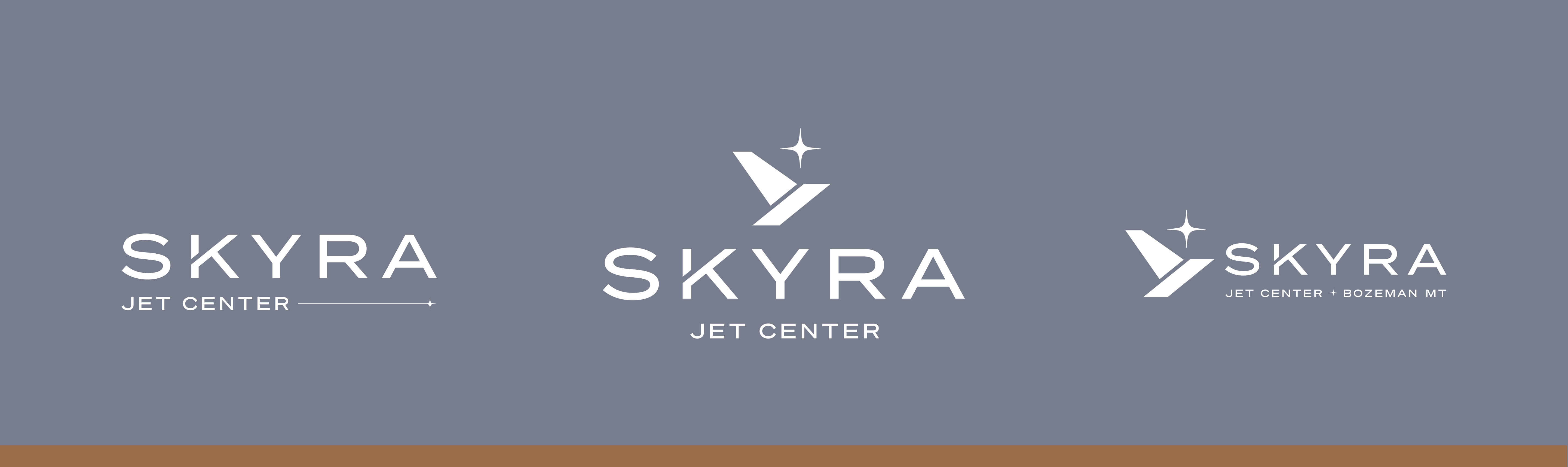
A cohesive brand that differentiates Skyra within a competitive FBO landscape. The name, messaging, and visual identity convey seamless, safe travel and reliable service, resonating with both pilots and passengers. By balancing operational credibility with a welcoming, service-driven experience, Skyra stands apart from larger, more impersonal operators. A consistent foundation across all touchpoints reinforces its commitment to safety, professionalism, and exceptional service.



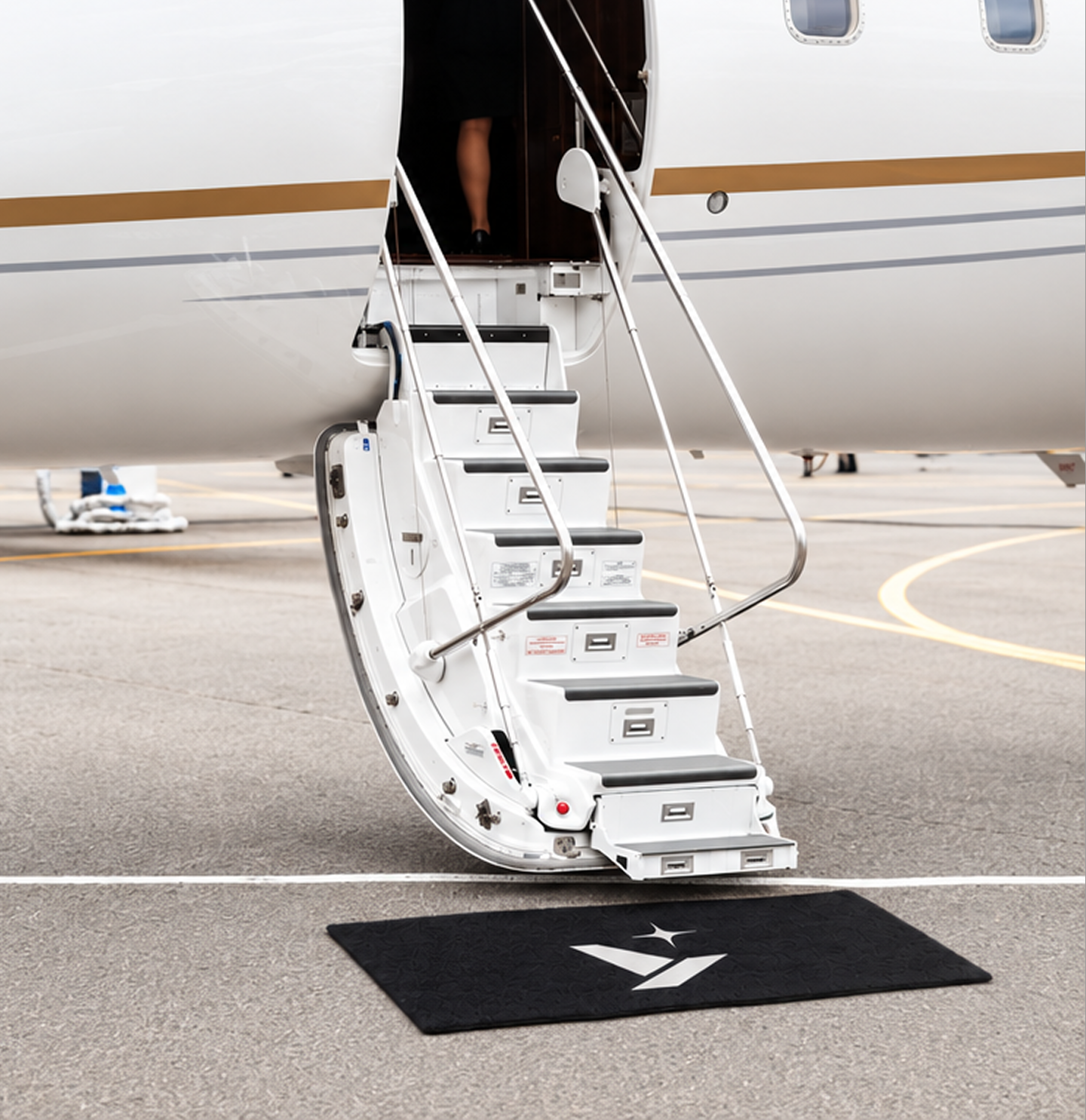
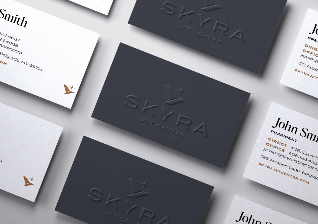

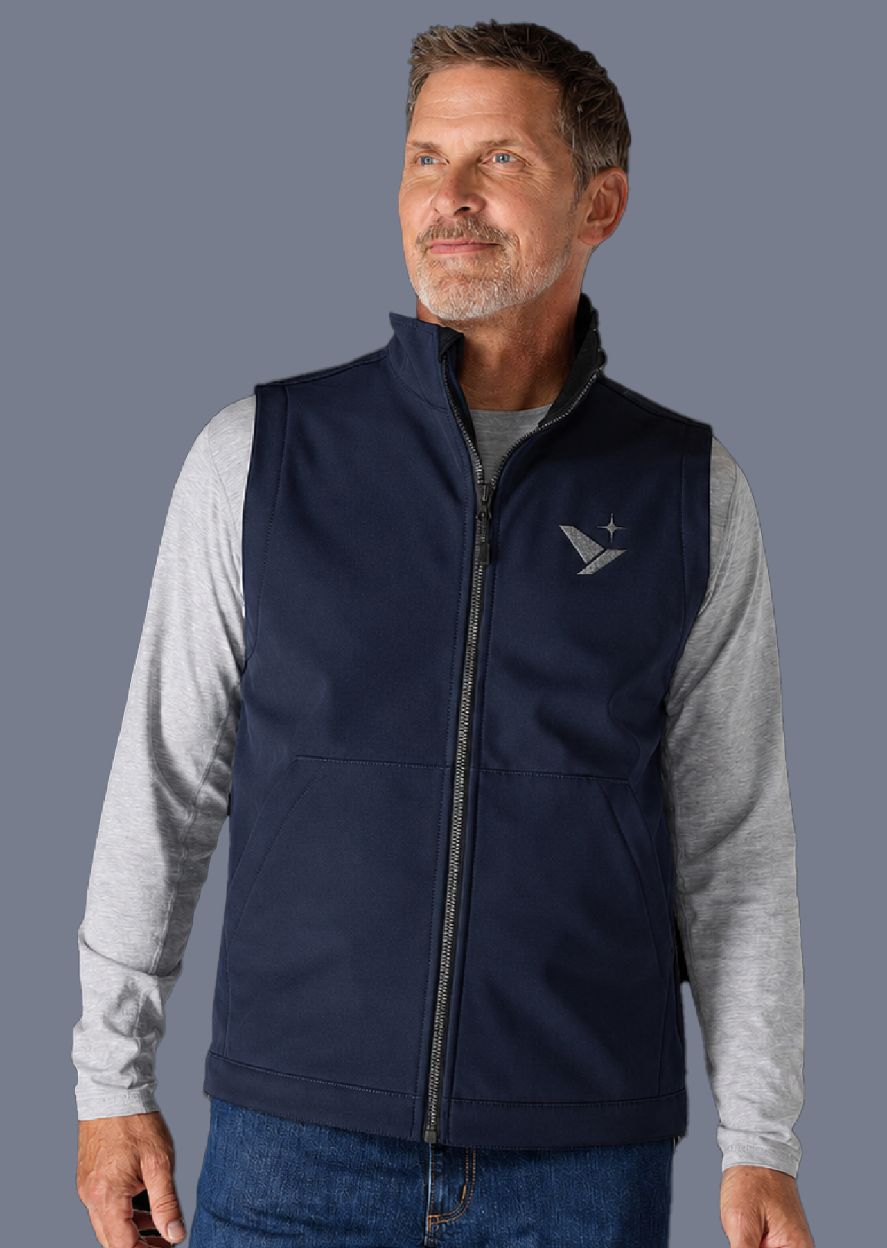

















FBOs often prioritize either luxury or operational efficiency, leaving a gap for a brand that genuinely serves both pilots and passengers. Skyra needed to stand apart from large national operators with an identity that felt inclusive, approachable, and rooted in aviation while communicating safety, trust, and consistency.
Create a timeless, aviation-inspired brand that balances operational excellence with genuine hospitality, making every pilot and passenger feel confident, welcome, and supported.
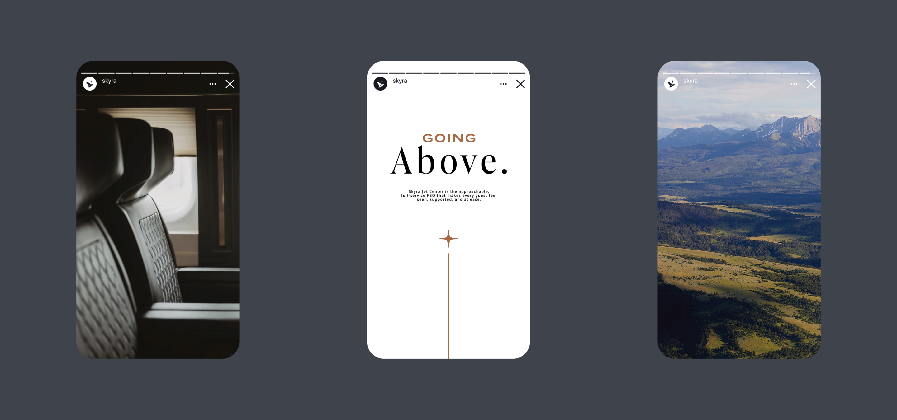
Through strategy sessions and industry research, we identified an opportunity to position Skyra as the approachable, full-service FBO that makes every guest feel seen, supported, and at ease. The name Skyra evokes freedom, openness, and the ease of seamless travel, reinforcing the brand's promise of reliable, safe, and effortless experiences. This positioning was brought to life through five core brand pillars: Safety, Attentive, Steadfast, Deliberate, and Empowering. Together, they shaped the brand platform, messaging, and visual identity, creating a cohesive experience that balances operational excellence with genuine hospitality and gives pilots and passengers confidence at every touchpoint.



















Hardy facilitated a multi-phase brand launch that considered everything from employee-owner training to the ‘why pay more’ signs. The first step was to train all leadership staff on the new strategy. By providing consistent language, their leadership team has the tools to communicate the brand to all employee-owners and customers, utilize it in hiring, and lean on it for business decisions. To support the high level of service T&C is known for, we created talking points, rack cards, and tools that empower employee-owners to answer questions customers may have.


The Bridger Brewing team wanted to be prepared to can and distribute its beer after opening its second location. AMS partnered with Bridger Brewing for packaging design concepts. The first step in the packaging process involved a strategy session in which the unique identity of each beer was explored and dissected. Several concepts were then sketched out. Once a concept was selected for each beer, custom illustrations were created for cans and boxes. The result is a full lineup of beers, each with its own design that is unique while still clearly a member of the Bridger Brewing brand.


The longest line you’ll see comes from a reel.
Big ideas are best discussed on the back of a pickup.