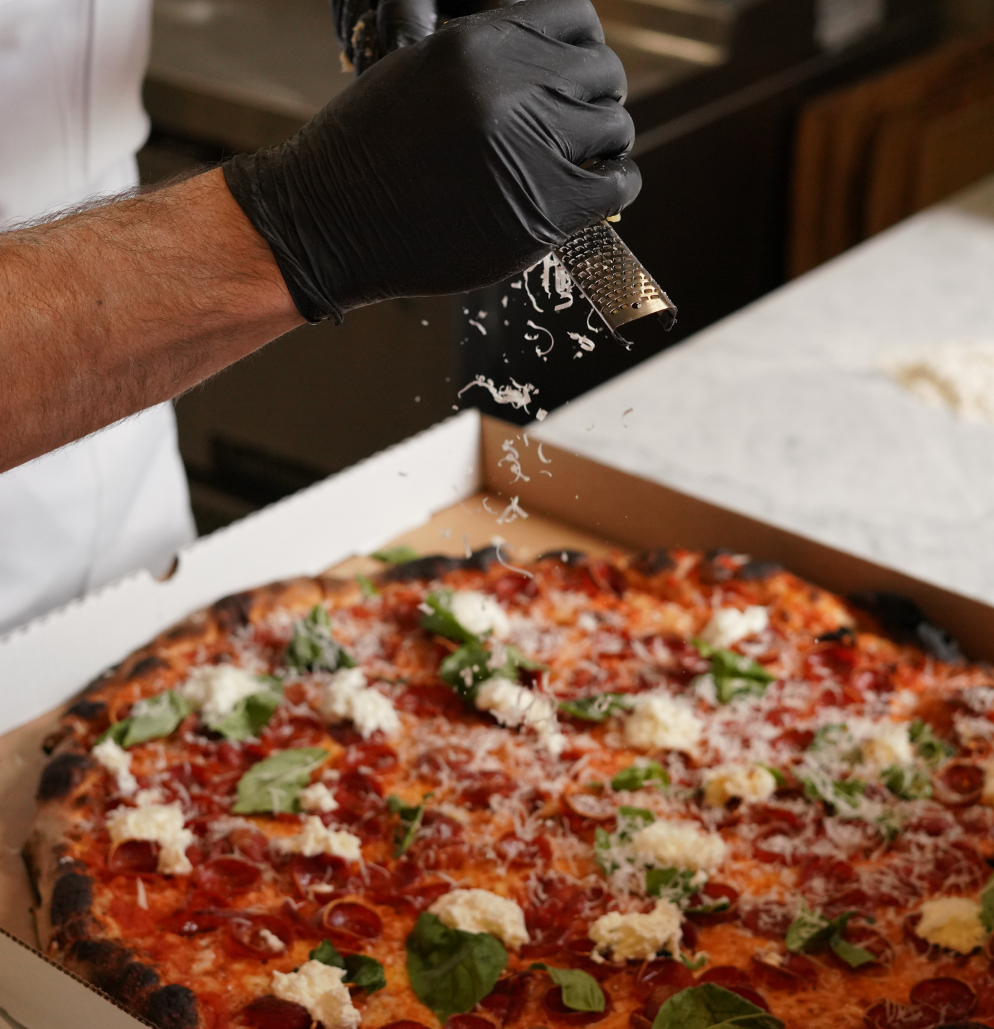
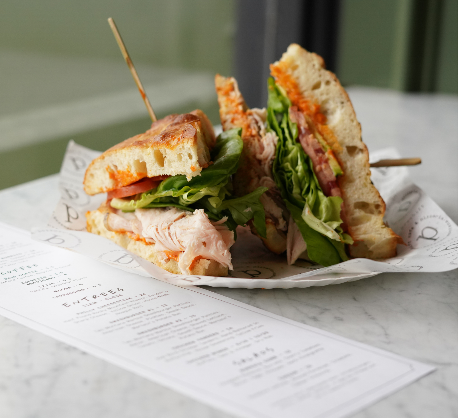
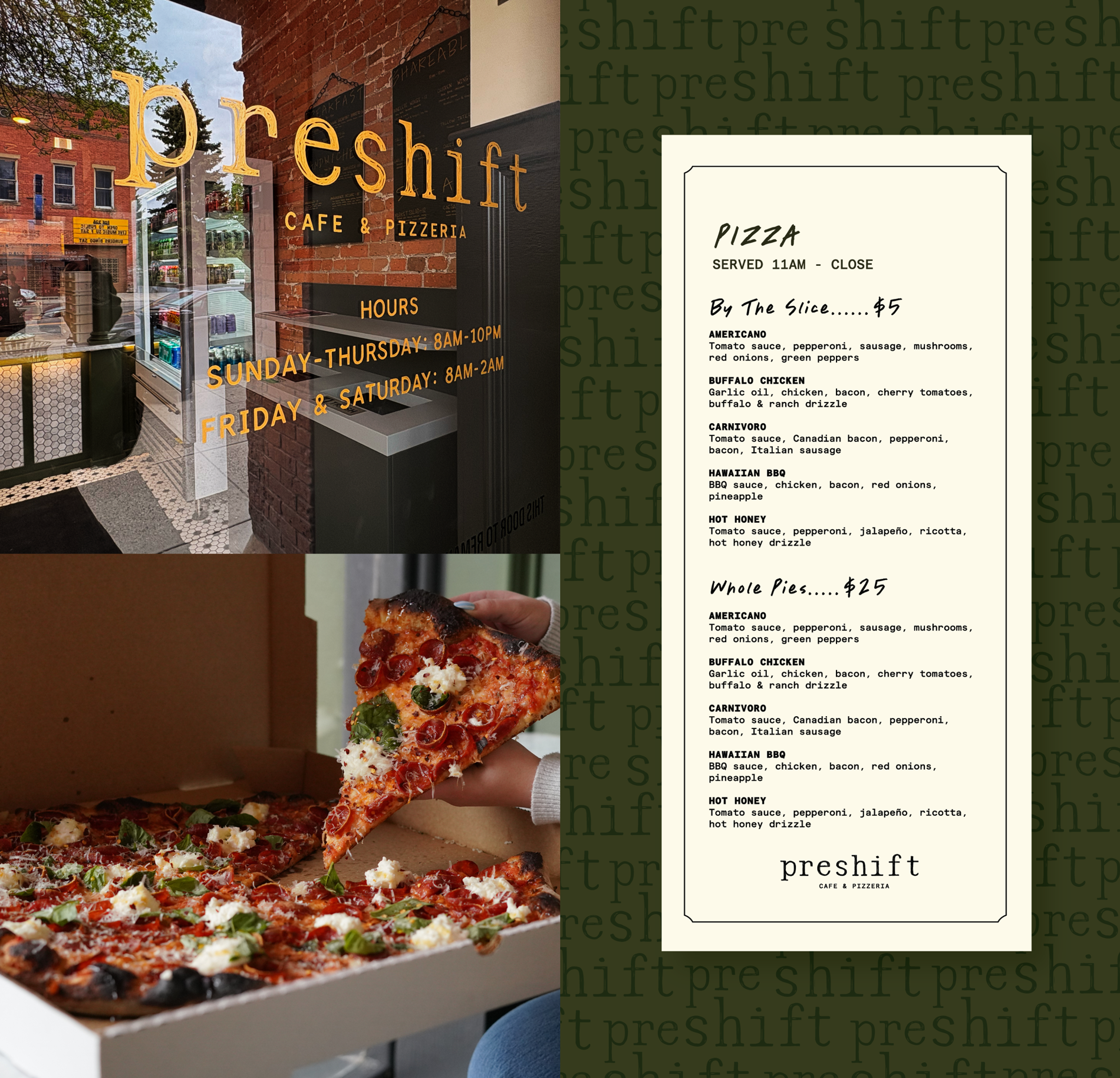
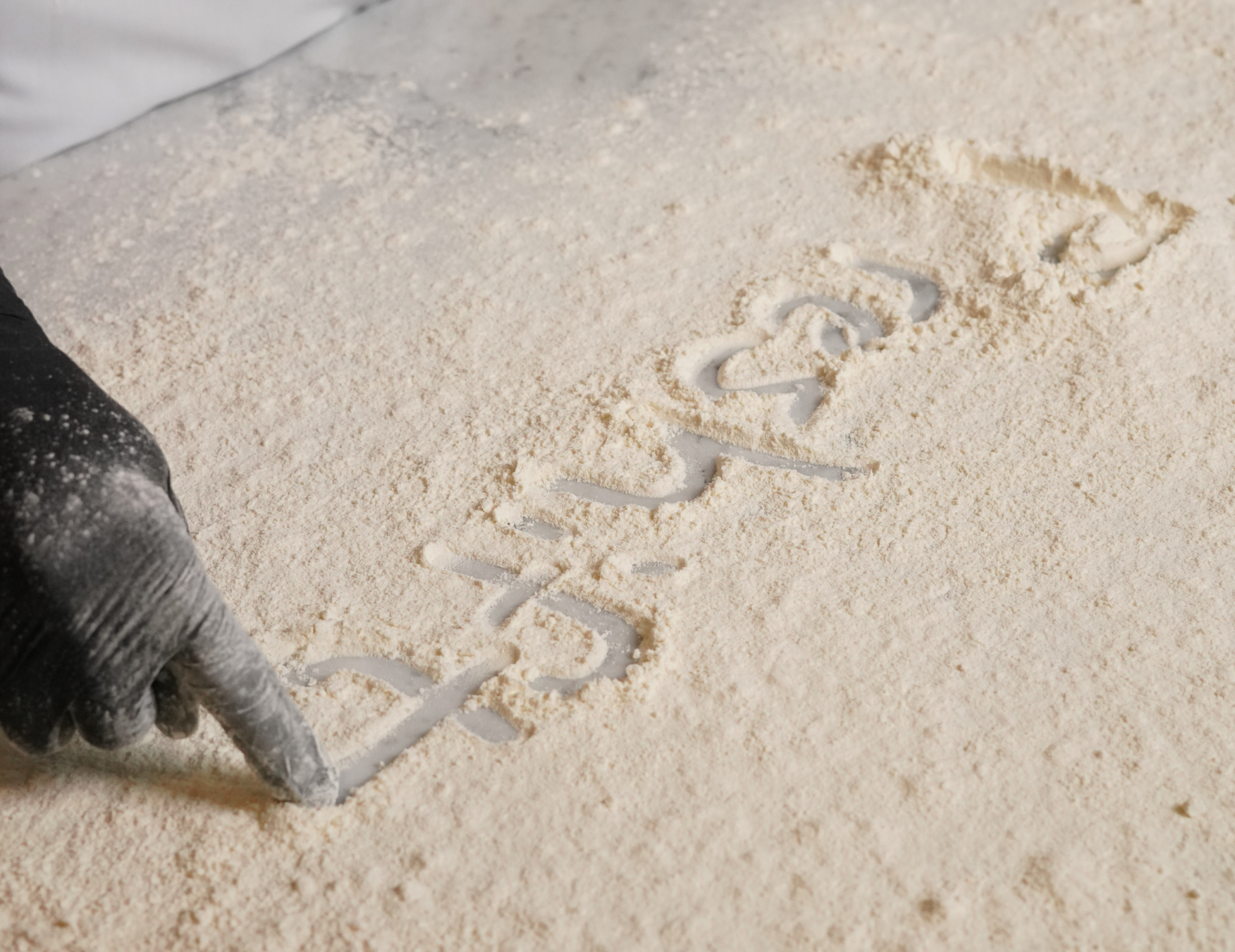
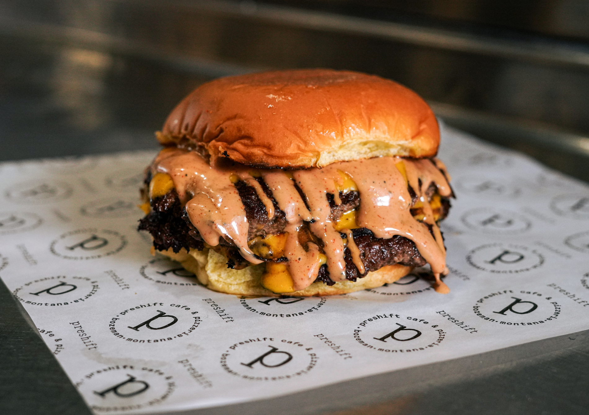
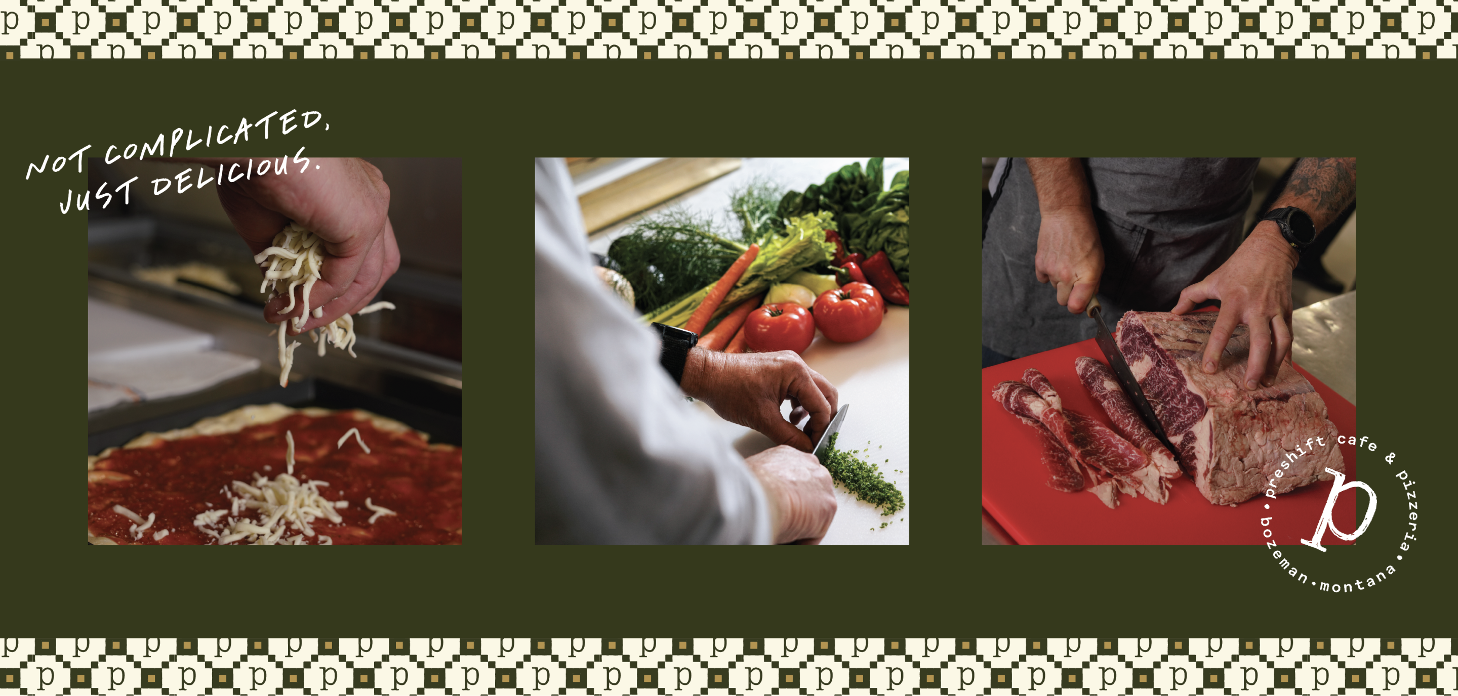
Preshift is a neighborhood café and pizzeria in Bozeman, Montana, built around quality ingredients, scratch-made food, and genuine hospitality. Formerly known as Tarantino's, a longtime local favorite, the ownership team saw an opportunity to evolve the business into a concept that better reflected its future vision.
With plans to expand beyond its traditional offerings and create a more flexible, growth-oriented brand, the ownership team selected the name Preshift and partnered with Hardy Brands to develop the strategy, positioning, visual identity, and customer experience framework needed to bring the new concept to life.
Brand Strategy
Brand Identity
Brand Execution
Bozeman, MT
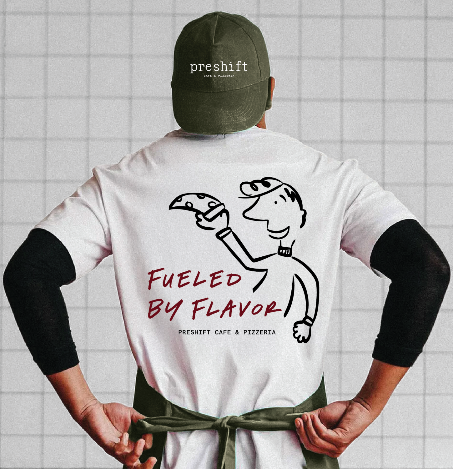
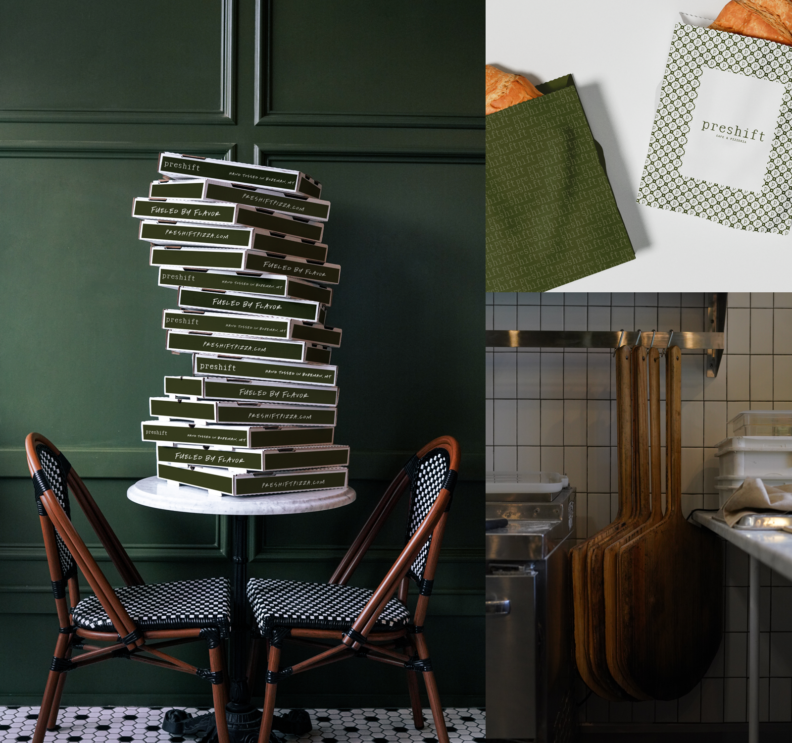
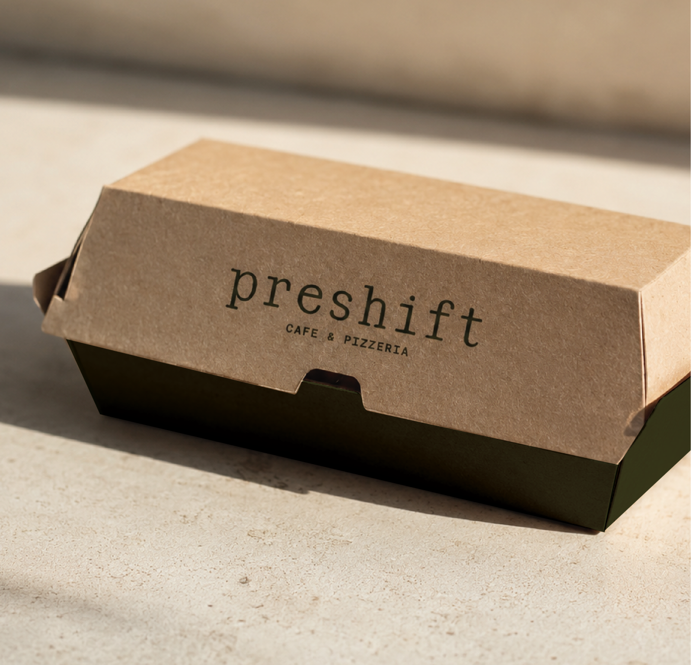
Preshift launched with a clear and cohesive brand that reflects both its ambition and its roots in the Bozeman community. The new identity differentiates the restaurant in a crowded market while preserving the trust established through years of serving local customers. Today, the brand provides a foundation for continued growth and ensures every customer touchpoint reinforces the same experience: approachable, high-quality food from a team that genuinely cares.


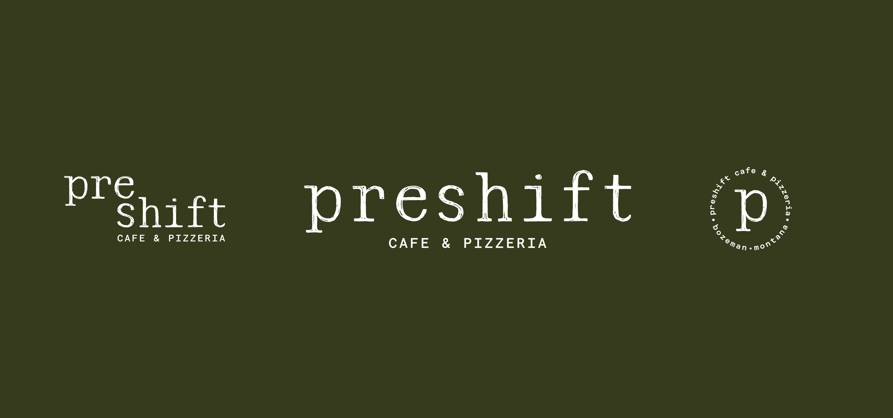


While Tarantino's had earned strong recognition and customer loyalty, the brand no longer reflected the business's long-term vision. The team wanted the flexibility to expand offerings, serve breakfast through dinner, and build a concept that embodied their commitment to quality ingredients, thoughtful preparation, hospitality, and future growth.
Create a brand that positions Preshift as a trusted neighborhood destination known for quality food, thoughtful hospitality, and consistency. The brand needed to establish a strong foundation for growth while remaining approachable and familiar to existing customers.
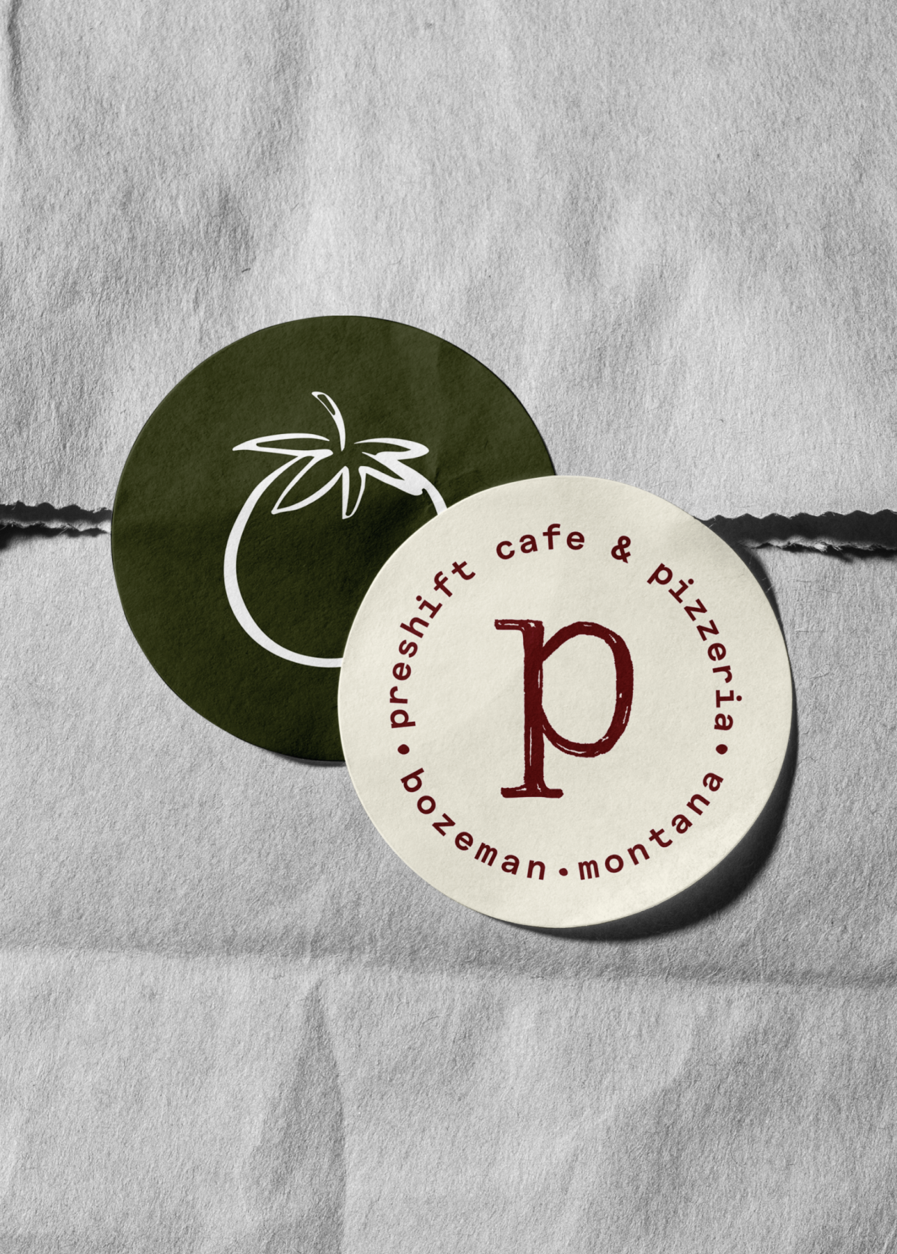
Through strategy workshops and stakeholder conversations, we clarified the restaurant’s vision, values, and customer experience. This work informed a brand position centered on quality, simplicity, and community connection. From there, we developed messaging, visual identity elements, and brand guidelines that could be applied consistently across menus, packaging, signage, digital platforms, and the in-store experience.


Hardy facilitated a multi-phase brand launch that considered everything from employee-owner training to the ‘why pay more’ signs. The first step was to train all leadership staff on the new strategy. By providing consistent language, their leadership team has the tools to communicate the brand to all employee-owners and customers, utilize it in hiring, and lean on it for business decisions. To support the high level of service T&C is known for, we created talking points, rack cards, and tools that empower employee-owners to answer questions customers may have.


The Bridger Brewing team wanted to be prepared to can and distribute its beer after opening its second location. AMS partnered with Bridger Brewing for packaging design concepts. The first step in the packaging process involved a strategy session in which the unique identity of each beer was explored and dissected. Several concepts were then sketched out. Once a concept was selected for each beer, custom illustrations were created for cans and boxes. The result is a full lineup of beers, each with its own design that is unique while still clearly a member of the Bridger Brewing brand.


The longest line you’ll see comes from a reel.
Big ideas are best discussed on the back of a pickup.