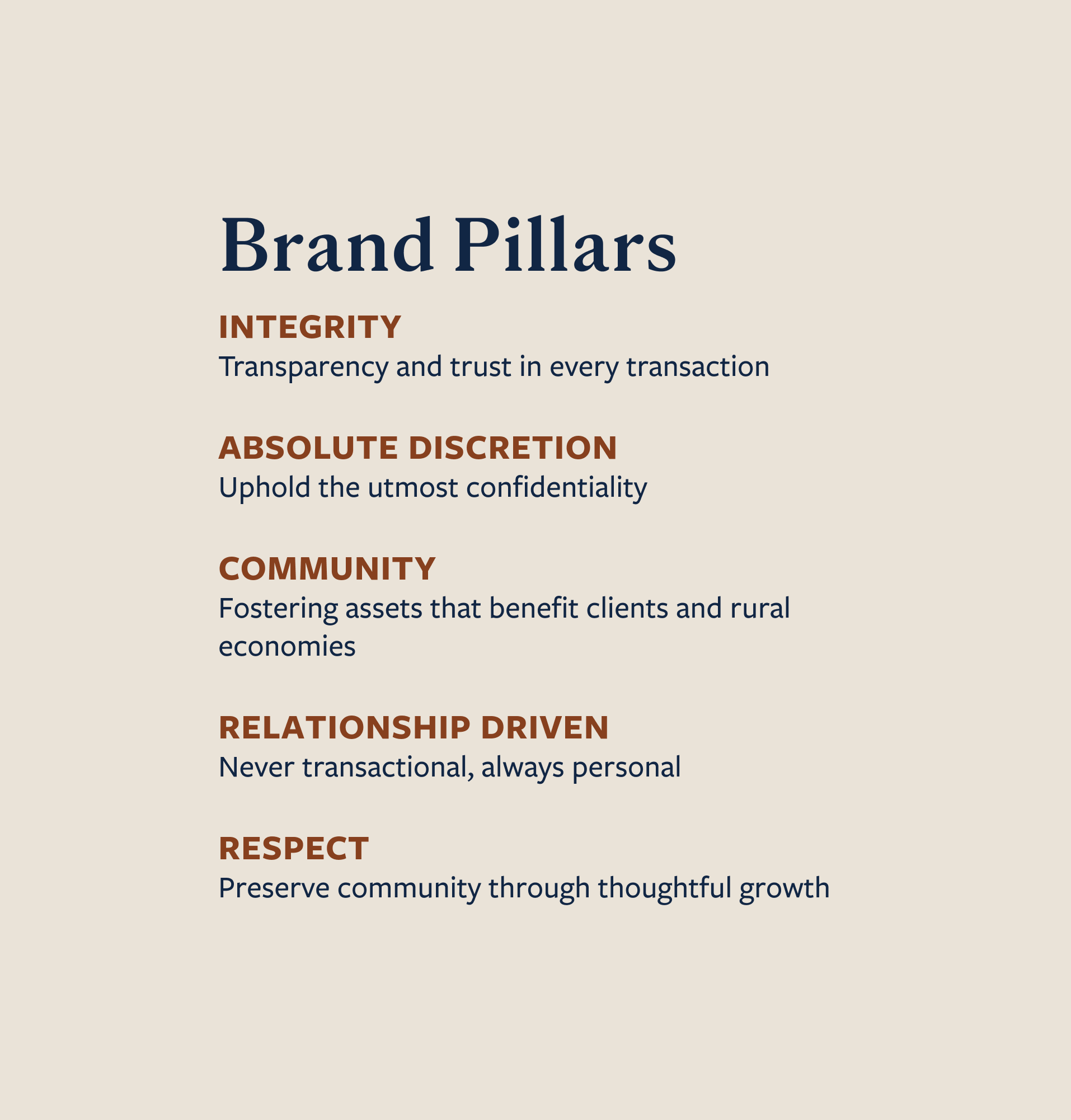
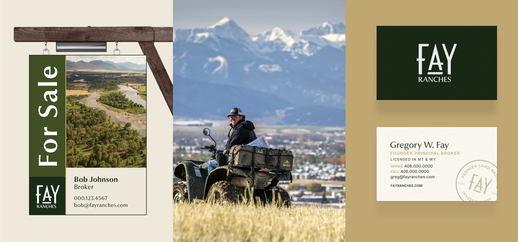
When Bozeman Family Fly Shop changed hands in 2021, there was a lot that the new owners wanted to keep the same and a few things they were ready to change. They wanted to maintain the shop’s reputation as a place where you could stop in, take your time, sit around the table to tie flies, share stories and find the largest selection of fly tying materials in town. The new owners needed a brand strategy to reflect what made the shop special in order to lay the framework for an updated identity and new website that could communicate their value outwardly.
We partnered with the new owner to craft a brand that would carry the fly shop into the future and communicate its value to Bozeman locals and visitors. This included a name change from Bozeman Family Fly Shop to Bozeman Fly Supply. Read on to see how we went about rebranding this community staple to reflect what sets it apart from other fly shops in Southwest Montana.
Brand Strategy
Rebrand
Brand Identity
Naming
Tagline
Website Design + Development
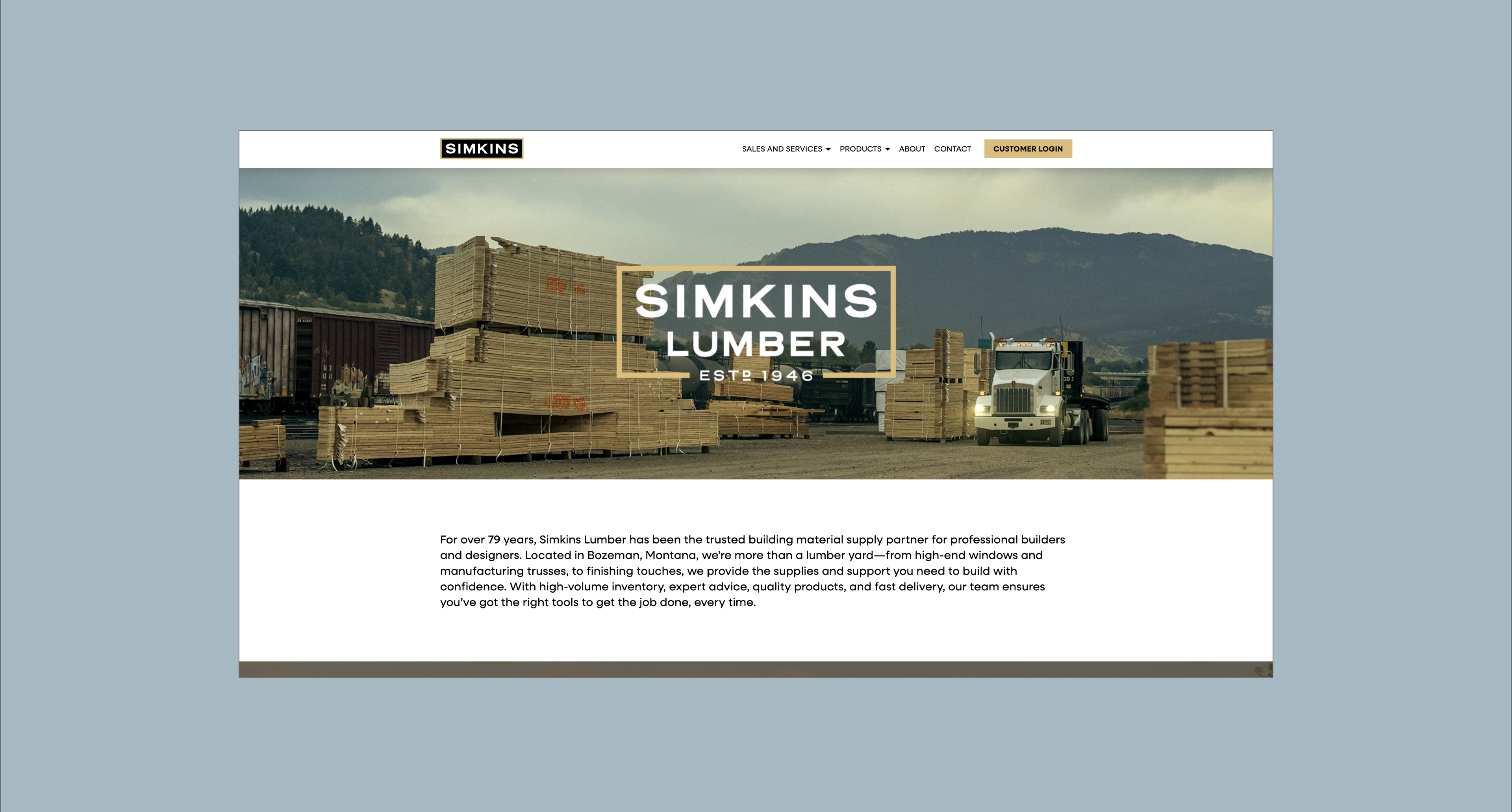
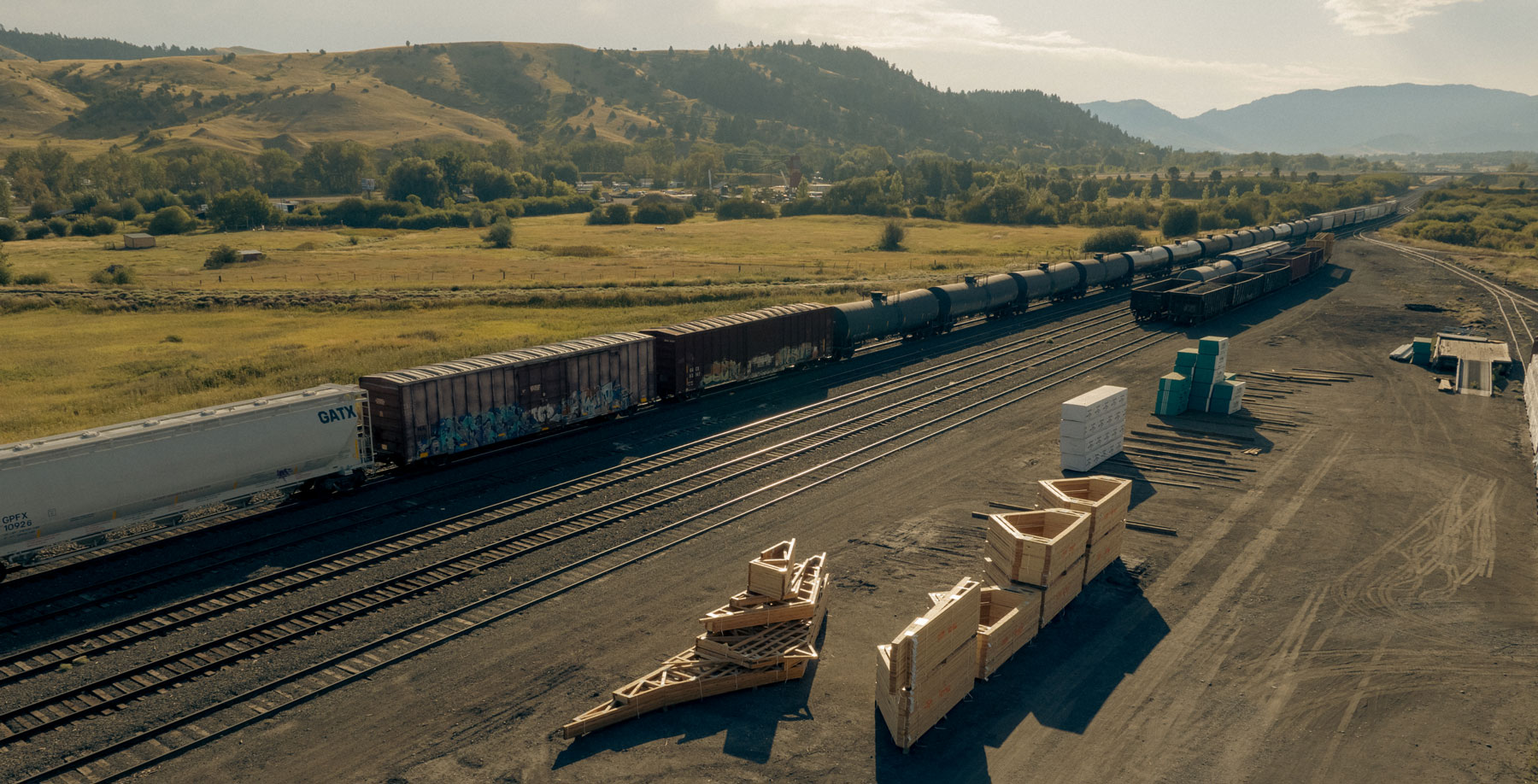
Bozeman, Montana
An internal strategy to guide the business into the future, a new brand identity to communicate Bozeman Fly Supply’s value and a website to support its positioning as the community gathering spot with the largest selection of fly tying materials.


Maintain the sense of camaraderie created by the shop’s previous owners and communicate that the new ownership intends to double down on the nostalgic, local Bozeman vibe, not turn the shop into something new.
Create a brand that fully communicates the vibe you can expect at BFS, a come-as-you-are, old-school Montana place that has the largest selection of fly tying materials and creates space to tie and swap stories.
We created a brand strategy and identity, including a new name, that leans into the value of Bozeman Fly Supply as the leader in fly tying materials and is reminiscent of Bozeman’s historic charm and sense of community.


Hardy facilitated a multi-phase brand launch that considered everything from employee-owner training to the ‘why pay more’ signs. The first step was to train all leadership staff on the new strategy. By providing consistent language, their leadership team has the tools to communicate the brand to all employee-owners and customers, utilize it in hiring, and lean on it for business decisions. To support the high level of service T&C is known for, we created talking points, rack cards, and tools that empower employee-owners to answer questions customers may have.


The Bridger Brewing team wanted to be prepared to can and distribute its beer after opening its second location. AMS partnered with Bridger Brewing for packaging design concepts. The first step in the packaging process involved a strategy session in which the unique identity of each beer was explored and dissected. Several concepts were then sketched out. Once a concept was selected for each beer, custom illustrations were created for cans and boxes. The result is a full lineup of beers, each with its own design that is unique while still clearly a member of the Bridger Brewing brand.


The longest line you’ll see comes from a reel.
Big ideas are best discussed on the back of a pickup.