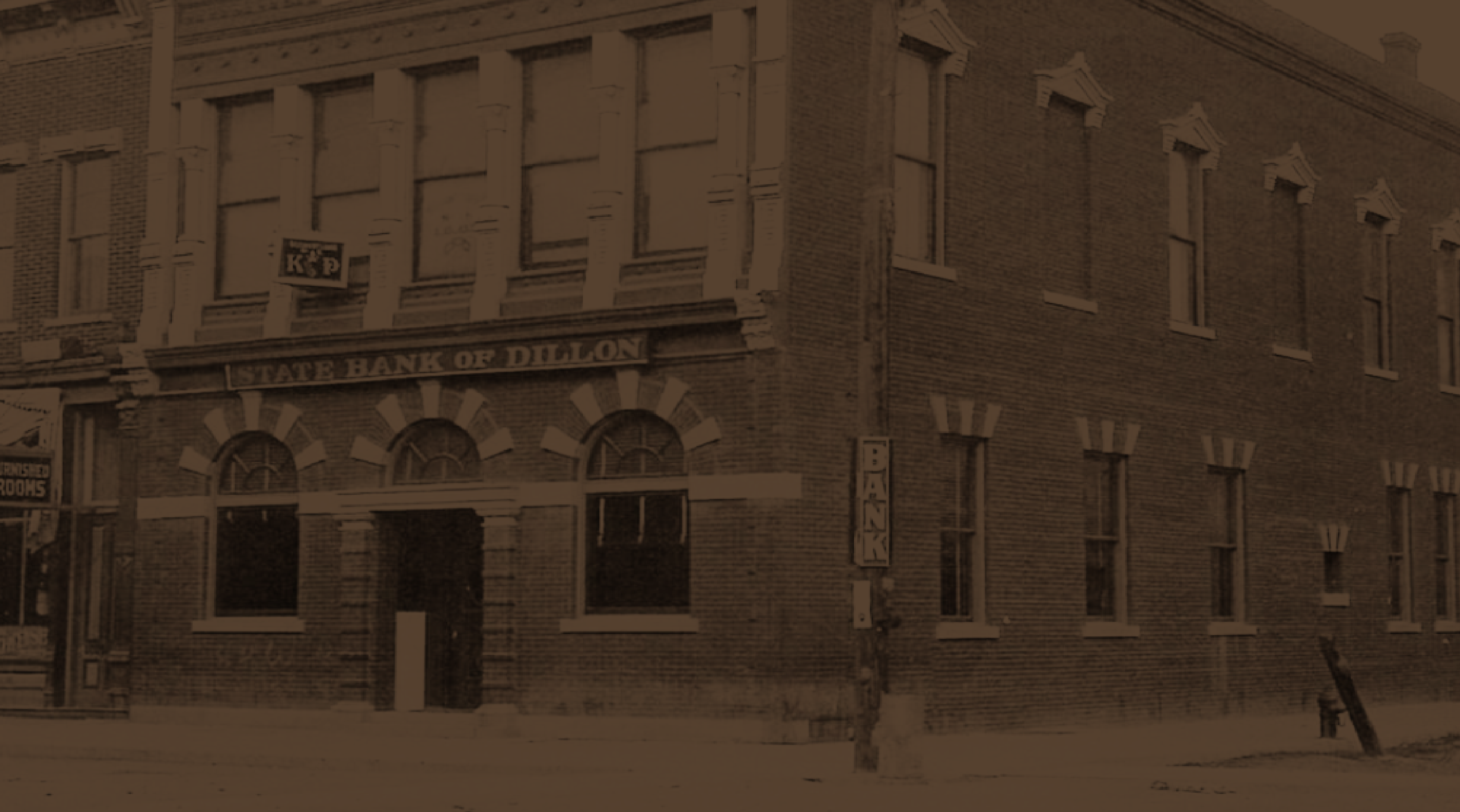
Since 1912, Pioneer State Bank has been part of Montana communities, earning trust through hard work, personal relationships, and a commitment to showing up for its neighbors. Originally established as Pioneer Federal Savings and Loan, the institution entered a new chapter in 2026 as a publicly traded bank - bringing greater resources and capabilities while remaining present in the communities it serves.
As Pioneer prepared for its next chapter, it partnered with Hardy Brands to clarify its brand strategy and create an identity that honored its heritage while reflecting the way modern customers expect to bank today.
The opportunity was bigger than a visual refresh. Pioneer needed to close a perception gap: while customers knew the institution as a familiar, community-minded organization, many still thought of it more like a credit union than a full-service bank. The work focused on making Pioneer’s capabilities, strength, and evolution more visible without losing the personal relationships and neighborly spirit that have defined the institution for generations.
Brand Strategy
Brand Identity
Brand Execution
Dillon & Deer Lodge, Montana
Pioneer State Bank emerged with a brand built to carry it into its next chapter while honoring the history that got it here. The refreshed identity gives Pioneer a more consistent, recognizable presence across customer touchpoints, while the strategy provides a framework for communicating what has always made the bank different: real relationships, dependable service, and a genuine commitment to the communities it calls home. At the heart of the brand is a central belief: Bankers Who Show Up. For Pioneer, being there for customers and communities isn’t a new promise. It’s simply how they’ve always done business.



















%402x.svg)
%402x.svg)


Pioneer State Bank had more than a century of history and strong community relationships, but its brand needed to better communicate the full value of what the bank offered. Some customers still perceived Pioneer more like a credit union than a full-service bank. The challenge was finding the balance between heritage and progress, communicating the capabilities, technology, and financial strength of a modern bank without losing the personal, neighborly experience that sets Pioneer apart
Position Pioneer State Bank as a trusted, relationship-first bank that gives customers the resources of a larger financial institution with the heart of a small-town bank. The brand needed to reinforce Pioneer’s reputation as a steady and capable financial partner while making its commitment to individuals, families, small businesses, and the communities it serves unmistakable.
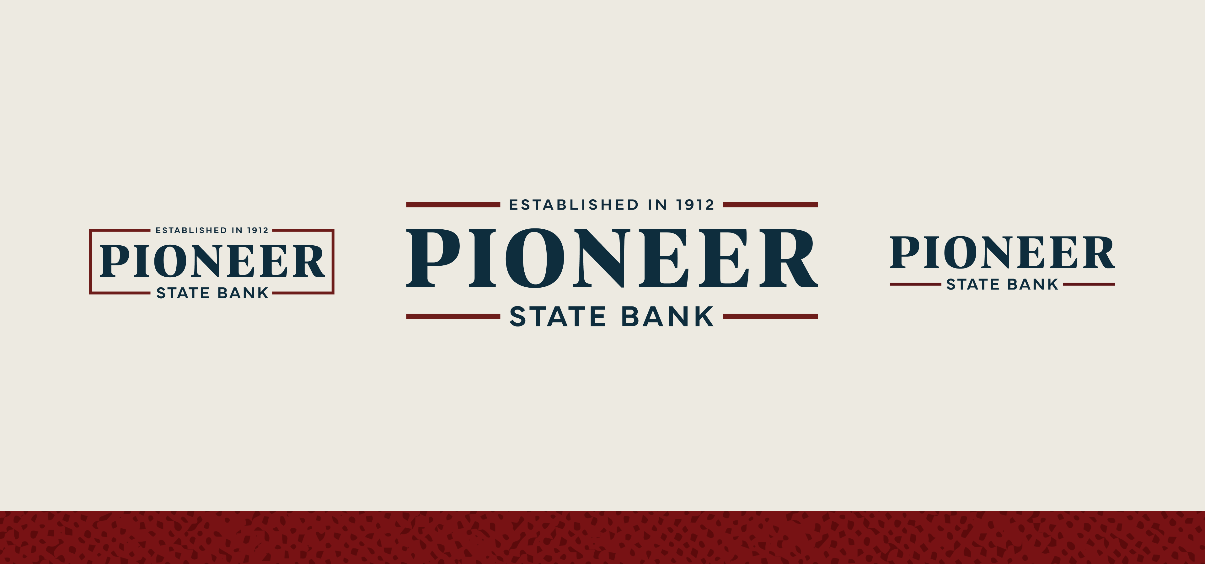
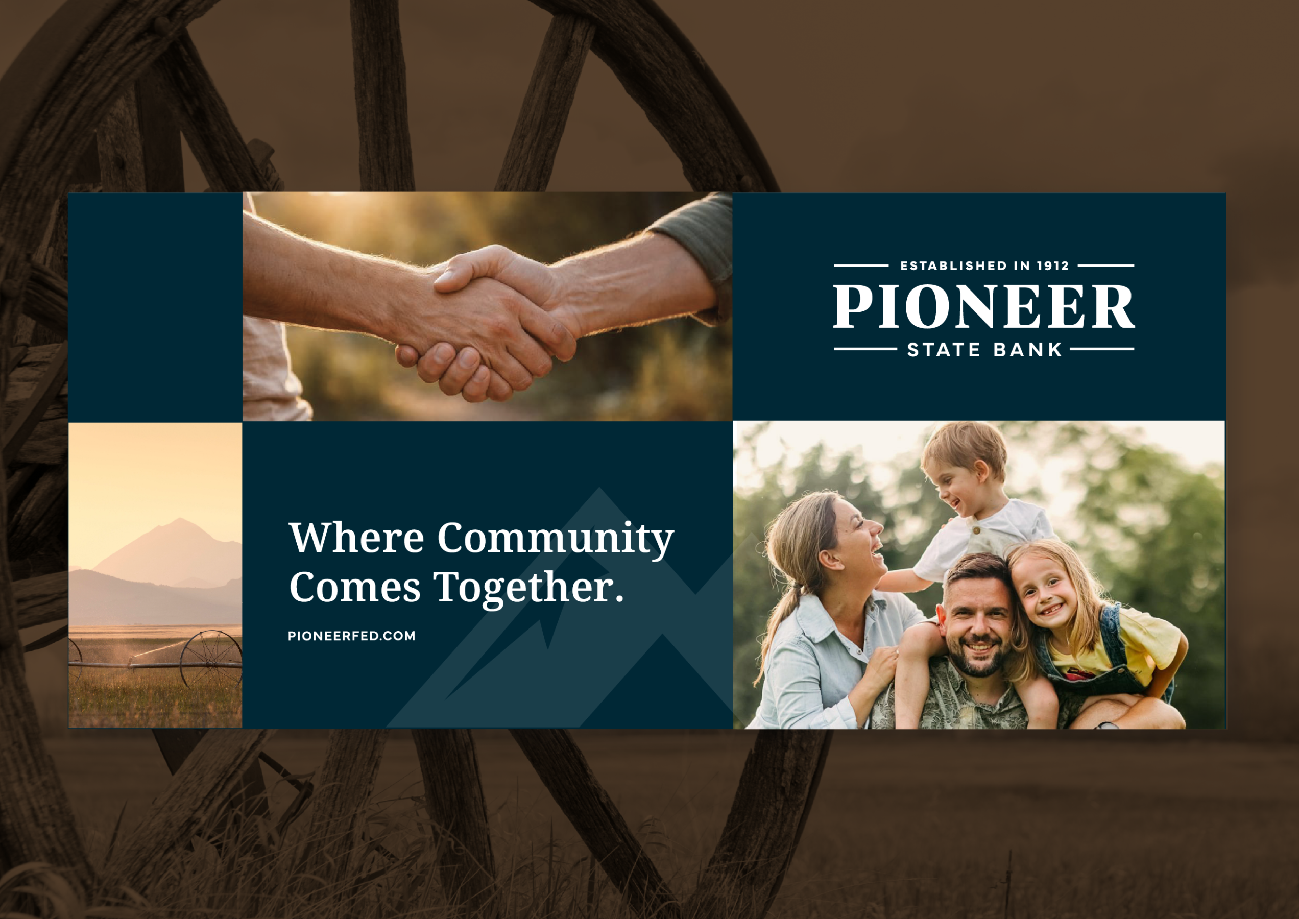
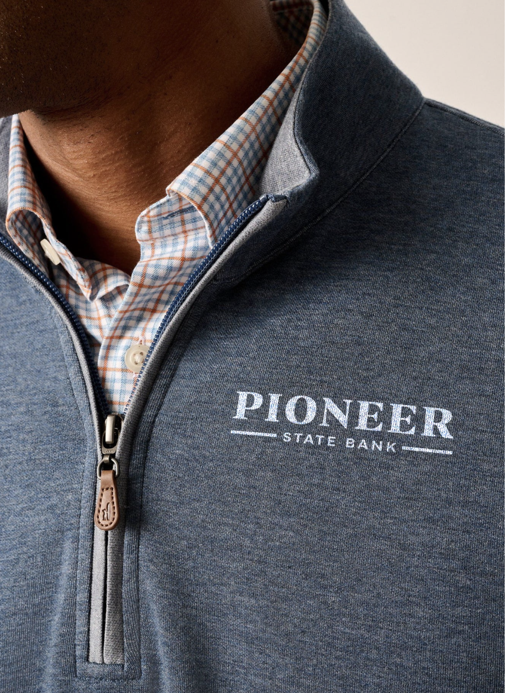
Through brand strategy and positioning, we defined Pioneer’s space in the market: putting people and businesses first so customers can bank with confidence, knowing their money is in trusted hands. Their four brand pillars of steadfast, personable, capable, and committed to community guide how Pioneer shows up across every customer interaction. From there, we developed a heritage-driven visual identity that builds on the bank’s history while creating a more contemporary and cohesive brand presence. The supporting icon nods to the nearby Pioneer Mountain range, providing a distinct sense of place. The identity is supported by a confident voice, genuine tone, and neighborly vibe, bringing the same personal service customers experience at the teller window to every Pioneer interaction, while reinforcing the bank’s strength and commitment to generational relationships.
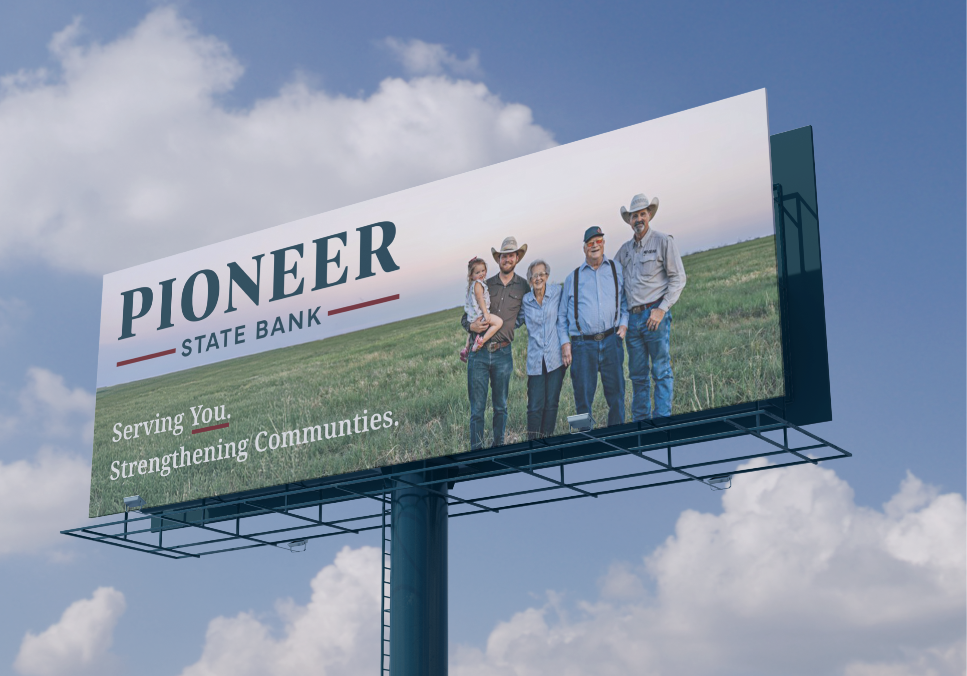


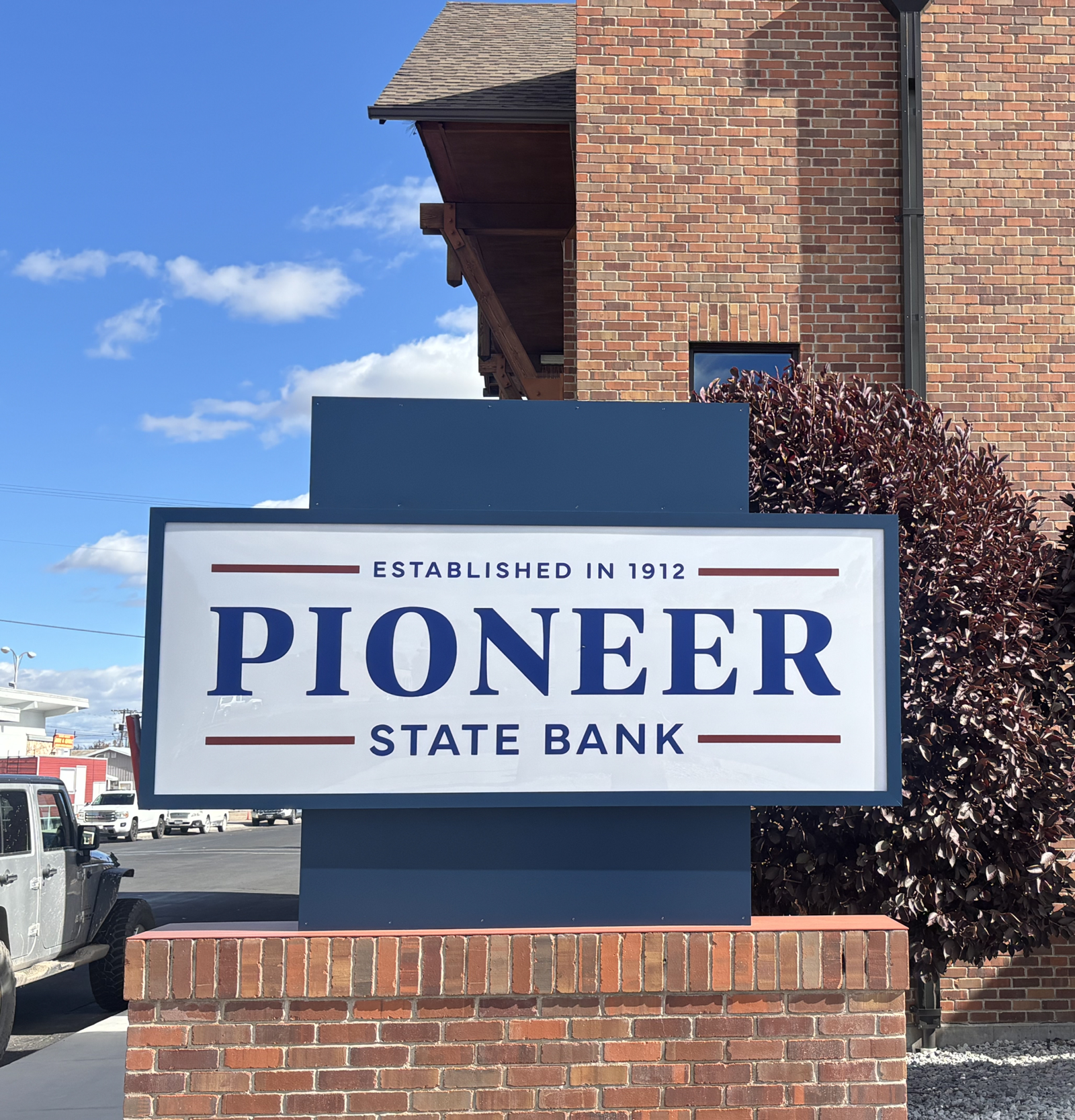
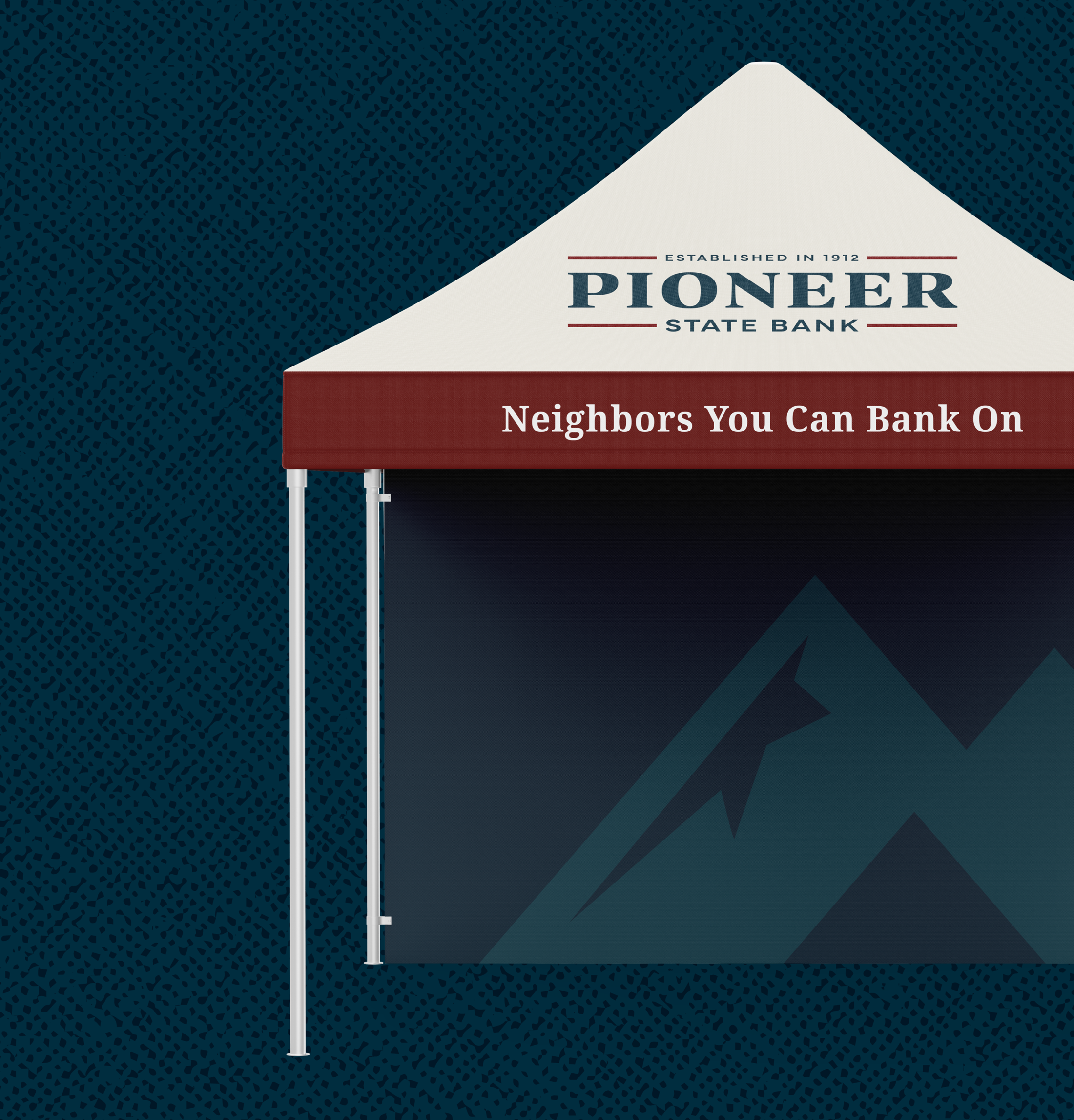

















Hardy facilitated a multi-phase brand launch that considered everything from employee-owner training to the ‘why pay more’ signs. The first step was to train all leadership staff on the new strategy. By providing consistent language, their leadership team has the tools to communicate the brand to all employee-owners and customers, utilize it in hiring, and lean on it for business decisions. To support the high level of service T&C is known for, we created talking points, rack cards, and tools that empower employee-owners to answer questions customers may have.


The Bridger Brewing team wanted to be prepared to can and distribute its beer after opening its second location. AMS partnered with Bridger Brewing for packaging design concepts. The first step in the packaging process involved a strategy session in which the unique identity of each beer was explored and dissected. Several concepts were then sketched out. Once a concept was selected for each beer, custom illustrations were created for cans and boxes. The result is a full lineup of beers, each with its own design that is unique while still clearly a member of the Bridger Brewing brand.


The longest line you’ll see comes from a reel.
Big ideas are best discussed on the back of a pickup.