Gastro Gnome’s founder came to Hardy with plans to create freeze-dried meals made for fellow outdoor enthusiasts who appreciate a good meal as much as they do a day in the backcountry. The former chef and restaurant consultant already had a name for her business, and she wanted branding that would communicate the scratch-made nature of the food and let people know that camping food can be packable AND super delicious.
Early on, Hardy determined that the branding would need to incorporate a gnome. Our team set out to create a logo that reflected the name and spirit of the company. The packaging had to stand out on shelves, so we created clean, vibrant visuals that showcased the meals and their ingredients.
As Gastro Gnome flourishes, its product line has expanded to include breakfast, lunch, dinner, snacks, dessert, and an instant coffee collaboration with Ghost Town Coffee. The brand, packaging, and website have resulted in easily recognizable products that resonate with their target audience.
Brand Strategy
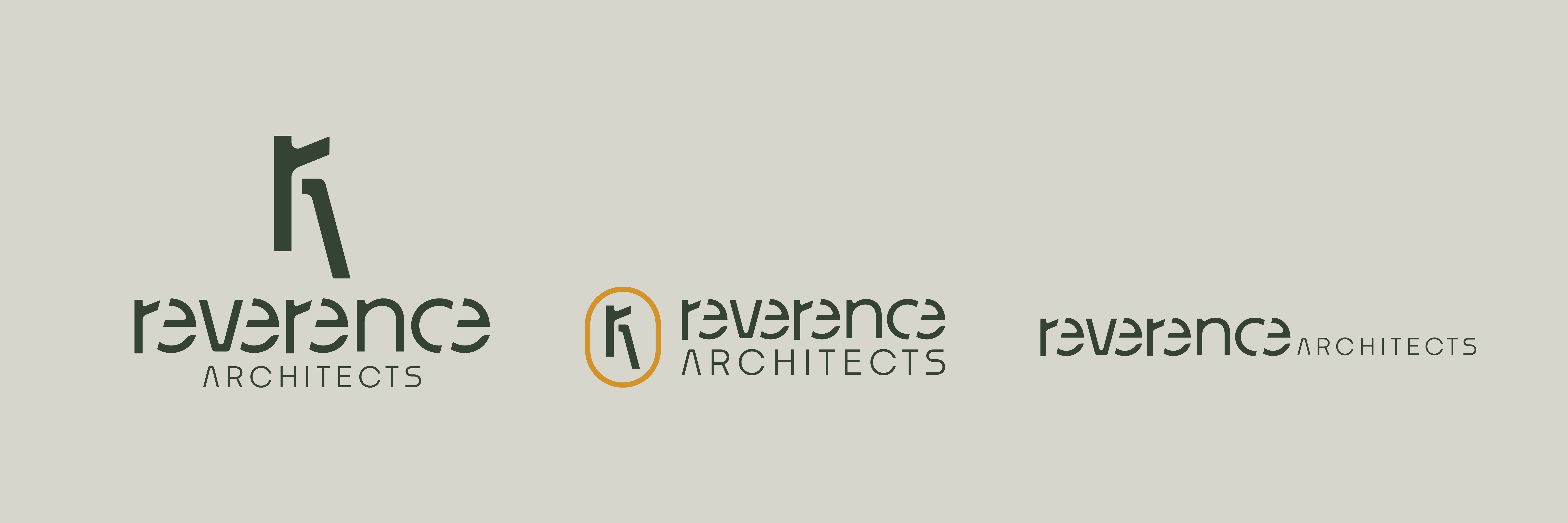
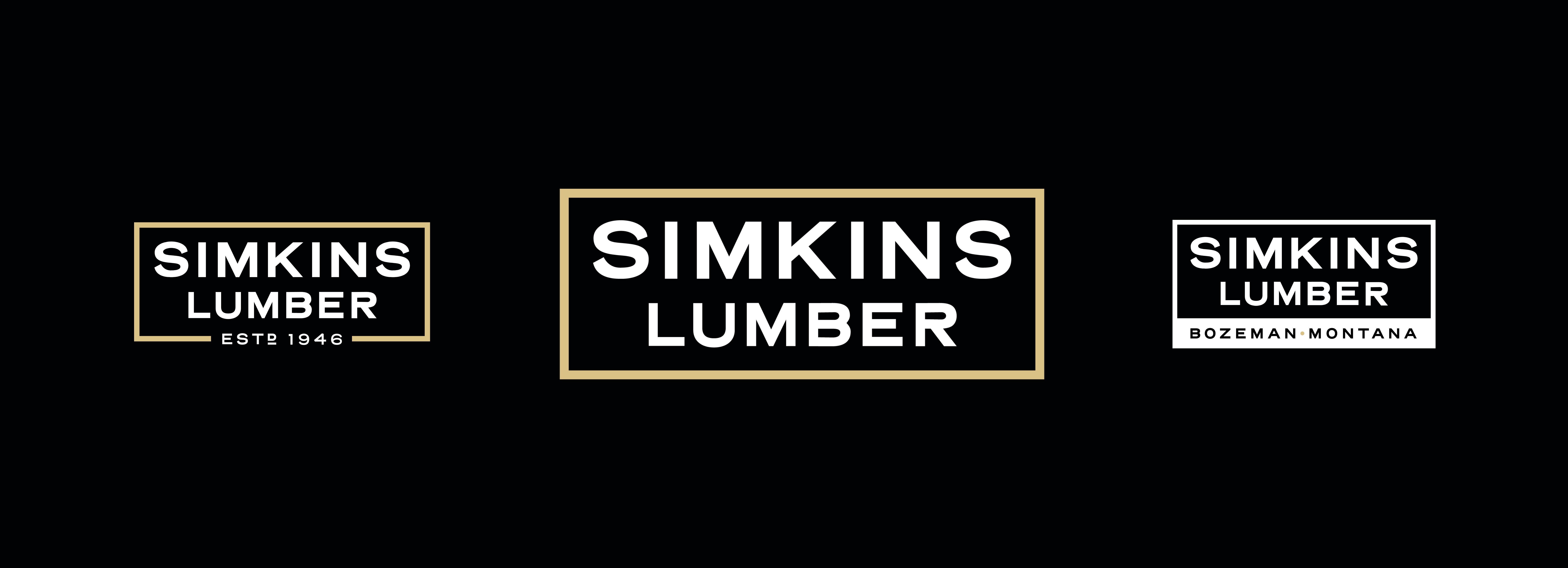
Brand Identity
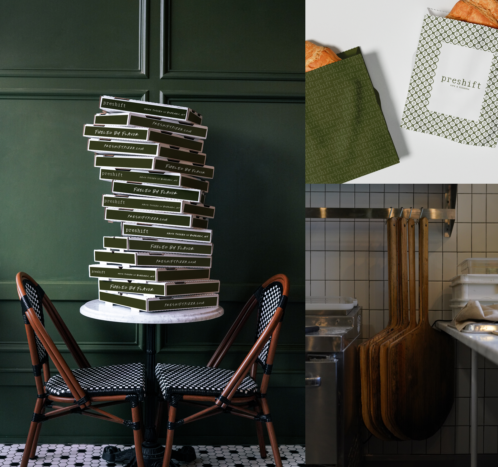
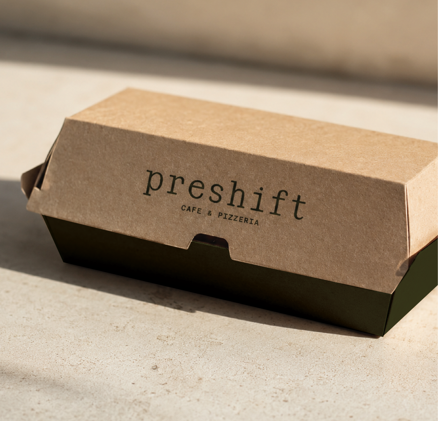
Packaging
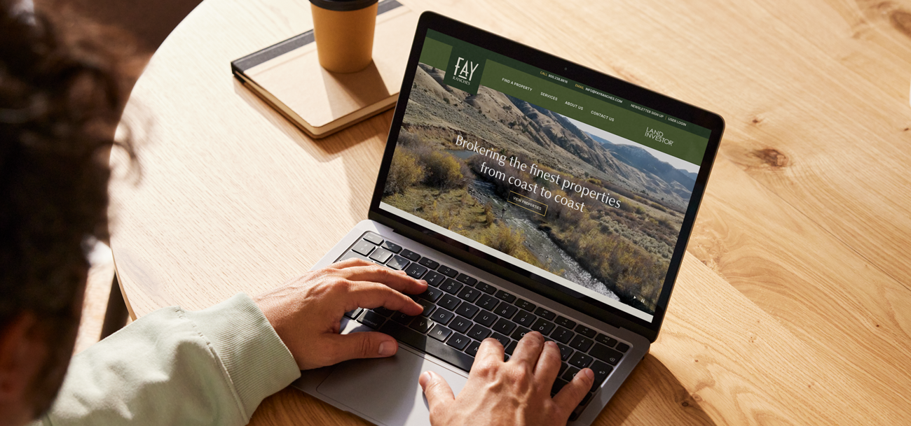
Website
Illustration
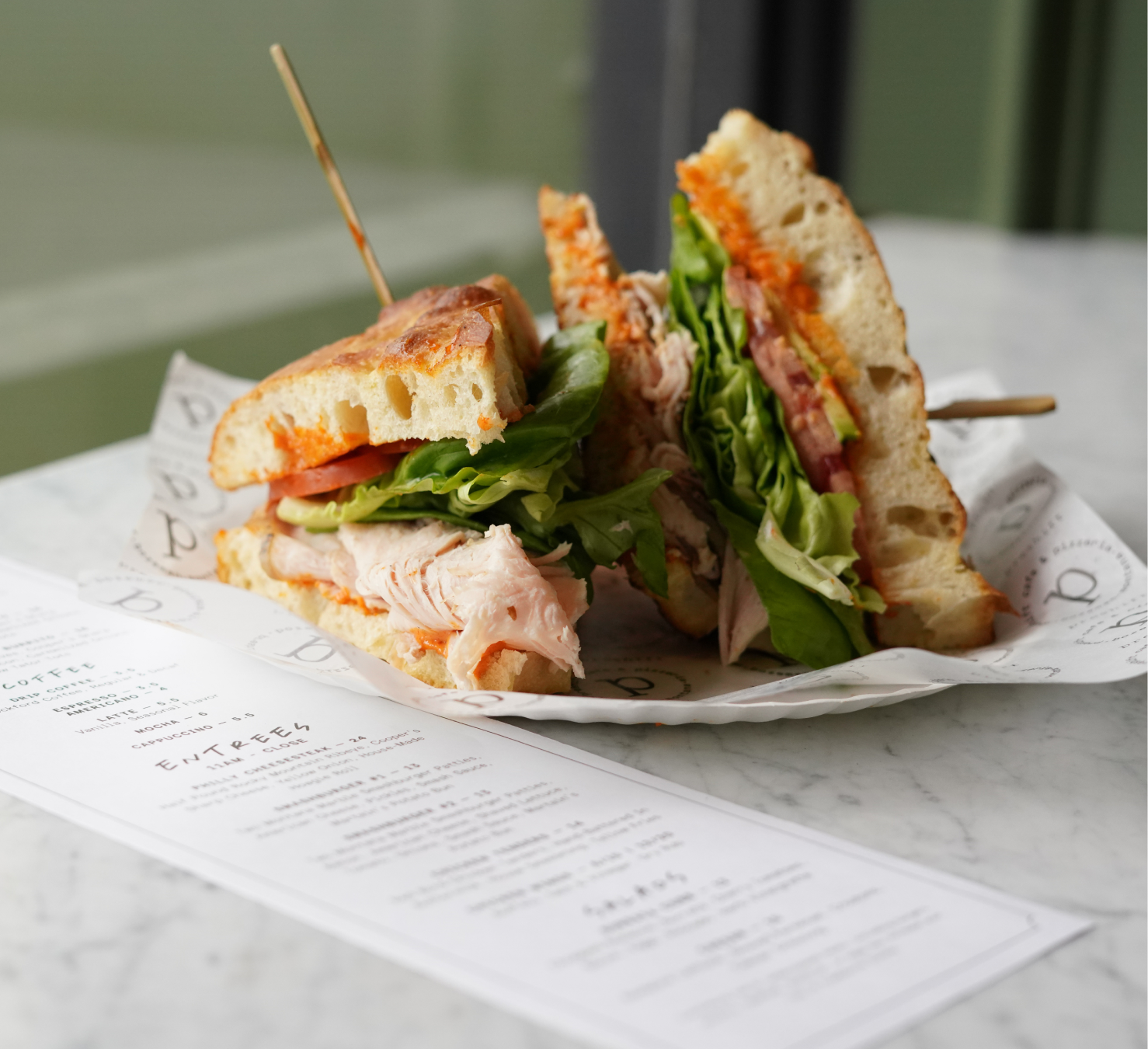
Photography
Social Media
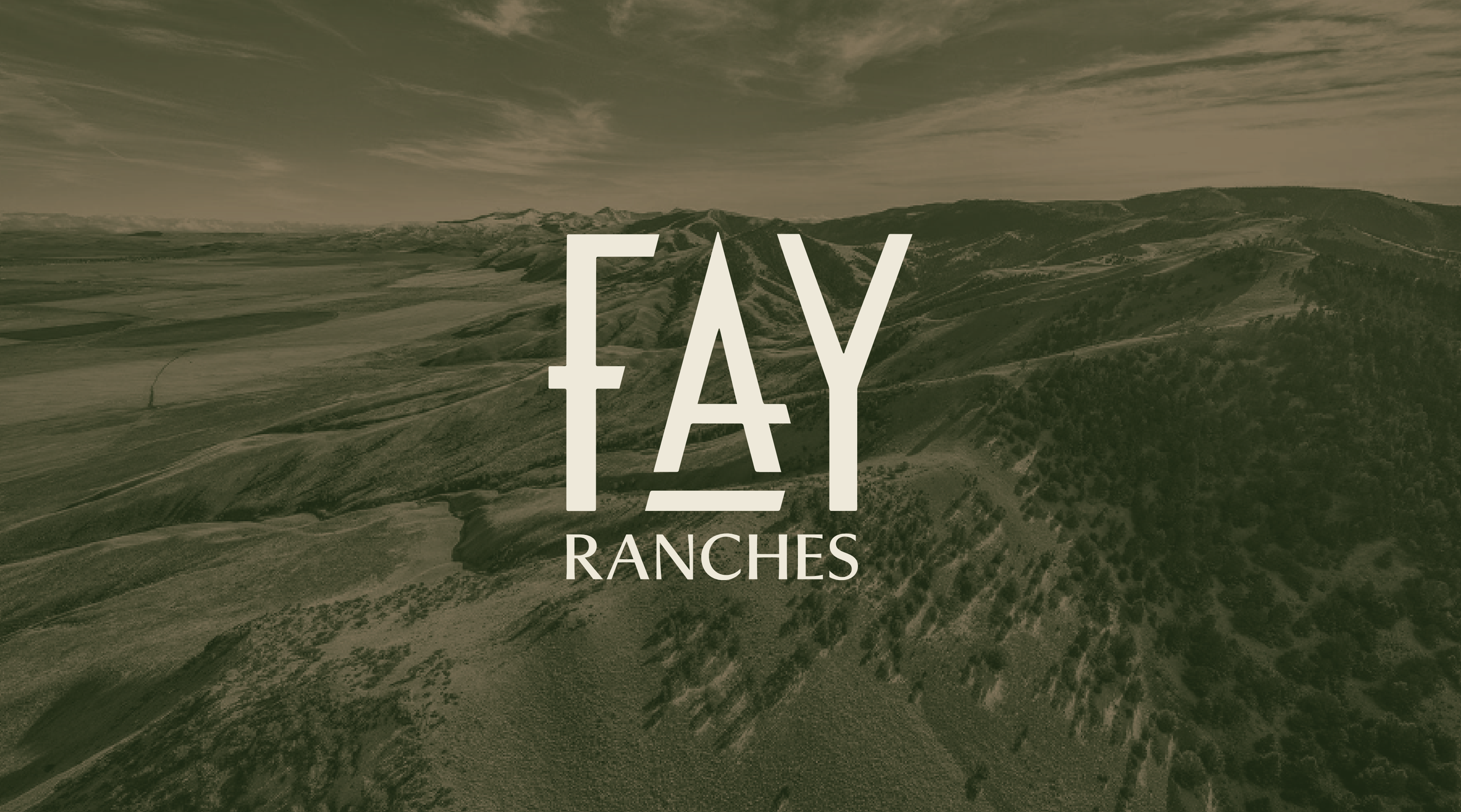
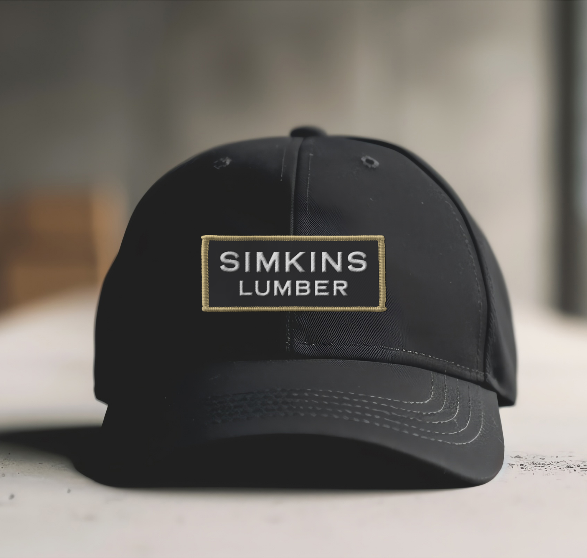
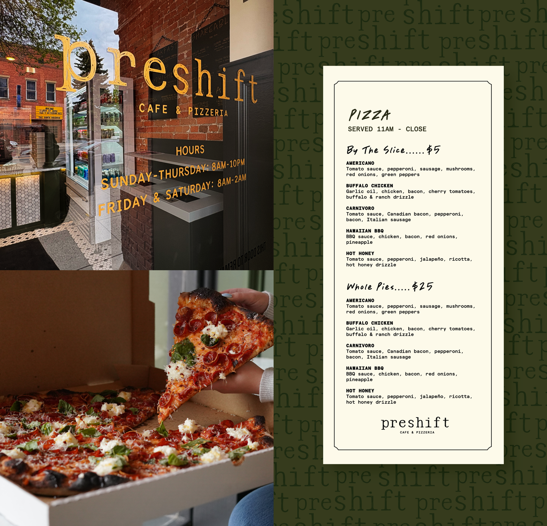
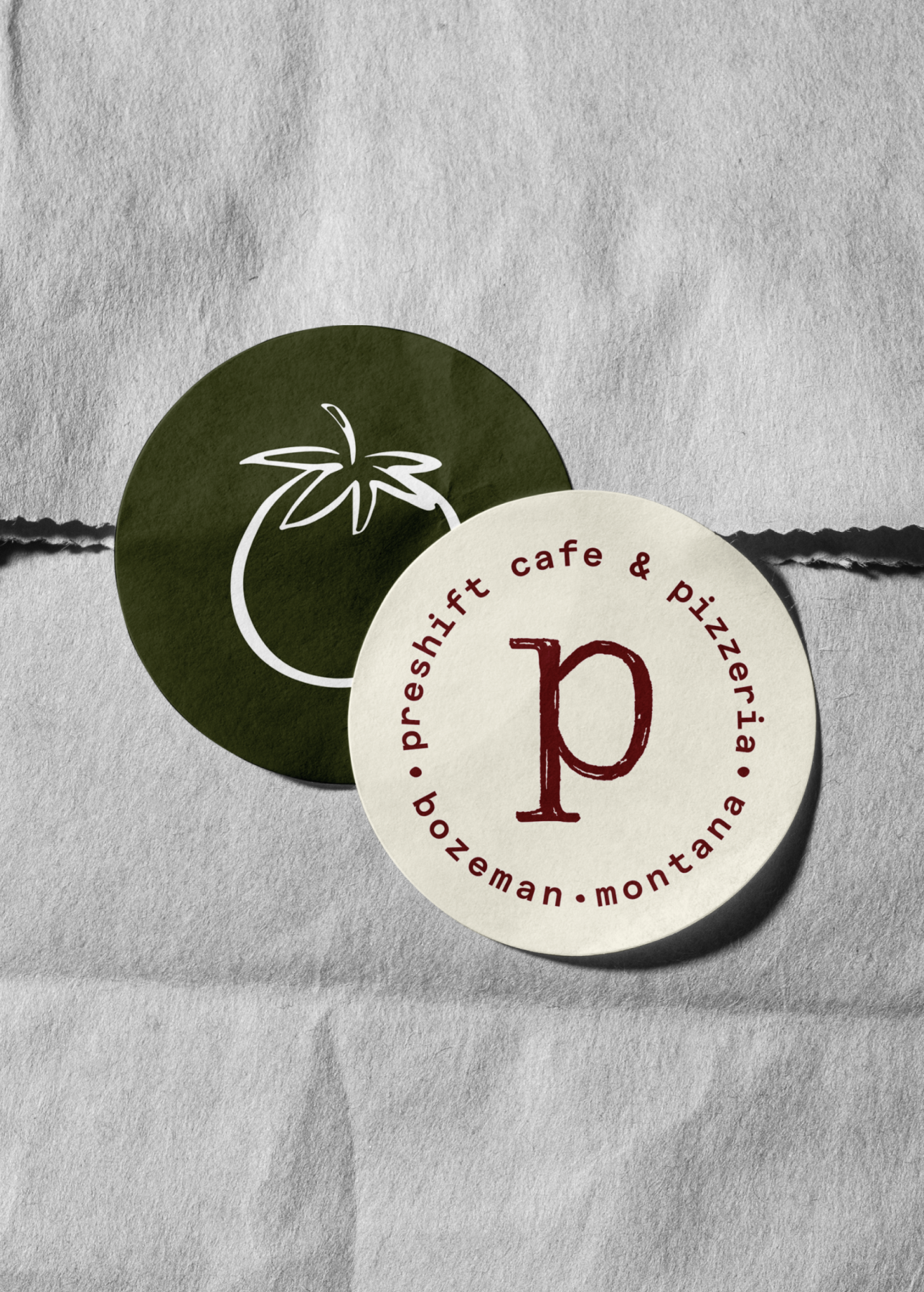
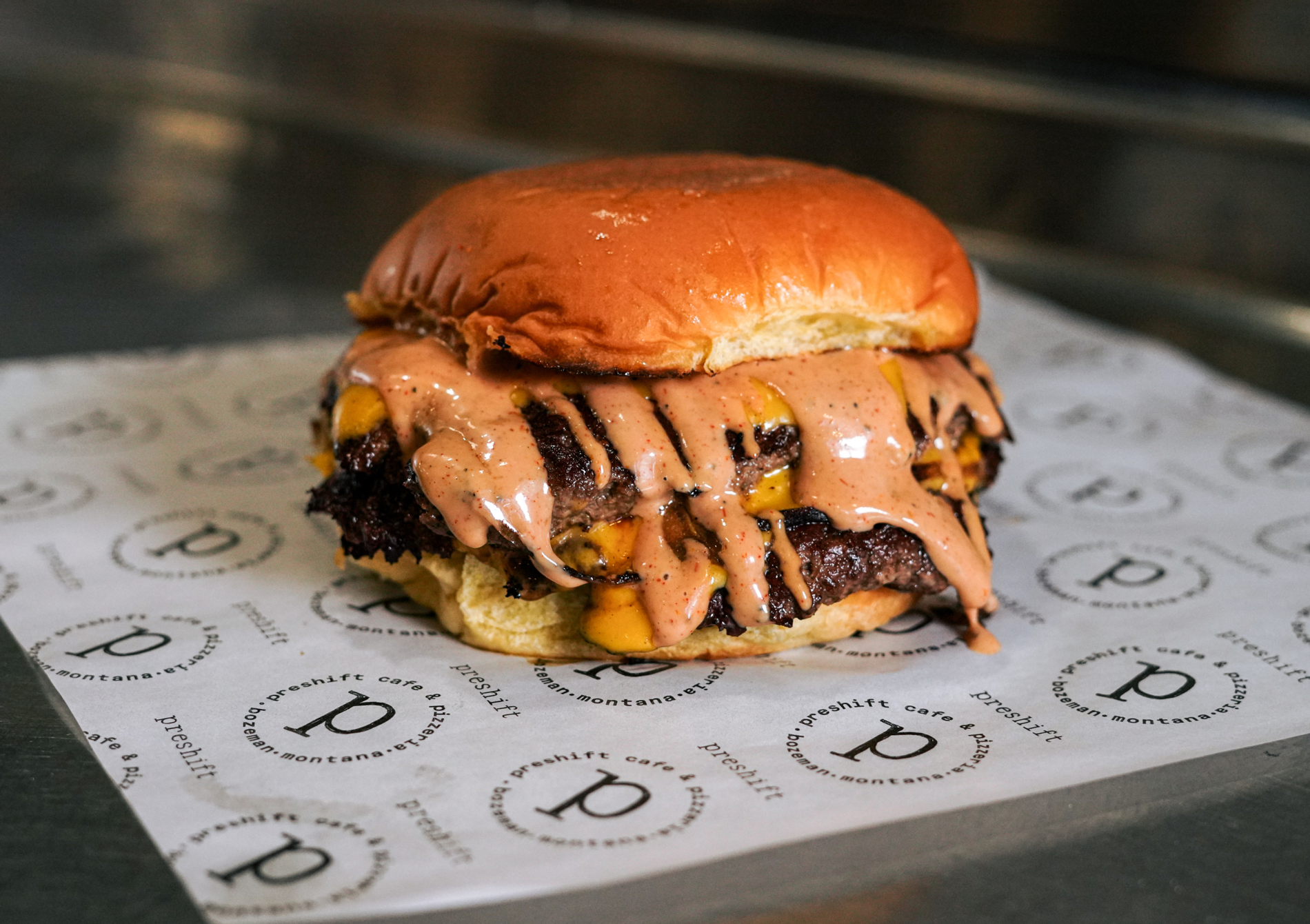
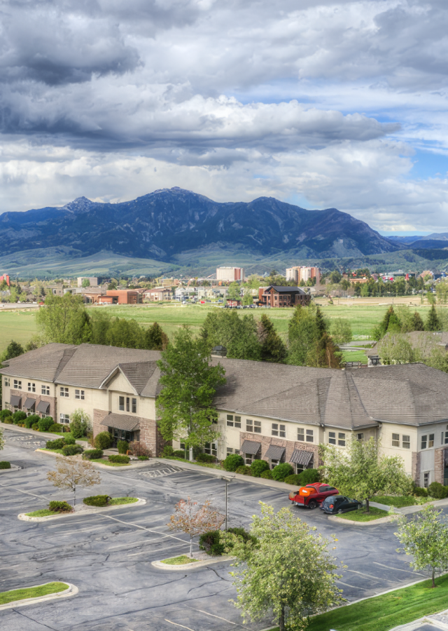
Bozeman, Montana
Gastro Gnome Website — American Advertising Awards Northwest, 2021
Gastro Gnome Packaging — American Advertising Awards Northwest, 2021
Gastro Gnome is experiencing wild success and has been featured in numerous publications such as Alaska Magazine. With its consistent visual assets and thriving brand of travel-ready meals, the company continues attracting customers and growing in a hyper-competitive market.


Develop a brand that relates to both the culinary gourmet and backcountry expert. Emphasis needed to be put on the freshness and care put into the recipes as well as their packability.
To clearly communicate that Gastro Gnome meals have been carefully crafted by a human that equally appreciates great food and a great backcountry adventure.
A balanced identity system that pairs restraint with grit. A defined grid with playful colors and textural elements. A friendly yet determined logo of a gnome trekking along with a spoon.


Hardy facilitated a multi-phase brand launch that considered everything from employee-owner training to the ‘why pay more’ signs. The first step was to train all leadership staff on the new strategy. By providing consistent language, their leadership team has the tools to communicate the brand to all employee-owners and customers, utilize it in hiring, and lean on it for business decisions. To support the high level of service T&C is known for, we created talking points, rack cards, and tools that empower employee-owners to answer questions customers may have.


The Bridger Brewing team wanted to be prepared to can and distribute its beer after opening its second location. AMS partnered with Bridger Brewing for packaging design concepts. The first step in the packaging process involved a strategy session in which the unique identity of each beer was explored and dissected. Several concepts were then sketched out. Once a concept was selected for each beer, custom illustrations were created for cans and boxes. The result is a full lineup of beers, each with its own design that is unique while still clearly a member of the Bridger Brewing brand.


The longest line you’ll see comes from a reel.
Big ideas are best discussed on the back of a pickup.


I first met part of the team at Hardy through a business networking community and was incredibly impressed with their work. I spent the next year pointing my clients in their direction for marketing/branding work. Meanwhile, I was building it into my budget for my own new start up to work with Hardy because I knew my next business deserved the quality of marketing and branding I'd seen them producing for companies both near and far. At this stage, I cannot imagine my brand without them. They spend quality and thoughtful time digging into the values and story within my ideas and turn them into a tangible brand identity. Their support, direction, organization, and professionalism are paramount to any other team I've worked with- no to mention the creativity and design skills that back each step of the way. I'm thrilled with the brand work, packaging design, and first steps of launching my website. I'm sure I'll continue to be impressed- my little biz is lucky to work with them.