
Stone Leaf Financial is a Montana-based financial advisory firm helping individuals, families, and businesses make confident financial decisions through personalized planning and trusted relationships.
As the firm transitioned into new ownership, it also recognized the need for a new name and brand identity, one that reflected the strength of the entire team rather than the legacy of a single owner. Stone Leaf partnered with Hardy Brands to develop a comprehensive brand strategy, name, and visual identity that honored the firm's reputation while positioning it for its next chapter. The result is a brand ingrained in thoughtful guidance, enduring relationships, and a commitment to being there through life’s transitions.
Brand Strategy
Brand Naming
Brand Identity
Brand Execution
Bozeman, MT
Stone Leaf Financial launched with a cohesive brand that reflects what truly differentiates the firm: relationships that guide clients through every stage of life. The new identity successfully shifted the brand from an owner-centric business to a team-centered advisory firm while preserving the trust clients had come to expect. Today, the brand communicates the firm's commitment to proactive planning, thoughtful guidance, and integrity at every touchpoint. More importantly, it provides the team with a shared identity that embodies the experience they strive to deliver every day—a trusted financial partner that's there through life's transitions.




























%402x.svg)
%402x.svg)


The firm had built a strong reputation, but its existing identity was closely tied to its previous ownership. As the business entered a new chapter, it needed a name and brand that represented the entire team while preserving the trust clients had developed over many years. Beyond the ownership transition, the brand also needed to stand apart in a financial services industry often perceived as transactional and product-focused. Stone Leaf wanted to communicate something different: proactive guidance, meaningful relationships, and a long-term commitment to helping clients navigate every stage of life with confidence.
Create a brand that reflects Stone Leaf Financial's relationship-first philosophy while positioning the firm for long-term growth beyond any one individual. The new identity needed to inspire confidence through expertise, reinforce the firm's commitment to integrity and proactive planning, and establish Stone Leaf as the trusted choice for generational financial planning.
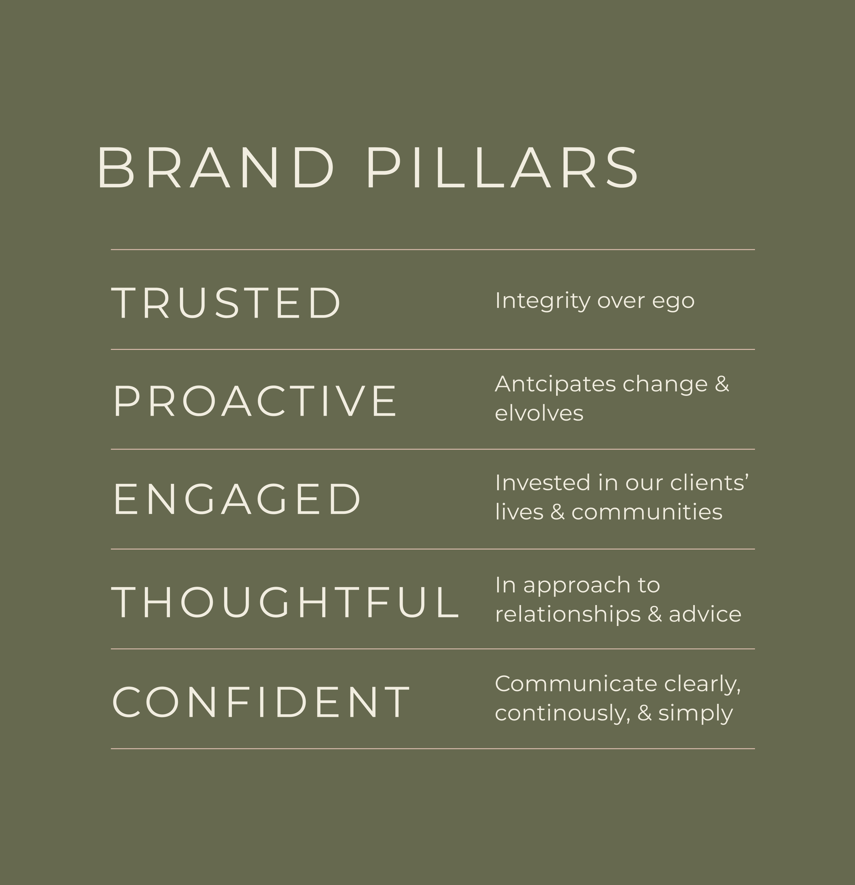
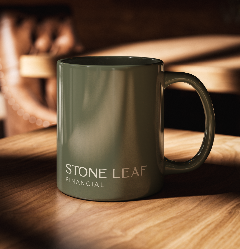
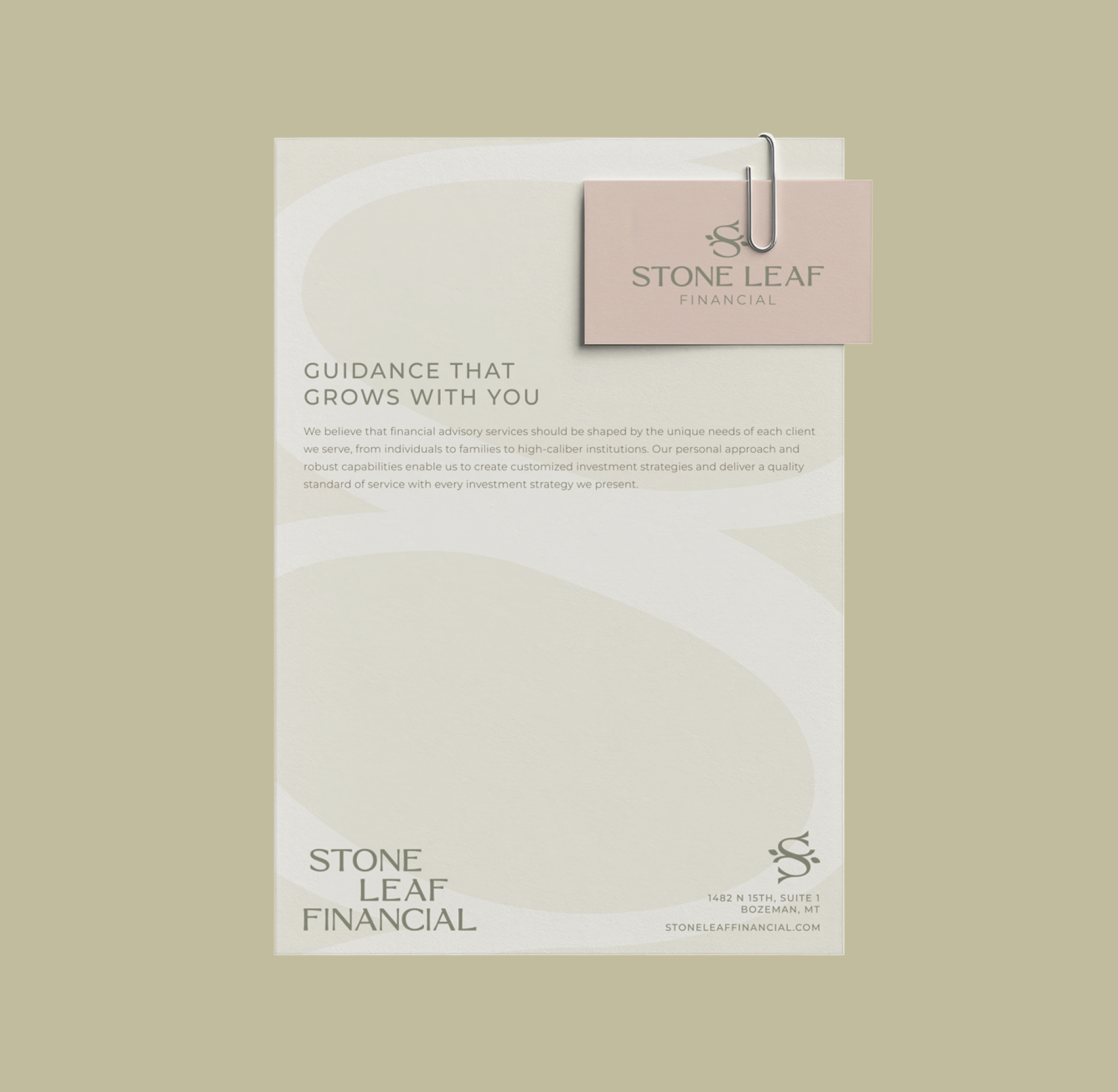
The engagement began with comprehensive brand strategy and positioning work to define the space Stone Leaf intends to own: helping clients make informed, intentional financial decisions with confidence. The resulting strategy centered on five brand pillars: Trusted, Proactive, Engaged, Thoughtful, and Confident, and a clear brand promise - There Through Life's Transitions. From there, we developed a visual identity designed to bring those ideas to life. Visually, the Stone Leaf logo pairs a strong serif wordmark with softened details, balancing expertise and stability with personal connection. Its intertwining paths represent growth, partnership, and each client’s unique journey, while the subtle infinity loop symbolizes enduring relationships and unwavering support.





























Hardy facilitated a multi-phase brand launch that considered everything from employee-owner training to the ‘why pay more’ signs. The first step was to train all leadership staff on the new strategy. By providing consistent language, their leadership team has the tools to communicate the brand to all employee-owners and customers, utilize it in hiring, and lean on it for business decisions. To support the high level of service T&C is known for, we created talking points, rack cards, and tools that empower employee-owners to answer questions customers may have.


The Bridger Brewing team wanted to be prepared to can and distribute its beer after opening its second location. AMS partnered with Bridger Brewing for packaging design concepts. The first step in the packaging process involved a strategy session in which the unique identity of each beer was explored and dissected. Several concepts were then sketched out. Once a concept was selected for each beer, custom illustrations were created for cans and boxes. The result is a full lineup of beers, each with its own design that is unique while still clearly a member of the Bridger Brewing brand.


The longest line you’ll see comes from a reel.
Big ideas are best discussed on the back of a pickup.